Getting Started with ASP.NET Core Predefined Dialogs
6 Feb 202612 minutes to read
This section briefly explains how to include ASP.NET Core Predefined Dialogs in an ASP.NET Core application using Visual Studio.
Prerequisites
System requirements for ASP.NET Core controls
Create ASP.NET Core web application with Razor pages
Install ASP.NET Core package in the application
To add ASP.NET Core controls in the application, open the NuGet package manager in Visual Studio (Tools → NuGet Package Manager → Manage NuGet Packages for Solution), search for Syncfusion.EJ2.AspNet.Core and then install it. Alternatively, you can utilize the following package manager command to achieve the same.
Install-Package Syncfusion.EJ2.AspNet.Core -Version 34.1.29NOTE
Syncfusion® ASP.NET Core controls are available in nuget.org. Refer to NuGet packages topic to learn more about installing NuGet packages in various OS environments. The Syncfusion.EJ2.AspNet.Core NuGet package has dependencies, Newtonsoft.Json for JSON serialization and Syncfusion.Licensing for validating Syncfusion® license key.
Add Syncfusion® ASP.NET Core Tag Helper
Open ~/Pages/_ViewImports.cshtml file and import the Syncfusion.EJ2 TagHelper.
@addTagHelper *, Syncfusion.EJ2Add stylesheet and script resources
Here, the theme and script are referenced using CDN inside the <head> of ~/Pages/Shared/_Layout.cshtml file as follows:
<head>
    ...
    <!-- Syncfusion ASP.NET Core controls styles -->
    <link rel="stylesheet" href="https://cdn.syncfusion.com/ej2/34.1.29/fluent.css" />
    <!-- Syncfusion ASP.NET Core controls scripts -->
    <script src="https://cdn.syncfusion.com/ej2/34.1.29/dist/ej2.min.js"></script>
</head>
NOTE
Checkout the Themes topic to learn different ways (CDN, NPM package, and CRG) to refer styles in ASP.NET Core application, and to have the expected appearance for Syncfusion® ASP.NET Core controls.
NOTE
Checkout the Adding Script Reference topic to learn different approaches for adding script references in your ASP.NET Core application.
Register Syncfusion® Script Manager
Also, register the script manager <ejs-script> at the end of <body> in the ASP.NET Core application as follows.
<body>
    ...
    <!-- Syncfusion ASP.NET Core Script Manager -->
    <ejs-scripts></ejs-scripts>
</body>
Render a Dialog using utility functions
The Dialog control provides built-in utility functions to render the alert and confirm dialogs with the minimal code. The following options are used as an argument on calling the utility functions:
| Options | Description |
|———–|————-|
| title | Specifies the title of dialog like the header property.|
| content | Specifies the value that can be displayed in dialog’s content area like the content property. |
| isModal | Specifies the Boolean value whether the dialog can be displayed as modal or non-modal. For more details, refer to the isModal property.|
| position | Specifies the value where the alert or confirm dialog is positioned within the document. For more details, refer to the position property { X: ‘center’, Y: ‘center’}|
| okButton | Configures the OK button that contains button properties with the click events. okButton:{ icon:'prefix icon to the button', cssClass:'custom class to the button', click: 'action for OK button click', text: 'Yes' // <-- Default value is 'OK' }|
| cancelButton | Configures the Cancel button that contains button properties with the click events. cancelButton:{ icon:'prefix icon to the button', cssClass:'custom class to the button', click: 'action for ‘Cancel’ button click', text: 'No' // <-- Default value is 'Cancel'}|
|isDraggable|Specifies the value whether the alert or confirm dialog can be dragged by the user.|
| showCloseIcon | When set to true, the close icon is shown in the Dialog control. |
| closeOnEscape|When set to true, you can close the dialog by pressing ESC key.|
| cssClass | Specifies the CSS class name that can be appended to the dialog.|
| zIndex | Specifies the order of the dialog, that is displayed in front or behind of another component.|
| open | Event which is triggered after the dialog is opened.|
| Close | Event which is triggered after the dialog is closed.|
| animationSettings | Specifies the animation settings of the dialog component. |
Add ASP.NET Core Predefined Dialogs
Now, add the Syncfusion® ASP.NET Core Predefined Dialogs tag helper in ~/Pages/Index.cshtml page.
Once you have completed the setup, you can open predefined dialogs from anywhere in the application using Alert, Confirm or Prompt methods in DialogUtility.
The dialog component provides built-in utility functions to render the alert and confirm dialogs with the minimal code.
The following options are used as an argument on calling the utility functions:
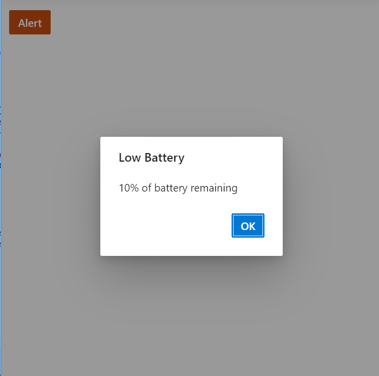
Show alert dialog
An alert dialog box is used to display errors, warnings, and information alerts that need user awareness. This can be achieved by using the DialogUtility.alert method. The alert dialog is displayed along with the OK button. When the user clicks the OK button, the alert dialog will close.
In the below code example, the alert dialog is displayed on button click action.
<div style="height:400px;">
    <ejs-button id="alertBtn" content="Alert" cssClass="e-danger"></ejs-button>
    <span id="statusText"></span>
</div>

<script>
    document.getElementById('alertBtn').onclick = function () {
        document.getElementById("statusText").style.display = "none";
        ej.popups.DialogUtility.alert({
            title: "Low battery",
            content: "10% of battery remaining",
            okButton: { click: alertokClick },
            position: { X: "center", Y: "center" }
        });
    };
    function alertokClick() {
        this.hide();
        document.getElementById("statusText").innerHTML = "The user closed the Alert dialog.";
        document.getElementById("statusText").style.display = "block";
    }
</script>
Press Ctrl+F5 (Windows) or ⌘+F5 (macOS) to run the app. Then, the Syncfusion® ASP.NET Core Predefined Dialog will be rendered in the default web browser.
Show confirm dialog
A confirm dialog box is used to display a specified message along with the OK and Cancel buttons. This can be achieved by using the DialogUtility.confirm method. It is used to get approval from the user, and it appears before any critical action. After getting approval from the user, the dialog will disappear automatically.
In the below code example, the confirm dialog is displayed on OK and Cancel button click action.
<div style="height:400px;">
    <ejs-button id="confirmBtn" content="Confirm" cssClass="e-success"></ejs-button>
    <span id="statusText"></span>
</div>

<script>
    document.getElementById('confirmBtn').onclick = function () {
        document.getElementById("statusText").style.display = "none";
        ej.popups.DialogUtility.confirm({
            title: "Delete multiple items",
            content: "Are you sure you want to permanently delete these items?",
            okButton: { click: confirmOkAction },
            cancelButton: { click: confirmCancelAction },
            position: { X: "center", Y: "center" }
        });
    };
    function confirmOkAction() {
        this.hide();
        document.getElementById("statusText").innerHTML = "The user confirmed the dialog box";
        document.getElementById("statusText").style.display = "block";
    }
    function confirmCancelAction() {
        this.hide();
        document.getElementById("statusText").innerHTML = "The user canceled the dialog box.";
        document.getElementById("statusText").style.display = "block";
    }
</script>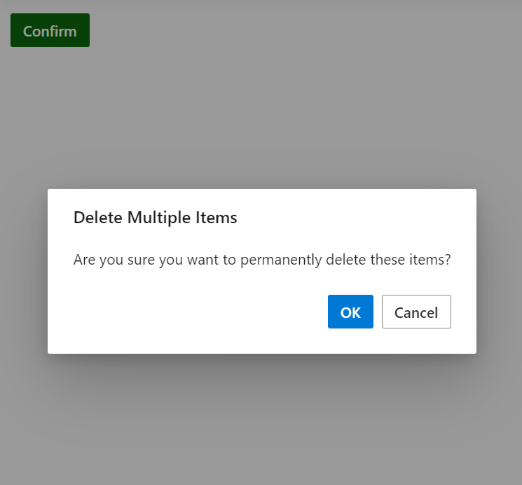
Show Prompt dialog
A prompt dialog is used to get input from the user. When the user clicks the OK button, the input value from the dialog is returned. If the user clicks the Cancel button, the null value is returned. After getting the input from the user, the dialog will disappear automatically.
In the below code example, the prompt dialog is displayed on OK and Cancel button click action.
<div style="height:400px;">
    <ejs-button id="promptBtn" content="Prompt" isPrimary="true"></ejs-button>
    <span id="statusText"></span>
</div>

<script>
    document.getElementById('promptBtn').onclick = function () {
        document.getElementById("statusText").style.display = "none";
        ej.popups.DialogUtility.confirm({
            title: "Join chat group",
            content: "<p>Enter your name: </p> <input id= inputEle type=text name=Required class=e-input placeholder=Type here.. />",
            okButton: { click: promptOkAction },
            cancelButton: { click: promptCancelAction },
            position: { X: "center", Y: "center" }
        });
    }
    function promptOkAction() {
        var value;
        value = document.getElementById("inputEle").value;
        if (value == "") {
            this.hide();
            document.getElementById("statusText").innerHTML = "The user's input is returned as \" \" ";
            document.getElementById("statusText").style.display = "block";
        }
        else {
            this.hide();
            document.getElementById("statusText").innerHTML = "The user's input is returned as" + " " + value;
            document.getElementById("statusText").style.display = "block";
        }
    }
    function promptCancelAction() {
        this.hide();
        document.getElementById("statusText").innerHTML = "The user canceled the prompt dialog";
        document.getElementById("statusText").style.display = "block";
    }
</script>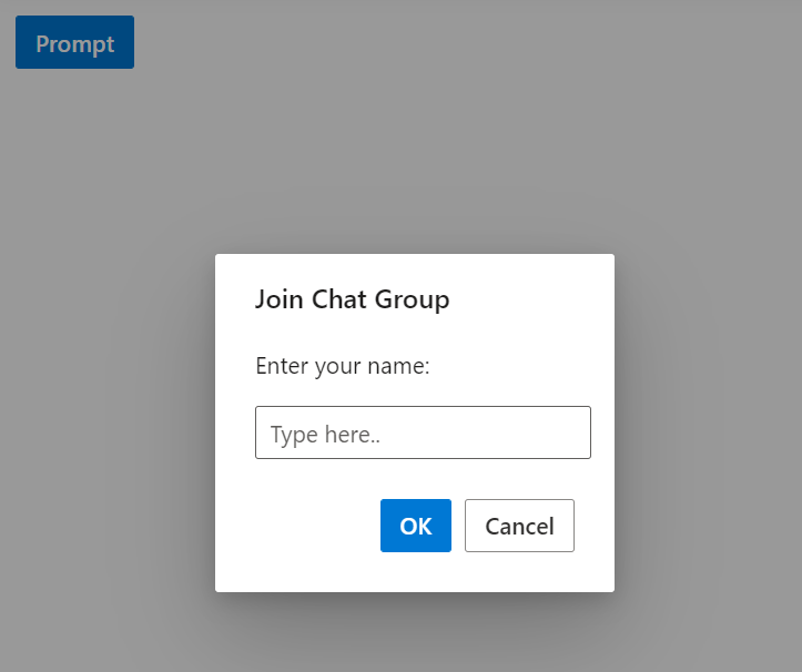
See also
- Getting Started with Syncfusion® ASP.NET Core using Razor Pages
- Getting Started with Syncfusion® ASP.NET Core MVC using Tag Helper
- Load dialog content using AJAX
- How to position the dialog on center of the page on scrolling
- Prevent closing of modal dialog
- Close dialog while click on outside of dialog
- How to make a reusable alert and confirm dialog