How can I help you?
Overview in ASP.NET Core Controls
8 Dec 202424 minutes to read
Theme Studio for Essential® JS 2 can be used to customize a new theme from an existing theme. It doesn’t support with Data visualization controls like Chart, Diagram, Gauge, Range Navigator, Maps.
Customizing theme color from theme studio
The Essential® JS 2 themes are developed under the SCSS environment. Each theme has a unique common variable list. When you change the common variable color code value, it will reflect in all the Syncfusion® ASP.NET Core controls. All the Syncfusion® ASP.NET Core control styles are derived from these theme-based common variables. This common variable list is handled inside the theme studio application for customizing theme-based colors.
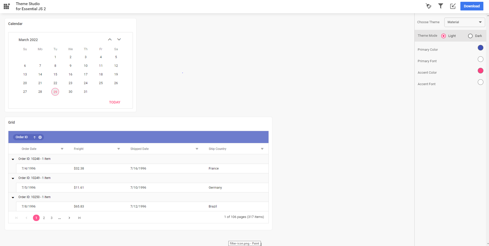
Step 1: Open the Syncfusion® Theme Studio application.
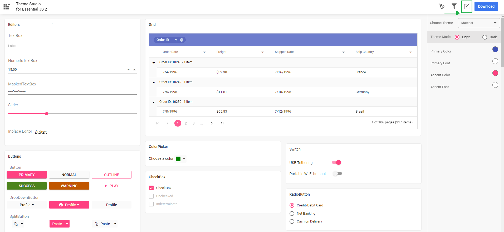
Step 2: The theme studio application page can be divided into two sections: the controls preview section on the left, and the theme customization section on the right.
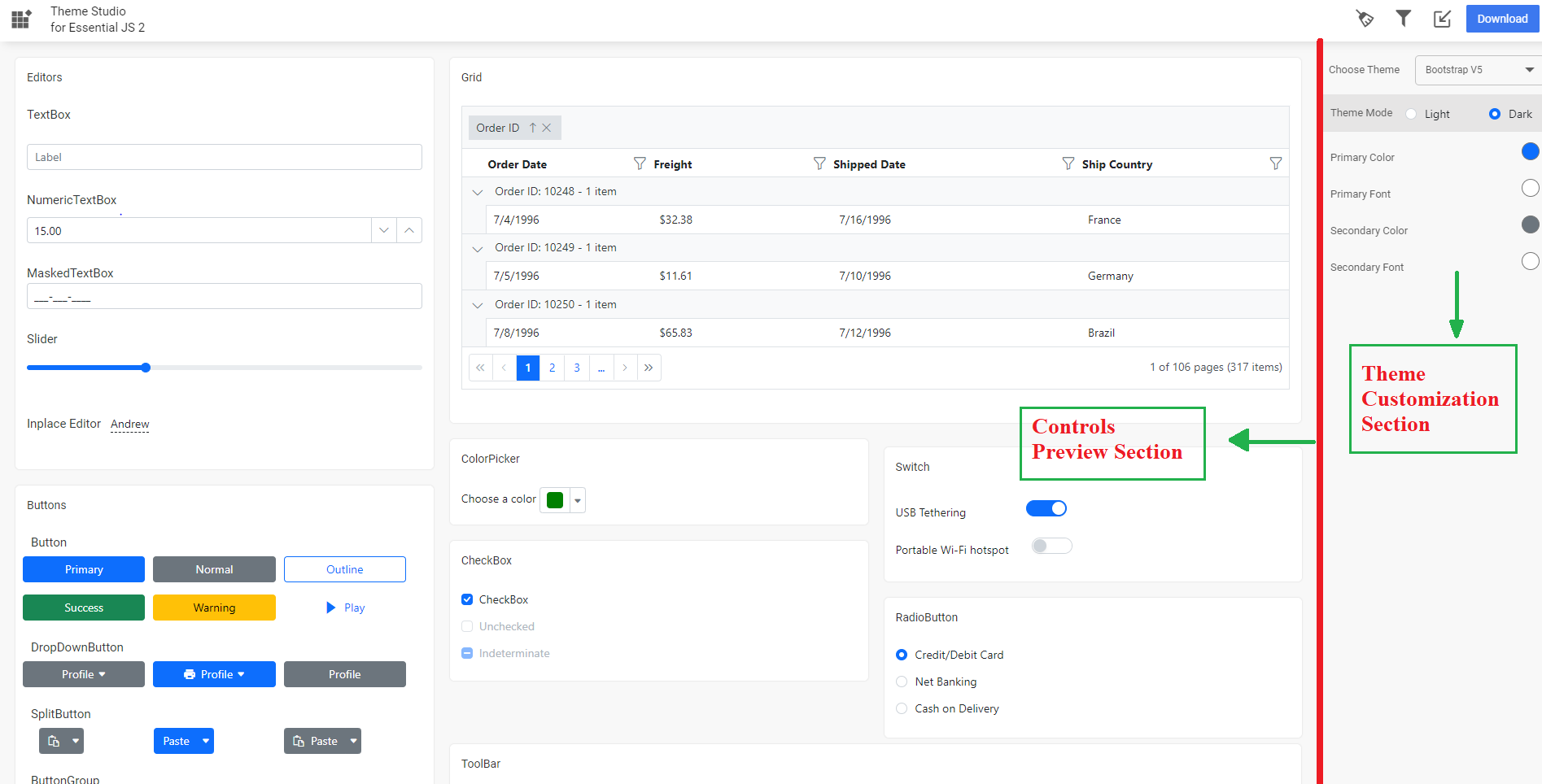
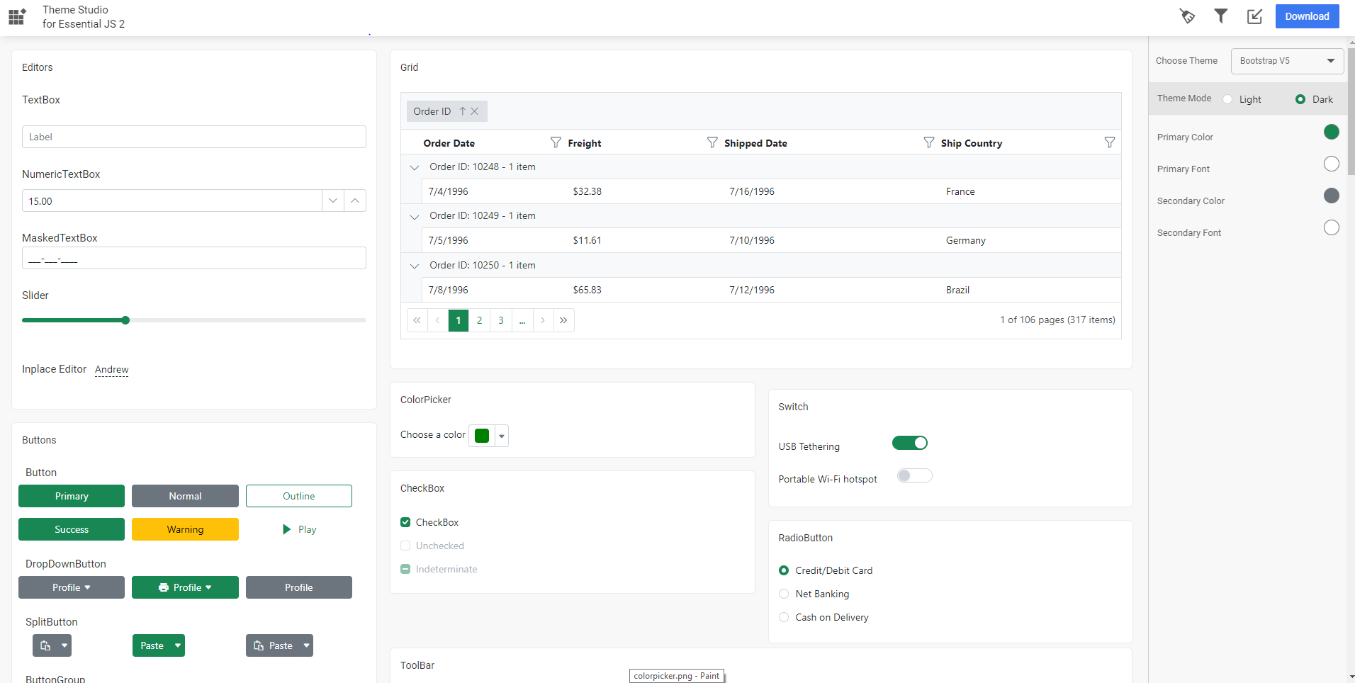
Step 3: Click the color pickers in the theme customization section to select your desired colors.
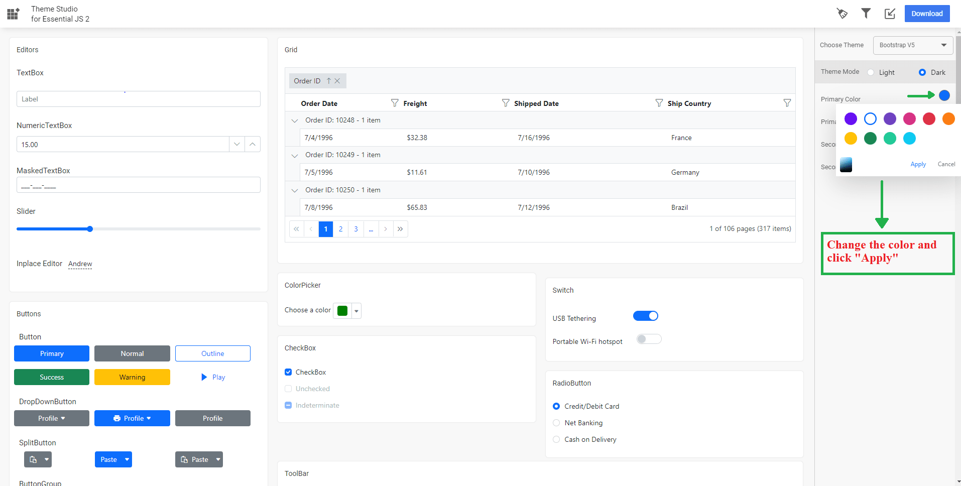
Step 4: After selecting colors with the color pickers, the Syncfusion® ASP.NET Core controls will have the newly selected colors applied to them in the controls preview section.
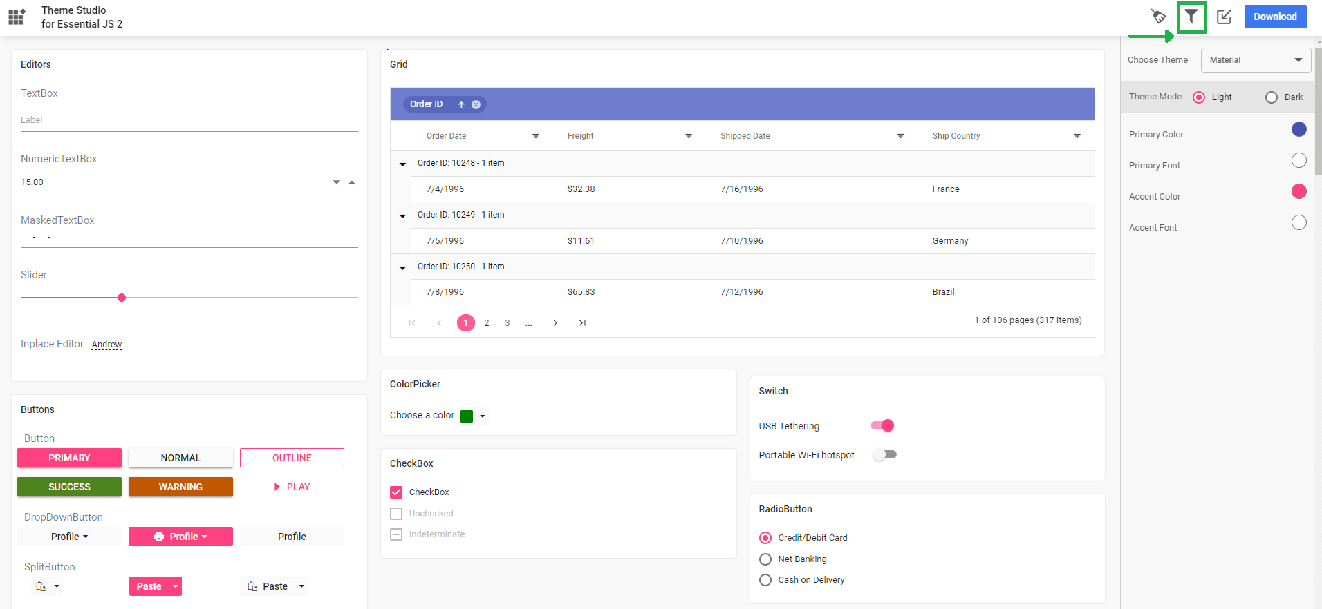
Filtering a specific list of controls
Using the theme studio, you can apply custom themes to a list of specific controls. This option is useful when you have integrated a selective list of Syncfusion® ASP.NET Core controls in your application. The theme studio will filter the selected controls and customize the final output for those controls’ styles alone, reducing the final output file size.
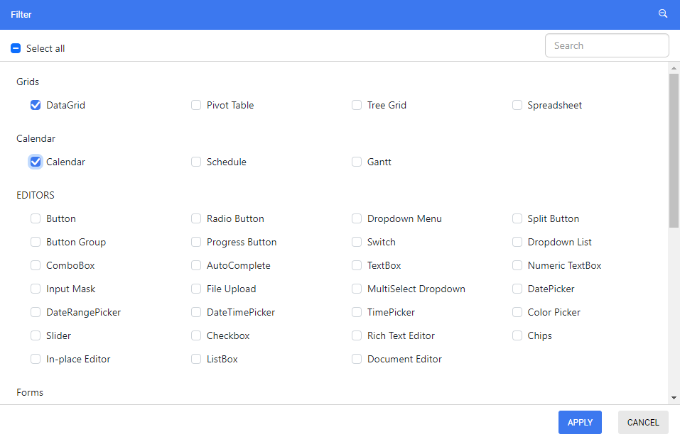
Step 1: Click the Filter icon in the top right corner and select the controls whose theme is to be customized.
Step 2: Click the Apply button in the Filter dialog. Now, only the selected controls will be rendered in the controls preview section.
Step 3: Now, you can customize the colors in the theme customization section for the controls you selected.
Download the customized theme
You can download the custom styles after customizing the theme colors.
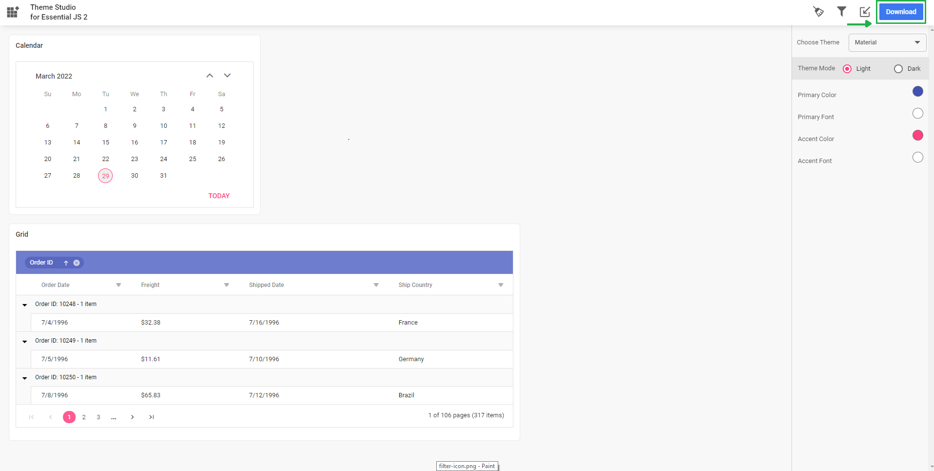
Step 1: Click the Download button in the top right corner. The Download dialog will open.
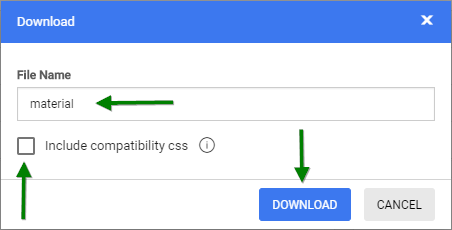
Step 2: Assign a theme name in the File Name field and click the Download button. If your application uses both Essential® JS 1 and Essential® JS 2 controls, then select the Include compatibility css check box before downloading the theme. This option will generate the custom theme for Essential® JS 2 compatibility styles, which are compatible as Essential® JS 1 styles. Refer this link for more details about Essential® JS 1 and Essential® JS 2 compatibility.
Step 3: The download styles will come as a zip file that contains SCSS and CSS files for the selected Syncfusion® ASP.NET Core controls. The current settings are stored in the settings.json file.
Using customized theme in a web application
You can directly use the customized CSS file in the web application.
Step 1: Copy/paste the customized CSS file from the download folder into your application at any folder. Example: styles/{file-name}.css.
Step 2: Refer the customized CSS file reference in the index.html or shared/_layout.cshtml main page head section.
<head>
    <link href="styles/{file-name}.css" rel="stylesheet"/>
</head>
NOTE
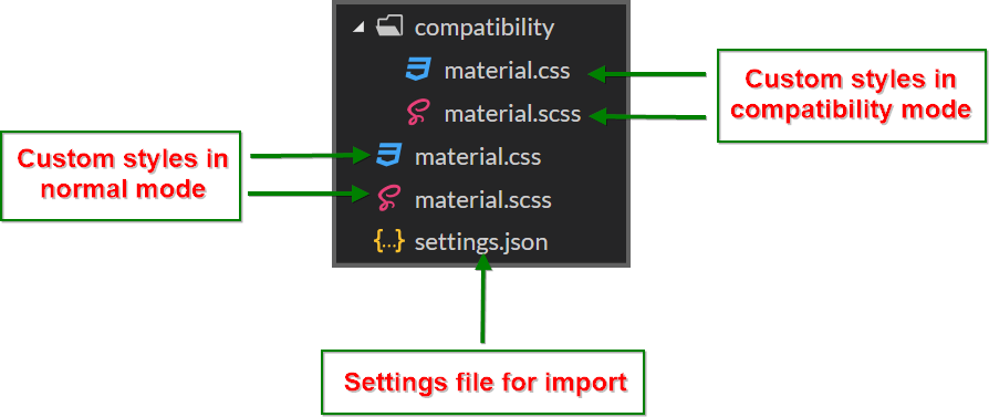
If you are using Essential® JS 1 and Essential® JS 2 controls in a same web application, then you have to copy/paste the customized CSS file from the
compatibilityfolder in the download location.
Import previously changed settings into the theme studio
When you want to change your application theme and UI design in the future, you won’t need to customize the Syncfusion® ASP.NET Core controls from scratch in the theme studio. Just import the old settings.json file to review and update your stored settings in the theme studio application.
Step 1: Click the Import icon in the top right corner.
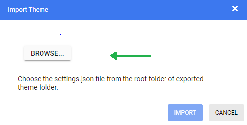
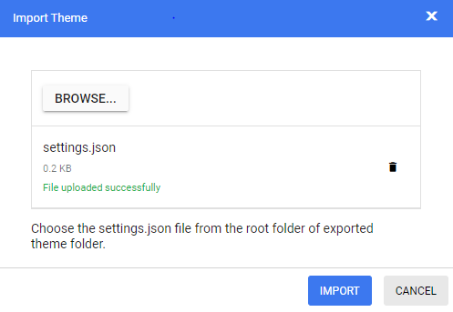
Step 2: The Import Theme dialog will open. Click the Browse button and select a settings.json file you exported previously.
Step 3: Click the Import button.
Step 4: The stored data will be reflected in the theme studio application. Now you can change the theme colors based on your latest design and export the theme again.
Step 5: The exported file will contain your latest changes. You can just replace the older custom style with the newer one to refresh your application.
Common Variables
The following list of common variables is used in the Syncfusion® ASP.NET Core library themes for all UI controls. You can change these variables to customize the corresponding theme.
Bootstrap 5 Theme
| Name | Value (Default Theme) | Value (Dark Theme) |
|---|---|---|
| $black | #000 | #000 |
| $white | #fff | #fff |
| $gray-100 | #f8f9fa | #f8f9fa |
| $gray-200 | #e9ecef | #e9ecef |
| $gray-300 | #dee2e6 | #dee2e6 |
| $gray-400 | #ced4da | #ced4da |
| $gray-500 | #adb5bd | #adb5bd |
| $gray-600 | #6c757d | #6c757d |
| $gray-700 | #495057 | #495057 |
| $gray-800 | #343a40 | #343a40 |
| $gray-900 | #212529 | #212529 |
| $blue | #0d6efd | #0d6efd |
| $indigo | #6610f2 | #6610f2 |
| $purple | #6f42c1 | #6f42c1 |
| $pink | #d63384 | #d63384 |
| $red | #dc3545 | #dc3545 |
| $orange | #fd7e14 | #fd7e14 |
| $yellow | #ffc107 | #ffc107 |
| $green | #198754 | #198754 |
| $teal | #20c997 | #20c997 |
| $cyan | #0dcaf0 | #0dcaf0 |
Fluent Theme
| Name | Value (Default Theme) | Value (Dark Theme) |
|---|---|---|
| $black | #000 | #000 |
| $white | #fff | #fff |
| $gray220 | #11100f | #11100f |
| $gray210 | #161514 | #161514 |
| $gray200 | #1b1a19 | #1b1a19 |
| $gray190 | #201f1e | #201f1e |
| $gray180 | #252423 | #252423 |
| $gray170 | #292827 | #292827 |
| $gray160 | #323130 | #323130 |
| $gray150 | #3b3a39 | #3b3a39 |
| $gray140 | #484644 | #484644 |
| $gray130 | #605e5c | #605e5c |
| $gray120 | #797775 | #797775 |
| $gray110 | #8a8886 | #8a8886 |
| $gray100 | #979593 | #979593 |
| $gray90 | #a19f9d | #a19f9d |
| $gray80 | #b3b0ad | #b3b0ad |
| $gray70 | #bebbb8 | #bebbb8 |
| $gray60 | #c8c6c4 | #c8c6c4 |
| $gray50 | #d2d0ce | #d2d0ce |
| $gray40 | #e1dfdd | #e1dfdd |
| $gray30 | #edebe9 | #edebe9 |
| $gray20 | #f3f2f1 | #f3f2f1 |
| $gray10 | #faf9f8 | #faf9f8 |
| $cyanblue10 | #0078d4 | #0078d4 |
| $red10 | #d13438 | #d13438 |
| $orange20 | #ca5010 | #ca5010 |
| $green20 | #0b6a0b | #0b6a0b |
| $cyan20 | #038387 | #038387 |
Bootstrap 4 Theme
| Name | Value |
|---|---|
| $white | #fff |
| $gray-100 | #f8f9fa |
| $gray-200 | #e9ecef |
| $gray-300 | #dee2e6 |
| $gray-400 | #ced4da |
| $gray-500 | #adb5bd |
| $gray-600 | #6c757d |
| $gray-700 | #495057 |
| $gray-800 | #343a40 |
| $gray-900 | #212529 |
| $black | #000 |
| $blue | #007bff |
| $indigo | #6610f2 |
| $purple | #6f42c1 |
| $pink | #e83e8c |
| $red | #dc3545 |
| $orange | #fd7e14 |
| $yellow | #ffc107 |
| $green | #28a745 |
| $teal | #20c997 |
| $cyan | #17a2b8 |
Bootstrap Theme
Design based on bootstrap 3 theme.
| Name | Value (Default Theme) | Value (Dark Theme) |
|---|---|---|
| $brand-primary | #317ab9 | #0070f0 |
| $brand-primary-darken-10 | #3071a9 | darken($brand-primary, 10%) |
| $brand-primary-darken-15 | #2a6496 | darken($brand-primary, 20%) |
| $brand-primary-darken-25 | #1f496e | darken($brand-primary, 30%) |
| $brand-primary-darken-35 | #142f46 | darken($brand-primary, 40%) |
| $brand-primary-font | #fff | #fff |
| $gray-base | #000 | #1a1a1a |
| $gray-darker | #222 | #131313 |
| $gray-dark | #333 | #2a2a2a |
| $gray | #555 | #313131 |
| $gray-light | #777 | #393939 |
| $grey-44 | #444 | #414141 |
| $grey-88 | #888 | #484848 |
| $grey-99 | #999 | #505050 |
| $grey-8c | #8c8c8c | #585858 |
| $grey-ad | #adadad | #676767 |
| $grey-dark-font | #fff | #f0f0f0 |
| $grey-white | #fff | #6e6e6e |
| $grey-lighter | #eee | #767676 |
| $grey-f9 | #f9f9f9 | #7e7e7e |
| $grey-f8 | #f8f8f8 | #858585 |
| $grey-f5 | #f5f5f5 | #8d8d8d |
| $grey-e6 | #e6e6e6 | #959595 |
| $grey-dd | #ddd | #9c9c9c |
| $grey-d4 | #d4d4d4 | #a4a4a4 |
| $grey-cc | #ccc | #acacac |
| $grey-light-font | #333 | #fff |
| $brand-success | #5cb85c | #48b14c |
| $brand-success-dark | #3c763d | #358238 |
| $brand-info | #5bc0de | #2aaac0 |
| $brand-info-dark | #31708f | #208090 |
| $brand-warning | #f0ad4e | #fac168 |
| $brand-warning-dark | #8a6d3b | #f9ad37 |
| $brand-danger | #d9534f | #d44f4f |
| $brand-danger-dark | #a94442 | #c12f2f |
| $brand-success-light | #dff0d8 | #dff0d8 |
| $brand-info-light | #d9edf7 | #d9edf7 |
| $brand-warning-light | #fcf8e3 | #fcf8e3 |
| $brand-danger-light | #f2dede | #f2dede |
| $input-border-focus | #66afe9 | #104888 |
| $brand-success-font | #3c763d | #2f7432 |
| $brand-info-font | #31708f | #1a6c7a |
| $brand-warning-font | #8a6d3b | #9d6106 |
| $brand-danger-font | #a94442 | #ac2a2a |
| $base-font | #000 | #000 |
| $brand-primary-lighten-10 | lighten($brand-primary, 10%) | |
| $brand-primary-lighten-15 | lighten($brand-primary, 15%) | |
| $brand-primary-lighten-20 | lighten($brand-primary, 20%) | |
| $brand-primary-lighten-30 | lighten($brand-primary, 30%) | |
| $brand-primary-lighten-40 | lighten($brand-primary, 40%) |
Material Theme
| Name | Value (Default Theme) | Value (Dark Theme) |
|---|---|---|
| $accent | #e3165b | #ff80ab |
| $accent-font | #fff | #000 |
| $primary | #3f51b5 | #3f51b5 |
| $primary-50 | #e8eaf6 | #e8eaf6 |
| $primary-100 | #c5cae9 | #c5cae9 |
| $primary-200 | #9fa8da | #9fa8da |
| $primary-300 | #7986cb | #7986cb |
| $primary-font | #fff | #fff |
| $primary-50-font | #000 | #000 |
| $primary-100-font | #000 | #000 |
| $primary-200-font | #000 | #000 |
| $primary-300-font | #fff | #fff |
| $grey-white | #fff | #fff |
| $grey-black | #000 | #000 |
| $grey-50 | #fafafa | #fafafa |
| $grey-100 | #f5f5f5 | #f5f5f5 |
| $grey-200 | #eee | #eee |
| $grey-300 | #e0e0e0 | #e0e0e0 |
| $grey-400 | #bdbdbd | #bdbdbd |
| $grey-500 | #9e9e9e | #9e9e9e |
| $grey-600 | #757575 | #757575 |
| $grey-700 | #616161 | #616161 |
| $grey-800 | #424242 | #424242 |
| $grey-900 | #212121 | #212121 |
| $grey-dark | #303030 | #303030 |
| $grey-light-font | #000 | #000 |
| $grey-dark-font | #fff | #fff |
| $base-font | #000 | #000 |
| $error-font | #f44336 | #ff6652 |
| $success-bg | #4caf50 | |
| $error-bg | #ff6652 | |
| $warning-bg | #ff9800 | |
| $info-bg | #03a9f4 | |
| $message-font | #fff | |
| $success-font | #4caf50 | |
| $warning-font | #ff9800 | |
| $info-font | #03a9f4 |
Tailwind CSS Theme
| Name | Value (Default Theme) | Value (Dark Theme) |
|---|---|---|
| $black | #000 | #000 |
| $white | #fff | #fff |
| $transparent | transparent | transparent |
| $cool-gray-50 | #f9fafb | #f9fafb |
| $cool-gray-100 | #f3f4f6 | #f3f4f6 |
| $cool-gray-200 | #e5e7eb | #e5e7eb |
| $cool-gray-300 | #d1d5db | #d1d5db |
| $cool-gray-400 | #9ca3af | #9ca3af |
| $cool-gray-500 | #6b7280 | #6b7280 |
| $cool-gray-600 | #4b5563 | #4b5563 |
| $cool-gray-700 | #374151 | #374151 |
| $cool-gray-800 | #1f2937 | #1f2937 |
| $cool-gray-900 | #111827 | #111827 |
| $red-100 | #fee2e2 | #fee2e2 |
| $red-400 | #f87171 | #f87171 |
| $red-500 | #ef4444 | #ef4444 |
| $red-600 | #dc2626 | #dc2626 |
| $red-800 | #991b1b | #991b1b |
| $green-100 | #dcfce7 | #dcfce7 |
| $green-500 | #22c55e | #22c55e |
| $green-600 | #16a34a | #16a34a |
| $green-700 | #15803d | #15803d |
| $orange-100 | #ffedd5 | #ffedd5 |
| $orange-500 | #f97316 | #f97316 |
| $orange-600 | #ea580c | #ea580c |
| $orange-700 | #c2410c | #c2410c |
| $orange-800 | #9a3412 | #9a3412 |
| $cyan-300 | #67e8f9 | #67e8f9 |
| $cyan-400 | #22d3ee | #22d3ee |
| $cyan-500 | #06b6d4 | #06b6d4 |
| $cyan-600 | #0891b2 | #0891b2 |
| $cyan-800 | #155e75 | #155e75 |
| $indigo-50 | #eef2ff | |
| $indigo-100 | #e0e7ff | |
| $indigo-200 | #c7d2fe | |
| $indigo-300 | #a5b4fc | |
| $indigo-400 | #818cf8 | |
| $indigo-500 | #6366f1 | |
| $indigo-600 | #4f46e5 | |
| $indigo-700 | #4338ca | |
| $indigo-800 | #3730a3 | |
| $indigo-900 | #312e81 | |
| $green-400 | #4ade80 | |
| $light-blue-50 | #f0f9ff | |
| $light-blue-100 | #e0f2fe | |
| $light-blue-400 | #38bdf8 | |
| $light-blue-500 | #0ea5e9 | |
| $light-blue-600 | #0284c7 | |
| $light-blue-700 | #0369a1 | |
| $light-blue-800 | #075985 |
Microsoft Office Fabric Theme
| Name | Value (Default Theme) | Value (Dark Theme) |
|---|---|---|
| $theme-primary | #0078d6 | #0074cc |
| $theme-dark-alt | darken($theme-primary, 3%) | darken($theme-primary, 3%) |
| $theme-dark | darken($theme-primary, 10%) | darken($theme-primary, 6%) |
| $theme-darker | darken($theme-primary, 18%) | darken($theme-primary, 10%) |
| $theme-secondary | lighten($theme-primary, 3%) | lighten($theme-primary, 3%) |
| $theme-tertiary | lighten($theme-primary, 21%) | lighten($theme-primary, 21%) |
| $theme-light | lighten($theme-primary, 44%) | lighten($theme-primary, 44%) |
| $theme-lighter | lighten($theme-primary, 49%) | lighten($theme-primary, 49%) |
| $theme-lighter-alt | lighten($theme-primary, 55%) | lighten($theme-primary, 55%) |
| $neutral-white | #fff | #201f1f |
| $neutral-lighter-alt | #f8f8f8 | #282727 |
| $neutral-lighter | #f4f4f4 | #333232 |
| $neutral-light | #eaeaea | #414040 |
| $neutral-quintenaryalt | #dadada | #4a4848 |
| $neutral-quintenary | #d0d0d0 | #514f4f |
| $neutral-tertiary-alt | #c8c8c8 | #6f6c6c |
| $neutral-tertiary | #a6a6a6 | #9a9a9a |
| $neutral-secondary-alt | #767676 | #c8c8c8 |
| $neutral-secondary | #666 | #dadada |
| $neutral-primary | #333 | #fff |
| $neutral-dark | #212121 | #f4f4f4 |
| $neutral-black | #000 | #f8f8f8 |
| $alert-bg | #deecf9 | #bf7500 |
| $error-bg | #fde7e9 | #cd2a19 |
| $success-bg | #dff6dd | #37844d |
| $theme-dark-font | #fff | #fff |
| $theme-primary-font | #fff | #fff |
| $theme-light-font | #333 | #000 |
| $neutral-light-font | #333 | #dadada |
| $neutral-light-fontalt | #000 | #fff |
| $grey-dark-font | #fff | #000 |
| $base-font | #333 | #dadada |
| $message-font | #333 | #fff |
| $alert-font | #d83b01 | #ff9d48 |
| $error-font | #a80000 | #ff5f5f |
| $success-font | #107c10 | #8eff8d |
| $info-bg | #1e79cb | |
| $info-font | #62cfff |
High Contrast Theme
| Name | Value |
|---|---|
| $selection-bg | #ffd939 |
| $selection-font | #000 |
| $selection-border | #ffd939 |
| $hover-bg | #685708 |
| $hover-font | #fff |
| $hover-border | #fff |
| $border-default | #969696 |
| $border-alt | #757575 |
| $border-fg | #fff |
| $border-fg-alt | #ffd939 |
| $bg-base-0 | #000 |
| $bg-base-5 | #0d0d0d |
| $bg-base-10 | #1a1a1a |
| $bg-base-15 | #262626 |
| $bg-base-20 | #333 |
| $bg-base-75 | #bfbfbf |
| $bg-base-100 | #fff |
| $header-font | #ffd939 |
| $header-font-alt | #fff |
| $content-font | #fff |
| $content-font-alt | #969696 |
| $link | #8a8aff |
| $invert-font | #000 |
| $success-bg | #166600 |
| $error-bg | #b30900 |
| $message-font | #fff |
| $alert-bg | #944000 |
| $info-bg | #0056b3 |
| $success-alt | #2bc700 |
| $error-alt | #ff6161 |
| $alert-alt | #ff7d1a |
| $info-alt | #66b0ff |
| $disable | #757575 |