Getting started with Angular Splitter component
4 Mar 20267 minutes to read
This section explains the steps required to create Syncfusion’s Angular Splitter component. The Splitter enables splittable layouts by placing a separator between two panes. You can dynamically adjust the size of the panes based on the separator’s position.
To get started quickly with Angular Splitter using CLI and Schematics, check out this video:
Getting Started with Angular CLI
Follow these steps to create and configure a basic Angular CLI application.
Setup Angular Environment
You can use Angular CLI to setup your Angular applications.
To install Angular CLI use the following command.
npm install -g @angular/cliAngular 21 Standalone Architecture: Standalone components are the default in Angular 21. This guide uses the modern standalone architecture. If you need more information about the standalone architecture, refer to the Standalone Guide.
Installing a specific version
To install a particular version of Angular CLI, use:
npm install -g @angular/[email protected]Create a new application
With Angular CLI installed, execute this command to generate a new application:
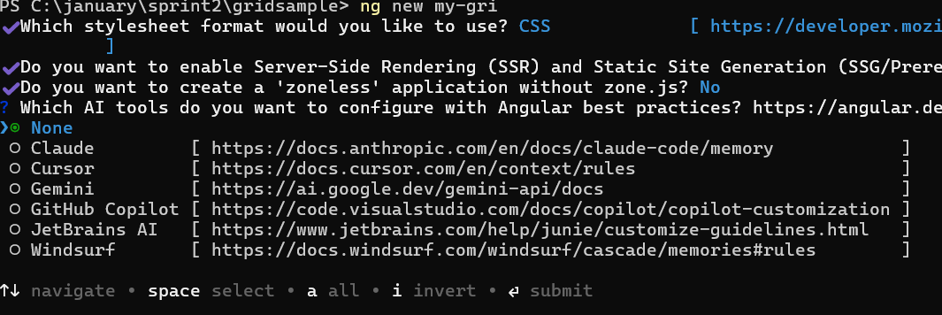
ng new syncfusion-angular-app- This command will prompt you to configure settings like enabling Angular routing and choosing a stylesheet format.
? Which stylesheet format would you like to use? (Use arrow keys)
> CSS             [ https://developer.mozilla.org/docs/Web/CSS                     ]
  Sass (SCSS)     [ https://sass-lang.com/documentation/syntax#scss                ]
  Sass (Indented) [ https://sass-lang.com/documentation/syntax#the-indented-syntax ]
Less [ http://lesscss.org ]- By default, a CSS-based application is created. Use SCSS if required:
ng new syncfusion-angular-app --style=scss- During project setup, when prompted for the Server-side rendering (SSR) option, choose the appropriate configuration.

- Select the required AI tool or ‘none’ if you do not need any AI tool.
- Navigate to your newly created application directory:
cd syncfusion-angular-appNote: In Angular 19 and below, it uses
app.component.ts,app.component.html,app.component.cssetc. In Angular 20+, the CLI generates a simpler structure withsrc/app/app.ts,app.html, andapp.css(no.component.suffixes).
Installing Syncfusion® Splitter package
Syncfusion® packages are distributed via npm as @syncfusion scoped packages. You can find all Angular Syncfusion® packages here.
Syncfusion® provides two package formats for Angular components:
- Ivy library distribution package format
- Angular compatibility compiler(Angular’s legacy compilation and rendering pipeline) package.
Ivy library distribution package
Syncfusion® Angular packages(>=20.2.36) has been moved to the Ivy distribution to support the Angular Ivy rendering engine and the package are compatible with Angular version 12 and above. To download the package use the below command.
Add @syncfusion/ej2-angular-layouts package to the application.
npm install @syncfusion/ej2-angular-layouts --saveAngular compatibility compiled package(ngcc)
For Angular version below 12, you can use the legacy (ngcc) package of the Syncfusion® Angular components. To download the ngcc package use the below.
Add @syncfusion/ej2-angular-layouts@ngcc package to the application.
npm install @syncfusion/ej2-angular-layouts@ngcc --saveTo mention the ngcc package in the package.json file, add the suffix -ngcc with the package version as below.
@syncfusion/ej2-angular-layouts:"20.2.38-ngcc"Note: If the ngcc tag is not specified while installing the package, the Ivy Library Package will be installed and this package will throw a warning.
Adding Splitter module
After installing the layouts package, import the required module in your application. Syncfusion® Angular packages offer multiple NgModule options.
Refer to the following snippet to import the SplitterModule in app.module.ts from the @syncfusion/ej2-angular-layouts.
import { BrowserModule } from '@angular/platform-browser';
import { NgModule } from '@angular/core';

import { AppRoutingModule } from './app-routing.module';
import { AppComponent } from './app.component';
// Imported syncfusion SplitterModule from layouts package
import { SplitterModule } from '@syncfusion/ej2-angular-layouts';

@NgModule({
  declarations: [
    AppComponent
  ],
  imports: [
    BrowserModule,
    AppRoutingModule,
    // Registering EJ2 Splitter Module
    SplitterModule
  ],
  providers: [],
  bootstrap: [AppComponent]
})
export class AppModule { }
Adding Splitter component
Add the Splitter component snippet in app.component.ts as follows.
import { Component } from '@angular/core';

@Component({
  selector: 'app-root',
  template: `
    <div id='container'>
      <ejs-splitter #horizontal height='110px' width='100%' >
          <e-panes>
            <e-pane></e-pane>
            <e-pane></e-pane>
          </e-panes>
      </ejs-splitter>
    </div>`
})
export class AppComponent {
    constructor() {
    }
}
Add the following styles in styles.css:
#container {
  margin: 50px auto;
}
Adding CSS reference
The following CSS files are available in ../node_modules/@syncfusion package folder. This can be referenced in [src/styles.css] using following code.
      @import '../node_modules/@syncfusion/ej2-base/styles/material3.css';
      @import '../node_modules/@syncfusion/ej2-icons/styles/material3.css';
      @import '../node_modules/@syncfusion/ej2-buttons/styles/material3.css';
      @import '../node_modules/@syncfusion/ej2-angular-layouts/styles/material3.css';
The Custom Resource Generator (CRG) is an online web tool, which can be used to generate the custom script and styles for a set of specific components.
This web tool is useful to combine the required component scripts and styles in a single file.
Load content to the pane
You can load the pane content using either HTML element or string values via the content property.
For detailed information, refer to the Pane Content section.
Running the application
Run the ng serve command in command window, it will serve your application and you can open the browser window. Output will appear as follows.
import { NgModule } from '@angular/core'
import { BrowserModule } from '@angular/platform-browser'
import { FormsModule } from '@angular/forms'
import { SplitterModule } from '@syncfusion/ej2-angular-layouts'


import { Component } from '@angular/core';

@Component({
imports: [
         FormsModule, SplitterModule
    ],


standalone: true,
    selector: 'app-root',
    template: `
    <div id='container'>
          <ejs-splitter #horizontal height='250px' width='600px'>
            <e-panes>
                <e-pane></e-pane>
                <e-pane></e-pane>
                <e-pane></e-pane>
            </e-panes>
          </ejs-splitter>
    </div>`
})
export class AppComponent {
    constructor() {
    }
}
import { bootstrapApplication } from '@angular/platform-browser';
import { AppComponent } from './app.component';
import 'zone.js';
bootstrapApplication(AppComponent).catch((err) => console.error(err));