Getting started with Angular MultiColumn ComboBox component
3 Jul 202622 minutes to read
This guide demonstrates how to set up and configure the Syncfusion Angular MultiColumn ComboBox component, from initial installation through displaying multi-column data with custom column configurations. The MultiColumn ComboBox allows users to select values from a dropdown list that displays multiple columns of data with header support and customizable column widths.
Note: This guide supports Angular 21 and other recent Angular versions. For detailed compatibility with other Angular versions, please refer to the Angular version support matrix. Starting from Angular 19, standalone components are the default, and this guide reflects that architecture.
Ready to streamline your Syncfusion® Angular development? Discover the full potential of Syncfusion® Angular components with Syncfusion® AI Coding Assistant. Effortlessly integrate, configure, and enhance your projects with intelligent, context-aware code suggestions, streamlined setups, and real-time insights—all seamlessly integrated into your preferred AI-powered IDEs like VS Code, Cursor, Syncfusion® CodeStudio and more. Explore Syncfusion® AI Coding Assistant
Prerequisites
Ensure your development environment meets the System Requirements for Syncfusion Angular UI Components.
Dependencies
The following list of dependencies are required to use the Angular ComboBox component in your application.
|-- @syncfusion/ej2-angular-multicolumn-combobox
    |-- @syncfusion/ej2-base
    |-- @syncfusion/ej2-data
    |-- @syncfusion/ej2-angular-base
    |-- @syncfusion/ej2-grids
    |-- @syncfusion/ej2-lists
    |-- @syncfusion/ej2-inputs
    |-- @syncfusion/ej2-popups
      |-- @syncfusion/ej2-buttons
SetUp the Angular application
A straightforward approach to beginning with Angular is to create a new application using the Angular CLI. Install Angular CLI globally with the following command:
npm install -g @angular/cliAngular 21 Standalone Architecture: Standalone components are the default in Angular 21. This guide uses the modern standalone architecture. If you need more information about the standalone architecture, refer to the Standalone Guide.
Installing a specific version
To install a particular version of Angular CLI, use:
npm install -g @angular/[email protected]Create a new application
With Angular CLI installed, execute this command to generate a new application:
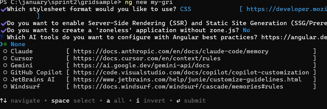
ng new syncfusion-angular-app- This command will prompt you to configure settings like enabling Angular routing and choosing a stylesheet format.
? Which stylesheet format would you like to use? (Use arrow keys)
> CSS             [ https://developer.mozilla.org/docs/Web/CSS                     ]
  Sass (SCSS)     [ https://sass-lang.com/documentation/syntax#scss                ]
  Sass (Indented) [ https://sass-lang.com/documentation/syntax#the-indented-syntax ]
Less [ http://lesscss.org ]- By default, a CSS-based application is created. Use SCSS if required:
ng new syncfusion-angular-app --style=scss- During project setup, when prompted for the Server-side rendering (SSR) option, choose the appropriate configuration.

- Select the required AI tool or ‘none’ if you do not need any AI tool.
- Navigate to your newly created application directory:
cd syncfusion-angular-appNote: In Angular 19 and below, it uses
app.component.ts,app.component.html,app.component.cssetc. In Angular 20+, the CLI generates a simpler structure withsrc/app/app.ts,app.html, andapp.css(no.component.suffixes).
Installing Syncfusion® MultiColumn ComboBox package
Syncfusion®’s Angular component packages are available on npmjs.com. To use Syncfusion® Angular components, install the necessary package.
This guide uses the Angular MultiColumn ComboBox component for demonstration. Add the Angular MultiColumn ComboBox component with:
ng add @syncfusion/ej2-angular-multicolumn-comboboxThis command will perform the following configurations:
- Add the
@syncfusion/ej2-angular-multicolumn-comboboxpackage and peer dependencies to yourpackage.json. - Import the MultiColumn ComboBox component in your application.
- Register the default Syncfusion® material theme in
angular.json.
For more details on version compatibility, refer to the Version Compatibility section.
Syncfusion® offers two package structures for Angular components:
- Ivy library distribution package format
- Angular compatibility compiler (ngcc), which is Angular’s legacy compilation pipeline.
Syncfusion®’s latest Angular packages are provided as Ivy-compatible and suited for Angular 12 and above. To install the package, execute:ng add @syncfusion/ej2-angular-multicolumn-comboboxFor applications not compiled with Ivy, use the
ngcctagged packages:The ngcc packages are still compatible with Angular CLI versions 15 and below. However, they may generate warnings suggesting the use of IVY compiled packages. Starting from Angular 16, support for the ngcc package has been completely removed. If you have further questions regarding ngcc compatibility, please refer to the following FAQ.
npm add @syncfusion/[email protected]
Import Syncfusion CSS styles
Syncfusion® Angular component themes can be added in various ways: via CSS or SCSS styles from npm packages, CDN, CRG, or Theme Studio.
The Material theme is added to your styles.css when you run ng add (this happens automatically by default).
To stylize only specific Syncfusion® components, import the necessary styles. For example, to style only the MultiColumn ComboBox component:
@import '../node_modules/@syncfusion/ej2-base/styles/material3.css';
@import '../node_modules/@syncfusion/ej2-inputs/styles/material3.css';
@import '../node_modules/@syncfusion/ej2-popups/styles/material3.css';
@import '../node_modules/@syncfusion/ej2-grids/styles/material3.css';
@import '../node_modules/@syncfusion/ej2-angular-multicolumn-combobox/styles/material3.css';
Ensure that the import order aligns with the component’s dependency sequence.
For using SCSS styles, refer to this guide.
Add MultiColumn ComboBox component
Now, modify the src/app/app.ts file to render the MultiColumn ComboBox component using the <ejs-multicolumncombobox> selector:
import { Component, OnInit } from '@angular/core';
import { MultiColumnComboBoxModule } from '@syncfusion/ej2-angular-multicolumn-combobox';

@Component({
  imports: [MultiColumnComboBoxModule],
  standalone: true,
  selector: 'app-root',
  template: `<!-- Render MultiColumn ComboBox -->
             <ejs-multicolumncombobox id='multicolumn'></ejs-multicolumncombobox>`
})
export class AppComponent implements OnInit {
  ngOnInit(): void {
  }
}
Binding data source with fields and columns
After initializing, populate the MultiColumn ComboBox with data using the dataSource property. To map data for each column, use the <e-column> selector and the fields property to map data fields from the dataSource:
import { Component, OnInit } from '@angular/core';
import { MultiColumnComboBoxModule } from '@syncfusion/ej2-angular-multicolumn-combobox';

@Component({
  imports: [MultiColumnComboBoxModule],
  standalone: true,
  selector: 'app-root',
  template: `<ejs-multicolumncombobox id='multicolumn' [dataSource]='employeeData' [fields]='fields'>
               <e-columns>
                 <e-column field='EmpID' header='Employee ID' width='70'></e-column>
                 <e-column field='Name' header='Name' width='80'></e-column>
                 <e-column field='Designation' header='Designation' width='60'></e-column>
                 <e-column field='Country' header='Country' width='80'></e-column>
               </e-columns>
             </ejs-multicolumncombobox>`
})
export class AppComponent implements OnInit {
  // Array of employee data
  public employeeData: Object[] = [
    { "EmpID": 1001, "Name": "Andrew Fuller", "Designation": "Team Lead", "Country": "England" },
    { "EmpID": 1002, "Name": "Robert", "Designation": "Developer", "Country": "USA" },
    { "EmpID": 1003, "Name": "John", "Designation": "Tester", "Country": "Germany" },
    { "EmpID": 1004, "Name": "Robert King", "Designation": "Product Manager", "Country": "India" },
    { "EmpID": 1005, "Name": "Steven Buchanan", "Designation": "Developer", "Country": "Italy" },
    { "EmpID": 1006, "Name": "Jane Smith", "Designation": "Developer", "Country": "Europe" },
    { "EmpID": 1007, "Name": "James Brown", "Designation": "Developer", "Country": "Australia" },
    { "EmpID": 1008, "Name": "Laura Callahan", "Designation": "Developer", "Country": "Africa" },
    { "EmpID": 1009, "Name": "Mario Pontes", "Designation": "Developer", "Country": "Russia" }
  ];
  // Maps the data fields to the field property
  public fields: Object = { text: 'Name', value: 'EmpID' };

  ngOnInit(): void {
  }
}
Running the application
After completing the configuration required to render a MultiColumn ComboBox component, run the following command to display the output in your default browser:
ng serve --openThe MultiColumn ComboBox component will be rendered in your browser with the data and columns configured.
The following example illustrates the output in your browser:
import { NgModule } from '@angular/core';
import { BrowserModule } from '@angular/platform-browser';
import { FormsModule, ReactiveFormsModule } from '@angular/forms';
import { MultiColumnComboBoxModule } from '@syncfusion/ej2-angular-multicolumn-combobox';

import { Component, HostListener, ViewChild } from '@angular/core';
import { MultiColumnComboBoxComponent } from '@syncfusion/ej2-angular-multicolumn-combobox';


@Component({
    imports: [ FormsModule, ReactiveFormsModule, MultiColumnComboBoxModule ],
    standalone: true,
    selector: 'app-root',
    // specifies the template string for the MultiColumn ComboBox component with change event
    template: `<ejs-multicolumncombobox id='multicolumn' #multicolumn [dataSource]='empData' [fields]='fields' [placeholder]='waterMark'>
                  <e-columns>
                    <e-column field='EmpID' header='Employee ID' width='100'></e-column>
                    <e-column field='Name' header='Name' width='90'></e-column>
                    <e-column field='Designation' header='Designation' width='100'></e-column>
                    <e-column field='Country' header='Country' width='90'></e-column>
                  </e-columns>
                </ejs-multicolumncombobox>`
})
export class AppComponent {
    @ViewChild('multicolumn')
    public multicomboBoxObj?: MultiColumnComboBoxComponent;
    constructor() {
    }
    // defined the array of object data
    public empData: Object[] = [
        { "EmpID": 1001, "Name": "Andrew Fuller", "Designation": "Team Lead", "Country": "England" },
        { "EmpID": 1002, "Name": "Robert", "Designation": "Developer", "Country": "USA" },
        { "EmpID": 1003, "Name": "Michael", "Designation": "HR", "Country": "Russia" },
        { "EmpID": 1004, "Name": "Steven Buchanan", "Designation": "Product Manager", "Country": "Ukraine" },
        { "EmpID": 1005, "Name": "Margaret Peacock", "Designation": "Developer", "Country": "Egypt" },
        { "EmpID": 1006, "Name": "Janet Leverling", "Designation": "Team Lead", "Country": "Africa" },
        { "EmpID": 1007, "Name": "Alice", "Designation": "Product Manager", "Country": "Australia" },
        { "EmpID": 1008, "Name": "Bob", "Designation": "Developer", "Country": "India" },
        { "EmpID": 1009, "Name": "John", "Designation": "Product Manager", "Country": "Ireland"},
        { "EmpID": 1010, "Name": "Mario Pontes", "Designation": "Team Lead", "Country": "South Africa" },
        { "EmpID": 1011, "Name": "Yang Wang", "Designation": "Developer", "Country": "Russia" },
        { "EmpID": 1012, "Name": "David", "Designation": "Product Manager", "Country": "Egypt" },
        { "EmpID": 1013, "Name": "Antonio Bianchi", "Designation": "Team Lead", "Country": "USA" },
        { "EmpID": 1014, "Name": "Laura", "Designation": "Developer", "Country": "England" },
        { "EmpID": 1015, "Name": "Carlos Hernandez", "Designation": "Developer", "Country": "Canada" },
        { "EmpID": 1016, "Name": "Lily", "Designation": "Product Manager", "Country": "France" },
        { "EmpID": 1017, "Name": "Tom Williams", "Designation": "Developer", "Country": "Ukraine" },
        { "EmpID": 1018, "Name": "Grace", "Designation": "Developer", "Country": "Australia" },
        { "EmpID": 1019, "Name": "Olivia", "Designation": "Team Lead", "Country": "Ireland" },
        { "EmpID": 1020, "Name": "James", "Designation": "Developer", "Country": "China" },
    ];
    // maps the appropriate column to fields property
    public fields: Object = { text: 'Name', value: 'EmpID' };
    // set placeholder to ComboBox input element
    public waterMark: string = "Select a employee";
    @HostListener('document:keyup', ['$event'])
    handleKeyboardEvent(event: KeyboardEvent) {
        if (event.altKey && event.keyCode === 84 /* t */) {
            // press alt+t to focus the control.
            this.multicomboBoxObj!.focusIn();
        }
    }
}
import { bootstrapApplication } from '@angular/platform-browser';
import { AppComponent } from './app.component';
import 'zone.js';
bootstrapApplication(AppComponent).catch((err) => console.error(err));Configure the popup list
By default, the width of the popup list automatically adjusts according to the MultiColumn ComboBox input element’s width, and the height is set to ‘300px’.
The height and width of the popup list can be customized using the popupHeight and popupWidth properties respectively.
In the following sample, the popup list’s width and height are customized:
import { NgModule } from '@angular/core';
import { BrowserModule } from '@angular/platform-browser';
import { FormsModule, ReactiveFormsModule } from '@angular/forms';
import { MultiColumnComboBoxModule } from '@syncfusion/ej2-angular-multicolumn-combobox';

import { Component, HostListener, ViewChild } from '@angular/core';
import { MultiColumnComboBoxComponent } from '@syncfusion/ej2-angular-multicolumn-combobox';


@Component({
    imports: [ FormsModule, ReactiveFormsModule, MultiColumnComboBoxModule ],
    standalone: true,
    selector: 'app-root',
    // specifies the template string for the MultiColumn ComboBox component with change event
    template: `<ejs-multicolumncombobox id='multicolumn' #multicolumn [dataSource]='empData' [fields]='fields' popupWidth='500px' popupHeight='250px' [placeholder]='waterMark'>
                  <e-columns>
                    <e-column field='EmpID' header='Employee ID' width='80'></e-column>
                    <e-column field='Name' header='Name' width='60'></e-column>
                    <e-column field='Designation' header='Designation' width='80'></e-column>
                    <e-column field='Country' header='Country' width='60'></e-column>
                  </e-columns>
                </ejs-multicolumncombobox>`
})
export class AppComponent {
    @ViewChild('multicolumn')
    public multicomboBoxObj?: MultiColumnComboBoxComponent;
    constructor() {
    }
    // defined the array of object data
    public empData: Object[] = [
        { "EmpID": 1001, "Name": "Andrew Fuller", "Designation": "Team Lead", "Country": "England" },
        { "EmpID": 1002, "Name": "Robert", "Designation": "Developer", "Country": "USA" },
        { "EmpID": 1003, "Name": "Michael", "Designation": "HR", "Country": "Russia" },
        { "EmpID": 1004, "Name": "Steven Buchanan", "Designation": "Product Manager", "Country": "Ukraine" },
        { "EmpID": 1005, "Name": "Margaret Peacock", "Designation": "Developer", "Country": "Egypt" },
        { "EmpID": 1006, "Name": "Janet Leverling", "Designation": "Team Lead", "Country": "Africa" },
        { "EmpID": 1007, "Name": "Alice", "Designation": "Product Manager", "Country": "Australia" },
        { "EmpID": 1008, "Name": "Bob", "Designation": "Developer", "Country": "India" },
        { "EmpID": 1009, "Name": "John", "Designation": "Product Manager", "Country": "Ireland"},
        { "EmpID": 1010, "Name": "Mario Pontes", "Designation": "Team Lead", "Country": "South Africa" },
        { "EmpID": 1011, "Name": "Yang Wang", "Designation": "Developer", "Country": "Russia" },
        { "EmpID": 1012, "Name": "David", "Designation": "Product Manager", "Country": "Egypt" },
        { "EmpID": 1013, "Name": "Antonio Bianchi", "Designation": "Team Lead", "Country": "USA" },
        { "EmpID": 1014, "Name": "Laura", "Designation": "Developer", "Country": "England" },
        { "EmpID": 1015, "Name": "Carlos Hernandez", "Designation": "Developer", "Country": "Canada" },
        { "EmpID": 1016, "Name": "Lily", "Designation": "Product Manager", "Country": "France" },
        { "EmpID": 1017, "Name": "Tom Williams", "Designation": "Developer", "Country": "Ukraine" },
        { "EmpID": 1018, "Name": "Grace", "Designation": "Developer", "Country": "Australia" },
        { "EmpID": 1019, "Name": "Olivia", "Designation": "Team Lead", "Country": "Ireland" },
        { "EmpID": 1020, "Name": "James", "Designation": "Developer", "Country": "China" },
    ];
    // maps the appropriate column to fields property
    public fields: Object = { text: 'Name', value: 'EmpID' };
    // set placeholder to ComboBox input element
    public waterMark: string = "Select a employee";
}
import { bootstrapApplication } from '@angular/platform-browser';
import { AppComponent } from './app.component';
import 'zone.js';
bootstrapApplication(AppComponent).catch((err) => console.error(err));