How can I help you?
Integrate Chart in Syncfusion Angular Grid
11 Jun 202624 minutes to read
Grid and Chart integration in Syncfusion® enables visualizing tabular data by linking the grid with a chart. Selected data can be rendered interactively as bar, line, or pie charts via the ContextMenu feature. This integration is suitable for dashboards, reporting tools, and other data-driven applications where tabular and visual representations improve analysis and decision making.
Steps for Chart integration
Refer to the sections below to configure and enable chart integration in the Grid.
Required dependencies
Below is the list of minimum dependencies required to integrate chart functionality into the grid:
|-- dependencies
  |-- @syncfusion/ej2-grid-chart
    |--@syncfusion/ej2-angular-grids
    |-- @syncfusion/ej2-base
    |-- @syncfusion/ej2-buttons
    |-- @syncfusion/ej2-dropdowns
    |-- @syncfusion/ej2-grids
    |-- @syncfusion/ej2-inputs
    |-- @syncfusion/ej2-navigations
    |-- @syncfusion/ej2-popups
    |-- @syncfusion/ej2-splitbuttons
    |-- @syncfusion/ej2-notifications
    |-- @syncfusion/ej2-calendars
    |-- @syncfusion/ej2-charts
Setup Angular environment
Use Angular CLI to setup Angular applications. Install Angular CLI using the following command:
npm install -g @angular/cliCreate an Angular application
Start a new Angular application using the Angular CLI command:
ng new my-appThis command will prompt for project settings such as Angular routing and stylesheet format preferences.
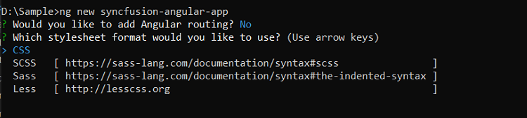
By default, it creates a CSS-based application.
Navigate to the created project folder:
cd my-appAdd Syncfusion Angular packages
All Essential JS 2 packages are published in the npmjs.com registry.
Install the Grid-Chart package using the following command:
npm install @syncfusion/ej2-grid-chart --saveImport Syncfusion CSS styles
Syncfusion Angular controls include built-in themes available in installed packages. Apply themes by importing required CSS files from the node_modules directory.
To use the “Material” theme, add the following imports to the src/styles.css file:
@import '../node_modules/@syncfusion/ej2-base/styles/material3.css';
@import '../node_modules/@syncfusion/ej2-buttons/styles/material3.css';
@import '../node_modules/@syncfusion/ej2-calendars/styles/material3.css';
@import '../node_modules/@syncfusion/ej2-dropdowns/styles/material3.css';
@import '../node_modules/@syncfusion/ej2-inputs/styles/material3.css';
@import '../node_modules/@syncfusion/ej2-navigations/styles/material3.css';
@import '../node_modules/@syncfusion/ej2-popups/styles/material3.css';
@import '../node_modules/@syncfusion/ej2-splitbuttons/styles/material3.css';
@import '../node_modules/@syncfusion/ej2-notifications/styles/material3.css';
@import '../node_modules/@syncfusion/ej2-angular-grids/styles/material3.css';
@import '../node_modules/@syncfusion/ej2-grid-chart/styles/material3.css';
Chart integration via context menu in Grid
This section explains grid rendering of charts dynamically based on interactions within the Angular Data Grid using the context menu. Right-clicking on selected rows presents chart types such as bar, pie, or line for immediate visualization. This enhances interactivity and provides a quick analytical view.
For example, in a sales dashboard, selecting records for specific products can display a comparative bar or pie chart that shows online sales versus retail sales or revenue trends across months.
Implementation steps
Step 1: Inject required modules
Import necessary modules from Grid, Chart, and GridChart packages, and inject the ContextMenuService to enable context menu functionality:
import { ContextMenuClickEventArgs, ContextMenuService, GridModule, ContextMenuItem, GridComponent} from '@syncfusion/ej2-angular-grids';
import { CategorySeries, ChartChanges, ChartPopupArgs, GridChart } from '@syncfusion/ej2-grid-chart';
import { ChartModel } from '@syncfusion/ej2-charts';

@Component({
  imports: [ GridModule],
  providers: [ContextMenuService],
  standalone: true,
  selector: 'app-root',
  templateUrl: 'app.component.html',
})
Step 2: Define Chart options in Grid context menu
Add chart visualization options as context menu items within the grid configuration using the contextMenuItems property. These items allow right-clicking on selected rows to choose a chart type for visualization.
export class AppComponent implements OnInit {
  public contextMenuItems?: ContextMenuItem[];

  ngOnInit(): void {
    this.contextMenuItems = [ 'Bar', 'StackingBar', 'StackingBar100', 'Pie', 'Column', 'StackingColumn', 'StackingColumn100', 'Line', 'StackingLine', 'StackingLine100', 'Area', 'StackingArea', 'StackingArea100', 'Scatter'];
  }
}
Step 3: Initialize GridChart instance on Grid creation
Inside the grid’s created event, instantiate a GridChart object. This instance is used to render charts dynamically based on the selected grid data.
created(): void {
  this.gridChart = new GridChart({
    enableRtl: (this.grid as GridComponent).enableRtl,
    locale: (this.grid as GridComponent).locale,
  });
}
This ensures chart instance readiness for seamless context menu interaction.
Step 4: Handle context menu click to render Chart
Use the contextMenuClick event to determine the selected chart type and render it with the gridChart.render method.
The ContextMenuClick event provides the following arguments:
-
args.chartType: Selected chart type. -
args.gridInstance: Current grid instance. -
args.records: Selected data records to visualize.
The gridChart.render method accepts three arguments:
-
chartArgs: Contains the grid instance, chart type, and the selected records. -
chartModel: Specifies chart configuration, including axes, labels, legends, tooltips, and other appearance or behavior settings. See Syncfusion’s Chart Model for details. -
categorySeries: Specifies data fields for categories and series.- Category fields define the grouping axis.
- Series fields define the values plotted on the chart.
contextMenuClick(args: ContextMenuClickEventArgs) {
  if (args.chartType) {
    // Prepare Chart arguments
    const chartArgs: ChartPopupArgs = {
      gridInstance: (args.gridInstance as GridComponent),
      chartType: args.chartType,
      records: args.records as SalesRecord[],
    };

    // Configure Chart model
    const chartModel: ChartModel = {
      primaryXAxis: {
        valueType: 'Category',
        labelRotation: 315
      }
    };

    // Combine Chart models
    const model: ChartChanges = { chart: chartModel, accumulationChart: {} };

    // Define category and series fields
    const categorySeries: CategorySeries = {
      category: ['Product', 'Month'],
      series: ['Online', 'Retail']
    };

    // Render Chart
    (this.gridChart as GridChart).render(chartArgs, model, categorySeries);
  }
}
The following complete example demonstrates chart integration into grid context menu:
import { salesDatas } from './datasource';
import { Component, OnInit, ViewChild } from '@angular/core';
import { ContextMenuClickEventArgs, ContextMenuItem, ContextMenuService, GridComponent, GridModule, IGrid } from '@syncfusion/ej2-angular-grids';
import { ChartModel } from '@syncfusion/ej2-charts';
import { CategorySeries, ChartChanges, ChartPopupArgs, GridChart } from '@syncfusion/ej2-grid-chart';

@Component({
  imports: [ GridModule],
  providers: [ContextMenuService],
  standalone: true,
  selector: 'app-root',
  templateUrl: 'app.component.html',
})

export class AppComponent implements OnInit {
  @ViewChild('grid') public grid?: GridComponent;
  public data?: Object[];
  public gridChart?: GridChart;
  public contextMenuItems?: ContextMenuItem[];
  public selectionSettings?: Object;

  ngOnInit(): void {
    this.data = salesDatas;
    this.selectionSettings = { type: 'Multiple' };
    this.contextMenuItems= [ 'Bar', 'StackingBar', 'StackingBar100', 'Pie', 'Column', 'StackingColumn', 'StackingColumn100', 'Line', 'StackingLine', 'StackingLine100', 'Area', 'StackingArea', 'StackingArea100', 'Scatter'];
  }

  created(): void {
    this.gridChart = new GridChart({
      enableRtl: (this.grid as GridComponent).enableRtl,
      locale: (this.grid as GridComponent).locale,
    });
  }

  contextMenuClick(args: ContextMenuClickEventArgs) {
    if (args.chartType) {
      const chartArgs: ChartPopupArgs = {
        gridInstance: (args.gridInstance as IGrid),
        chartType: args.chartType,
        records: args.records as SalesRecord[],
      };
      const chartModel: ChartModel = {
        primaryXAxis: {
          valueType: 'Category',
          labelRotation: 315
        }
      };

      const model: ChartChanges = { chart: chartModel, accumulationChart: {} };
      const categorySeries: CategorySeries = {
        category: ['Product', 'Month'],
        series: ['Online', 'Retail']
      };
      (this.gridChart as GridChart).render(chartArgs, model, categorySeries);
    }
  }
}

interface SalesRecord {
  Product: string;
  Category: string;
  Year: number;
  Online: number;
  Retail: number;
  ProfitLoss: number;
  UnitsSold: number;
  Revenue: number;
  Image: string;
  CategoryIcon: string;
}<ejs-grid [dataSource]='data' #grid id="GridChart" height="500" allowSelection="true" [selectionSettings]='selectionSettings' [contextMenuItems]='contextMenuItems' (contextMenuClick)='contextMenuClick($event)' (created)='created()'>
<e-columns>
<e-column type='checkbox' width='50'></e-column>
<e-column field='Product' headerText='Product' width='200'></e-column>
<e-column field='Month' headerText='Month' width='140'></e-column>
<e-column field='Online' headerText='Online' format='C2' textAlign='Right' width='160'></e-column>
<e-column field='Total' headerText='Total' format='C2' textAlign='Right' width='160'></e-column>
</e-columns>
</ejs-grid>import { bootstrapApplication } from '@angular/platform-browser';
import { AppComponent } from './app.component';
import 'zone.js';
bootstrapApplication(AppComponent).catch((err) => console.error(err));Enable export functionality in GridChart
GridChart export functionality enables saving or sharing charts in multiple formats. This is useful for preserving visualizations or including charts in reports and presentations.
Enable export by setting the allowExport property to true when creating the GridChart instance. Once enabled, an export option appears in the chart popup toolbar, allowing export to formats such as PDF, CSV, Print, JPEG, XLSX, SVG, and PNG.
gridChart = new GridChart({
  allowExport: true
});
When enabled, the property panel appears alongside chart popups and offers three main configuration sections:
Chart types: Choose from a variety of chart types, including Column, Line, Pie, and others.
Chart data: Configure category axis and series fields for data visualization.
Formatting options: Adjust styling properties such as chart style, title style, legend appearance, series settings, and axes formatting.
-
Chart style:
- Margin: Adjust margins around charts (top, bottom, left, right) for better layout spacing.
- Color: Set distinct colors for different chart elements to improve visual clarity.
-
Title style:
- Legend: Toggle legend visibility and customize font, size, color, and position.
- Series: Enable/disable tooltips and customize Series colors and data labels based on categories.
-
Axes: Select axes as category or value type, and customize:
- Reverse Order to change data sequence.
- Title: Adjust text, font, size, color, and rotation.
- Label: Modify text, font, size, color, and rotation for better presentation.
Customize Chart models
Accumulation Charts (for example, pie charts) can be customized using the accumulationChart property of the model object. This property configures titles, legends, data labels, and visual styles for accumulation-type visualizations.
Additionally, Accumulation chart events can be used to apply extra customizations during rendering.
The following code demonstrates chart customization:
contextMenuClick(args: ContextMenuClickEventArgs) {
  if (args.chartType) {
    const chartArgs: ChartPopupArgs = {
      gridInstance: (args.gridInstance as GridComponent),
      chartType: args.chartType,
      records: (args.records as SalesRecord[]),
    };
    const chartModel: ChartModel = {
      primaryXAxis: {
        valueType: 'Category',
        labelRotation: 315,
      },
      margin: {
        top: 20,
        bottom: 20,
        right: 20,
        left: 20
      },
      tooltip: {
        enable: true,
        textStyle: {
          size: '16px',
          fontFamily: 'Arial, Helvetica, sans-serif'
        }
      },
      title: 'Sales Data',
      titleStyle: {
        size: '24px',
        fontFamily: 'Arial, Helvetica, sans-serif',
        fontWeight: 'Bold'
      },
      subTitle: 'Sales data for various products over the months',
      load: (args: ILoadedEventArgs) => {
        if (args.chart.titleStyle) {
            args.chart.titleStyle.color = '#1976d2';
        }
      }
    };
    const accumulationChartModel: AccumulationChartModel = {
      title: 'Sales Distribution'
    }

    // Combine Chart models
    const model: ChartChanges = {
      chart: chartModel,
      accumulationChart: accumulationChartModel
    };
  }
}
Chart appearance can also be updated programmatically using the updateChartSettings event provided by the GridChart integration. This event triggers when chart properties are modified through the chart popup’s property panel. The event enables applying custom themes, adjusting axis settings, or modifying series styles.
The following code snippet demonstrates dynamically customizing chart margins and restricting their values to a minimum of “20” using the updateChartSettings event:
created(): void {
  this.gridChart = new GridChart({
    enablePropertyPanel: true,
    allowExport: true,
    enableRtl: (this.grid as GridComponent).enableRtl,
    locale: (this.grid as GridComponent).locale,
    updateChartSettings: this.updateChartSettings.bind(this),
  });
}

updateChartSettings(args: UpdateChartArgs){
  const chart = args.changes?.chart;
  if (!chart) return;

  // Restrict margin values to minimum 20
  const chartMargin = chart.margin;
  if (chartMargin && !isNullOrUndefined(chartMargin)) {
    if ((chartMargin.top ?? 0) < 20) chartMargin.top = 20;
    if ((chartMargin.bottom ?? 0) < 20) chartMargin.bottom = 20;
    if ((chartMargin.left ?? 0) < 20) chartMargin.left = 20;
    if ((chartMargin.right ?? 0) < 20) chartMargin.right = 20;
  }
}
The following example demonstrates enabling the property panel by setting enablePropertyPanel to true, customizing the chart using the chartModel within contextMenuClick event, and dynamically controlling or customizing the behavior of the updateChartSettings event.
import { salesDatas } from './datasource';
import { Component, OnInit, ViewChild } from '@angular/core';
import { ContextMenuClickEventArgs, ContextMenuItem, ContextMenuService, GridComponent, GridModule, IGrid } from '@syncfusion/ej2-angular-grids';
import { isNullOrUndefined } from '@syncfusion/ej2-base';
import { AccumulationChartModel, ChartModel, ILoadedEventArgs } from '@syncfusion/ej2-charts';
import { CategorySeries, ChartChanges, ChartPopupArgs, GridChart, UpdateChartArgs } from '@syncfusion/ej2-grid-chart';

@Component({
  imports: [ GridModule],
  providers: [ContextMenuService],
  standalone: true,
  selector: 'app-root',
  templateUrl: 'app.component.html',
})

export class AppComponent implements OnInit {
  @ViewChild('grid') public grid?: GridComponent;
  public data?: Object[];
  public gridChart?: GridChart;
  public contextMenuItems?: ContextMenuItem[];
  public selectionSettings?: Object;

  ngOnInit(): void {
    this.data = salesDatas;
    this.selectionSettings = { type: 'Multiple' };
    this.contextMenuItems= [ 'Bar', 'StackingBar', 'StackingBar100', 'Pie', 'Column', 'StackingColumn', 'StackingColumn100', 'Line', 'StackingLine', 'StackingLine100', 'Area', 'StackingArea', 'StackingArea100', 'Scatter'];
  }

  created(): void {
    this.gridChart = new GridChart({
      enablePropertyPanel: true,
      allowExport: true,
      enableRtl: (this.grid as GridComponent).enableRtl,
      locale: (this.grid as GridComponent).locale,
      updateChartSettings: this.updateChartSettings.bind(this),
    });
  }

  contextMenuClick(args: ContextMenuClickEventArgs) {
    if (args.chartType) {
      const chartArgs: ChartPopupArgs = {
        gridInstance: (args.gridInstance as IGrid),
        chartType: args.chartType,
        records: (args.records as SalesRecord[]),
      };
      const chartModel: ChartModel = {
        primaryXAxis: {
          valueType: 'Category',
          labelRotation: 315,
        },
        margin: {
          top: 20,
          bottom: 20,
          right: 20,
          left: 20
        },
        tooltip: {
          enable: true,
          textStyle: {
            size: '16px',
            fontFamily: 'Arial, Helvetica, sans-serif'
          }
        },
        title: 'Sales Data',
        titleStyle: {
          size: '24px',
          fontFamily: 'Arial, Helvetica, sans-serif',
          fontWeight: 'Bold'
        },
        subTitle: 'Sales data for various products over the months',
        load: (args: ILoadedEventArgs) => {
          if (args.chart.titleStyle) {
            args.chart.titleStyle.color = '#1976d2';
          }
        }
      };
      const accumulationChartModel: AccumulationChartModel = {
        title :'Sales Distribution'
      }
      const model: ChartChanges = {
        chart: chartModel,
        accumulationChart: accumulationChartModel
      };
      const categorySeries: CategorySeries = {
        category: ['Product', 'Month'],
        series: ['Online', 'Retail']
      };
      (this.gridChart as GridChart).render(chartArgs, model, categorySeries);
    }
  }

  updateChartSettings(args: UpdateChartArgs){
    const chart = args.changes?.chart;
    if (!chart) return;

    const chartMargin = chart.margin;
    if (chartMargin && !isNullOrUndefined(chartMargin)) {
      if ((chartMargin.top ?? 0) < 20) chartMargin.top = 20;
      if ((chartMargin.bottom ?? 0) < 20) chartMargin.bottom = 20;
      if ((chartMargin.left ?? 0) < 20) chartMargin.left = 20;
      if ((chartMargin.right ?? 0) < 20) chartMargin.right = 20;
    }
  }
}

interface SalesRecord {
  Product: string;
  Category: string;
  Year: number;
  Online: number;
  Retail: number;
  ProfitLoss: number;
  UnitsSold: number;
  Revenue: number;
  Image: string;
  CategoryIcon: string;
}<ejs-grid [dataSource]='data' #grid id="GridChart" height="500" allowSelection="true" [selectionSettings]='selectionSettings' [contextMenuItems]='contextMenuItems' (contextMenuClick)='contextMenuClick($event)' (created)='created()'>
<e-columns>
<e-column type='checkbox' width='50'></e-column>
<e-column field='Product' headerText='Product' width='200'></e-column>
<e-column field='Month' headerText='Month' width='140'></e-column>
<e-column field='Online' headerText='Online' format='C2' textAlign='Right' width='160'></e-column>
<e-column field='Total' headerText='Total' format='C2' textAlign='Right' width='160'></e-column>
</e-columns>
</ejs-grid>import { bootstrapApplication } from '@angular/platform-browser';
import { AppComponent } from './app.component';
import 'zone.js';
bootstrapApplication(AppComponent).catch((err) => console.error(err));