How can I help you?
Filter Menu in Angular Grid Component
19 Mar 202624 minutes to read
The filter menu in the Angular Grid component provides a dialog-based filtering interface that appears when clicking the filter icon in column headers. This menu displays dropdown operators (such as equals, contains, startswith) and an input field for entering filter values, giving precise control over data filtering.
For basic filtering setup and configuration, refer to the Filter Feature Guide.
Enable filter menu
To enable the filter menu, set the filterSettings.type property to Menu. This property determines the type of filter UI that will be rendered, allowing users to apply filters using different operators tailored to each column’s data type.
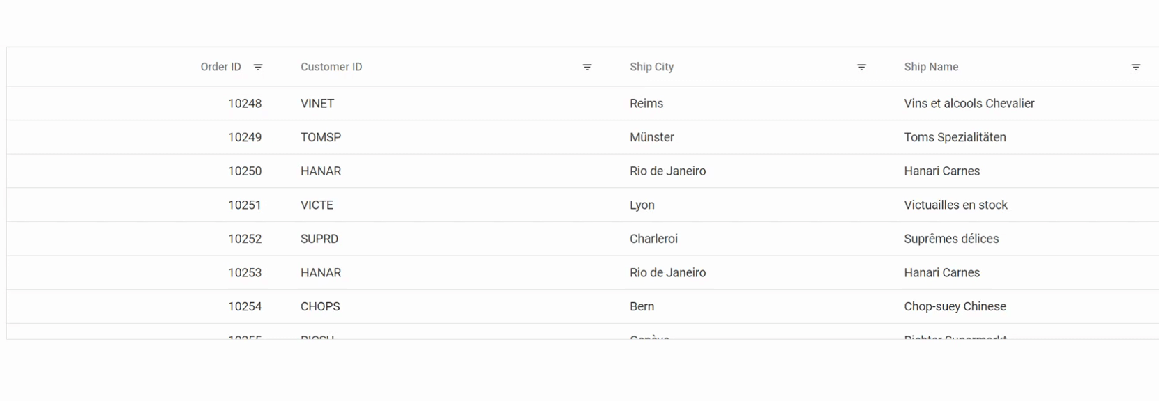
The following example demonstrates basic filter menu usage in the Syncfusion Angular Grid:
import { data } from './datasource';
import { Component, OnInit } from '@angular/core';
import { CheckBoxModule } from '@syncfusion/ej2-angular-buttons';
import { CheckBoxSelectionService, DropDownListAllModule, MultiSelectModule } from '@syncfusion/ej2-angular-dropdowns';
import { FilterService, FilterSettingsModel, GridModule, PageService } from '@syncfusion/ej2-angular-grids';

@Component({
    imports: [
        GridModule,
        MultiSelectModule,
        DropDownListAllModule,
        CheckBoxModule
        ],
    providers: [FilterService, PageService,CheckBoxSelectionService],
    standalone: true,
    selector: 'app-root',
    template: `<ejs-grid [dataSource]='data' [allowFiltering]='true' [filterSettings]='filterOptions' height='273px'>
                <e-columns>
                    <e-column field='OrderID' headerText='Order ID' textAlign='Right' width=100></e-column>
                    <e-column field='CustomerID' headerText='Customer ID' width=120></e-column>
                    <e-column field='ShipCity' headerText='Ship City' width=100></e-column>
                    <e-column field='ShipName' headerText='Ship Name' width=100></e-column>
                </e-columns>
                </ejs-grid>`
})
export class AppComponent implements OnInit {

    public data?: object[];
    public filterOptions?: FilterSettingsModel;

    ngOnInit(): void {
        this.data = data;
        this.filterOptions = {
           type: 'Menu'
        };
    }
}
import { AppComponent } from './app.component';
import { bootstrapApplication } from '@angular/platform-browser';
bootstrapApplication(AppComponent).catch((err) => console.error(err));
- allowFiltering must be set as
trueto enable filter menu.- By setting columns.allowFiltering as
falsewill prevent filter menu rendering for a particular column.
Custom component in filter menu
The filter menu provides enhanced customization capabilities by allowing replacement of default filter components with custom ones. This enables creation of more intuitive filtering experiences tailored to specific data and user requirements.
By default, the filter menu provides:
-
AutoCompletecomponent for string type columns. -
NumericTextBoxfor number type columns. -
DropDownListcomponent for boolean type columns. -
DatePickerfor date type columns. -
DateTimePickerfor datetime type columns.
To implement custom filter components, use the column.filter.ui property and define the following functions:
-
create: Creates the custom component for the filter. -
write: Connects event handlers for the custom component. This function handles changes in the custom filter UI and updates filter behavior accordingly. -
read: Reads the filter value from the custom component. This retrieves the selected filter value when the filter is applied.
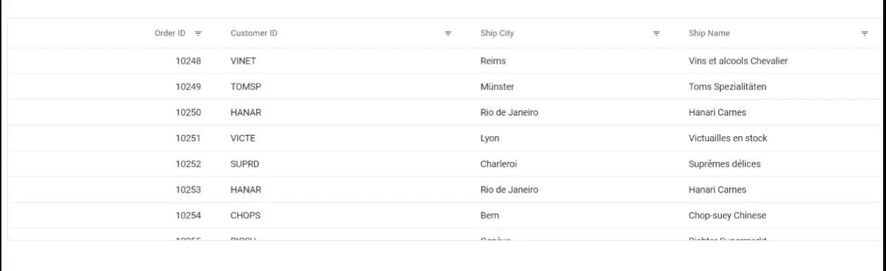
The following example demonstrates rendering a DropDownList component for the “Customer ID” column instead of the default AutoComplete:
import { data } from './datasource';
import { Component, OnInit } from '@angular/core';
import { DropDownList, DropDownListAllModule } from '@syncfusion/ej2-angular-dropdowns';
import { FilterService, FilterSettingsModel, GridModule, IFilter, IFilterCreate, IFilterRead, IFilterWrite, PageService } from '@syncfusion/ej2-angular-grids';
import { createElement } from '@syncfusion/ej2-base';
import { DataManager } from '@syncfusion/ej2-data';

@Component({
  imports: [ GridModule,DropDownListAllModule],
  providers: [FilterService, PageService],
  standalone: true,
    selector: 'app-root',
    template: `<ejs-grid [dataSource]='data' [allowFiltering]='true' [filterSettings]='filterOptions' height='273px'>
                <e-columns>
                    <e-column field='OrderID' headerText='Order ID'  textAlign='Right' width=100></e-column>
                    <e-column field='CustomerID' headerText='Customer ID' [filter]= 'filter' width=120></e-column>
                    <e-column field='ShipCity' headerText='Ship City' width=100></e-column>
                    <e-column field='ShipName' headerText='Ship Name' width=100></e-column>
                </e-columns>
                </ejs-grid>`
})
export class AppComponent implements OnInit {

    public data?: object[];
    public filterOptions?: FilterSettingsModel;
    public filter?: IFilter;
    public dropInstance?: DropDownList;

    ngOnInit(): void {
        this.data = data;
        this.filterOptions = {
            type: 'Menu'
        };
        this.filter = {
      ui: {
        create: (args: IFilterCreate): void => {
          const flValInput: HTMLElement = createElement('input', {
            className: 'flm-input',
          });


          const target = (args.target ?? undefined) as HTMLElement | undefined;
          if (!target) {
            return;
          }
          this.dropInstance = new DropDownList({
            dataSource: new DataManager(data),
            fields: { text: 'CustomerID', value: 'CustomerID' },
            placeholder: 'Select a value',
            popupHeight: '200px',
          });
          (this.dropInstance as DropDownList).appendTo(flValInput);
        },
        write: (args: IFilterWrite): void => {
          (this.dropInstance as DropDownList).value =
            args.filteredValue as string;
        },

        read: (args: IFilterRead): void => {
          const field = args.column?.field ?? '';
          const operator = args.operator ?? 'equal';
          const value = (this.dropInstance?.value ?? '') as string;

          if (!field || !args.fltrObj) return;
          args.fltrObj.filterByColumn(field, operator, value);
        },
      },
    };
    }
}
import { bootstrapApplication } from '@angular/platform-browser';
import { AppComponent } from './app.component';
import 'zone.js';
bootstrapApplication(AppComponent).catch((err) => console.error(err));Default filter input for CustomerID column
Custom dropdown filter for CustomerID column
Show 24 hours time format in filter dialog
The Grid provides a feature to display time in a “24-hour” format in date or datetime column filter dialogs.
By default, filter dialogs display time in “12-hour” format (AM/PM) for date or datetime columns. To customize this behavior, set the column type as datetime and format as “M/d/y HH:mm”. The actionComplete event with requestType as filterafteropen can be used to set the timeFormat of the DateTimepicker to “HH:mm”.
Here is an example that demonstrates the “24-hour” time format in the filter dialog:
import { data } from './datasource';
import { Component, OnInit, ViewChild } from '@angular/core';
import { CheckBoxModule } from '@syncfusion/ej2-angular-buttons';
import { CheckBoxSelectionService, DropDownListAllModule, MultiSelectModule } from '@syncfusion/ej2-angular-dropdowns';
import { Column, FilterService, GridComponent, GridModule, PageService, SortService } from '@syncfusion/ej2-angular-grids';

@Component({
  imports: [
      GridModule,
      MultiSelectModule,
      DropDownListAllModule,
      CheckBoxModule
      ],
  providers: [FilterService, PageService, SortService, CheckBoxSelectionService],
  standalone: true,
  selector: 'app-root',
  template: `<div class="control-section">
  <ejs-grid
    #grid
    [dataSource]="data"
    allowSorting="true"
    allowPaging="true"
    allowFiltering="true"
    [pageSettings]="pageSettings"
    [filterSettings]="filterSettings"
    (actionComplete)="actionComplete($event)"
    height='273px'
  >
  <e-columns>
      <e-column
        field="OrderID"
        headerText="Order ID"
        width="120"
        textAlign="Right"
      ></e-column>
      <e-column
        field="OrderDate"
        headerText="Order Date"
        width="180"
        type="datetime"
        [format]="formatoptions"
        textAlign="Right"
      ></e-column>
      <e-column
        field="ShippedDate"
        headerText="Shipped Date"
        width="180"
        type="datetime"
        [format]="formatoptions"
        textAlign="Right"
      ></e-column>
      <e-column
        field="ShipCountry"
        headerText="Ship Country"
        width="150"
      ></e-column>
   </e-columns>
  </ejs-grid>
</div>
  `,
})
export class AppComponent implements OnInit {
  public data?: Object[];
  public pageSettings?: Object;
  public filterSettings?: Object;
  public formatoptions?: Object;

  @ViewChild('grid')
  public grid?: GridComponent;

  ngOnInit(): void {
    this.data = data;
    this.pageSettings = { pageCount: 5 };
    this.filterSettings = { type: 'Menu' };
    this.formatoptions = { type: 'dateTime', format: 'M/d/y HH:mm' };
  }
  public actionComplete(args: { requestType: string; columnName: string }): void {
    if (args.requestType === 'filterAfterOpen') {
      var columnObj : Column | undefined  = this.grid?.getColumnByField(args.columnName);
      if (columnObj?.type === 'datetime') {
        var dateObj = (document.getElementById('dateui-' + columnObj.uid) as any)['ej2_instances'][0];
        dateObj.timeFormat = 'HH:mm';
      }
    }
  }
}
import { bootstrapApplication } from '@angular/platform-browser';
import { AppComponent } from './app.component';
import 'zone.js';
bootstrapApplication(AppComponent).catch((err) => console.error(err));Customizing filter menu operators list
Filter operators are comparison methods that determine the match between the filter value and data. Examples include:
-
equals: Exact match -
contains: Partial match (substring search) -
startswith: Matches beginning of value -
greaterthan: Numeric/date comparison
The Grid enables customizing the default filter operator list using the filterSettings.operators property. This feature defines custom sets of operators available in the filter menu, allowing restriction or simplification of filtering methods for specific columns.
Customize operators for string, number, date, and boolean data types using these options:
-
stringOperator- defines customized string operator list. -
numberOperator- defines customized number operator list. -
dateOperator- defines customized date operator list. -
booleanOperator- defines customized boolean operator list.
Here is an example to customize the filter operators list in Syncfusion Angular Grid:
import { data } from './datasource';
import { Component, OnInit } from '@angular/core';
import { CheckBoxModule } from '@syncfusion/ej2-angular-buttons';
import { CheckBoxSelectionService, DropDownListAllModule, MultiSelectModule } from '@syncfusion/ej2-angular-dropdowns';
import { FilterService, FilterSettingsModel, GridModule, PageService } from '@syncfusion/ej2-angular-grids';

@Component({
  imports: [
      GridModule,
      MultiSelectModule,
      DropDownListAllModule,
      CheckBoxModule
      ],

  providers: [FilterService, PageService,CheckBoxSelectionService],
  standalone: true,
    selector: 'app-root',
    template: `<ejs-grid [dataSource]='data' [allowFiltering]='true' [filterSettings]='filterOptions' height='273px'>
                <e-columns>
                    <e-column field='OrderID' headerText='Order ID' textAlign='Right' width=100></e-column>
                    <e-column field='CustomerID' headerText='Customer ID' width=120></e-column>
                    <e-column field='OrderDate' headerText='Order Date' format='yMd' width=100></e-column>
                    <e-column field='Verified' headerText='Verified' [displayAsCheckBox]= 'true' width=100></e-column>
                    <e-column field='ShipName' headerText='Ship Name' width=100></e-column>
                </e-columns>
                </ejs-grid>`
})
export class AppComponent implements OnInit {

    public data?: object[];
    public filterOptions?: FilterSettingsModel;

    ngOnInit(): void {
        this.data = data;
        this.filterOptions = {
           type: 'Menu',
           operators: {
            stringOperator: [
                { value: 'startsWith', text: 'Starts With' },
                { value: 'endsWith', text: 'Ends With' },
                { value: 'contains', text: 'Contains' },
                { value: 'equal', text: 'Equal' },
                { value: 'notEqual', text: 'Not Equal' }
              ],
              numberOperator: [
                { value: 'equal', text: 'Equal' },
                { value: 'notEqual', text: 'Not Equal' },
                { value: 'greaterThan', text: 'Greater Than' },
                { value: 'lessThan', text: 'Less Than' }
              ],
              dateOperator: [
                { value: 'equal', text: 'Equal' },
                { value: 'notEqual', text: 'Not Equal' },
                { value: 'greaterThan', text: 'After' },
                { value: 'lessThan', text: 'Before' }
              ],
              booleanOperator: [
                { value: 'equal', text: 'Equal' },
                { value: 'notEqual', text: 'Not Equal' }
              ]
            }
        };
    }
}
import { bootstrapApplication } from '@angular/platform-browser';
import { AppComponent } from './app.component';
import 'zone.js';
bootstrapApplication(AppComponent).catch((err) => console.error(err));Filter by multiple keywords using filter menu
The Grid allows filtering based on multiple keywords simultaneously, rather than a single keyword. This is useful when users need to filter by selecting multiple values from a list.
To enable this feature, set filterSettings.type as Menu and render the MultiSelect component as a custom component in the filter menu dialog using the filter.ui property.
The following example demonstrates multiple keyword filtering implementation:
import { data } from './datasource';
import { Component, OnInit, ViewChild } from '@angular/core';
import { CheckBoxModule } from '@syncfusion/ej2-angular-buttons';
import { CheckBoxSelectionService, DropDownListAllModule, MultiSelectModule, MultiSelect } from '@syncfusion/ej2-angular-dropdowns';
import { FilterService, GridModule, IFilterCreate, IFilterRead, IFilterWrite, PageService, FilterSettingsModel,IFilter, GridComponent, Column, PredicateModel, } from '@syncfusion/ej2-angular-grids';
import { createElement } from '@syncfusion/ej2-base';
import { DataUtil } from '@syncfusion/ej2-data';

@Component({
  imports: [
      GridModule,
      MultiSelectModule,
      DropDownListAllModule,
      CheckBoxModule,
      ],
  providers: [FilterService, PageService, CheckBoxSelectionService],
  standalone: true,
  selector: 'app-root',
  template: `
   <ejs-grid
      [dataSource]="data"
      #grid
      [allowFiltering]="true"
      [allowPaging]="true"
      [filterSettings]="filterOptions"
      height='273px'
    >
      <e-columns>
        <e-column
          field="OrderID"
          headerText="Order ID"
          [filter]="filter"
          textAlign="Right"
          width="100"
        ></e-column>
        <e-column
          field="CustomerID"
          headerText="Customer ID"
          [filter]="filter"
          width="120"
        ></e-column>
        <e-column
          field="ShipCity"
          headerText="Ship City"
          [filter]="filter"
          width="100"
        ></e-column>
        <e-column
          field="ShipName"
          headerText="Ship Name"
          [filter]="filter"
          width="100"
        ></e-column>
      </e-columns>
    </ejs-grid>
  `,
})
export class AppComponent implements OnInit {
  public data?: object[];
  public filterOptions?: FilterSettingsModel;
  public filter?: IFilter;
  public dropInstance?: MultiSelect;
  @ViewChild('grid')
  public grid?: GridComponent;
  ngOnInit(): void {
    this.data = data;
    this.filterOptions = {
      type: 'Menu',
    };
    this.filter = {
      ui: {
        create: (args: IFilterCreate): void => {
          const flValInput: HTMLElement = createElement('input', {
            className: 'flm-input',
          });
          if (!args.target) return;
          args.target.appendChild(flValInput);
          const fieldName: string = (args.column as Column).field;
          const dropdownData: string[] = DataUtil.distinct(
            data,
            fieldName
          ) as string[];
          this.dropInstance = new MultiSelect({
            dataSource: dropdownData,
            placeholder: 'Select a value',
            popupHeight: '200px',
            allowFiltering: true,
            mode: 'Delimiter',
          });
          this.dropInstance.appendTo(flValInput);
        },
        write: (args: IFilterWrite): void => {
          const fieldName = args.column?.field;
          if (!fieldName) return;

          const filteredValue: string[] = [];
          const cols =
            (this.grid as GridComponent).filterSettings?.columns ?? [];
          cols.forEach((item: PredicateModel) => {
            if (item.field === fieldName && item.value) {
              filteredValue.push(String(item.value));
            }
          });

          if (filteredValue.length && this.dropInstance) {
            (this.dropInstance as MultiSelect).value = filteredValue;
          }
        },
        read: (args: IFilterRead): void => {
          const field = args.column?.field ?? '';
          const value = (this.dropInstance?.value ?? '') as string;
          const operator = args.operator ?? 'equal';

          (this.grid as GridComponent).removeFilteredColsByField(field);

          if (!field || !args.fltrObj) return;
          args.fltrObj.filterByColumn(field, operator, value);
        },
      },
    };
  }
}
import { bootstrapApplication } from '@angular/platform-browser';
import { AppComponent } from './app.component';
import 'zone.js';
bootstrapApplication(AppComponent).catch((err) => console.error(err));Customize the default input component of filter menu dialog
The default settings of input components within the filter menu can be customized by utilizing the params property within the column definition filter. This allows modification of specific filter component behavior to better suit application requirements.
Each column type uses a default component in the filter menu, which can be customized with specific parameters:
| Column Type | Default component | Customization | API Reference |
|---|---|---|---|
| String | AutoComplete | Eg: { params: { autofill: false }} | AutoComplete API |
| Number | NumericTextBox | Eg: { params: { showSpinButton: false }} | NumericTextBox API |
| Boolean | DropDownList | Eg: { params: { sortOrder:’Ascending’}} | DropDownList API |
| Date | DatePicker | Eg: { params: { weekNumber: true }} | DatePicker API |
| DateTime | DateTimePicker | Eg: { params: { showClearButton: true }} | DateTimePicker API |
Refer to the Getting Started documentation and API Reference for complete feature details
In the following example, the “Order ID” and “Freight” columns are numeric columns. When the filter dialog opens for these columns, a NumericTextBox with a spin button displays by default. The params property can be used to hide the spin button specifically for the “Order ID” column.
import { data } from './datasource';
import { Component, NgModule, OnInit } from '@angular/core';
import { BrowserModule } from '@angular/platform-browser';
import { CheckBoxSelectionService, DropDownListAllModule } from '@syncfusion/ej2-angular-dropdowns';
import { FilterService, FilterSettingsModel, GridModule, PageService } from '@syncfusion/ej2-angular-grids';

@Component({
    imports: [ GridModule, DropDownListAllModule ],
    providers: [FilterService, PageService, CheckBoxSelectionService],
    standalone: true,
    selector: 'app-root',
    template: `<ejs-grid [dataSource]='data' [allowFiltering]='true' [allowPaging]='true' [filterSettings]='filterOption' height='273px'>
                <e-columns>
                    <e-column field='OrderID' headerText='Order ID' [filter]='filterParams' textAlign='Right' ></e-column>
                    <e-column field='CustomerID' headerText='Name'></e-column>
                    <e-column field='ShipName' headerText='ShipName' ></e-column>
                    <e-column field='Freight' headerText='Freight' textAlign='Right' format='C2' ></e-column>
                </e-columns>
                </ejs-grid>`
})
export class AppComponent implements OnInit {

    public data?: object[];
    public filterParams?: object;
    public filterOption?: FilterSettingsModel = { type: 'Menu' };

    ngOnInit(): void {
        this.data = data;
        this.filterParams = { params: { showSpinButton: false } };
    }
}
import { bootstrapApplication } from '@angular/platform-browser';
import { AppComponent } from './app.component';
import 'zone.js';
bootstrapApplication(AppComponent).catch((err) => console.error(err));Prevent autofill option in autocomplete of menu filter
By default, the AutoComplete component in the filter menu dialog automatically fills suggestions as users type. To disable this autofill behavior, set the autofill parameter to false using the params property within the column definition of the filter.
import { data } from './datasource';
import { Component, OnInit } from '@angular/core';
import { CheckBoxModule } from '@syncfusion/ej2-angular-buttons';
import { CheckBoxSelectionService, DropDownListAllModule, MultiSelectModule } from '@syncfusion/ej2-angular-dropdowns';
import { FilterService, FilterSettingsModel, GridModule, PageService } from '@syncfusion/ej2-angular-grids';
import { MessageModule } from '@syncfusion/ej2-angular-notifications';

@Component({
  imports: [
    GridModule,
    MultiSelectModule,
    DropDownListAllModule,
    CheckBoxModule,
    MessageModule
      ],
  providers: [FilterService, PageService,CheckBoxSelectionService],
  standalone: true,
  selector: 'app-root',
  template: `<ejs-grid [dataSource]='data' [allowFiltering]='true' [allowPaging]='true' [filterSettings]='filterOption' height='273px'>
                <e-columns>
                    <e-column field='OrderID' headerText='Order ID' textAlign='Right' ></e-column>
                    <e-column field='CustomerID' headerText='Customer ID' [filter]='filterParams'></e-column>
                    <e-column field='ShipName' headerText='ShipName' ></e-column>
                    <e-column field='Freight' headerText='Freight' textAlign='Right' format='C2' ></e-column>
                </e-columns>
                </ejs-grid>`
})
export class AppComponent implements OnInit {

  public data?: object[];
  public filterParams?: object;
  public filterOption?: FilterSettingsModel = { type: 'Menu' };

  ngOnInit(): void {
    this.data = data;
    this.filterParams = { params: { autofill: false } };
  }
}
import { bootstrapApplication } from '@angular/platform-browser';
import { AppComponent } from './app.component';
import 'zone.js';
bootstrapApplication(AppComponent).catch((err) => console.error(err));Hide default filter icons while perform filtering through method
When filtering is performed programmatically using grid methods, the default filter icons can be hidden to provide a simpler interface.
To hide the filter icon in the grid, apply the following CSS rule to the filter menu class:
.e-filtermenudiv.e-icons.e-icon-filter {
    display: none;
}
The following example demonstrates hiding the default filter icons while filtering the “Customer ID” column programmatically using a method.
import { data } from './datasource';
import { Component, OnInit, ViewChild } from '@angular/core';
import { ButtonModule } from '@syncfusion/ej2-angular-buttons';
import { FilterService, FilterSettingsModel, GridComponent, GridModule, PageService } from '@syncfusion/ej2-angular-grids';

@Component({
  imports: [GridModule, ButtonModule],
  providers: [FilterService, PageService, ],
  standalone: true,
  selector: 'app-root',
  template: `
  <div>
  <button ejs-button id='performFilter' (click)='filterAction($event)'>Filter Customer ID Column</button>
  <button ejs-button id='clearFilter' (click)='filterAction($event)'>Clear Filter</button>
  </div>
  <ejs-grid #grid style='margin-top:10px' [dataSource]='data' [allowFiltering]='true' [allowPaging]='true' [filterSettings]='filterOption' height='250px'>
    <e-columns>
        <e-column field='OrderID' headerText='Order ID' textAlign='Right' ></e-column>
        <e-column field='CustomerID' headerText='Customer ID'></e-column>
        <e-column field='ShipName' headerText='ShipName' ></e-column>
        <e-column field='Freight' headerText='Freight' textAlign='Right' format='C2' ></e-column>
    </e-columns>
  </ejs-grid>`
})
export class AppComponent implements OnInit {

  public data?: object[];
  public filterParams?: object;
  public filterOption?: FilterSettingsModel = { type: 'Menu' };
  @ViewChild('grid')
  public grid?: GridComponent;

  ngOnInit(): void {
    this.data = data;
  }

  filterAction(args: MouseEvent){
    if((args.currentTarget  as HTMLElement).id === 'performFilter'){
      (this.grid as GridComponent).filterByColumn('CustomerID', 'startswith', 'v');
    }
    else{
      (this.grid as GridComponent).clearFiltering()
    }
  }
}
import { bootstrapApplication } from '@angular/platform-browser';
import { AppComponent } from './app.component';
import 'zone.js';
bootstrapApplication(AppComponent).catch((err) => console.error(err));Filter menu events
The Syncfusion® Angular Grid offers the actionBegin and actionComplete events, which provide information about the actions being performed. Within the event handlers, an argument named requestType specifies the action being executed, such as filterbeforeopen, filterafteropen, or filtering. By analyzing this action type, custom logic can be implemented or messages displayed.
Event types and their purposes:
-
filterbeforeopen- Triggered before the filter menu dialog opens. Use this to modify menu settings, pre-populate values, or prevent the dialog from opening based on conditions. -
filterafteropen- Triggered after the filter menu dialog opens. Use this to customize the dialog appearance, focus specific input fields, or add additional UI elements. -
filtering- Triggered when a filter is applied. Use this to log filter actions, display custom notifications, or perform additional data processing.
These events enable implementation of custom logic, display of messages, or modification of filter behavior based on specific requirements.
The following example demonstrates filter menu event handling in the Syncfusion Angular Grid:
import { GridModule, FilterService, PageService,FilterSettingsModel} from '@syncfusion/ej2-angular-grids'
import { MultiSelectModule, CheckBoxSelectionService,DropDownListAllModule } from '@syncfusion/ej2-angular-dropdowns';
import { CheckBoxModule } from '@syncfusion/ej2-angular-buttons';
import { MessageModule } from '@syncfusion/ej2-angular-notifications';
import { Component, OnInit } from '@angular/core';
import { data } from './datasource';;

@Component({
  imports: [
    GridModule,
    MultiSelectModule,
    DropDownListAllModule,
    CheckBoxModule,
    MessageModule
  ],
  providers: [FilterService, PageService,CheckBoxSelectionService],
  standalone: true,
  selector: 'app-root',
  template: `<div class='message'>{{actionBeginMessage}}</div><div class='message'>{{actionCompleteMessage}}</div>
    <ejs-grid [dataSource]='data' [allowFiltering]='true' [filterSettings]='filterOptions' height='273px' (actionBegin)="actionBegin($event)" (actionComplete)="actionComplete($event)">
                <e-columns>
                    <e-column field='OrderID' headerText='Order ID' textAlign='Right' width=100></e-column>
                    <e-column field='CustomerID' headerText='Customer ID' width=120></e-column>
                    <e-column field='Freight' headerText='Freight' width=120></e-column>
                    <e-column field='ShipCity' headerText='Ship City' width=100></e-column>
                    <e-column field='ShipName' headerText='Ship Name' width=100></e-column>
                </e-columns>
                </ejs-grid>`
})
export class AppComponent implements OnInit {

  public data?: object[];
  public filterOptions?: FilterSettingsModel;
  public actionBeginMessage: string | undefined;
  public actionCompleteMessage: string | undefined;

  ngOnInit(): void {
    this.data = data;
    this.filterOptions = { type: 'Menu' }
  }
  actionBegin(args: any) {
    this.actionBeginMessage='';
    if (args.requestType == 'filterbeforeopen' && args.columnType === "number") {
        args.filterModel.customFilterOperators.numberOperator = [
        { value: "equal", text: "Equal" },
        { value: "notequal", text: "Not Equal" }];
        this.actionBeginMessage ='Filter operators for number column were customized using the filterbeforeopen action in the actionBegin event';
    }
    else{
      this.actionBeginMessage = args.requestType + ' action is triggered in actionBegin event'
    }
    if(args.requestType == 'filtering' && args.currentFilteringColumn == 'ShipCity'){
      args.cancel=true;
      this.actionBeginMessage = args.requestType + ' is not allowed for ShipCity column';
    }

  }
  actionComplete(args: any) {
    if(args.requestType === 'filterafteropen') {
      this.actionCompleteMessage ='Applied CSS for filter dialog during filterafteropen action';
      args.filterModel.dlgDiv.querySelector('.e-dlg-content').style.background = '#eeeaea';
      args.filterModel.dlgDiv.querySelector('.e-footer-content').style.background = '#30b0ce';
    }
    if(args.requestType == 'filtering'){
      this.actionCompleteMessage = args.requestType + ' action is triggered in actionComplete event';
    }
  }
}
import { bootstrapApplication } from '@angular/platform-browser';
import { AppComponent } from './app.component';
import 'zone.js';
bootstrapApplication(AppComponent).catch((err) => console.error(err));Troubleshoot filter menu operator issue
When using the filter menu, the UI displays operators for all columns based on the data type of the first data it encounters. If the first data is empty or null, the operators may not display correctly. To resolve this issue:
Explicitly Define Data Type: When defining columns in an Angular Grid component, explicitly specify the data type for each column using the type property within the columns configuration:
<ejs-grid [dataSource]='data'>
    <e-columns>
        <e-column field='OrderID' headerText='Order ID' type='number' width=120></e-column>
        <e-column field='CustomerName' headerText='Customer Name' type='string' width=150></e-column>
        <!-- Define data types for other columns as needed -->
    </e-columns>
</ejs-grid>
Handle Null or Empty Data: If the data source contains null or empty values, these values should be appropriately handled within the data source or by preprocessing the data to maintain consistency.
Check Data Types in Data Source: The data types specified in the column definitions must match the actual data types in the data source. Mismatched data types can lead to unexpected behavior.