Container in Angular Diagram Component
4 Jun 202610 minutes to read
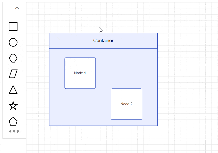
A Container is a specialized node that groups logically related shapes within a visible boundary. Unlike regular groups, containers automatically manage child elements while maintaining individual element properties. Common use cases include organizing related components in flowcharts, creating swimlanes in process diagrams, and building composite UI layouts.
Create Container
Add a Container
Container nodes require specific configuration to enable child element management and boundary recognition. The following example demonstrates creating a basic container with essential properties:
import { NgModule } from '@angular/core';
import { BrowserModule } from '@angular/platform-browser'
import { DiagramModule } from '@syncfusion/ej2-angular-diagrams'
import { Component, ViewEncapsulation, OnInit, ViewChild } from '@angular/core';
import { DiagramComponent, NodeModel } from '@syncfusion/ej2-angular-diagrams';

@Component({
  imports: [DiagramModule],
  providers: [],
  standalone: true,
  selector: "app-container",
  template: `<ejs-diagram #diagram id="diagram" width="100%" height="500px" [nodes]='nodes' (created)='created($event)'>
             </ejs-diagram>`,
  encapsulation: ViewEncapsulation.None
})
export class AppComponent {
  @ViewChild("diagram")
  public diagram?: DiagramComponent;
  // Define a collection of nodes used in the diagram
  public nodes: NodeModel[] = [
    // First rectangle node
    {
      id: 'node1',
      // Margin from the left and top
      margin: { left: 50, top: 30 },
      width: 100, height: 100,
      style: { fill: 'white', strokeColor: '#2546BB', strokeWidth: 1 },
      shape: { type: 'Basic', shape: 'Rectangle', cornerRadius: 4 },
      annotations: [{ content: 'Node 1' }]
    },
    // Second rectangle node
    {
      id: 'node2',
      // Margin from the left and top
      margin: { left: 200, top: 130 },
      width: 100, height: 100,
      style: { fill: 'white', strokeColor: '#2546BB', strokeWidth: 1 },
      shape: { type: 'Basic', shape: 'Rectangle', cornerRadius: 4 },
      annotations: [{ content: 'Node 2' }]
    },
    // Container node configuration to contain node1 and node2
    {
      id: 'container',
      width: 350, height: 280, // Width and height of the container
      offsetX: 250, offsetY: 250, // Position of the container
      shape: {
        // Define the type as a container
        type: 'Container',
        // Includes node1 and node2 as children
        children: ['node1', 'node2'],
      },
      // Style properties for the container
      style: { fill: '#E9EEFF', strokeColor: '#2546BB', strokeWidth: 1 }
    },
  ];

  public created(args: Object): void {
    (this.diagram as DiagramComponent).select([(this.diagram as DiagramComponent).getObject('container')]);
  }
}
import { bootstrapApplication } from '@angular/platform-browser';
import { AppComponent } from './app.component';
import 'zone.js';
bootstrapApplication(AppComponent).catch((err) => console.error(err));Setting a Header
Headers provide textual identification for containers and can be fully customized for appearance and behavior. The header property accepts text content, while the header’s style property controls visual formatting including fonts, colors, and alignment.
The following example shows header configuration with custom styling:
import { NgModule } from '@angular/core';
import { BrowserModule } from '@angular/platform-browser'
import { DiagramModule } from '@syncfusion/ej2-angular-diagrams'
import { Component, ViewEncapsulation, OnInit, ViewChild } from '@angular/core';
import { DiagramComponent, NodeModel } from '@syncfusion/ej2-angular-diagrams';

@Component({
  imports: [DiagramModule],
  providers: [],
  standalone: true,
  selector: "app-container",
  template: `<ejs-diagram #diagram id="diagram" width="100%" height="500px" [nodes]='nodes'>
             </ejs-diagram>`,
  encapsulation: ViewEncapsulation.None
})
export class AppComponent {
  @ViewChild("diagram")
  public diagram?: DiagramComponent;
  // Define a collection of nodes used in the diagram
  public nodes: NodeModel[] = [
    {
      id: 'node1',
      margin: { left: 50, top: 30 },
      width: 100, height: 100,
      style: { fill: '#357BD2', strokeColor: 'white' },
      annotations: [{ content: 'Node 1', style: { color: 'white', fontFamily: 'Arial' } }],
    },
    {
      id: 'node2',
      margin: { left: 200, top: 130 },
      width: 100, height: 100,
      style: { fill: '#357BD2', strokeColor: 'white' },
      annotations: [{ content: 'Node 2', style: { color: 'white', fontFamily: 'Arial' } }],
    },
    // Container Node
    {
      id: 'container',
      // Container Size
      width: 350, height: 300,
      // Container Position
      offsetX: 250, offsetY: 250,
      // Define Shape
      shape: {
        // Set type as Container
        type: 'Container',
        // Define header for container
        header: {
          annotation: {
            content: 'Container Title',
            // Style of container title text
            style: { fontSize: 18, bold: true, color: 'white' },
          },
          // Height of container header
          height: 40,
          // Style of container header
          style: { fill: '#3c63ac', strokeColor: '#30518f' },
        },
        // children of container
        children: ['node1', 'node2'],
      },
      // style of container
      style: { fill: 'white', strokeColor: '#30518f', strokeDashArray: '4 4' },
    },
  ];
}
import { bootstrapApplication } from '@angular/platform-browser';
import { AppComponent } from './app.component';
import 'zone.js';
bootstrapApplication(AppComponent).catch((err) => console.error(err));NOTE
Double-click the header region to enable inline text editing functionality.
Container from symbol palette
Preconfigured container templates can be added to the symbol palette for reusable across diagrams. This approach standardizes container designs and accelerates diagram creation workflows.
For detailed symbol palette integration steps, refer to the Symbol Palette documentation.
Interactively Add or Remove Elements
The diagram supports drag-and-drop operations for adding elements to containers at runtime. When elements approach a container’s boundary, visual feedback indicates drop zones, and the container automatically expands to accommodate new children while maintaining proper spacing.
Interaction
Containers support the same interactions as regular nodes—such as selection, dragging, resizing, and rotating. For more information refer to the nodes interactions
Events
The events triggered when interacting with container nodes are similar to those for individual nodes. For more information, refer to the nodes events