Getting started with Angular Dashboard Layout component
4 Mar 202622 minutes to read
This section explains the steps required to create the Syncfusion® Angular Dashboard Layout component and configure its basic functionality. The Dashboard Layout is a grid-structured layout component that helps create static and dynamic dashboard layouts with panels.
To get started quickly with Angular Dashboard Layout using CLI and Schematics, you can check this video:
Setup Angular Environment
You can use Angular CLI to setup your Angular applications.
To install Angular CLI use the following command.
npm install -g @angular/cliAngular 21 Standalone Architecture: Standalone components are the default in Angular 21. This guide uses the modern standalone architecture. If you need more information about the standalone architecture, refer to the Standalone Guide.
Installing a specific version
To install a particular version of Angular CLI, use:
npm install -g @angular/[email protected]Create a new application
With Angular CLI installed, execute this command to generate a new application:
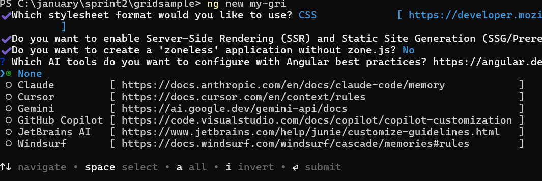
ng new syncfusion-angular-app- This command will prompt you to configure settings like enabling Angular routing and choosing a stylesheet format.
? Which stylesheet format would you like to use? (Use arrow keys)
> CSS             [ https://developer.mozilla.org/docs/Web/CSS                     ]
  Sass (SCSS)     [ https://sass-lang.com/documentation/syntax#scss                ]
  Sass (Indented) [ https://sass-lang.com/documentation/syntax#the-indented-syntax ]
Less [ http://lesscss.org ]- By default, a CSS-based application is created. Use SCSS if required:
ng new syncfusion-angular-app --style=scss- During project setup, when prompted for the Server-side rendering (SSR) option, choose the appropriate configuration.

- Select the required AI tool or ‘none’ if you do not need any AI tool.
- Navigate to your newly created application directory:
cd syncfusion-angular-appNote: In Angular 19 and below, it uses
app.component.ts,app.component.html,app.component.cssetc. In Angular 20+, the CLI generates a simpler structure withsrc/app/app.ts,app.html, andapp.css(no.component.suffixes).
Adding dependencies
The following list of dependencies are required to use the Dashboard Layout component in your application:
|-- @syncfusion/ej2-angular-layouts
    |-- @syncfusion/ej2-angular-base
    |-- @syncfusion/ej2-base
    |-- @syncfusion/ej2-layouts
Installing Syncfusion® Dashboard Layout package
Syncfusion® packages are distributed in npm as @syncfusion scoped packages. You can get all the Angular Syncfusion® packages from npm link.
Currently, Syncfusion® provides two types of package structures for Angular components:
- Ivy library distribution package format
- Angular compatibility compiler (Angular’s legacy compilation and rendering pipeline) package
Ivy library distribution package
Syncfusion® Angular packages(>=20.2.36) have been moved to the Ivy distribution to support the Angular Ivy rendering engine. The packages are compatible with Angular version 12 and above. To download the package, use the command below.
Add @syncfusion/ej2-angular-layouts package to the application:
npm install @syncfusion/ej2-angular-layouts --saveAngular compatibility compiled package (ngcc)
For Angular versions below 12, you can use the legacy (ngcc) package of the Syncfusion® Angular components. To download the ngcc package, use the command below.
Add @syncfusion/ej2-angular-layouts@ngcc package to the application:
npm install @syncfusion/ej2-angular-layouts@ngcc --saveTo specify the ngcc package in the package.json file, add the suffix -ngcc with the package version as shown below:
@syncfusion/ej2-angular-layouts:"20.2.38-ngcc"Note: If the ngcc tag is not specified while installing the package, the Ivy Library Package will be installed and this package will throw a warning.
Adding style sheet to the application
To render the Dashboard Layout component, import the Dashboard Layout and its dependent component styles as shown below in [src/styles.css]:
@import "../node_modules/@syncfusion/ej2-base/styles/material3.css";
@import "../node_modules/@syncfusion/ej2-angular-layouts/styles/material3.css";
Alternatively, based on the location of your CSS file, you can import the styles as shown below:
@import 'node_modules/@syncfusion/ej2-base/styles/material3.css';
@import 'node_modules/@syncfusion/ej2-angular-layouts/styles/material3.css';
Note: To refer to the combined component styles, use Syncfusion®
CRG(Custom Resource Generator) in your application.
Adding Dashboard Layout to the application
You can render the Dashboard Layout component in two ways:
- HTML attributes approach: Define panels as HTML elements with data attributes
-
Property binding approach: Define panels through the
panelsproperty
Setting the panels property using HTML attributes
You can render the DashboardLayout component by adding the panels property as an attribute to the HTML element directly. Add the HTML div element with panel definition for DashboardLayout by using <ejs-dashboardlayout> selector in template section of the app.component.ts file.
Now, modify the template in app.component.ts file to render DashboardLayout component.
[src/app/app.component.ts]
import { Component } from '@angular/core';
import { DashboardLayoutModule } from '@syncfusion/ej2-angular-layouts';

@Component({
  selector: 'app-root',
  styleUrls: ['./app.component.css'],
  imports: [DashboardLayoutModule],
    standalone: true,
    selector: 'app-root',
    template: `
    <div class="control-section">
          <ejs-dashboardlayout id='defaultLayout' [columns]="5" #defaultLayout>
              <div id="one" class="e-panel" data-row="0" data-col="0" data-sizeX="1" data-sizeY="1">
                  <span id="close" class="e-template-icon e-clear-icon"></span>
                  <div class="e-panel-container">
                      <div class="text-align">0</div>
                  </div>
              </div>
              <div id="two" class="e-panel" data-row="1" data-col="0" data-sizeX="1" data-sizeY="2">
                  <span id="close" class="e-template-icon e-clear-icon"></span>
                  <div class="e-panel-container">
                      <div class="text-align">1</div>
                  </div>
              </div>
              <div id="three" class="e-panel" data-row="0" data-col="1" data-sizeX="2" data-sizeY="2">
                  <span id="close" class="e-template-icon e-clear-icon"></span>
                  <div class="e-panel-container">
                      <div class="text-align">2</div>
                  </div>
              </div>
              <div id="four" class="e-panel" data-row="2" data-col="1" data-sizeX="1" data-sizeY="1">
                  <span id="close" class="e-template-icon e-clear-icon"></span>
                  <div class="e-panel-container">
                      <div class="text-align">3</div>
                  </div>
              </div>
              <div id="five" class="e-panel" data-row="2" data-col="2" data-sizeX="2" data-sizeY="1">
                  <span id="close" class="e-template-icon e-clear-icon"></span>
                  <div class="e-panel-container">
                      <div class="text-align">4</div>
                  </div>
              </div>
              <div id="six" class="e-panel" data-row="0" data-col="3" data-sizeX="1" data-sizeY="1">
                  <span id="close" class="e-template-icon e-clear-icon"></span>
                  <div class="e-panel-container">
                      <div class="text-align">5</div>
                  </div>
              </div>
              <div id="seven" class="e-panel" data-row="1" data-col="3" data-sizeX="1" data-sizeY="1">
                  <span id="close" class="e-template-icon e-clear-icon"></span>
                  <div class="e-panel-container">
                      <div class="text-align">6</div>
                  </div>
              </div>
              <div id="eight" class="e-panel" data-row="0" data-col="4" data-sizeX="1" data-sizeY="3">
                  <span id="close" class="e-template-icon e-clear-icon"></span>
                  <div class="e-panel-container">
                      <div class="text-align">7</div>
                  </div>
              </div>
          </ejs-dashboardlayout>
      </div>`
})

export class AppComponent {
}- Import DashboardLayout module into Angular application(
app.module.ts) from the package@syncfusion/ej2-angular-layouts.
import { NgModule }      from '@angular/core';
import { BrowserModule } from '@angular/platform-browser';
// import the DashboardLayoutModule for the Dashboard Layout component
import { DashboardLayoutModule } from '@syncfusion/ej2-angular-layouts';
import { AppComponent }  from './app.component';

@NgModule({
  //declaration of ej2-angular-layouts module into NgModule
  imports:      [ BrowserModule, DashboardLayoutModule ],
  declarations: [ AppComponent ],
  bootstrap:    [ AppComponent ]
})
export class AppModule { }
Run the application
Use the npm start command to run the application in the browser:
npm startThe following example shows a basic DashboardLayout by adding the panels property directly into the HTML element.
import { NgModule } from '@angular/core'
import { BrowserModule } from '@angular/platform-browser'
import { DashboardLayoutModule } from '@syncfusion/ej2-angular-layouts'
import { Component, ViewEncapsulation, ViewChild } from '@angular/core';

@Component({
    imports: [DashboardLayoutModule],
    standalone: true,
    selector: 'app-root',
    template: `
    <div class="control-section">
        <ejs-dashboardlayout id='defaultLayout' #defaultLayout [columns]="5" [cellSpacing]='cellSpacing'>
            <div id="one" class="e-panel" data-row="0" data-col="0" data-sizeX="1" data-sizeY="1">
                <span id="close" class="e-template-icon e-clear-icon"></span>
                <div class="e-panel-container">
                    <div class="text-align">0</div>
                </div>
            </div>
            <div id="two" class="e-panel" data-row="1" data-col="0" data-sizeX="1" data-sizeY="2">
                <span id="close" class="e-template-icon e-clear-icon"></span>
                <div class="e-panel-container">
                    <div class="text-align">1</div>
                </div>
            </div>
            <div id="three" class="e-panel" data-row="0" data-col="1" data-sizeX="2" data-sizeY="2">
                <span id="close" class="e-template-icon e-clear-icon"></span>
                <div class="e-panel-container">
                    <div class="text-align">2</div>
                </div>
            </div>
            <div id="four" class="e-panel" data-row="2" data-col="1" data-sizeX="1" data-sizeY="1">
                <span id="close" class="e-template-icon e-clear-icon"></span>
                <div class="e-panel-container">
                    <div class="text-align">3</div>
                </div>
            </div>
            <div id="five" class="e-panel" data-row="2" data-col="2" data-sizeX="2" data-sizeY="1">
                <span id="close" class="e-template-icon e-clear-icon"></span>
                <div class="e-panel-container">
                    <div class="text-align">4</div>
                </div>
            </div>
            <div id="six" class="e-panel" data-row="0" data-col="3" data-sizeX="1" data-sizeY="1">
                <span id="close" class="e-template-icon e-clear-icon"></span>
                <div class="e-panel-container">
                    <div class="text-align">5</div>
                </div>
            </div>
            <div id="seven" class="e-panel" data-row="1" data-col="3" data-sizeX="1" data-sizeY="1">
                <span id="close" class="e-template-icon e-clear-icon"></span>
                <div class="e-panel-container">
                    <div class="text-align">6</div>
                </div>
            </div>
            <div id="eight" class="e-panel" data-row="0" data-col="4" data-sizeX="1" data-sizeY="3">
                <span id="close" class="e-template-icon e-clear-icon"></span>
                <div class="e-panel-container">
                    <div class="text-align">7</div>
                </div>
            </div>
        </ejs-dashboardlayout>
    </div>`,
    encapsulation: ViewEncapsulation.None
})

export class AppComponent {
    public cellSpacing: number[] = [10, 10];
}
@import "node_modules/@syncfusion/ej2-base/styles/material3.css";
@import 'node_modules/@syncfusion/ej2-angular-base/styles/material3.css';
@import 'node_modules/@syncfusion/ej2-angular-layouts/styles/material3.css';
.control-section {
margin: 0 auto;
width: 500px;
}
#defaultLayout {
padding: 10px;
}
#defaultLayout .e-panel .e-panel-container {
vertical-align: middle;
font-weight: 600;
font-size: 20px;
text-align: center;
}
.text-align {
line-height: 90px;
}import { bootstrapApplication } from '@angular/platform-browser';
import { AppComponent } from './app.component';
import 'zone.js';
bootstrapApplication(AppComponent).catch((err) => console.error(err));Setting the panels property through binding
You can render the DashboardLayout component by using the panels property through binding.
Now, modify the template in app.component.ts file to render DashboardLayout component.
[src/app/app.component.ts]
import { DashboardLayoutModule } from '@syncfusion/ej2-angular-layouts'
import { Component, ViewEncapsulation } from '@angular/core';

@Component({
    imports: [DashboardLayoutModule],
    standalone: true,
    selector: 'app-root',
    template: `
    <div class="control-section">
        <ejs-dashboardlayout id='defaultLayout' #defaultLayout [cellSpacing]='cellSpacing' [panels]='panels' [columns]="5">
        </ejs-dashboardlayout>
    </div>`,
    encapsulation: ViewEncapsulation.None
})
export class AppComponent {
  public cellSpacing: number[] = [10, 10];
  public panels: any = [{ "sizeX": 1, "sizeY": 1, "row": 0, "col": 0, content: '<div class="content">0</div>' },
    { "sizeX": 3, "sizeY": 2, "row": 0, "col": 1, content: '<div class="content">1</div>' },
    { "sizeX": 1, "sizeY": 3, "row": 0, "col": 4, content: '<div class="content">2</div>' },
    { "sizeX": 1, "sizeY": 1, "row": 1, "col": 0, content: '<div class="content">3</div>' },
    { "sizeX": 2, "sizeY": 1, "row": 2, "col": 0, content: '<div class="content">4</div>' },
    { "sizeX": 1, "sizeY": 1, "row": 2, "col": 2, content: '<div class="content">5</div>' },
    { "sizeX": 1, "sizeY": 1, "row": 2, "col": 3, content: '<div class="content">6</div>' }
  ]
}
The following example demonstrates a basic Dashboard Layout using the panels property.
import { NgModule } from '@angular/core'
import { BrowserModule } from '@angular/platform-browser'
import { DashboardLayoutModule } from '@syncfusion/ej2-angular-layouts'
import { Component, ViewEncapsulation } from '@angular/core';

@Component({
    imports: [DashboardLayoutModule],
    standalone: true,
    selector: 'app-root',
    template: `
    <div class="control-section">
        <ejs-dashboardlayout id='defaultLayout' #defaultLayout [columns]='5' [cellSpacing]='cellSpacing' [panels]='panels'>
        </ejs-dashboardlayout>
    </div>`,
    encapsulation: ViewEncapsulation.None
})
export class AppComponent {
    public cellSpacing: number[] = [10, 10];
    public panels: any = [{ "sizeX": 1, "sizeY": 1, "row": 0, "col": 0, content: '<div class="content">0</div>' },
    { "sizeX": 3, "sizeY": 2, "row": 0, "col": 1, content: '<div class="content">1</div>' },
    { "sizeX": 1, "sizeY": 3, "row": 0, "col": 4, content: '<div class="content">2</div>' },
    { "sizeX": 1, "sizeY": 1, "row": 1, "col": 0, content: '<div class="content">3</div>' },
    { "sizeX": 2, "sizeY": 1, "row": 2, "col": 0, content: '<div class="content">4</div>' },
    { "sizeX": 1, "sizeY": 1, "row": 2, "col": 2, content: '<div class="content">5</div>' },
    { "sizeX": 1, "sizeY": 1, "row": 2, "col": 3, content: '<div class="content">6</div>' }
    ]
}
@import "node_modules/@syncfusion/ej2-base/styles/material3.css";
@import 'node_modules/@syncfusion/ej2-angular-base/styles/material3.css';
@import 'node_modules/@syncfusion/ej2-angular-layouts/styles/material3.css';
.control-section {
margin: 0 auto;
width: 500px;
}
#defaultLayout {
padding: 10px;
}
#defaultLayout .e-panel .e-panel-container {
vertical-align: middle;
font-weight: 600;
font-size: 20px;
text-align: center;
}
.content {
line-height: 90px;
}import { bootstrapApplication } from '@angular/platform-browser';
import { AppComponent } from './app.component';
import 'zone.js';
bootstrapApplication(AppComponent).catch((err) => console.error(err));You can refer to the Angular Dashboard Layout feature tour page for its groundbreaking feature representations. You can also explore the Angular Dashboard Layout example to learn how to present and manipulate data.