Getting Started with Angular Chart
11 Aug 202611 minutes to read
This section explains the steps required to create a simple chart and demonstrates the basic usage of the Angular Chart component.
To get started quickly with Angular Chart using CLI and Schematics, view the following video:
Prerequisites
- Node.js 24+ (LTS recommended).
- Syncfusion CLI.
Install the Syncfusion CLI
Install the Syncfusion CLI globally using the following command:
npm install -g @syncfusion/syncfusion-cliCreate a new Angular application using Syncfusion CLI
You can create a Angular application using the Syncfusion CLI. The CLI provides two ways to create a project:
Non-interactive mode
Non-interactive mode allows you to create a project directly using a single command with the required command-line arguments.
sf new syncfusion-angular-app --framework angular --template chartIn this mode, the project configuration is passed directly in the command. The above command creates a Angular application configured with the Syncfusion® Chart component.
Interactive mode
Interactive mode guides you through the project creation process with step-by-step prompts.
sfWhen you run the sf command, the CLI prompts you to select the required project configuration. To create a Angular application with the Syncfusion® Chart component, select the following options:
√ Project name? ... syncfusion-angular-app
√ Choose Framework: » Angular
√ Choose Template: » Chart
√ Choose Theme: » Material3
√ Choose Style Format: » CSS
√ Would you like to integrate the Syncfusion MCP Server (AI Assistant) into this project? ... no
√ Would you like to install Syncfusion Component Skills for AI-powered development? ... no
√ Install dependencies and start app now? ... no
The above selections generate a Angular application configured with the Syncfusion® Chart component. You can choose different values for language, theme, style format, MCP setup, and skills installation based on your project requirements.
The Syncfusion® CLI creates the project with a predefined template. After the project is generated, you can customize or replace the component code based on your application requirements.
Run the project
Once the project is created, navigate to the project directory and run the following commands in your terminal.
cd syncfusion-angular-app
npm install
ng serve
The output will appear as follows:
Prerequisites
Before getting started, ensure that your environment meets the system requirements for Syncfusion® Angular UI components, which covers supported Node.js, Angular, and @syncfusion/ej2-angular-charts versions.
Before You Begin
This guide uses the standalone application structure generated by the latest Angular CLI.
Angular 21 Standalone Architecture: Standalone components are the default in Angular 21. This guide uses the modern standalone architecture. If you need more information about the standalone architecture, refer to the Standalone Guide.
The main files used in this guide are:
-
src/app/app.ts— Defines the root standalone component. -
src/index.html— Contains the Angular root element.
In newer Angular CLI standalone projects, the root component may be generated as
src/app/app.ts. In NgModule-based Angular projects, the equivalent file is typicallysrc/app/app.component.ts.
If your application uses an older NgModule-based structure, import
ChartModulein the application module, such asapp.module.ts, instead of adding it to the standalone componentimportscollection.
Install the Angular CLI
Use Angular CLI to create and manage Angular applications. Install Angular CLI globally using the following command:
npm install -g @angular/cli
Verify the installation:
ng version
Angular 21 Standalone Architecture: Standalone components are the default in Angular 21. This guide uses the modern standalone architecture. If you need more information about the standalone architecture, refer to the Standalone Guide.
Installing a specific version
To install a particular version of Angular CLI, use:
npm install -g @angular/[email protected]
Create an Angular application
With Angular CLI installed, execute the following command to generate a new application:
ng new syncfusion-angular-app
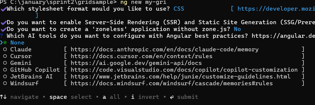
- This command will prompt you to configure settings like enabling Angular routing and choosing a stylesheet format.
? Which stylesheet format would you like to use? (Use arrow keys)
> CSS             [ https://developer.mozilla.org/docs/Web/CSS                     ]
  Sass (SCSS)     [ https://sass-lang.com/documentation/syntax#scss                ]
  Sass (Indented) [ https://sass-lang.com/documentation/syntax#the-indented-syntax ]
  Less            [ http://lesscss.org                                             ]
- By default, a CSS-based application is created. Use SCSS if required:
ng new syncfusion-angular-app --style=scss
- During project setup, when prompted for the Server-side rendering (SSR) option, choose the appropriate configuration.

- Select the required AI tool or ‘none’ if you do not need any AI tool.
- Navigate to your newly created application directory:
cd syncfusion-angular-app
In Angular 19 and below, the CLI generates files like
app.component.ts,app.component.html, etc. In Angular 20+, the CLI generates a simpler structure withapp.ts,app.html, andapp.css(no.component.suffixes).
Adding the Syncfusion® Angular Chart package
To install the Syncfusion® Angular Chart package, use the following command:
ng add @syncfusion/ej2-angular-charts
The ng add command installs the package, registers it in package.json, and configures the required entries in your workspace automatically.
If ng add is unavailable in your setup, install the package manually with:
npm install @syncfusion/ej2-angular-charts
Add Syncfusion® Chart component
Modify the template in src/app/app.component.ts (or src/app/app.ts in Angular 20+) to render the Chart component:
import { Component } from '@angular/core';
import { ChartModule } from '@syncfusion/ej2-angular-charts';

@Component({
    selector: 'app-root',
    standalone: true,
    imports: [ChartModule],
    // specifies the template string for the Chart component
    template: `<ejs-chart id="chart-container"></ejs-chart>`
})
export class App { }
import { bootstrapApplication } from '@angular/platform-browser';
import { App } from './app.component';
import 'zone.js';
bootstrapApplication(App).catch((err) => console.error(err));Module Injection
Angular Chart components are segregated into individual feature-wise modules. To use a particular feature, you need to inject its feature service in src/app/app.ts (Angular 20+) or src/app/app.component.ts (Angular 19 and below). This example will use the line series feature of the chart.
-
LineSeriesService- Inject this provider to render the line series.
Replace the contents of src/app/app.ts (or src/app/app.component.ts on Angular 19 and below) with the following:
import { Component } from '@angular/core';
import { ChartModule, LineSeriesService } from '@syncfusion/ej2-angular-charts';

@Component({
  selector: 'app-root',
  standalone: true,
  imports: [ChartModule],
  providers: [LineSeriesService],
  template: `<ejs-chart id='chart-container'></ejs-chart>`,
})
export class App {}
Bind data to the Chart
This section explains how to plot JSON data to the Angular Chart. Replace the contents of src/app/app.ts (Angular 20+) or src/app/app.component.ts (Angular 19 and below) with the following:
import { Component } from '@angular/core';
import {
  ChartModule,
  CategoryService,
  LineSeriesService,
  TooltipService
} from '@syncfusion/ej2-angular-charts';

@Component({
  selector: 'app-root',
  standalone: true,
  imports: [ChartModule],
  providers: [CategoryService, LineSeriesService, TooltipService],
  template: `
    <ejs-chart
        id="chart-container"
        [primaryXAxis]='primaryXAxis'
        [title]='title'
        [tooltip]='tooltip'>
        <e-series-collection>
            <e-series
                [dataSource]='chartData'
                type='Line'
                xName='month'
                yName='sales'>
            </e-series>
        </e-series-collection>
    </ejs-chart>
`,
})
export class App {
  public primaryXAxis: Object = { valueType: 'Category' };
  public title: string = 'Monthly Sales';
  public tooltip: Object = { enable: true };
  public chartData: { month: string; sales: number }[] = [
    { month: 'Jan', sales: 35 },
    { month: 'Feb', sales: 28 },
    { month: 'Mar', sales: 34 },
    { month: 'Apr', sales: 32 },
    { month: 'May', sales: 40 },
    { month: 'Jun', sales: 32 },
    { month: 'Jul', sales: 35 },
    { month: 'Aug', sales: 55 },
    { month: 'Sep', sales: 38 },
    { month: 'Oct', sales: 30 },
    { month: 'Nov', sales: 25 },
    { month: 'Dec', sales: 32 },
  ];
}
import { bootstrapApplication } from '@angular/platform-browser';
import { App } from './app';
import 'zone.js';
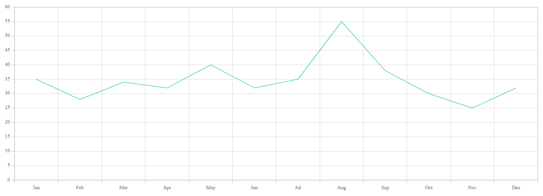
bootstrapApplication(App).catch((err) => console.error(err));The chart renders a line with the month names (Jan–Dec) on the horizontal axis and the sales values on the vertical axis. Hovering over a data point displays a tooltip with the corresponding month and sales value.
Open the generated local URL (for example, http://localhost:4200/) from the terminal in the browser. The application displays a line chart showing monthly sales from January to December.
Run the application
Run the application using the following command:
npm start
Open the generated local URL (for example, http://localhost:4200/) from the terminal in the browser. The application displays a line chart showing monthly sales from January to December, as shown below:
Troubleshooting
If the chart does not render as expected, check for these common issues:
-
“No provider for CategoryService” error: Confirm that
CategoryServiceandLineSeriesServiceare added to the component’sprovidersarray. Each chart series type requires its corresponding service. -
Chart not visible: Verify that the
<ejs-chart>element has a uniqueidand that the component’sselectormatches the root element used insrc/index.html(commonly<app-root>). -
Data not displayed: Check that the
xNameandyNamevalues match the field names in your data source exactly, and that thedataSourceis assigned before the chart renders. -
Build errors: Run
ng versionto confirm that Node.js, Angular CLI, and@syncfusion/ej2-angular-chartsare on supported versions, and check the terminal output for the specific error. -
Port already in use: If
npm startfails because port4200is in use, runng serve --port 4201(or another free port) instead.