How can I help you?
Getting started with Angular Avatar component
4 Mar 20266 minutes to read
The following section explains the steps required to create a simple Avatar component using styles and its basic usage.
Setup Angular Environment
You can use Angular CLI to setup your Angular applications.
To install Angular CLI use the following command.
npm install -g @angular/cliAngular 21 Standalone Architecture: Standalone components are the default in Angular 21. This guide uses the modern standalone architecture. If you need more information about the standalone architecture, refer to the Standalone Guide.
Installing a specific version
To install a particular version of Angular CLI, use:
npm install -g @angular/[email protected]Create a new application
With Angular CLI installed, execute this command to generate a new application:
ng new syncfusion-angular-app- This command will prompt you to configure settings like enabling Angular routing and choosing a stylesheet format.
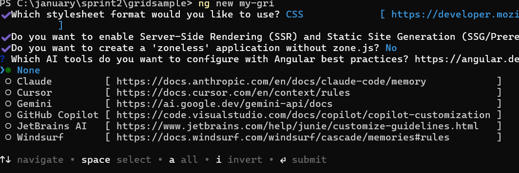
? Which stylesheet format would you like to use? (Use arrow keys)
> CSS             [ https://developer.mozilla.org/docs/Web/CSS                     ]
  Sass (SCSS)     [ https://sass-lang.com/documentation/syntax#scss                ]
  Sass (Indented) [ https://sass-lang.com/documentation/syntax#the-indented-syntax ]
Less [ http://lesscss.org ]- By default, a CSS-based application is created. Use SCSS if required:
ng new syncfusion-angular-app --style=scss- During project setup, when prompted for the Server-side rendering (SSR) option, choose the appropriate configuration.

- Select the required AI tool or ‘none’ if you do not need any AI tool.
- Navigate to your newly created application directory:
cd syncfusion-angular-appNote: In Angular 19 and below, it uses
app.component.ts,app.component.html,app.component.cssetc. In Angular 20+, the CLI generates a simpler structure withsrc/app/app.ts,app.html, andapp.css(no.component.suffixes).
Avatar component dependencies
The Avatar component is pure CSS component which doesn’t need specific dependencies to render.
The component requires the following Syncfusion® package:
|-- @syncfusion/ej2-layoutsThis package provides the essential styles and utilities needed for the Avatar component.
Installing Syncfusion® Layouts package
Syncfusion® packages are distributed in npm as @syncfusion scoped packages. You can find all Angular Syncfusion® packages on npm.
Syncfusion® provides two types of package structures for Angular components:
- Ivy library distribution package format
- Angular compatibility compiler(Angular’s legacy compilation and rendering pipeline) package:
Ivy library distribution package
Syncfusion® Angular packages(>=20.2.36) has been moved to the Ivy distribution to support the Angular Ivy rendering engine and the package are compatible with Angular version 12 and above. To download the package use the below command.
Add @syncfusion/ej2-angular-layouts package to the application.
npm install @syncfusion/ej2-angular-layouts --saveAngular compatibility compiled package (ngcc)
For Angular versions below 12, use the legacy (ngcc) package of Syncfusion® Angular components.
Add the @syncfusion/ej2-angular-layouts@ngcc package:
npm install @syncfusion/ej2-angular-layouts@ngcc --saveTo specify the ngcc package in the package.json file, add the suffix -ngcc with the package version as below.
@syncfusion/ej2-angular-layouts:"20.2.38-ngcc"Note: If the ngcc tag is not specified during installation, the Ivy Library Package will be installed and may display warnings for incompatible Angular versions.
Adding style sheet to the application
To render the Avatar component, import the required stylesheets in the [src/styles.css] file:
@import '../node_modules/@syncfusion/ej2-base/styles/material3.css';
@import '../node_modules/@syncfusion/ej2-layouts/styles/material3.css';
@import '../node_modules/@syncfusion/ej2-angular-layouts/styles/material3.css';
Alternatively, import the styles directly relative to the node_modules folder based on your CSS file’s location, as shown below:
@import 'node_modules/@syncfusion/ej2-base/styles/material3.css';
@import 'node_modules/@syncfusion/ej2-layouts/styles/material3.css';
@import 'node_modules/@syncfusion/ej2-angular-layouts/styles/material3.css';
Note: To use combined component styles, refer to Syncfusion®
CRG(Custom Resource Generator) for your application.
Adding Avatar to the application
The Avatar component uses CSS classes to display user representations. Modify the template in the app.component.ts file to render the Avatar component.
[src/app/app.component.ts]
import { Component } from '@angular/core';

@Component({
    imports: [
    ],
    standalone: true,
    selector: 'app-root',
    template: `<div id='element'><span class="e-avatar">GR</span></div>`
})

export class AppComponent {}
Run the application
Run the application in the browser using the following command:
npm startThe following example demonstrates a basic Avatar component with initials:
import { NgModule } from '@angular/core'
import { BrowserModule } from '@angular/platform-browser'

import { Component } from '@angular/core';

@Component({
    imports: [
    ],
    standalone: true,
    selector: 'my-app',
    template: `
    <div id='element'>
            <span class="e-avatar e-avatar-xlarge"></span>
            <span class="e-avatar e-avatar-large"></span>
            <span class="e-avatar"></span>
            <span class="e-avatar e-avatar-small"></span>
            <span class="e-avatar e-avatar-xsmall"></span>
    </div>
    `
})

export class AppComponent { }
@import 'node_modules/@syncfusion/ej2-base/styles/material3.css';
@import 'node_modules/@syncfusion/ej2-layouts/styles/material3.css';
#loader {
color: #008cff;
height: 40px;
width: 30%;
position: absolute;
font-family: 'Helvetica Neue','calibiri';
font-size: 14px;
top: 45%;
left: 45%;
}
#element {
display: block;
width: 300px;
margin: 130px auto;
border-radius: 3px;
justify-content: center;
}
.e-avatar {
background-image: url(https://ej2.syncfusion.com/demos/src/grid/images/2.png);
margin: 2px;
}
#container {
visibility: hidden;
}import { bootstrapApplication } from '@angular/platform-browser';
import { AppComponent } from './app.component';
import 'zone.js';
bootstrapApplication(AppComponent).catch((err) => console.error(err));Refer to the Angular Avatar feature tour page for comprehensive feature demonstrations. Explore the Angular Avatar example to learn data presentation and manipulation techniques.