How can I help you?
Getting Started with the Vue TimePicker Component in Vue 3
13 Mar 202613 minutes to read
This article provides a step-by-step guide for setting up a Vite project with a JavaScript environment and integrating the Syncfusion® Vue TimePicker component using the Composition API / Options API.
The Composition API is a new feature introduced in Vue.js 3 that provides an alternative way to organize and reuse component logic. It allows developers to write components as functions that use smaller, reusable functions called composition functions to manage their properties and behavior.
The Options API is the traditional way of writing Vue.js components, where the component logic is organized into a series of options that define the component’s properties and behavior. These options include data, methods, computed properties, watchers, lifecycle hooks, and more.
Prerequisites
System requirements for Syncfusion® Vue UI components
Set up the Vite project
A recommended approach for beginning with Vue is to scaffold a project using Vite. To create a new Vite project, use one of the commands that are specific to either NPM or Yarn.
npm create vite@latestor
yarn create viteUsing one of the above commands will lead you to set up additional configurations for the project as below:
1.Define the project name: We can specify the name of the project directly. Let’s specify the name of the project as my-project for this article.
? Project name: » my-project2.Select Vue as the framework. It will create a Vue 3 project.
? Select a framework: » - Use arrow-keys. Return to submit.
Vanilla
> Vue
  React
  Preact
  Lit
  Svelte
  Others
3.Choose JavaScript as the framework variant to build this Vite project using JavaScript and Vue.
? Select a variant: » - Use arrow-keys. Return to submit.
> JavaScript
  TypeScript
  Customize with create-vue ↗
  Nuxt ↗
4.Roll-down is Vite’s new experimental faster bundler (rust-based, replacing roll-up). Choose No uses the stable, proven roll-up-based Vite (recommended for most users)
Use rolldown-vite (Experimental)? No5.Install dependencies and start the dev server.
Install with npm and start now?: YesSince you selected Yes, the development server should start automatically. If you selected No, please follow these steps to set up and start the project manually:
cd my-project
npm install
or
cd my-project
yarn install
Now that my-project is ready to run with default settings, let’s add Syncfusion® components to the project.
Add Syncfusion® Vue packages
Syncfusion® Vue component packages are available at npmjs.com. To use Syncfusion® Vue components in the project, install the corresponding npm package.
This article uses the Vue TimePicker component as an example. To use the Vue TimePicker component in the project, the @syncfusion/ej2-vue-calendars package needs to be installed using the following command:
npm install @syncfusion/ej2-vue-calendars --saveor
yarn add @syncfusion/ej2-vue-calendarsImport Syncfusion® CSS styles
Syncfusion® components require CSS stylesheets to display correctly. You can import themes in various ways, such as using CSS or SASS styles from npm packages, CDN, CRG, and Theme Studio. Refer to themes topic to learn more about built-in themes and different ways to reference themes in a Vue project.
In this article, Material3 theme is applied using CSS styles, which are available in installed packages. The necessary Material3 CSS styles for the TimePicker component and its dependents were imported into the <style> section of src/App.vue file.
<style>
  @import '../node_modules/@syncfusion/ej2-base/styles/material3.css';
  @import '../node_modules/@syncfusion/ej2-inputs/styles/material3.css';
  @import '../node_modules/@syncfusion/ej2-popups/styles/material3.css';
  @import '../node_modules/@syncfusion/ej2-lists/styles/material3.css';
  @import "../node_modules/@syncfusion/ej2-vue-calendars/styles/material3.css";
</style>
The order of CSS imports matters. Import base styles first, then component-specific styles. Missing CSS imports can result in misaligned layouts, buttons without styling, or missing visual elements in popups and dialogs.
Add Syncfusion® Vue component
Follow the below steps to add the Vue TimePicker component using Composition API or Options API:
1.First, import and register the TimePicker component and its child directives in the script section of the src/App.vue file. If you are using the Composition API, you should add the setup attribute to the script tag to indicate that Vue will be using the Composition API.
<script setup>
  import { TimePickerComponent as EjsTimepicker } from "@syncfusion/ej2-vue-calendars";
</script><script>
import { TimePickerComponent } from "@syncfusion/ej2-vue-calendars";
//Component registeration
export default {
name: "App",
components: {
'ejs-timepicker' : TimePickerComponent
}
}
</script>2.In the template section, define the TimePicker component with the dataSource property and column definitions.
<template>
    <div class="control_wrapper">
        <ejs-timepicker></ejs-timepicker>
    </div>
</template>
Here is the summarized code for the above steps in the src/App.vue file:
<template>
    <div class="control_wrapper">
        <ejs-timepicker></ejs-timepicker>
    </div>
</template>
<script setup>
  import { TimePickerComponent as EjsTimepicker } from "@syncfusion/ej2-vue-calendars";
</script>
<style>
  @import '../node_modules/@syncfusion/ej2-base/styles/material3.css';
  @import '../node_modules/@syncfusion/ej2-inputs/styles/material3.css';
  @import '../node_modules/@syncfusion/ej2-popups/styles/material3.css';
  @import '../node_modules/@syncfusion/ej2-lists/styles/material3.css';
  @import "../node_modules/@syncfusion/ej2-vue-calendars/styles/material3.css";
  .control_wrapper {
    max-width: 250px;
    margin: 0 auto;
  }
</style><template>
<div class="control_wrapper">
<ejs-timepicker></ejs-timepicker>
</div>
</template>
<script>
import { TimePickerComponent } from "@syncfusion/ej2-vue-calendars";
//Component registeration
export default {
name: 'App',
components: {
"ejs-timepicker": TimePickerComponent
}
}
</script>
<style>
@import '../node_modules/@syncfusion/ej2-base/styles/material3.css';
@import '../node_modules/@syncfusion/ej2-inputs/styles/material3.css';
@import '../node_modules/@syncfusion/ej2-popups/styles/material3.css';
@import '../node_modules/@syncfusion/ej2-lists/styles/material3.css';
@import "../node_modules/@syncfusion/ej2-vue-calendars/styles/material3.css";
.control_wrapper {
max-width: 250px;
margin: 0 auto;
}
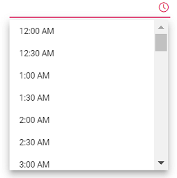
</style>Run the project
To run the project, use the following command:
npm run devor
yarn run devThe output will appear as follows:
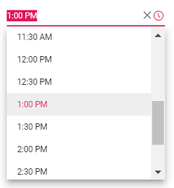
Setting the value, min, and max time
The following example demonstrates how to set the value, min, and max time on initializing the TimePicker. The TimePicker allows you to select the time value within a range from 7:00 AM to 4:00 PM.
<template>
  <div id="app">
    <div class='wrapper'>
      <ejs-timepicker :min="data[0].minDate" :max="data[0].maxDate" :value="data[0].timeVal"></ejs-timepicker>
    </div>
  </div>
</template>
<script setup>
  import { TimePickerComponent as EjsTimepicker } from "@syncfusion/ej2-vue-calendars";
  const data = [{ minDate : new Date("05/07/2017 7:00 AM"),
                  maxDate : new Date("05/07/2017 4:00 PM"),
                  timeVal : new Date("05/27/2017 1:00 PM") }]
</script>
<style>
    @import '../node_modules/@syncfusion/ej2-base/styles/material3.css';
    @import '../node_modules/@syncfusion/ej2-inputs/styles/material3.css';
    @import '../node_modules/@syncfusion/ej2-popups/styles/material3.css';
    @import '../node_modules/@syncfusion/ej2-lists/styles/material3.css';
    @import "../node_modules/@syncfusion/ej2-vue-calendars/styles/material3.css";
   .wrapper {
        max-width: 250px;
        margin: 0 auto;
    }
</style><template>
<div id="app">
<div class='wrapper'>
<ejs-timepicker :min="minDate" :max="maxDate" :value="timeVal"></ejs-timepicker>
</div>
</div>
</template>
<script>
import { TimePickerComponent } from "@syncfusion/ej2-vue-calendars";
//Component registeration
export default {
name: 'App',
components: {
"ejs-timepicker": TimePickerComponent
},
data () {
return {
minDate : new Date("05/07/2017 7:00 AM"),
maxDate : new Date("05/07/2017 4:00 PM"),
timeVal : new Date("05/27/2017 1:00 PM")
}
}
}
</script>
<style>
@import '../node_modules/@syncfusion/ej2-base/styles/material3.css';
@import '../node_modules/@syncfusion/ej2-inputs/styles/material3.css';
@import '../node_modules/@syncfusion/ej2-popups/styles/material3.css';
@import '../node_modules/@syncfusion/ej2-lists/styles/material3.css';
@import "../node_modules/@syncfusion/ej2-vue-calendars/styles/material3.css";
.wrapper {
max-width: 250px;
margin: 0 auto;
}
</style>The output will appear as follows:
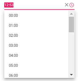
Setting the time format
Time formats is a way of representing the time value in different string format in textbox and popup list. By default, the TimePicker’s format is based on the culture. You can also customize the format by using the format property. To know more about the time format standards, refer to the Date and Time Format section.
The following example demonstrates the TimePicker component in 24 hours format with 60 minutes interval. The time interval is set to 60 minutes by using the step property.
<template>
    <div id="app">
        <div class='wrapper'>
            <ejs-timepicker :step="data[0].timeStep" :format="data[0].timeFormat" :value="data[0].timeVal"></ejs-timepicker>
     </div>
  </div>
</template>
<script setup>
  import { TimePickerComponent as EjsTimepicker } from "@syncfusion/ej2-vue-calendars";
  const data = [{ timeStep : 60,
                  timeFormat : 'HH:mm',
                  timeVal : new Date() }]
</script>
<style>
    @import '../node_modules/@syncfusion/ej2-base/styles/material3.css';
    @import '../node_modules/@syncfusion/ej2-inputs/styles/material3.css';
    @import '../node_modules/@syncfusion/ej2-popups/styles/material3.css';
    @import '../node_modules/@syncfusion/ej2-lists/styles/material3.css';
    @import "../node_modules/@syncfusion/ej2-vue-calendars/styles/material3.css";
   .wrapper {
        max-width: 250px;
        margin: 0 auto;
    }
</style><template>
<div id="app">
<div class='wrapper'>
<ejs-timepicker :step="timeStep" :format="timeFormat" :value="timeVal"></ejs-timepicker>
</div>
</div>
</template>
<script>
import { TimePickerComponent } from "@syncfusion/ej2-vue-calendars";
//Component registeration
export default {
name: 'App',
components: {
"ejs-timepicker": TimePickerComponent
},
data () {
return {
timeStep : 60,
timeFormat : 'HH:mm',
timeVal : new Date()
}
}
}
</script>
<style>
@import '../node_modules/@syncfusion/ej2-base/styles/material3.css';
@import '../node_modules/@syncfusion/ej2-inputs/styles/material3.css';
@import '../node_modules/@syncfusion/ej2-popups/styles/material3.css';
@import '../node_modules/@syncfusion/ej2-lists/styles/material3.css';
@import "../node_modules/@syncfusion/ej2-vue-calendars/styles/material3.css";
.wrapper {
max-width: 250px;
margin: 0 auto;
}
</style>Output be like the below.
Once the time format property is defined, it will be applicable to all the cultures.