How can I help you?
Getting Started with the Vue Sparkline Component in Vue 2
10 Feb 202613 minutes to read
This article provides a step-by-step guide for creating a Vue 2 project with Vue-CLI and integrating the Syncfusion® Vue Sparkline component.
To get started quickly with Vue Sparkline, watch this video:
Prerequisites
System requirements for Syncfusion® Vue UI components
Dependencies
The following minimum dependencies are required to use the sparkline:
|-- @syncfusion/ej2-vue-charts
    |-- @syncfusion/ej2-base
    |-- @syncfusion/ej2-data
    |-- @syncfusion/ej2-pdf-export
    |-- @syncfusion/ej2-file-utils
    |-- @syncfusion/ej2-compression
    |-- @syncfusion/ej2-svg-base
    |-- @syncfusion/ej2-sparkline
    |-- @syncfusion/ej2-vue-base
Setting up the Vue 2 project
To generate a Vue 2 project using Vue-CLI, use the vue create command. Follow these steps to install Vue CLI and create a new project:
npm install -g @vue/cli
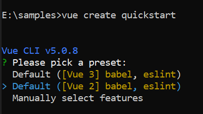
vue create quickstart
cd quickstart
npm run serveor
yarn global add @vue/cli
vue create quickstart
cd quickstart
yarn run serve
When creating a new project, choose the option Default ([Vue 2] babel, eslint) from the menu.
Once the quickstart project is set up with default settings, add Syncfusion® components to the project.
Add Syncfusion® Vue packages
Syncfusion® packages are available on npm. The Vue Sparkline component is provided in the @syncfusion/ej2-vue-charts package, which includes the necessary Sparkline modules. For advanced or custom integrations, developers can install the lower-level @syncfusion/ej2-sparkline package together with @syncfusion/ej2-vue-base.
This article uses the Vue Sparkline component as an example. Install the @syncfusion/ej2-vue-charts package by running the following command:
npm install @syncfusion/ej2-vue-charts --saveor
yarn add @syncfusion/ej2-vue-chartsAdd Syncfusion® Vue component
Follow these steps to add the Vue Sparkline component:
- Import and register the Sparkline component in the
scriptsection of the src/App.vue file.
<script>
import { SparklineComponent } from "@syncfusion/ej2-vue-charts";

export default {
  components: {
    'ejs-sparkline': SparklineComponent
  }
}
</script>- In the
templatesection, define the Sparkline component.
<template>
    <div id="app">
    <ejs-sparkline></ejs-sparkline>
  </div>
</template>
Run the project
To run the project, use the following command:
npm run serveor
yarn run serveThe following example shows a basic Sparkline.
<template>
<ejs-sparkline id="sparkline"></ejs-sparkline>
</template>

<script>
import { SparklineComponent } from '@syncfusion/ej2-vue-charts';

export default {
  components: {
    'ejs-sparkline': SparklineComponent
  }
}
</script>
Since no data source is provided, the sparkline renders an empty SVG element.
Module Injection
The Sparkline component is split into feature modules. To enable a feature, import its module and provide it to the component using the provide option. Available modules include:
- SparklineTooltip — enables tooltip display for points and series.
The example below demonstrates enabling the tooltip feature by importing SparklineTooltip and providing it to the component.
<template>
    <div class="control_wrapper">
        <ejs-sparkline id="sparkline"></ejs-sparkline>
    </div>
</template>
<script>
import { SparklineComponent, SparklineTooltip } from "@syncfusion/ej2-vue-charts";

export default {
  components: {
    'ejs-sparkline': SparklineComponent
  },
  data: function() {
    return {
    }
  },
provide:{
    sparkline:[SparklineTooltip]
}
}
</script>
Bind data source to Sparkline
Use the dataSource property to bind data to the sparkline. This property accepts a collection (for example, an array of objects) as input.
<template>
    <div class="control_wrapper">
    <div>
        <ejs-sparkline id="sparkline" align="center" :dataSource='dataSource' xName='xval' yName='yval' :height='height' :width='width'></ejs-sparkline>
    </div>
    </div>
</template>
<script>
import { SparklineComponent } from "@syncfusion/ej2-vue-charts";

export default {
  components: {
    'ejs-sparkline': SparklineComponent
  },
  data: function() {
    return {
    height: '100px',
    width: '70%',
    dataSource: [
            { x: 0, xval: '2005', yval: 20090440 },
            { x: 1, xval: '2006', yval: 20264080 },
            { x: 2, xval: '2007', yval: 20434180 },
            { x: 3, xval: '2008', yval: 21007310 },
            { x: 4, xval: '2009', yval: 21262640 },
            { x: 5, xval: '2010', yval: 21515750 },
            { x: 6, xval: '2011', yval: 21766710 },
            { x: 7, xval: '2012', yval: 22015580 },
            { x: 8, xval: '2013', yval: 22262500 },
            { x: 9, xval: '2014', yval: 22507620 },
        ]
    }
  }
}
</script>
<style>
.spark {
    border: 1px solid rgb(209, 209, 209);
    border-radius: 2px;
    width: 100%;
    height: 100%;
}
</style>Change the type of Sparkline
Change the sparkline type by setting the type property to Line, Column, WinLoss, Pie, or Area. The example below uses the area type.
<template>
    <div class="control_wrapper">
    <div>
        <ejs-sparkline id="sparkline" align="center" :dataSource='dataSource' xName='xval' yName='yval' :type='type' :height='height' :width='width'></ejs-sparkline>
        </div>
    </div>
</template>
<script>
import { SparklineComponent } from "@syncfusion/ej2-vue-charts";

export default {
  components: {
    'ejs-sparkline': SparklineComponent
  },
  data: function() {
    return {
    height: '100px',
    width: '70%',
    dataSource: [
            { x: 0, xval: '2005', yval: 20090440 },
            { x: 1, xval: '2006', yval: 20264080 },
            { x: 2, xval: '2007', yval: 20434180 },
            { x: 3, xval: '2008', yval: 21007310 },
            { x: 4, xval: '2009', yval: 21262640 },
            { x: 5, xval: '2010', yval: 21515750 },
            { x: 6, xval: '2011', yval: 21766710 },
            { x: 7, xval: '2012', yval: 22015580 },
            { x: 8, xval: '2013', yval: 22262500 },
            { x: 9, xval: '2014', yval: 22507620 },
        ],
    // Assign the 'area' as type of Sparkline
    type:'Area'
    }
  }
}
</script>
<style>
.spark {
    border: 1px solid rgb(209, 209, 209);
    border-radius: 2px;
    width: 100%;
    height: 100%;
}
</style>Enable tooltip for Sparkline
The sparkline displays additional information in a tooltip when hovering over points. Enable tooltips by setting tooltipSettings.visible to true and injecting the SparklineTooltip module via the provide option.
<template>
    <div class="control_wrapper">
    <div>
        <ejs-sparkline id="sparkline" align="center" :dataSource='dataSource' xName='xval' yName='yval' :type='type' :tooltipSettings='tooltipSettings' :height='height' :width='width'></ejs-sparkline>
    </div>
    </div>
</template>
<script>
import Vue from 'vue';
import { SparklineComponent, SparklineTooltip } from "@syncfusion/ej2-vue-charts";

export default {
  components: {
    'ejs-sparkline': SparklineComponent
  },
  data: function() {
    return {
    height: '100px',
    width: '70%',
    dataSource: [
            { x: 0, xval: '2005', yval: 20090440 },
            { x: 1, xval: '2006', yval: 20264080 },
            { x: 2, xval: '2007', yval: 20434180 },
            { x: 3, xval: '2008', yval: 21007310 },
            { x: 4, xval: '2009', yval: 21262640 },
            { x: 5, xval: '2010', yval: 21515750 },
            { x: 6, xval: '2011', yval: 21766710 },
            { x: 7, xval: '2012', yval: 22015580 },
            { x: 8, xval: '2013', yval: 22262500 },
            { x: 9, xval: '2014', yval: 22507620 },
        ],
    // Assign the 'area' as type of Sparkline
    type:'Area',
     // To enable the tooltip for Sparkline
    tooltipSettings: {
        visible: true,
        format: '${xval} : ${yval}'
    }
    }
  },
provide:{
    sparkline:[SparklineTooltip]
}
}
</script>
<style>
.spark {
    border: 1px solid rgb(209, 209, 209);
    border-radius: 2px;
    width: 100%;
    height: 100%;
}
</style>