How can I help you?
Getting Started with the Vue Range Slider Component in Vue 3
10 Feb 202617 minutes to read
This article provides a step-by-step guide for setting up a Vite project with a JavaScript environment and integrating the Syncfusion® Vue Range Slider component using the Composition API / Options API.
The Composition API is a new feature introduced in Vue.js 3 that provides an alternative way to organize and reuse component logic. It allows developers to write components as functions that use smaller, reusable functions called composition functions to manage their properties and behavior.
The Options API is the traditional way of writing Vue.js components, where the component logic is organized into a series of options that define the component’s properties and behavior. These options include data, methods, computed properties, watchers, life-cycle hooks, and more.
Prerequisites
System requirements for Syncfusion® Vue UI components
Set up the Vite project
A recommended approach for beginning with Vue is to scaffold a project using Vite. To create a new Vite project, use one of the commands that are specific to either NPM or Yarn.
npm create vite@latestor
yarn create viteUsing one of the above commands will lead you to set up additional configurations for the project as below:
1.Define the project name: We can specify the name of the project directly. Let’s specify the name of the project as my-project for this article.
? Project name: » my-project2.Select Vue as the framework. It will create a Vue 3 project.
? Select a framework: » - Use arrow-keys. Return to submit.
Vanilla
> Vue
  React
  Preact
  Lit
  Svelte
  Others
3.Choose JavaScript as the framework variant to build this Vite project using JavaScript and Vue.
? Select a variant: » - Use arrow-keys. Return to submit.
> JavaScript
  TypeScript
  Customize with create-vue ↗
  Nuxt ↗
4.Roll-down is Vite’s new experimental faster bundler (rust-based, replacing roll-up). Choose No uses the stable, proven roll-up-based Vite (recommended for most users)
Use rolldown-vite (Experimental)? No5.Install dependencies and start the dev server.
Install with npm and start now?: YesSince you selected Yes, the development server should start automatically. If you selected No, please follow these steps to set up and start the project manually:
cd my-project
npm install
or
cd my-project
yarn install
Now that my-project is ready to run with default settings, let’s add Syncfusion® components to the project.
Add Syncfusion® Vue packages
Syncfusion® Vue component packages are available at npmjs.com. To use Syncfusion® Vue components in the project, install the corresponding npm package.
This article uses the Vue Range Slider component as an example. To use the Vue Range Slider component in the project, the @syncfusion/ej2-vue-inputs package needs to be installed using the following command:
npm install @syncfusion/ej2-vue-inputs --saveor
yarn add @syncfusion/ej2-vue-inputsImport Syncfusion® CSS styles
Syncfusion® components require CSS stylesheets to display correctly. You can import themes in various ways, such as using CSS or SASS styles from npm packages, CDN, CRG, and Theme Studio. Refer to themes topic to learn more about built-in themes and different ways to reference themes in a Vue project.
In this article, Material3 theme is applied using CSS styles, which are available in installed packages. The necessary Material3 CSS styles for the Range Slider component and its dependents were imported into the <style> section of src/App.vue file.
<style>
  @import "../node_modules/@syncfusion/ej2-base/styles/material.css";
  @import "../node_modules/@syncfusion/ej2-buttons/styles/material.css";
  @import "../node_modules/@syncfusion/ej2-popups/styles/material.css";
  @import "../node_modules/@syncfusion/ej2-vue-inputs/styles/material.css";
</style>
The order of CSS imports matters. Import base styles first, then component-specific styles. Missing CSS imports can result in misaligned layouts, buttons without styling, or missing visual elements in popups and dialogs.
Add Syncfusion® Vue component
Follow the below steps to add the Vue Range Slider component using Composition API or Options API:
1.First, import and register the Range Slider component in the script section of the src/App.vue file. If you are using the Composition API, you should add the setup attribute to the script tag to indicate that Vue will be using the Composition API.
<script setup>
  import { SliderComponent as EjsSlider} from "@syncfusion/ej2-vue-inputs";
</script><script>
import { SliderComponent} from "@syncfusion/ej2-vue-inputs";
//Component registration
export default {
name: "App",
components: {
'ejs-slider': SliderComponent
}
}
</script>2.Add the component definition in template section.
<template>
    <ejs-slider id='default' :value='value'></ejs-slider>
</template>
Here is the summarized code for the above steps in the src/App.vue file:
<template>
  <div id="app" style="margin:50px auto 0; width:250px;">
    <ejs-slider id='default' :value='value'></ejs-slider>
  </div>
</template>

<script setup>
  import { SliderComponent as EjsSlider} from "@syncfusion/ej2-vue-inputs";

  const value = 30;
</script>

<style>
  @import "../node_modules/@syncfusion/ej2-base/styles/material.css";
  @import "../node_modules/@syncfusion/ej2-buttons/styles/material.css";
  @import "../node_modules/@syncfusion/ej2-popups/styles/material.css";
  @import "../node_modules/@syncfusion/ej2-vue-inputs/styles/material.css";
</style><template>
<div id="app" style="margin:50px auto 0; width:250px;">
<ejs-slider id='default' :value='value'></ejs-slider>
</div>
</template>
<script>
import { SliderComponent} from "@syncfusion/ej2-vue-inputs";
//Component registration
export default {
name: "App",
components: {
'ejs-slider': SliderComponent
},
data() {
return {
value: 30,
};
}
}
</script>
<style>
@import "../node_modules/@syncfusion/ej2-base/styles/material.css";
@import "../node_modules/@syncfusion/ej2-buttons/styles/material.css";
@import "../node_modules/@syncfusion/ej2-popups/styles/material.css";
@import "../node_modules/@syncfusion/ej2-vue-inputs/styles/material.css";
</style>Run the project
To run the project, use the following command:
npm run devor
yarn run devThe output will appear as follows:

Types
The types of Range Slider are as follows:
| Types | Usage |
|---|---|
| Default | Shows a default Range Slider to select a single value. |
| MinRange | Displays the shadow from the start value to the current selected value. |
| Range | Selects a range of values. It also displays the shadow in-between the selection range. |
Both the Default Slider and Min-Range Slider have same behavior that is used to select a single value. In Min-Range Slider, a shadow is considered from the start value to current handle position. But the Range Slider contains two handles that is used to select a range of values and a shadow is considered in between the two handles.
In the following example demonstrates all types in Range Slider component.
<template>
  <div id="app" style="margin:50px auto 0; width:250px;">
    <label class="labeltext">Default</label>
    <ejs-slider id='default' :value='minvalue'></ejs-slider>
    <label class="labeltext">MinRange</label>
    <ejs-slider id='default' :value='minvalue' :type="mintype"></ejs-slider>
    <label class="labeltext">Range</label>
    <ejs-slider id='type' :value='value' :type="type"></ejs-slider>
  </div>
</template>

<script setup>
  import { SliderComponent as EjsSlider} from "@syncfusion/ej2-vue-inputs";

  const minvalue = 30;
  const value = [30, 70];
  const type = 'Range';
  const mintype = 'MinRange';
</script>

<style>
  @import "../node_modules/@syncfusion/ej2-base/styles/material.css";
  @import "../node_modules/@syncfusion/ej2-buttons/styles/material.css";
  @import "../node_modules/@syncfusion/ej2-popups/styles/material.css";
  @import "../node_modules/@syncfusion/ej2-vue-inputs/styles/material.css";
</style><template>
<div id="app" style="margin:50px auto 0; width:250px;">
<label class="labeltext">Default</label>
<ejs-slider id='default' :value='minvalue'></ejs-slider>
<label class="labeltext">MinRange</label>
<ejs-slider id='default' :value='minvalue' :type="mintype"></ejs-slider>
<label class="labeltext">Range</label>
<ejs-slider id='type' :value='value' :type="type"></ejs-slider>
</div>
</template>
<script>
import { SliderComponent} from "@syncfusion/ej2-vue-inputs";
//Component registration
export default {
name: "App",
components: {
'ejs-slider': SliderComponent
},
data() {
return {
value: [30, 70],
minvalue: 30,
mintype: 'MinRange',
type: 'Range'
};
}
}
</script>
<style>
@import "../node_modules/@syncfusion/ej2-base/styles/material.css";
@import "../node_modules/@syncfusion/ej2-buttons/styles/material.css";
@import "../node_modules/@syncfusion/ej2-popups/styles/material.css";
@import "../node_modules/@syncfusion/ej2-vue-inputs/styles/material.css";
</style>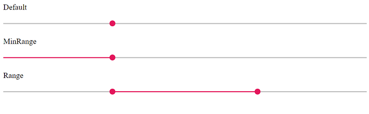
Customization
Orientation
The Range Slider can be displayed, either in horizontal or vertical orientation. By default, the Range Slider renders in horizontal orientation.
In the following example, orientation property set as Vertical in Range Slider component.
<template>
  <div id="app">
    <ejs-slider id='orientation' :value='value' :orientation="orientation"></ejs-slider>
  </div>
</template>

<script setup>
  import { SliderComponent as EjsSlider} from "@syncfusion/ej2-vue-inputs";

  const value = 30;
  const orientation = 'Vertical';
</script>

<style>
  @import "../node_modules/@syncfusion/ej2-base/styles/material.css";
  @import "../node_modules/@syncfusion/ej2-buttons/styles/material.css";
  @import "../node_modules/@syncfusion/ej2-popups/styles/material.css";
  @import "../node_modules/@syncfusion/ej2-vue-inputs/styles/material.css";
  #app {
    color: #008cff;
    height: 340px;
    width: 50%;
  }
</style><template>
<div id="app">
<ejs-slider id='orientation' :value='value' :orientation="orientation"></ejs-slider>
</div>
</template>
<script>
import { SliderComponent} from "@syncfusion/ej2-vue-inputs";
//Component registration
export default {
name: "App",
components: {
'ejs-slider': SliderComponent
},
data() {
return {
value: 30,
orientation: 'Vertical'
};
}
}
</script>
<style>
@import "../node_modules/@syncfusion/ej2-base/styles/material.css";
@import "../node_modules/@syncfusion/ej2-buttons/styles/material.css";
@import "../node_modules/@syncfusion/ej2-popups/styles/material.css";
@import "../node_modules/@syncfusion/ej2-vue-inputs/styles/material.css";
#app {
color: #008cff;
height: 340px;
width: 50%;
}
</style>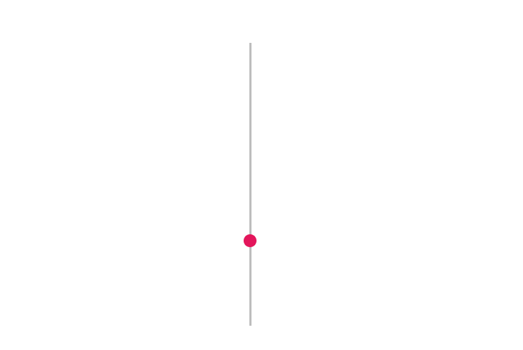
Tooltip
The Range Slider displays the tooltip to indicate the current value by clicking the Range Slider bar or drag the Range Slider handle. The Tooltip position can be customized by using the placement property. Also decides the tooltip display mode on a page, i.e., on hovering, focusing, or clicking on the Range Slider handle. Tooltip always remains/displays on the page.
In the following example, tooltip property is enabled in Range Slider component.
<template>
  <div id="app">
    <ejs-slider id='tooltip' :value='value' :tooltip="tooltip" :type="type"></ejs-slider>
  </div>
</template>

<script setup>
  import { SliderComponent as EjsSlider} from "@syncfusion/ej2-vue-inputs";

  const value = 30;
  const type = 'MinRange';
  const tooltip = { placement: 'After', isVisible: true, showOn: 'Always' };
</script>

<style>
  @import "../node_modules/@syncfusion/ej2-base/styles/material.css";
  @import "../node_modules/@syncfusion/ej2-buttons/styles/material.css";
  @import "../node_modules/@syncfusion/ej2-popups/styles/material.css";
  @import "../node_modules/@syncfusion/ej2-vue-inputs/styles/material.css";
  #app {
    color: #008cff;
    height: 40px;
    width: 50%;
  }
</style><template>
<div id="app">
<ejs-slider id='tooltip' :value='value' :tooltip="tooltip" :type="type"></ejs-slider>
</div>
</template>
<script>
import { SliderComponent} from "@syncfusion/ej2-vue-inputs";
//Component registration
export default {
name: "App",
components: {
'ejs-slider': SliderComponent
},
data() {
return {
value: 30,
type: 'MinRange',
tooltip: { placement: 'After', isVisible: true, showOn: 'Always' }
};
}
}
</script>
<style>
@import "../node_modules/@syncfusion/ej2-base/styles/material.css";
@import "../node_modules/@syncfusion/ej2-buttons/styles/material.css";
@import "../node_modules/@syncfusion/ej2-popups/styles/material.css";
@import "../node_modules/@syncfusion/ej2-vue-inputs/styles/material.css";
#app {
color: #008cff;
height: 40px;
width: 50%;
}
</style>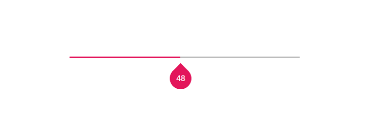
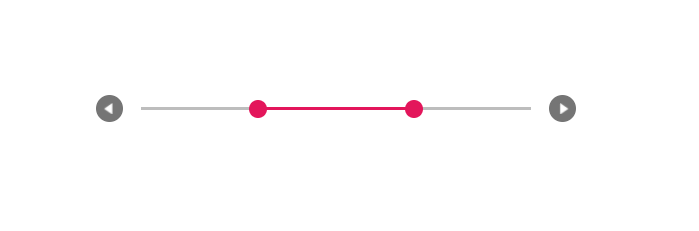
Buttons
The Range Slider value can be changed by using the Increase and Decrease buttons. In Range Range Slider, by default the first handle value will be changed while clicking the button. Change the handle focus and press the button to change the last focused handle value.
After enabling the Range Slider buttons if the ‘Tab’ key is pressed, the focus goes to the handle and not to the button.
In the following example, showButtons property is enabled in Range Slider component.
<template>
  <div id="app">
    <ejs-slider id='buttons' :value='value' :showButtons="showButtons" :type="type"></ejs-slider>
  </div>
</template>

<script setup>
  import { SliderComponent as EjsSlider} from "@syncfusion/ej2-vue-inputs";

  const value = [30, 70];
  const type = 'Range';
  const showButtons = true;
</script>

<style>
  @import "../node_modules/@syncfusion/ej2-base/styles/material.css";
  @import "../node_modules/@syncfusion/ej2-buttons/styles/material.css";
  @import "../node_modules/@syncfusion/ej2-popups/styles/material.css";
  @import "../node_modules/@syncfusion/ej2-vue-inputs/styles/material.css";
  #app {
    color: #008cff;
    height: 40px;
    width: 50%;
  }
</style><template>
<div id="app">
<ejs-slider id='buttons' :value='value' :showButtons="showButtons" :type="type"></ejs-slider>
</div>
</template>
<script>
import { SliderComponent} from "@syncfusion/ej2-vue-inputs";
//Component registration
export default {
name: "App",
components: {
'ejs-slider': SliderComponent
},
data() {
return {
value: [30, 70],
type: 'Range',
showButtons: true
};
}
}
</script>
<style>
@import "../node_modules/@syncfusion/ej2-base/styles/material.css";
@import "../node_modules/@syncfusion/ej2-buttons/styles/material.css";
@import "../node_modules/@syncfusion/ej2-popups/styles/material.css";
@import "../node_modules/@syncfusion/ej2-vue-inputs/styles/material.css";
#app {
color: #008cff;
height: 40px;
width: 50%;
}
</style>