Getting Started with the Vue Progress Bar Component in Vue 2
19 Feb 20266 minutes to read
This article provides a step-by-step guide for setting up a Vue 2 project using Vue-CLI and integrating the Syncfusion® Vue Progress Bar component.
Prerequisites
System requirements for Syncfusion® Vue UI components
Dependencies
Below is the list of minimum dependencies required to use the Progress Bar component.
  |-- @syncfusion/ej2-vue-progressbar
    |-- @syncfusion/ej2-base
    |-- @syncfusion/ej2-data
    |-- @syncfusion/ej2-svg-base
Setup the Vue 2 project
To generate a Vue 2 project using Vue-CLI, use the vue create command. Follow these steps to install Vue CLI and create a new project:
npm install -g @vue/cli
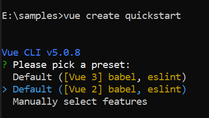
vue create quickstart
cd quickstart
npm run serveor
yarn global add @vue/cli
vue create quickstart
cd quickstart
yarn run serve
When creating a new project, choose the option Default ([Vue 2] babel, eslint) from the menu.
Once the quickstart project is set up with default settings, proceed to add Syncfusion® components to the project.
Add Syncfusion® Vue packages
Syncfusion® packages are available at npmjs.com. To use Vue components, install the required npm package.
This article uses the Vue Progress Bar component as an example. Install the @syncfusion/ej2-vue-progressbar package by running the following command:
npm install @syncfusion/ej2-vue-progressbar --saveor
yarn add @syncfusion/ej2-vue-progressbarThe –save option will instruct NPM to include the Progress Bar package inside of the
dependenciessection of thepackage.json.
Add Syncfusion® Vue component
Follow the below steps to add the Vue Progress Bar component:
1. First, import and register the Progress Bar component in the script section of the src/App.vue file.
<script setup>
import { ProgressBarComponent } from '@syncfusion/ej2-vue-progressbar';
</script><script>
import { ProgressBarComponent } from '@syncfusion/ej2-vue-progressbar';
export default {
name: "App",
components: {
'ejs-progressbar': ProgressBarComponent
}
}
</script>2. In the template section, define the Progress Bar component with the animation and value property.
<template>
  <div id="container">
    <ejs-progressbar
      id="percentage"
      type='Circular'
      :value='value'
      :animation="animation"
    >
    </ejs-progressbar>
  </div>
</template>
3. Declare the value for the animation and value properties in the script section.
<script setup>
const value = 100;
const animation = {
  enable: true,
  duration: 2000,
  delay: 0
};
</script><script>
export default {
data() {
return {
value: 100,
animation: {
enable: true,
duration: 2000,
delay: 0
}
};
}
}
</script>Here is the summarized code for the above steps in the src/App.vue file:
<template>
  <div id="container">
    <ejs-progressbar
      id="percentage"
      type='Circular'
      :value='value'
      :animation="animation"
    >
    </ejs-progressbar>
  </div>
</template>

<script setup>
import { ProgressBarComponent } from "@syncfusion/ej2-vue-progressbar";

const value = 100;
const animation = {
  enable: true,
  duration: 2000,
  delay: 0
};
</script>

<style>
#container {
  display: flex;
  justify-content: center;
  align-items: center;
  height: 100vh;
}
</style><template>
<div id="container">
<ejs-progressbar
id="percentage"
type='Circular'
:value='value'
:animation="animation"
>
</ejs-progressbar>
</div>
</template>
<script>
import { ProgressBarComponent } from "@syncfusion/ej2-vue-progressbar";
export default {
name: "App",
components: {
'ejs-progressbar': ProgressBarComponent
},
data() {
return {
value: 100,
animation: {
enable: true,
duration: 2000,
delay: 0
}
};
}
}
</script>
<style>
#container {
display: -webkit-box;
}
</style>Run the project
To run the project, use the following command:
npm run serveor
yarn run serveModule Injection
The Progress Bar component features are organized into individual feature-wise modules. To use specific features such as annotations, you must inject the corresponding feature service. Below is the available feature service:
-
ProgressAnnotation- Inject this service to enable annotations on the Progress Bar.
To inject the required module, add it to the provide section of your component as shown below:
import { ProgressBarComponent, ProgressAnnotationService } from "@syncfusion/ej2-vue-progressbar";

export default {
  components: {
    'ejs-progressbar': ProgressBarComponent
  },
  provide: {
    progressbar: [ProgressAnnotationService]
  }
};