Getting Started with the Vue Predefined Dialogs Component in Vue 2
13 Mar 202613 minutes to read
This article provides a step-by-step guide for setting up a Vue 2 project using Vue-CLI and integrating the Syncfusion® Vue Predefined Dialogs component.
Prerequisites
System requirements for Syncfusion® Vue UI components
Setup the Vue 2 project
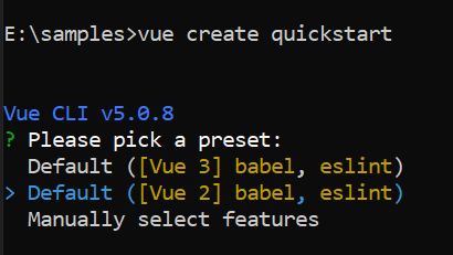
To generate a Vue 2 project using Vue-CLI, use the vue create command. Follow these steps to install Vue CLI and create a new project:
npm install -g @vue/cli
vue create quickstart
cd quickstart
npm run serve
or
yarn global add @vue/cli
vue create quickstart
cd quickstart
yarn run serve
When creating a new project, choose the option Default ([Vue 2] babel, eslint) from the menu.
Once the quickstart project is set up with default settings, proceed to add Syncfusion® components to the project.
Add Syncfusion® Vue packages
Syncfusion® packages are available at npmjs.com. To use Vue components, install the required npm package.
This article uses the Vue Predefined dialogs component as an example. Install the @syncfusion/ej2-vue-popups package by running the following command:
npm install @syncfusion/ej2-vue-popups --saveor
yarn add @syncfusion/ej2-vue-popupsImport Syncfusion® CSS styles
Syncfusion® components require CSS stylesheets to display correctly. You can import themes in various ways, such as using CSS or SASS styles from npm packages, CDN, CRG, and Theme Studio. Refer to themes topic to learn more about built-in themes and different ways to reference themes in a Vue project.
In this article, the Material3 theme is applied using CSS styles, which are available in installed packages. The necessary Material3 CSS styles for the Predefined Dialogs component and its dependents were imported into the <style> section of the src/App.vue file.
<style>
@import "../node_modules/@syncfusion/ej2-base/styles/material3.css";
@import "../node_modules/@syncfusion/ej2-vue-buttons/styles/material3.css";
@import "../node_modules/@syncfusion/ej2-vue-popups/styles/material3.css";
</style>
The order of CSS imports matters. Import base styles first, then component-specific styles. Missing CSS imports can result in misaligned layouts, buttons without styling, or missing visual elements in popups and dialogs.
Add Syncfusion® Vue component
Follow the below steps to add the Vue Predefined dialogs component:
1. First, import and register the Predefined dialogs component in the script section of the src/App.vue file.
<script>
import { DialogUtility } from "@syncfusion/ej2-vue-popups";
import { ButtonComponent } from "@syncfusion/ej2-vue-buttons";

export default {
  components: {
    'ejs-button': ButtonComponent
  }
}
</script>
2. In the template section, define the Predefined dialogs component.
<template>
  <div>
    <div class="predefinedDialogs">
      <ejs-button id="alertDlgBtn" v-on:click.native="alertBtnClick" cssClass="e-danger">Alert</ejs-button>
      <span id="statusText"></span>
    </div>
  </div>
</template>
Creating Vue sample
Add the following code to the App.vue file in src directory.
<template>
  <div>
    <div class="predefinedDialogs">
      <ejs-button id="alertDlgBtn" v-on:click.native="alertBtnClick" cssClass="e-danger">Alert</ejs-button>
      <span id="statusText"></span>
    </div>
  </div>
</template>

<style>
@import "../node_modules/@syncfusion/ej2-base/styles/material3.css";
@import "../node_modules/@syncfusion/ej2-vue-buttons/styles/material3.css";
@import "../node_modules/@syncfusion/ej2-vue-popups/styles/material3.css";
#statusText {
  font-size: 16px;
  margin-top: 20px;
}
.predefinedDialogs {
  height: 100%;
  min-height: 350px;
}
</style>

<script>
import { DialogUtility } from "@syncfusion/ej2-vue-popups";
import { ButtonComponent } from "@syncfusion/ej2-vue-buttons";

export default {
  components: {
    'ejs-button': ButtonComponent
  },
  data: function () {
    return {};
  },
  methods: {
    alertBtnClick: function () {
      document.getElementById("statusText").style.display = "none";
      DialogUtility.alert({
        title: "Low battery",
        content: "10% of battery remaining",
      });
    },
  },
}
</script>
Show alert dialog
An alert dialog box is used to display errors, warnings, and information alerts that require user awareness. This can be achieved by using the DialogUtility.alert method. The alert dialog is displayed along with the OK button. When the user clicks the OK button, the alert dialog closes.
In the below code example, alert dialog displayed on button click action.
Now run the npm run dev command in the console, it will build your application and open in the browser.
<template>
  <div class="predefinedDialogs">
    <ejs-button id="alertDlgBtn" v-on:click="alertBtnClick" cssClass="e-danger">Alert</ejs-button>
    <span id="statusText"></span>
  </div>
</template>

<script>
import { DialogUtility } from "@syncfusion/ej2-vue-popups";
import { ButtonComponent } from "@syncfusion/ej2-vue-buttons";

let dialogObj = undefined;
export default {
name: "App",
components: {
"ejs-button":ButtonComponent
},
  data: function () {
    return {};
  },
  methods: {
    alertBtnClick: function () {
      document.getElementById("statusText").style.display = "none";
      dialogObj = DialogUtility.alert({
        title: "Low battery",
        content: "10% of battery remaining",
        okButton: { click: this.alertOkAction },
        position: { X: "center", Y: "center" },
      });
    },
    alertOkAction: function () {
      dialogObj.hide();
      document.getElementById("statusText").innerHTML =
        "The user closed the Alert dialog.";
      document.getElementById("statusText").style.display = "block";
    },
  },
}
</script>
<style>
@import "../node_modules/@syncfusion/ej2-base/styles/material3.css";
@import "../node_modules/@syncfusion/ej2-vue-buttons/styles/material3.css";
@import "../node_modules/@syncfusion/ej2-vue-popups/styles/material3.css";
#statusText {
  font-size: 16px;
  margin-top: 20px;
}
.predefinedDialogs {
  height: 100%;
  min-height: 350px;
}
</style>Show confirm dialog
A confirm dialog box is used to display a specified message along with the OK and Cancel buttons. This can be achieved by using the DialogUtility.confirm method. It is used to get user approval and appears before critical actions. After the user approves, the dialog closes automatically.
In the below code example, the confirm dialog displayed on OK and Cancel button click action.
<template>
  <div class="predefinedDialogs">
    <ejs-button id="confirmDlgBtn" v-on:click="confirmBtnClick" cssClass="e-success">Confirm</ejs-button>
    <span id="statusText"></span>
  </div>
</template>

<script>
import { DialogUtility } from "@syncfusion/ej2-vue-popups";
import { ButtonComponent } from "@syncfusion/ej2-vue-buttons";

let dialogObj = undefined;
export default {
  name: "App",
  components: {
    "ejs-button": ButtonComponent
  },
  data: function () {
    return {};
  },
  methods: {
    confirmBtnClick: function () {
      document.getElementById("statusText").style.display = "none";
      dialogObj = DialogUtility.confirm({
        title: " Delete multiple items",
        content: "Are you sure you want to permanently delete these items?",
        okButton: { click: this.confirmOkAction },
        cancelButton: { click: this.confirmCancelAction },
      });
    },
    confirmOkAction: function () {
      dialogObj.hide();
      document.getElementById("statusText").innerHTML = "The user confirmed the dialog box";
      document.getElementById("statusText").style.display = "block";
    },
    confirmCancelAction: function () {
      dialogObj.hide();
      document.getElementById("statusText").innerHTML = "The user canceled the dialog box.";
      document.getElementById("statusText").style.display = "block";
    }
  },
}
</script>
<style>
@import "../node_modules/@syncfusion/ej2-base/styles/material3.css";
@import "../node_modules/@syncfusion/ej2-vue-buttons/styles/material3.css";
@import "../node_modules/@syncfusion/ej2-vue-popups/styles/material3.css";

#statusText {
  font-size: 16px;
  margin-top: 20px;
}

.predefinedDialogs {
  height: 100%;
  min-height: 350px;
}
</style>Show Prompt dialog
A prompt dialog is used to get input from the user. When the user clicks the OK button, the input value from the dialog is returned. If the user clicks the Cancel button, a null value is returned. After getting the input from the user, the dialog closes automatically.
In the below code example, the confirm dialog displayed on OK and Cancel button click action.
<template>
  <div class="predefinedDialogs">
    <ejs-button id="promptDlgBtn" v-on:click="promptBtnClick" :isPrimary="true">Prompt</ejs-button>
    <span id="statusText"></span>
  </div>
</template>
<script>
import { DialogUtility } from "@syncfusion/ej2-vue-popups";
import { ButtonComponent } from "@syncfusion/ej2-vue-buttons";

let dialogObj = undefined;
let value;
export default {
  name: "App",
  components: {
    "ejs-button": ButtonComponent
  },
  data: function () {
    return {};
  },
  methods: {
    promptBtnClick: function () {
      document.getElementById("statusText").style.display = "none";
      dialogObj = DialogUtility.confirm({
        title: "Join chat group",
        content: '<P>Enter your name:</p><input id= "inputEle" type="text" name="Required" class="e-input" placeholder="Type here.." />',
        okButton: { click: this.promptOkAction },
        cancelButton: { click: this.promptCancelAction },
        position: { X: 'center', Y: 'center' }
      });
    },
    promptOkAction: function () {
      value = document.getElementById("inputEle").value;
      if (value == "") {
        dialogObj.hide();
        document.getElementById("statusText").innerHTML = "The user's input is returned as\" \"";
        document.getElementById("statusText").style.display = "block";
      }
      else {
        dialogObj.hide();
        document.getElementById("statusText").innerHTML = "The user's input is returned as" + " " + value;
        document.getElementById("statusText").style.display = "block";
      }
    },
    promptCancelAction: function () {
      dialogObj.hide();
      document.getElementById("statusText").innerHTML = "The user canceled the prompt dialog";
      document.getElementById("statusText").style.display = "block";
    }
  },
}
</script>
<style>
@import "../node_modules/@syncfusion/ej2-base/styles/material3.css";
@import "../node_modules/@syncfusion/ej2-vue-buttons/styles/material3.css";
@import "../node_modules/@syncfusion/ej2-vue-popups/styles/material3.css";

#statusText {
  font-size: 16px;
  margin-top: 20px;
}

.predefinedDialogs {
  height: 100%;
  min-height: 350px;
}
</style>