Getting Started with the Vue Color picker Component in Vue 2
10 Feb 20267 minutes to read
This article provides a step-by-step guide for setting up a Vue 2 project using Vue-CLI and integrating the Syncfusion® Vue ColorPicker component.
Prerequisites
System requirements for Syncfusion® Vue UI components
Setting up the Vue 2 project
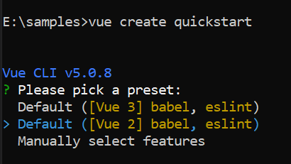
To generate a Vue 2 project using Vue-CLI, use the vue create command. Follow these steps to install Vue CLI and create a new project:
npm install -g @vue/cli
vue create quickstart
cd quickstart
npm run serve
or
yarn global add @vue/cli
vue create quickstart
cd quickstart
yarn run serve
When creating a new project, choose the option Default ([Vue 2] babel, eslint) from the menu.
Once the quickstart project is set up with default settings, proceed to add Syncfusion® components to the project.
Add Syncfusion® Vue packages
Syncfusion® packages are available at npmjs.com. To use Vue components, install the required npm package.
This article uses the Vue Color picker component as an example. Install the @syncfusion/ej2-vue-inputs package by running the following command:
npm install @syncfusion/ej2-vue-inputs --saveor
yarn add @syncfusion/ej2-vue-inputsImport Syncfusion® CSS styles
Syncfusion® components require CSS stylesheets to display correctly. You can import themes in various ways, such as using CSS or SASS styles from npm packages, CDN, CRG, and Theme Studio. Refer to themes topic to learn more about built-in themes and different ways to reference themes in a Vue project.
In this article, the Material3 theme is applied using CSS styles, which are available in installed packages. The necessary Material3 CSS styles for the ColorPicker component and its dependents were imported into the <style> section of the src/App.vue file.
<style>
 @import '../node_modules/@syncfusion/ej2-base/styles/material.css';
 @import '../node_modules/@syncfusion/ej2-buttons/styles/material.css';
 @import '../node_modules/@syncfusion/ej2-popups/styles/material.css';
 @import '../node_modules/@syncfusion/ej2-splitbuttons/styles/material.css';
 @import '../node_modules/@syncfusion/ej2-inputs/styles/material.css';
</style>
The order of CSS imports matters. Import base styles first, then component-specific styles. Missing CSS imports can result in misaligned layouts, buttons without styling, or missing visual elements in popups and dialogs.
Add Syncfusion® Vue component
Follow the below steps to add the Vue ColorPicker component:
1. First, import and register the ColorPicker component in the script section of the src/App.vue file.
<script setup>
import { ColorPickerComponent as EjsColorpicker } from '@syncfusion/ej2-vue-inputs';
</script><script>
import { ColorPickerComponent } from '@syncfusion/ej2-vue-inputs';
export default {
name: "App",
components: {
"ejs-colorpicker':":ColorPickerComponent
}
}
</script>2. In the template section, define the Color picker component.
<template>
<div class='wrap'>
    <h4>Choose Color</h4>
    <ejs-colorpicker></ejs-colorpicker>
</div>
</template>
Here is the summarized code for the above steps in the src/App.vue file:
<template>
<div class='wrap'>
    <h4>Choose Color</h4>
    <ejs-colorpicker></ejs-colorpicker>
</div>
</template>

<script setup>
import { ColorPickerComponent as EjsColorpicker } from '@syncfusion/ej2-vue-inputs';
import { enableRipple } from '@syncfusion/ej2-base';

enableRipple(true);

</script>

<style>
@import '../node_modules/@syncfusion/ej2-base/styles/material.css';
@import '../node_modules/@syncfusion/ej2-buttons/styles/material.css';
@import '../node_modules/@syncfusion/ej2-popups/styles/material.css';
@import '../node_modules/@syncfusion/ej2-splitbuttons/styles/material.css';
@import '../node_modules/@syncfusion/ej2-inputs/styles/material.css';

.wrap {
  margin: 0 auto;
  width: 300px;
  text-align: center;
}
</style><template>
<div class='wrap'>
<h4>Choose Color</h4>
<ejs-colorpicker></ejs-colorpicker>
</div>
</template>
<script>
import { ColorPickerComponent } from '@syncfusion/ej2-vue-inputs';
import { enableRipple } from '@syncfusion/ej2-base';
enableRipple(true);
export default {
name: "App",
components: {
"ejs-colorpicker": ColorPickerComponent
}
}
</script>
<style>
@import '../node_modules/@syncfusion/ej2-base/styles/material.css';
@import '../node_modules/@syncfusion/ej2-buttons/styles/material.css';
@import '../node_modules/@syncfusion/ej2-popups/styles/material.css';
@import '../node_modules/@syncfusion/ej2-splitbuttons/styles/material.css';
@import '../node_modules/@syncfusion/ej2-inputs/styles/material.css';
.wrap {
margin: 0 auto;
width: 300px;
text-align: center;
}
</style>Run the project
To run the project, use the following command:
npm run serveor
yarn run serveInline type
By default, the ColorPicker will be rendered using SplitButton and open the pop-up to access the ColorPicker. To render the ColorPicker container alone and to access it directly, render it as inline. It can be achieved by setting the inline property to true.
The following sample shows the inline type rendering of ColorPicker.
<template>
  <div class='wrap'>
    <h4>Choose Color</h4>
    <ejs-colorpicker :inline="true" :showButtons="false"></ejs-colorpicker>
  </div>
</template>

<script setup>
import { ColorPickerComponent as EjsColorpicker} from '@syncfusion/ej2-vue-inputs';
import { enableRipple } from '@syncfusion/ej2-base';

enableRipple(true);

</script>

<style>
@import '../node_modules/@syncfusion/ej2-base/styles/material.css';
@import '../node_modules/@syncfusion/ej2-buttons/styles/material.css';
@import '../node_modules/@syncfusion/ej2-popups/styles/material.css';
@import '../node_modules/@syncfusion/ej2-splitbuttons/styles/material.css';
@import '../node_modules/@syncfusion/ej2-inputs/styles/material.css';

.wrap {
  margin: 0 auto;
  width: 300px;
  text-align: center;
}
</style><template>
<div class='wrap'>
<h4>Choose Color</h4>
<ejs-colorpicker :inline="true" :showButtons="false"></ejs-colorpicker>
</div>
</template>
<script>
import { ColorPickerComponent } from '@syncfusion/ej2-vue-inputs';
import { enableRipple } from '@syncfusion/ej2-base';
enableRipple(true);
export default {
name: "App",
components: {
"ejs-colorpicker": ColorPickerComponent
}
}
</script>
<style>
@import '../node_modules/@syncfusion/ej2-base/styles/material.css';
@import '../node_modules/@syncfusion/ej2-buttons/styles/material.css';
@import '../node_modules/@syncfusion/ej2-popups/styles/material.css';
@import '../node_modules/@syncfusion/ej2-splitbuttons/styles/material.css';
@import '../node_modules/@syncfusion/ej2-inputs/styles/material.css';
.wrap {
margin: 0 auto;
width: 300px;
text-align: center;
}
</style>The
showButtonsproperty is disabled in this sample because the control buttons are not needed for inline type. To know about the control buttons functionality, refer to theshowButtonssample.