How can I help you?
Getting Started with the Vue Card Component in Vue 2
5 Mar 20266 minutes to read
This article provides a step-by-step guide for setting up a Vue 2 project using Vue-CLI and integrating the Syncfusion® Vue Card component using the Composition API / Options API.
To get start quickly with Vue Card component, you can check on this video:
Prerequisites
System requirements for Syncfusion® Vue UI components
Dependencies
The Card is pure CSS component so no other package dependencies are needed to render the Card.
|-- @syncfusion/ej2-layoutsSetting up the Vue 2 project
To generate a Vue 2 project using Vue-CLI, use the vue create command. Follow these steps to install Vue CLI and create a new project:
npm install -g @vue/cli
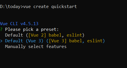
vue create quickstart
cd quickstart
npm run serveor
yarn global add @vue/cli
vue create quickstart
cd quickstart
yarn run serve
When creating a new project, choose the option Default ([Vue 2] babel, eslint) from the menu.
Once the quickstart project is set up with default settings, proceed to add Syncfusion® components to the project.
Adding Syncfusion® packages
Syncfusion® packages are available at npmjs.com. To use Vue components, install the required npm package.
This article uses the Vue card component as an example. Install the @syncfusion/ej2-vue-layouts package by running the following command:
npm install @syncfusion/ej2-vue-layouts –saveor
yarn add @syncfusion/ej2-vue-layoutsImport Syncfusion® CSS styles
You can import themes for the Syncfusion® Vue component in various ways, such as using CSS or SASS styles from npm packages, CDN, CRG and Theme Studio. Refer to themes topic to know more about built-in themes and different ways to refer to themes in a Vue project.
In this article, the Material3 theme is applied using CSS styles, which are available in installed packages. The necessary Material3 CSS styles for the Card component and its dependents were imported into the <style> section of src/App.vue file.
<style>
@import '../node_modules/@syncfusion/ej2-base/styles/material3.css';
@import '../node_modules/@syncfusion/ej2-vue-layouts/styles/material3.css';
</style>
Creating Vue Sample
Add the HTML div element with e-card class into the <template> section of the App.vue file in src directory.
<template>
    <div id="app">
     <div class = "e-card">
          Sample Card
        </div>
  </div>
</template>
Adding a header and content
You can create Card with a header in a specific structure. For adding header you need to create a div element with e-card-header class added.
- You can include heading inside the Card header by adding a
divelement withe-card-header-captionclass, and also content will be added by adding element withe-card-content. For detailed information, refer to the Header and Content.
<div class = "e-card">                    --> Root Element
    <div class="e-card-header">           --> Root Header Element
        <div class="e-card-header-caption">    --> Root Heading Element
            <div class="e-card-header-title"></div>   --> Heading Title Element
        </div>
        <div class="e-card-content"></div>         --> Card content Element
    </div>
</div>
Here is the summarized code for the above steps in the src/App.vue file:
<template>
  <div id="app">
    <div id='container' style="margin:50px auto 0; width:100%;">
        <br>
          <div tabindex="0" class="e-card" id="basic">
            <div class="e-card-header">
                <div class="e-card-header-caption">
                    <div class="e-card-title">Advanced UWP</div>
                </div>
            </div>
            <div class="e-card-content">
                Communicating with Windows 10 and Other Apps, the second in a five-part series written by Succinctly series
                author Matteo Pagani. To download the complete white paper, and other papers in the series, visit
                the White Paper section of Syncfusion’s Technology Resource Portal.
            </div>
        </div>
    </div>
  </div>
</template>

<style>
  @import "../node_modules/@syncfusion/ej2-base/styles/material3.css";
  @import "../node_modules/@syncfusion/ej2-vue-layouts/styles/material3.css";
</style>
Running the Project
To run the project, use the following command:
npm run serveor
yarn run serve