Getting Started with React Slider component
10 Feb 202624 minutes to read
This section explains the steps required to create a simple React Slider component and demonstrate its basic usage in a React environment.
Ready to streamline your Syncfusion® React development? Discover the full potential of Syncfusion® React components with Syncfusion® AI Coding Assistant. Effortlessly integrate, configure, and enhance your projects with intelligent, context-aware code suggestions, streamlined setups, and real-time insights—all seamlessly integrated into your preferred AI-powered IDEs like VS Code, Cursor, Syncfusion® CodeStudio and more. Explore Syncfusion® AI Coding Assistant.
To get started quickly with React Slider, you can watch this video:
Setup for local development
Easily set up a React application using create-vite-app, which provides a faster development environment, smaller bundle sizes, and optimized builds compared to traditional tools like create-react-app. For detailed steps, refer to the Vite installation instructions. Vite sets up your environment using JavaScript and optimizes your application for production.
Note: To create a React application using
create-react-app, refer to this documentation for more details.
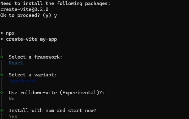
To create a new React application, run the following command.
npm create vite@latest my-appThis command will prompt you for a few settings for the new project, such as selecting a framework and a variant.
To set up a React application in TypeScript environment, run the following command.
npm create vite@latest my-app -- --template react-ts
cd my-app
npm run dev
To set up a React application in JavaScript environment, run the following command.
npm create vite@latest my-app -- --template react
cd my-app
npm run dev
Adding Syncfusion® Slider packages
All the available Essential® JS 2 packages are published in the npmjs.com public registry.
To install the Slider component, use the following command
npm install @syncfusion/ej2-react-inputs --saveThe –save will instruct NPM to include the Slider package inside of the dependencies section of the package.json.
Adding CSS reference
The following CSS files are available in the ../node_modules/@syncfusion package folder. Add these as references in src/App.css.
@import "../node_modules/@syncfusion/ej2-base/styles/tailwind3.css";
@import "../node_modules/@syncfusion/ej2-buttons/styles/tailwind3.css";
@import "../node_modules/@syncfusion/ej2-popups/styles/tailwind3.css";
@import "../node_modules/@syncfusion/ej2-react-inputs/styles/tailwind3.css";
To refer App.css in the application then import it in the src/App.tsx file.
Adding Slider component
The React Slider component can be added to the application by following these steps. To get started, add the Slider component to the src/App.tsx file using the following code.
The following slider code should be placed in the src/App.tsx file.
import * as React from 'react';
import { SliderComponent } from '@syncfusion/ej2-react-inputs';
import './App.css';

function App() {
  return (
    <div id='container'>
      <div className='wrap'>
        <SliderComponent id='slider' value={30} />
      </div>
    </div>
  );
}
export default App;
Add the following CSS to your project’s stylesheet:
.wrap {
  box-sizing: border-box;
  height: 100px;
  margin: 0 auto;
  padding: 30px 10px;
  width: 460px;
}
Run the Application
Run the npm run dev command in the console to start the development server. This command compiles your code and serves the application locally, opening it in the browser.
npm run dev
import * as React from 'react';
import * as ReactDOM from "react-dom";
import { SliderComponent } from '@syncfusion/ej2-react-inputs';
function App() {
    return (<div id='container'>
            <div className='wrap'>
                <div className="sliderwrap">
                    <SliderComponent id='default' value={30}/>
                </div>
            </div>
        </div>);
}
export default App;
ReactDOM.render(<App />, document.getElementById('element'));
import * as React from 'react';
import * as ReactDOM from "react-dom";
import { SliderComponent } from '@syncfusion/ej2-react-inputs';
function App() {
return (
<div id='container'>
<div className='wrap'>
<div className="sliderwrap">
<SliderComponent id='default' value={30} />
</div>
</div>
</div>
);
}
export default App;
ReactDOM.render(<App />, document.getElementById('element'));.sliderwrap {
margin-top: 20px;
}
.sliderwrap label {
font-size: 13px;
font-weight: 100;
margin-top: 15px;
padding-bottom: 15px;
}
.wrap {
box-sizing: border-box;
height: 100px;
margin: 0 auto;
padding: 30px 10px;
width: 460px;
}
.wrap .label {
text-align: center;
}
.labeltext {
text-align: center;
}<!DOCTYPE html>
<html lang="en">
<head>
<title>Syncfusion React ListView</title>
<meta charset="utf-8" />
<meta name="viewport" content="width=device-width, initial-scale=1.0" />
<meta name="description" content="Essential JS 2 for React Components" />
<meta name="author" content="Syncfusion" />
<link href="https://cdn.syncfusion.com/ej2/34.1.29/ej2-base/styles/tailwind3.css" rel="stylesheet" />
<link href="https://cdn.syncfusion.com/ej2/34.1.29/ej2-react-inputs/styles/tailwind3.css" rel="stylesheet" />
<link href="https://cdn.syncfusion.com/ej2/34.1.29/ej2-react-popups/styles/tailwind3.css" rel="stylesheet" />
<link href="https://cdn.syncfusion.com/ej2/34.1.29/ej2-react-buttons/styles/tailwind3.css" rel="stylesheet" />
<link href="index.css" rel="stylesheet" />
<script src="https://cdnjs.cloudflare.com/ajax/libs/systemjs/0.19.38/system.js"></script>
<script src="systemjs.config.js"></script>
</head>
<body>
<div id='element'>
</div>
</body>
</html>Types
Slider supports the following types:
| Types | Usage |
|---|---|
| Default | Shows a default Slider to select a single value. |
| MinRange | Displays the shadow from the start value to the current selected value. |
| Range | Selects a range of values. It also displays the shadow in-between the selection range. |
Both Default and MinRange types select a single value. In MinRange, the selection shadow spans from the start value to the current handle position. The Range type uses two handles to select a range of values, and the shadow spans between the two handles.
import * as React from 'react';
import * as ReactDOM from "react-dom";
import { SliderComponent } from '@syncfusion/ej2-react-inputs';
function App() {
    return (<div id='container'>
            <div className='wrap'>
                <div className="sliderwrap">
                    <div className="labeltext">Default</div>
                    <SliderComponent id='default' value={30}/>
                </div>
                <div className="sliderwrap">
                    <div className="labeltext">MinRange</div>
                    <SliderComponent id='minrange' type='MinRange' value={30}/>
                </div>
                <div className="sliderwrap">
                    <div className="labeltext">Range</div>
                    <SliderComponent id='range' type='Range' value={[30, 70]}/>
                </div>
            </div>
        </div>);
}
export default App;
ReactDOM.render(<App />, document.getElementById('element'));
import * as React from 'react';
import * as ReactDOM from "react-dom";
import { SliderComponent } from '@syncfusion/ej2-react-inputs';
function App() {
return (
<div id='container'>
<div className='wrap'>
<div className="sliderwrap">
<div className="labeltext">Default</div>
<SliderComponent id='default' value={30}/>
</div>
<div className="sliderwrap">
<div className="labeltext">MinRange</div>
<SliderComponent id='minrange' type='MinRange' value={30} />
</div>
<div className="sliderwrap">
<div className="labeltext">Range</div>
<SliderComponent id='range' type='Range' value={[30, 70]} />
</div>
</div>
</div>
);
}
export default App;
ReactDOM.render(<App />, document.getElementById('element'));.sliderwrap {
margin-top: 20px;
}
.sliderwrap label {
font-size: 13px;
font-weight: 100;
margin-top: 15px;
padding-bottom: 15px;
}
.wrap {
box-sizing: border-box;
height: 100px;
margin: 0 auto;
padding: 30px 10px;
width: 460px;
}
.wrap .label {
text-align: center;
}
.labeltext {
text-align: center;
}<!DOCTYPE html>
<html lang="en">
<head>
<title>Syncfusion React ListView</title>
<meta charset="utf-8" />
<meta name="viewport" content="width=device-width, initial-scale=1.0" />
<meta name="description" content="Essential JS 2 for React Components" />
<meta name="author" content="Syncfusion" />
<link href="https://cdn.syncfusion.com/ej2/34.1.29/ej2-base/styles/tailwind3.css" rel="stylesheet" />
<link href="https://cdn.syncfusion.com/ej2/34.1.29/ej2-react-inputs/styles/tailwind3.css" rel="stylesheet" />
<link href="https://cdn.syncfusion.com/ej2/34.1.29/ej2-react-popups/styles/tailwind3.css" rel="stylesheet" />
<link href="https://cdn.syncfusion.com/ej2/34.1.29/ej2-react-buttons/styles/tailwind3.css" rel="stylesheet" />
<link href="index.css" rel="stylesheet" />
<script src="https://cdnjs.cloudflare.com/ajax/libs/systemjs/0.19.38/system.js"></script>
<script src="systemjs.config.js"></script>
</head>
<body>
<div id='element'>
</div>
</body>
</html>Customization
Orientation
The Slider can be displayed either in horizontal or vertical orientation using the orientation property. By default, the Slider renders in horizontal orientation.
import * as React from 'react';
import * as ReactDOM from "react-dom";
import { SliderComponent } from '@syncfusion/ej2-react-inputs';
import './index.css';
function App() {
    return (<div id='container'>
            <div className='wrap'>
                <SliderComponent id='slider' orientation='Vertical' value={30}/>
            </div>
        </div>);
}
export default App;
ReactDOM.render(<App />, document.getElementById('element'));
import * as React from 'react';
import * as ReactDOM from "react-dom";
import { SliderComponent } from '@syncfusion/ej2-react-inputs';
function App() {
return (
<div id='container'>
<div className='wrap'>
<SliderComponent id='slider' orientation='Vertical' value={30} />
</div>
</div>
);
}
export default App;
ReactDOM.render(<App />, document.getElementById('element'));.wrap {
box-sizing: border-box;
height: 260px;
margin: 0 auto;
padding: 30px 10px;
width: 260px;
}
.sliderwrap {
margin-top: 20px;
}
.sliderwrap label {
font-size: 13px;
font-weight: 100;
margin-top: 15px;
padding-bottom: 15px;
}<!DOCTYPE html>
<html lang="en">
<head>
<title>Syncfusion React ListView</title>
<meta charset="utf-8" />
<meta name="viewport" content="width=device-width, initial-scale=1.0" />
<meta name="description" content="Essential JS 2 for React Components" />
<meta name="author" content="Syncfusion" />
<link href="https://cdn.syncfusion.com/ej2/34.1.29/ej2-base/styles/tailwind3.css" rel="stylesheet" />
<link href="https://cdn.syncfusion.com/ej2/34.1.29/ej2-react-inputs/styles/tailwind3.css" rel="stylesheet" />
<link href="https://cdn.syncfusion.com/ej2/34.1.29/ej2-react-popups/styles/tailwind3.css" rel="stylesheet" />
<link href="https://cdn.syncfusion.com/ej2/34.1.29/ej2-react-buttons/styles/tailwind3.css" rel="stylesheet" />
<link href="index.css" rel="stylesheet" />
<script src="https://cdnjs.cloudflare.com/ajax/libs/systemjs/0.19.38/system.js"></script>
<script src="systemjs.config.js"></script>
</head>
<body>
<div id='element'>
</div>
</body>
</html>Tooltip
The Slider displays a tooltip to indicate the current value when clicking the Slider bar or dragging the Slider handle. The tooltip position can be customized using the placement property.
It also controls the tooltip display mode on the page (hover, focus, or click) and whether it remains visible.
import * as React from 'react';
import * as ReactDOM from "react-dom";
import { SliderComponent } from '@syncfusion/ej2-react-inputs';
function App() {
    let tooltip = { placement: 'After', isVisible: true, showOn: 'Always' };
    return (<div id='container'>
            <div className='wrap'>
                <SliderComponent id='slider' type="MinRange" tooltip={tooltip} value={30}/>
            </div>
        </div>);
}
export default App;
ReactDOM.render(<App />, document.getElementById('element'));
import * as React from 'react';
import * as ReactDOM from "react-dom";
import { SliderComponent } from '@syncfusion/ej2-react-inputs';
function App() {
let tooltip: Object = { placement: 'After', isVisible: true, showOn: 'Always' };
return (
<div id='container'>
<div className='wrap'>
<SliderComponent id='slider' type="MinRange" tooltip={tooltip} value={30} />
</div>
</div>
);
}
export default App;
ReactDOM.render(<App />, document.getElementById('element'));Buttons
Change the Slider value using the showButtons property to increase and decrease the values. In a Range Slider, the first handle value changes by default when clicking the buttons. Change the handle focus and press the button to change the last focused handle value.
After enabling the Slider buttons, if the Tab key is pressed, the focus moves to the handle and not to the buttons.
import * as React from 'react';
import * as ReactDOM from "react-dom";
import { SliderComponent } from '@syncfusion/ej2-react-inputs';
function App() {
    return (<div id='container'>
            <div className='wrap'>
                <SliderComponent id='slider' showButtons={true} type='Range' value={[30, 70]}/>
            </div>
        </div>);
}
export default App;
ReactDOM.render(<App />, document.getElementById('element'));
import * as React from 'react';
import * as ReactDOM from "react-dom";
import { SliderComponent } from '@syncfusion/ej2-react-inputs';
function App() {
return (
<div id='container'>
<div className='wrap'>
<SliderComponent id='slider' showButtons={true} type='Range' value={[30, 70]} />
</div>
</div>
);
}
export default App;
ReactDOM.render(<App />, document.getElementById('element'));.sliderwrap {
margin-top: 20px;
}
.sliderwrap label {
font-size: 13px;
font-weight: 100;
margin-top: 15px;
padding-bottom: 15px;
}
.wrap {
box-sizing: border-box;
height: 100px;
margin: 0 auto;
padding: 30px 10px;
width: 460px;
}
.wrap .label {
text-align: center;
}
.labeltext {
text-align: center;
}<!DOCTYPE html>
<html lang="en">
<head>
<title>Syncfusion React ListView</title>
<meta charset="utf-8" />
<meta name="viewport" content="width=device-width, initial-scale=1.0" />
<meta name="description" content="Essential JS 2 for React Components" />
<meta name="author" content="Syncfusion" />
<link href="https://cdn.syncfusion.com/ej2/34.1.29/ej2-base/styles/tailwind3.css" rel="stylesheet" />
<link href="https://cdn.syncfusion.com/ej2/34.1.29/ej2-react-inputs/styles/tailwind3.css" rel="stylesheet" />
<link href="https://cdn.syncfusion.com/ej2/34.1.29/ej2-react-popups/styles/tailwind3.css" rel="stylesheet" />
<link href="https://cdn.syncfusion.com/ej2/34.1.29/ej2-react-buttons/styles/tailwind3.css" rel="stylesheet" />
<link href="index.css" rel="stylesheet" />
<script src="https://cdnjs.cloudflare.com/ajax/libs/systemjs/0.19.38/system.js"></script>
<script src="systemjs.config.js"></script>
</head>
<body>
<div id='element'>
</div>
</body>
</html>Refer to the React Slider feature tour page for its groundbreaking feature representations. You can also explore our React Slider component example that shows how to render the Slider in React.