Ticks
30 Jan 20252 minutes to read
The Ticks in Slider supports you to easily identify the current value/values of the Slider. It contains smallStep and largeStep. The value of the major ticks alone will be displayed in the slider. In order to enable/disable the small ticks, use the showSmallTicks property.
@using Syncfusion.EJ2
@using Syncfusion.EJ2.Inputs

@Html.EJS().Slider("default")
     .Value("30")
     .Ticks( new SliderTicksData { Placement = Placement.After, LargeStep = 20, SmallStep = 10, ShowSmallTicks = true })
     .Tooltip(new SliderTooltipData { IsVisible = true, Placement = TooltipPlacement.Before, ShowOn = TooltipShowOn.Always }).Render()
public ActionResult Ticks()
{
return View();
}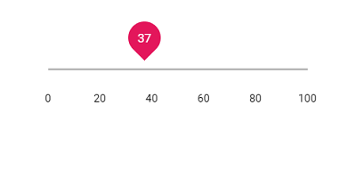
Step
When the Slider is moved, it increases/decreases the value based on the step value. By default, the value is increased/decreased by 1. Use the step property to change the increment step value.
@using Syncfusion.EJ2
@using Syncfusion.EJ2.Inputs

@Html.EJS().Slider("default")
     .Value("30")
     .Step(10)
     .Ticks( new SliderTicksData { Placement = Placement.After, LargeStep = 20, SmallStep = 10, ShowSmallTicks = true })
     .Tooltip(new SliderTooltipData { IsVisible = true, Placement = TooltipPlacement.Before, ShowOn = TooltipShowOn.Always }).Render()
public ActionResult Step()
{
return View();
}
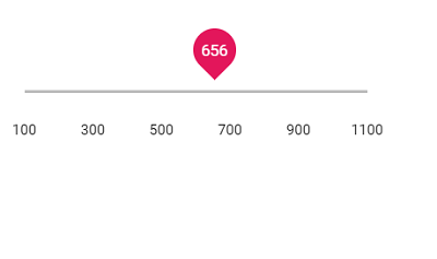
Min and Max
Enables the minimum/starting and maximum/ending value of the Slider, by using the min and max property. By default, the minimum value is 1 and maximum value is 100. In the following sample the slider is rendered with the min value as 100 and max value as 1000.
@using Syncfusion.EJ2
@using Syncfusion.EJ2.Inputs

@Html.EJS().Slider("default")
     .Min(100)
     .Max(1100)
     .Value("300")
     .Tooltip(new SliderTooltipData { IsVisible = true, ShowOn = TooltipShowOn.Always, Placement = TooltipPlacement.Before })
     .Ticks(new SliderTicksData { Placement = Placement.After, LargeStep = 200, SmallStep = 100, ShowSmallTicks = true }).Render()
public ActionResult MiniMax()
{
return View();
}