How can I help you?
Appearance in ASP.NET MVC OTP Input control
13 Jun 20242 minutes to read
You can also customize the appearance of OTP Input control.
Setting input length
You can specify the length of OTP by using the Length property. The default value is 4.
@using Syncfusion.EJ2.Inputs

<div id='container' style="width: 350px;">
    @Html.EJS().OtpInput("otpInput").Length(5).Render()
</div>
public ActionResult Default()
{
return View();
}
Disable inputs
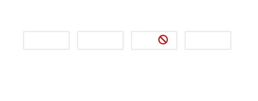
You can disable the OTP Input control by using the Disabled property. By default the value is false.
@using Syncfusion.EJ2.Inputs

<div id='container' style="width: 350px;">
    @Html.EJS().OtpInput("otpInput").Disabled(true).Render()
</div>
public ActionResult Default()
{
return View();
}
CssClass
You can customize the appearance of the OTP Input control, such as by changing its colors, fonts, sizes or other visual aspects by using the CssClass property.
The OTP input control supports the following predefined styles that can be defined using the cssClass property. You can customize by replacing the cssClass property with the below defined class names.
| cssClass | Description |
|---|---|
e-success |
Used to represent a positive action. |
e-warning |
Used to represent an action with caution. |
e-error |
Used to represent a negative action. |
@using Syncfusion.EJ2.Inputs

<div id='container' style="width: 350px;">
    @Html.EJS().OtpInput("otpInput").CssClass("e-success").Render()
</div>
public ActionResult Default()
{
return View();
}