Column chooser in ASP.NET MVC Grid component
13 Jul 202624 minutes to read
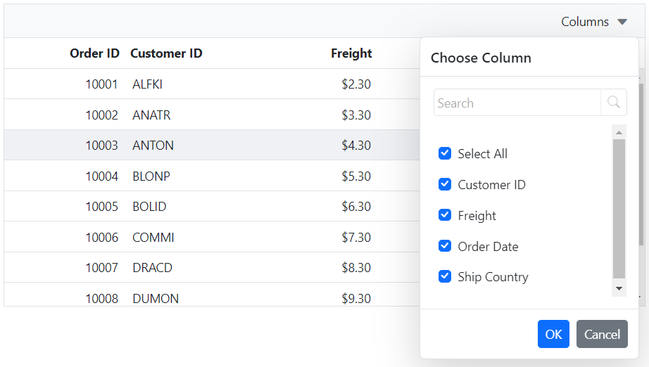
The column chooser feature in the Syncfusion® ASP.NET MVC Grid component allows you to dynamically show or hide columns. This feature can be enabled by defining the ShowColumnChooser property as true.
@Html.EJS().Grid("Grid").DataSource((IEnumerable<object>)ViewBag.DataSource).Height("270px").ShowColumnChooser(true).Columns(col =>
{
    col.Field("OrderID").HeaderText("Order ID").Width("120").TextAlign(Syncfusion.EJ2.Grids.TextAlign.Right).Add();
    col.Field("CustomerID").HeaderText("Customer ID").Width("130").Add();
    col.Field("Freight").HeaderText("Freight").Width("120").Format("C").TextAlign(Syncfusion.EJ2.Grids.TextAlign.Right).Add();
    col.Field("OrderDate").HeaderText("Order Date").Width("130").Format("yMd").TextAlign(Syncfusion.EJ2.Grids.TextAlign.Right).Add();
    col.Field("ShipCountry").HeaderText("Ship Country").Width("120").Add();
}).Toolbar(new List<string>() { "ColumnChooser" }).Render()
public IActionResult Index()
{
var Order = OrdersDetails.GetAllRecords();
ViewBag.DataSource = Order;
return View();
}
The column chooser dialog displays the header text of each column by default. If the header text is not defined for a column, the corresponding column field name is displayed instead.
Column chooser modes
The Grid column chooser supports two modes, Default and Immediate. In Default mode, column visibility changes are applied only after clicking the “OK” button in the column chooser dialog. In Immediate mode, column visibility changes are applied automatically when columns are checked or unchecked through the checkboxes in the column chooser.
The following example enables immediate mode by setting the columnChooserSettings.mode property to Immediate:
@Html.EJS().Grid("Grid").DataSource((IEnumerable<object>)ViewBag.DataSource).Height("270px").ShowColumnChooser(true).ColumnChooserSettings(columnChooser => { columnChooser.Mode(Syncfusion.EJ2.Grids.ColumnChooserMode.Immediate); }).Columns(col =>
{
    col.Field("OrderID").HeaderText("Order ID").Width("120").ShowInColumnChooser(false).TextAlign(Syncfusion.EJ2.Grids.TextAlign.Right).Add();
    col.Field("CustomerID").HeaderText("Customer ID").Width("130").Add();
    col.Field("Freight").HeaderText("Freight").Width("120").Format("C").TextAlign(Syncfusion.EJ2.Grids.TextAlign.Right).Add();
    col.Field("OrderDate").HeaderText("Order Date").Width("130").Format("yMd").TextAlign(Syncfusion.EJ2.Grids.TextAlign.Right).Add();
    col.Field("ShipCountry").HeaderText("Ship Country").Width("120").Add();
}).Toolbar(new List<string>() { "ColumnChooser" }).Render()
public IActionResult Index()
{
var Order = OrdersDetails.GetAllRecords();
ViewBag.DataSource = Order;
return View();
}The
columnChooserSettings.immediateModeDelayproperty can be used to control how quickly visibility changes are applied in immediate mode. This property specifies the delay interval, in milliseconds, before the update is executed. The default value is0, which applies changes immediately.
Hide column in column chooser dialog
You can hide the column names in column chooser by defining the Columns.ShowInColumnChooser as false. This feature is useful when working with a large number of columns or when you want to limit the number of columns that are available for selection in the column chooser dialog.
In this example, the Columns.ShowInColumnChooser property is set to false for the Order ID column. As a result, the Order ID column will not be displayed in the column chooser dialog.
@Html.EJS().Grid("Grid").DataSource((IEnumerable<object>)ViewBag.DataSource).Height("270px").ShowColumnChooser(true).Columns(col =>
{
    col.Field("OrderID").HeaderText("Order ID").Width("120").ShowInColumnChooser(false).TextAlign(Syncfusion.EJ2.Grids.TextAlign.Right).Add();
    col.Field("CustomerID").HeaderText("Customer ID").Width("130").Add();
    col.Field("Freight").HeaderText("Freight").Width("120").Format("C").TextAlign(Syncfusion.EJ2.Grids.TextAlign.Right).Add();
    col.Field("OrderDate").HeaderText("Order Date").Width("130").Format("yMd").TextAlign(Syncfusion.EJ2.Grids.TextAlign.Right).Add();
    col.Field("ShipCountry").HeaderText("Ship Country").Width("120").Add();
}).Toolbar(new List<string>() { "ColumnChooser" }).Render()
public IActionResult Index()
{
var Order = OrdersDetails.GetAllRecords();
ViewBag.DataSource = Order;
return View();
}
The
Columns.ShowInColumnChooserproperty is applied to each column element individually. By setting it to false, you can hide specific columns from the column chooser dialog.
Open column chooser by externally
The Syncfusion® ASP.NET MVC Grid provides the flexibility to open the column chooser dialog on a web page using an external button. By default, the column chooser button is displayed in the right corner of the grid component, and clicking the button opens the column chooser dialog below it. However, you can programmatically open the column chooser dialog at specific X and Y axis positions by using the openColumnChooser method.
Here’s an example of how to open the column chooser in the Grid using an external button:
<div style="padding:0px 0px 20px 0px">
    @Html.EJS().Button("show").CssClass("e-primary").Content("open Column Chooser").Render()
</div>
@Html.EJS().Grid("Grid").DataSource((IEnumerable<object>)ViewBag.DataSource).ShowColumnChooser(true).Columns(col =>
{
    col.Field("OrderID").HeaderText("Order ID").Width("120").TextAlign(Syncfusion.EJ2.Grids.TextAlign.Right).Add();
    col.Field("CustomerID").HeaderText("Customer ID").Width("130").Add();
    col.Field("Freight").HeaderText("Freight").Width("120").Format("C").TextAlign(Syncfusion.EJ2.Grids.TextAlign.Right).Add();
    col.Field("OrderDate").HeaderText("Order Date").Width("130").Format("yMd").TextAlign(Syncfusion.EJ2.Grids.TextAlign.Right).Add();
    col.Field("ShipCountry").HeaderText("Ship Country").Width("120").Add();
}).Render()
<script>
    document.getElementById('show').addEventListener('click', () => {
        var gridObj = document.getElementById("Grid").ej2_instances[0];
        gridObj.columnChooserModule.openColumnChooser(100, 40);
    });
</script>
public IActionResult Index()
{
var Order = OrdersDetails.GetAllRecords();
ViewBag.DataSource = Order;
return View();
}
Customize column chooser dialog size
The column chooser dialog in Syncfusion® ASP.NET MVC Grid comes with default size, but you can modify its height and width as per your specific needs using CSS styles.
To customize the column chooser dialog size, you can use the following CSS styles:
.e-grid .e-dialog.e-ccdlg {
    height: 500px;
    width: 200px;
}
.e-grid .e-ccdlg .e-cc-contentdiv {
    height: 200px;
    width: 230px;
}@Html.EJS().Grid("Grid").DataSource((IEnumerable<object>)ViewBag.DataSource).ShowColumnChooser(true).Columns(col =>
{
col.Field("OrderID").HeaderText("Order ID").Width("120").TextAlign(Syncfusion.EJ2.Grids.TextAlign.Right).Add();
col.Field("CustomerID").HeaderText("Customer ID").Width("130").Add();
col.Field("Freight").HeaderText("Freight").Width("120").Format("C").TextAlign(Syncfusion.EJ2.Grids.TextAlign.Right).Add();
col.Field("OrderDate").HeaderText("Order Date").Width("130").Format("yMd").TextAlign(Syncfusion.EJ2.Grids.TextAlign.Right).Add();
col.Field("ShipCountry").HeaderText("Ship Country").Width("120").Add();
}).Toolbar(new List<string>() { "ColumnChooser" }).Render()
<style>
.e-grid .e-dialog.e-ccdlg {
height: 500px;
width: 200px;
}
.e-grid .e-ccdlg .e-cc-contentdiv {
height: 200px;
width: 230px;
}
</style>public IActionResult Index()
{
var Order = OrdersDetails.GetAllRecords();
ViewBag.DataSource = Order;
return View();
}
Customizing the order of columns in the column chooser
The Syncfusion ASP.NET MVC Grid makes it easy to customize the order of columns in the column chooser, without affecting their actual order in the Grid.
By default, the column chooser displayed columns in the same order as they appeared in the Grid. With the introduction of customization options, the column list in the chooser can now be rearranged.
Sorting columns in the column chooser
The Syncfusion Grid allows to sort the list of columns displayed in the column chooser dialog.
You can control the sorting behavior by specifying the SortDirection in the event argument of the BeforeOpenColumnChooser event. The available sorting options are:
| Option | Description |
|---|---|
| None | No sorting is applied to the column list. |
| Ascending | Columns are sorted in ascending alphabetical order (A → Z). |
| Descending | Columns are sorted in descending alphabetical order (Z → A). |
Here is an example of how to sort the column chooser list based on sort direction:
@Html.EJS().Grid("Grid").DataSource((IEnumerable<object>)ViewBag.DataSource).ShowColumnChooser(true).Toolbar(new List<string> { "ColumnChooser" }).Height("235").Columns(col =>
{
    col.Field("OrderID").HeaderText("Order ID").Width("120").IsPrimaryKey(true).TextAlign(Syncfusion.EJ2.Grids.TextAlign.Right).Add();
    col.Field("CustomerID").HeaderText("Customer Name").Width("150").TextAlign(Syncfusion.EJ2.Grids.TextAlign.Left).Add();
    col.Field("OrderDate").HeaderText("Order Date").Width("130").Format("yMd").TextAlign(Syncfusion.EJ2.Grids.TextAlign.Right).Add();
    col.Field("Freight").HeaderText("Freight").Width("120").Format("C2").TextAlign(Syncfusion.EJ2.Grids.TextAlign.Right).Add();
    col.Field("ShipCity").HeaderText("Ship City").Width("150").ShowInColumnChooser(false).Add();
    col.Field("ShipRegion").HeaderText("Ship Region").Width("150").Visible(false).Add();
    col.Field("ShipCountry").HeaderText("Ship Country").Width("150").Add();
}).BeforeOpenColumnChooser("onBeforeOpenColumnChooser").Render()

< script >
	// Sort the column chooser list based on the sort direction.
    function onBeforeOpenColumnChooser(args) {
        args.sortDirection = "Ascending";
    }
</script>
public IActionResult Index()
{
var Order = OrdersDetails.GetAllRecords();
ViewBag.DataSource = Order;
return View();
}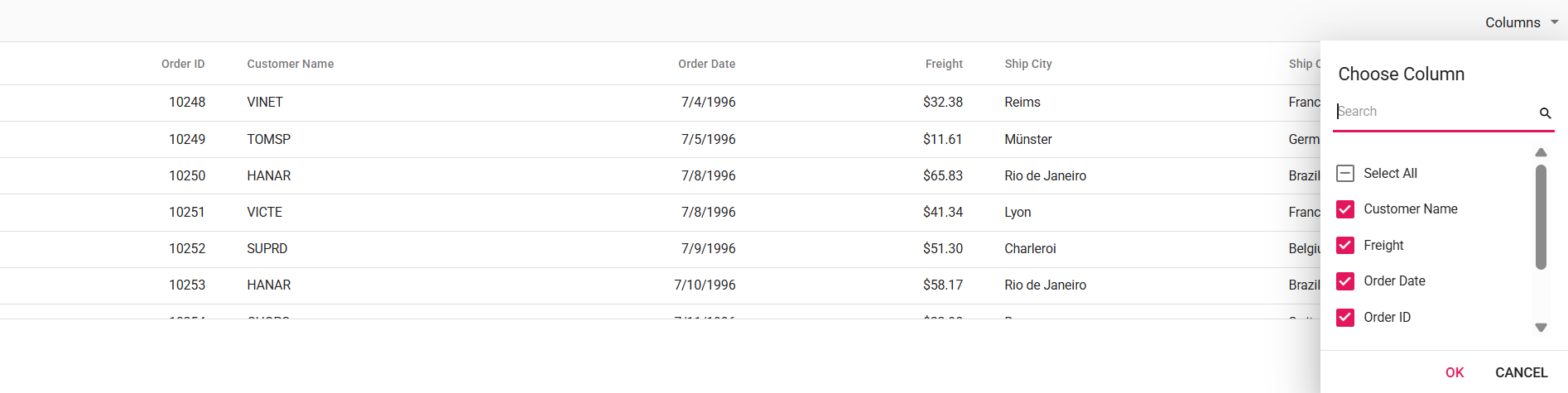
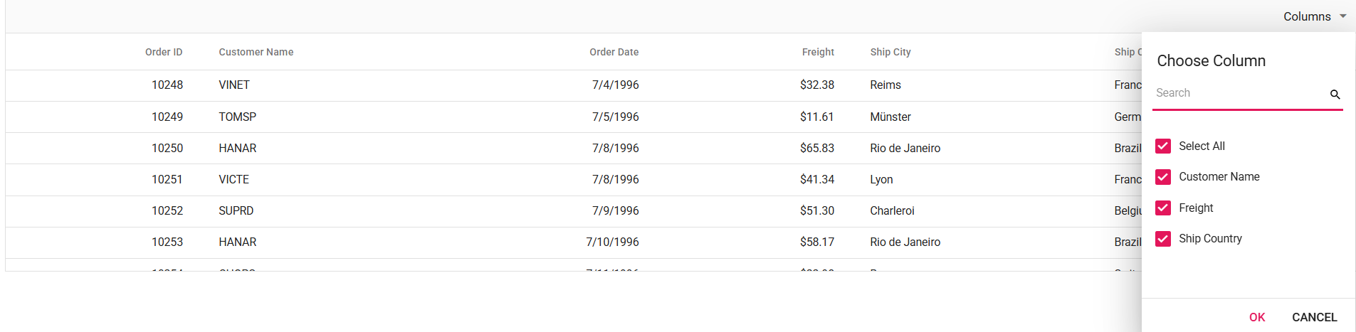
Displaying specific columns in the column chooser
The Grid also supports displaying only selected columns in the column chooser. This is helpful when only specific columns need to be shown in the column chooser, making it easier to focus on the most important ones.
To achieve this, you can specify which columns should appear in the column chooser by setting SelectedColumns in the event argument of the BeforeOpenColumnChooser event.
Here is an example of how to show only specific columns in the column chooser:
@Html.EJS().Grid("Grid").DataSource((IEnumerable<object>)ViewBag.DataSource).ShowColumnChooser(true).Toolbar(new List<string> { "ColumnChooser" }).Height("235").Columns(col =>
{
  col.Field("OrderID").HeaderText("Order ID").Width("120").IsPrimaryKey(true).TextAlign(Syncfusion.EJ2.Grids.TextAlign.Right).Add();
  col.Field("CustomerID").HeaderText("Customer Name").Width("150").TextAlign(Syncfusion.EJ2.Grids.TextAlign.Left).Add();
  col.Field("OrderDate").HeaderText("Order Date").Width("130").Format("yMd").TextAlign(Syncfusion.EJ2.Grids.TextAlign.Right).Add();
  col.Field("Freight").HeaderText("Freight").Width("120").Format("C2").TextAlign(Syncfusion.EJ2.Grids.TextAlign.Right).Add();
  col.Field("ShipCity").HeaderText("Ship City").Width("150").ShowInColumnChooser(false).Add();
  col.Field("ShipRegion").HeaderText("Ship Region").Width("150").Visible(false).Add();
  col.Field("ShipCountry").HeaderText("Ship Country").Width("150").Add();
}).BeforeOpenColumnChooser("onBeforeOpenColumnChooser").Render()

< script >
    // Show only specific columns in the column chooser.
    function onBeforeOpenColumnChooser(args) {
         args.selectedColumns = ["CustomerID", "Freight", "ShipCountry"];
    }
</script>
public IActionResult Index()
{
var Order = OrdersDetails.GetAllRecords();
ViewBag.DataSource = Order;
return View();
}
Change default search operator of the column chooser
The column chooser dialog in the Syncfusion® ASP.NET MVC Grid provides a search box that allows you to search for column names. By default, the search functionality uses the “startsWith” operator to match columns and display the results in the column chooser dialog. However, there might be cases where you need to change the default search operator to achieve more precise data matching.
To change the default search operator of the column chooser in Syncfusion® Grid, you need to use the Operator property of the columnChooserSettings.
Here’s an example of how to change the default search operator of the column chooser to contains in the ASP.NET MVC Grid:
@Html.EJS().Grid("Grid").DataSource((IEnumerable<object>)ViewBag.DataSource).ShowColumnChooser(true).Columns(col =>
{
    col.Field("OrderID").HeaderText("Order ID").Width("120").TextAlign(Syncfusion.EJ2.Grids.TextAlign.Right).Add();
    col.Field("CustomerID").HeaderText("Customer ID").Width("130").Add();
    col.Field("Freight").HeaderText("Freight").Width("120").Format("C").TextAlign(Syncfusion.EJ2.Grids.TextAlign.Right).Add();
    col.Field("OrderDate").HeaderText("Order Date").Width("130").Format("yMd").TextAlign(Syncfusion.EJ2.Grids.TextAlign.Right).Add();
    col.Field("ShipCountry").HeaderText("Ship Country").Width("120").Add();
}).Toolbar(new List<string>() { "ColumnChooser" }).ColumnChooserSettings(choose=> { choose.Operator("Contains"); }).Render()
public IActionResult Index()
{
var Order = OrdersDetails.GetAllRecords();
ViewBag.DataSource = Order;
return View();
}
Diacritics searching in column chooser
By default, the grid ignores diacritic characters when performing a search in the column chooser. However, in some cases, you may want to include diacritic characters in the search. To enable this behavior, you can set the ColumnChooserSettings.IgnoreAccent property to true.
Here is an example that demonstrates the usage of the IgnoreAccent property to include diacritic characters for searching in the column chooser:
@Html.EJS().Grid("Grid").DataSource((IEnumerable<object>)ViewBag.DataSource).ShowColumnChooser(true).Columns(col =>
{
    col.Field("ÒrderID̂").HeaderText("Òrder ID̂").Width("120").TextAlign(Syncfusion.EJ2.Grids.TextAlign.Right).Add();
    col.Field("CustomerID").HeaderText("Customer ID").Width("130").Add();
    col.Field("F̂reight").HeaderText("F̂reight").Width("120").Format("C").TextAlign(Syncfusion.EJ2.Grids.TextAlign.Right).Add();
    col.Field("OrderDate").HeaderText("Order Date").Width("130").Format("yMd").TextAlign(Syncfusion.EJ2.Grids.TextAlign.Right).Add();
    col.Field("ShipCountry").HeaderText("Ship Country").Width("120").Add();
}).Toolbar(new List<string>() { "ColumnChooser" }).ColumnChooserSettings(choose => { choose.IgnoreAccent(true); }).Render()
public IActionResult Index()
{
var Order = OrdersDetails.GetAllRecords();
ViewBag.DataSource = Order;
return View();
}Column Chooser Template in Syncfusion® ASP.NET MVC Grid
The Column Chooser Template feature allows full customization of the column chooser’s header, content, and footer, making it easier to manage column visibility. To enable the column chooser, set ShowColumnChooser to true and add ColumnChooser to the Toolbar property.
To implement a custom column chooser template in the Grid, use the following properties:
-
ColumnChooserSettings.HeaderTemplate - Defines the header template of the column chooser.
-
ColumnChooserSettings.Template- Defines the content template.
-
ColumnChooserSettings.FooterTemplate - Defines the footer template.
-
ColumnChooserSettings.RenderCustomColumnChooser - Allows you to override the default column chooser UI with a fully customized layout.
In this example, a Syncfusion TreeView component is rendered inside the column chooser. To use the TreeView component, install the Syncfusion TreeView package as described in the documentation. The ColumnChooserSettings.Template property defines a element with the id set to tree-view-list, providing as a container for the TreeView component. The ColumnChooserSettings.RenderCustomColumnChooser method initializes the TreeView with checkboxes and appends it to this template. Checkbox selection is handled using the NodeClicked and KeyPress events, which organize columns into Order Details, Shipping Details, and Delivery Status.
The column chooser footer is customized using ColumnChooserSettings.FooterTemplate, replacing the default buttons with customized Apply and Close buttons. The Apply button updates column visibility based on selection, while the Close button closes the column chooser via the onClick event. Additionally, the header is customized using ColumnChooserSettings.HeaderTemplate to include a title and an icon.
@Html.EJS().Grid("Grid").DataSource((IEnumerable<object>)ViewBag.StackedHeaderData).Columns(col =>
{
    col.Field("CustomerID").HeaderText("Customer ID").Width("160").MinWidth("100").TextAlign(Syncfusion.EJ2.Grids.TextAlign.Right).IsPrimaryKey(true).ShowInColumnChooser(false).Add();
    col.Field("CustomerName").HeaderText("Name").Width("100").MinWidth("100").Add();
    col.HeaderText("Order Details").TextAlign(Syncfusion.EJ2.Grids.TextAlign.Center).Columns(new List<Syncfusion.EJ2.Grids.GridColumn>() {
    new Syncfusion.EJ2.Grids.GridColumn { Field = "OrderID", Width = "90", HeaderText = "ID", TextAlign=Syncfusion.EJ2.Grids.TextAlign.Right},
    new Syncfusion.EJ2.Grids.GridColumn { Field = "OrderDate", Width = "110", TextAlign=Syncfusion.EJ2.Grids.TextAlign.Right, Format="yMd", HeaderText = "Date" } }).Add();
    col.HeaderText("Shipping Details").TextAlign(Syncfusion.EJ2.Grids.TextAlign.Center).Columns(new List<Syncfusion.EJ2.Grids.GridColumn>() {
    new Syncfusion.EJ2.Grids.GridColumn { Field = "ShipCountry", Width = "115",  HeaderText = "Country" },
    new Syncfusion.EJ2.Grids.GridColumn { Field = "Freight", Width = "130", HeaderText = "Charges",TextAlign=Syncfusion.EJ2.Grids.TextAlign.Right, Format="C2"}}).Add();
    col.HeaderText("Delivery Details").TextAlign(Syncfusion.EJ2.Grids.TextAlign.Center).Columns(new List<Syncfusion.EJ2.Grids.GridColumn>() {
    new Syncfusion.EJ2.Grids.GridColumn { Field = "Status", Width = "110", HeaderText = "Status", TextAlign=Syncfusion.EJ2.Grids.TextAlign.Center}}).Add();
}).AllowPaging().ShowColumnChooser(true).ColumnChooserSettings(new Syncfusion.EJ2.Grids.GridColumnChooserSettings { Template = "#column-chooser-template", HeaderTemplate = "#ccHeadertemplate", FooterTemplate = "#ccFootertemplate", RenderCustomColumnChooser = "renderCustomColumnChooser" }).Created("onCreated").Toolbar(new List<string>() { "ColumnChooser" }).Render()
<script id='ccHeadertemplate' type="text/x-template">
    <div>
        <span class="e-icons e-columns" id="column-chooser-icon"></span>
        <span id="column-chooser-text">Column Options</span>
    </div>
</script>
<script type="text/x-template" id="column-chooser-template">
    <div id="tree-view-list" ></div>
</script>
<script id='ccFootertemplate' type="text/x-template">
    <div id="columnChooserFooter">
        <button id="submitButton">Apply</button>
        <button id="abortButton">Close</button>
    </div>
</script>
<script type="text/javascript">
    var treeObj;
    var treeData = [];
    function renderCustomColumnChooser(targetLHTMLElement, columns) {
        var grid = document.getElementById("Grid").ej2_instances[0];
        var parentNodes = [
            { id: 1, name: 'Order Details', hasChild: true, expanded: true },
            { id: 2, name: 'Shipping Details', hasChild: true, expanded: true },
            { id: 3, name: 'Delivery Status', hasChild: true, expanded: true },
        ];
        if (columns && columns.length) {
            treeData = columns.map(function (column) {
                var parentId;
                switch (column.field) {
                    case 'OrderID':
                    case 'OrderDate':
                        parentId = 1;
                        break;
                    case 'ShipCountry':
                    case 'Freight':
                        parentId = 2;
                        break;
                    case 'Status':
                        parentId = 3;
                        break;
                }
                return {
                    id: column.uid,
                    name: column.headerText,
                    pid: parentId,
                    isChecked: column.visible
                };
            });
            var uniquePids = [];
            treeData.forEach(function (item) {
                if (uniquePids.indexOf(item.pid) === -1) {
                    uniquePids.push(item.pid);
                }
            });
            var filteredParents = parentNodes.filter(function (parent) {
                return uniquePids.indexOf(parent.id) !== -1;
            });
            treeData = treeData.concat(filteredParents);
        } else {
            treeData = [];
        }
        treeObj = new ej.navigations.TreeView({
            fields: { dataSource: treeData, id: 'id', parentID: 'pid', text: 'name', hasChildren: 'hasChild' },
            showCheckBox: true,
            nodeClicked: nodeCheck,
            keyPress: nodeCheck,
            enableRtl: grid.enableRtl ? true : false,
            cssClass: "no-border"
        });
        if (columns && columns.length) {
            treeObj.appendTo(targetLHTMLElement);
        } else {
            var noRecordDiv = document.createElement('div');
            noRecordDiv.innerHTML = 'No Matches Found';
            noRecordDiv.className = 'no-record-text';
            targetLHTMLElement.appendChild(noRecordDiv);
        }
    }

    function nodeCheck(args) {
        var checkedNode = [args.node];
        if (args.event.target.classList.contains('e-fullrow') || args.event.key == "Enter") {
            var getNodeDetails = treeObj.getNode(args.node);
            if (getNodeDetails.isChecked == 'true') {
                treeObj.uncheckAll(checkedNode);
            } else {
                treeObj.checkAll(checkedNode);
            }
        }
    }

    function onCreated() {
        var submitButton = new ej.buttons.Button();
        submitButton.appendTo('#submitButton');
        if (document.getElementById('submitButton')) {
            document.getElementById('submitButton').onclick = function () {
                columnChooserSubmit();
            };
        }
        var abortButton = new ej.buttons.Button();
        abortButton.appendTo('#abortButton');
        if (document.getElementById('abortButton')) {
            document.getElementById('abortButton').onclick = function () {
                var grid = document.getElementById("Grid").ej2_instances[0];
                grid.columnChooserModule.hideDialog();
            };
        }
    }
    function columnChooserSubmit() {
        var checkedElements = [];
        var uncheckedElements = [];
        var grid = document.getElementById("Grid").ej2_instances[0];
        var showColumns = grid.getVisibleColumns().filter(function (column) { return (column.showInColumnChooser === true); });
        showColumns = showColumns.map(function (col) { return col.headerText; });
        var treeItems = document.querySelectorAll('.e-list-item');
        treeItems.forEach(function (item) {
            var itemDetails = treeObj.getNode(item);
            if (!itemDetails.hasChildren) {
                if (item.getAttribute('aria-checked') === 'true') {
                    checkedElements.push(itemDetails.text);
                } else {
                    uncheckedElements.push(itemDetails.text);
                }
            }
        });
        showColumns = showColumns.filter(function (col) {
            return !uncheckedElements.includes(col);
        });
        checkedElements.forEach(function (item) {
            if (!showColumns.includes(item)) {
                showColumns.push(item);
            }
        });
        var columnsToUpdate = { visibleColumns: showColumns, hiddenColumns: uncheckedElements };
        grid.columnChooserModule.changeColumnVisibility(columnsToUpdate);
    }
</script>
public IActionResult Index()
{
ViewBag.StackedHeaderData = OrdersDetails.GetAllRecords();
return View();
}Enable and disable search option
By default, the search option in the column chooser allows filtering specific columns from the Grid’s column list.
The search option is enabled by default in the column chooser. However, you can disable it by setting the columnChooserSettings.enableSearching property to false.
The following example demonstrates how to enable or disable the search option dynamically using a Switch and its change event in the Grid.
<div style="padding-bottom: 20px; display: flex">
   <label style="margin-right:5px;font-weight: bold;">Enable and disable search option</label>
   @Html.EJS().Switch("switch").Checked(true).Change("onSwitchChange").Render()
</div>
@Html.EJS().Grid("Grid").DataSource((IEnumerable<object>)ViewBag.DataSource).ShowColumnChooser(true).Columns(col =>
{
    col.Field("ÒrderID̂").HeaderText("Òrder ID̂").Width("120").TextAlign(Syncfusion.EJ2.Grids.TextAlign.Right).Add();
    col.Field("CustomerID").HeaderText("Customer ID").Width("130").Add();
    col.Field("F̂reight").HeaderText("F̂reight").Width("120").Format("C").TextAlign(Syncfusion.EJ2.Grids.TextAlign.Right).Add();
    col.Field("OrderDate").HeaderText("Order Date").Width("130").Format("yMd").TextAlign(Syncfusion.EJ2.Grids.TextAlign.Right).Add();
    col.Field("ShipCountry").HeaderText("Ship Country").Width("120").Add();
}).Toolbar(new List<string>() { "ColumnChooser" }).ColumnChooserSettings(choose => { choose.IgnoreAccent(true); }).Render()
<script>
    function onSwitchChange(args)
    {
      var grid = document.getElementById("grid").ej2_instances[0];
        grid.columnChooserSettings.enableSearching = args.checked;
    }
</script>
public IActionResult Index()
{
var Order = OrdersDetails.GetAllRecords();
ViewBag.DataSource = Order;
return View();
}