Navigators and Indicators
11 Jul 202324 minutes to read
The navigators and indicators are used to transition the slides manually.
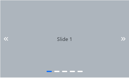
Navigators
Show or hide previous and next button
In navigators, the previous and next slide transition buttons are used to perform slide transitions manually. You can show/hide the navigators using the ButtonsVisibility property. The possible property values are as follows:
-
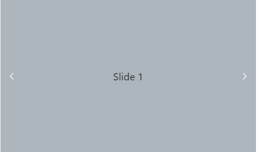
Hidden– the navigator’s buttons are not visible. -
Visible– the navigator’s buttons are visible. -
VisibleOnHover– the navigator’s buttons are visible only when hovering over the carousel.
The following example depicts the code to hide the navigators in the carousel.
@using Syncfusion.EJ2.Navigations;

<div class="container">
    <div class="control-container">
        @(Html.EJS().Carousel("defaultCarousel").ButtonsVisibility(CarouselButtonVisibility.Hidden).Items(new List<CarouselItem> {
                    new CarouselItem { Template = "<div class='slide-content'>Slide 1</div>"  },
                    new CarouselItem { Template = "<div class='slide-content'>Slide 2</div>" },
                    new CarouselItem { Template = "<div class='slide-content'>Slide 3</div>" },
                    new CarouselItem { Template = "<div class='slide-content'>Slide 4</div>"  },
                    new CarouselItem { Template = "<div class='slide-content'>Slide 5</div>"  }
                })
                .Render()
            )
    </div>
</div>

<style>
    .control-container {
        background-color: #adb5bd;
        height: 300px;
        margin: 0 auto;
        width: 500px;
    }

    .e-carousel .slide-content {
        align-items: center;
        display: flex;
        font-size: 1.25rem;
        height: 100%;
        justify-content: center;
    }
</style>
public ActionResult Index()
{
return View();
}
Show previous and next button on hover
In the carousel, you can show the previous and next buttons only on mouse hover using the ButtonsVisibility property. The following example depicts the code to show the navigators on mouse hover in the carousel.
@using Syncfusion.EJ2.Navigations;

<div class="container">
    <div class="control-container">
        @(Html.EJS().Carousel("defaultCarousel").ButtonsVisibility(CarouselButtonVisibility.VisibleOnHover).Items(new List<CarouselItem> {
                    new CarouselItem { Template = "<div class='slide-content'>Slide 1</div>"  },
                    new CarouselItem { Template = "<div class='slide-content'>Slide 2</div>" },
                    new CarouselItem { Template = "<div class='slide-content'>Slide 3</div>" },
                    new CarouselItem { Template = "<div class='slide-content'>Slide 4</div>"  },
                    new CarouselItem { Template = "<div class='slide-content'>Slide 5</div>"  }
                })
                .Render()
            )
    </div>
</div>

<style>
    .control-container {
        background-color: #adb5bd;
        height: 300px;
        margin: 0 auto;
        width: 500px;
    }

    .e-carousel .slide-content {
        align-items: center;
        display: flex;
        font-size: 1.25rem;
        height: 100%;
        justify-content: center;
    }
</style>
public ActionResult Index()
{
return View();
}
Previous and next button template
Template options are provided to customize the previous button using PreviousButtonTemplate and the next button using NextButtonTemplate. The following example depicts the code for applying the template to previous and next buttons in the carousel.
@using Syncfusion.EJ2.Navigations;

<div class="container">
    <div class="control-container">
        @(Html.EJS().Carousel("defaultCarousel")
            .PreviousButtonTemplate("<button id='previous'></button>")
            .NextButtonTemplate("<button id='next'></button>")
            .Items(new List<CarouselItem> {
                    new CarouselItem { Template = "<div class='slide-content'>Slide 1</div>"  },
                    new CarouselItem { Template = "<div class='slide-content'>Slide 2</div>" },
                    new CarouselItem { Template = "<div class='slide-content'>Slide 3</div>" },
                    new CarouselItem { Template = "<div class='slide-content'>Slide 4</div>"  },
                    new CarouselItem { Template = "<div class='slide-content'>Slide 5</div>"  }
                })
                .Render()
            )
    </div>
</div>
<script type="text/javascript">
    document.addEventListener('DOMContentLoaded', function () {
        var prevBtn = new ej.buttons.Button({ cssClass: 'e-flat e-round', iconCss: 'e-icons e-chevron-left-double' });
        prevBtn.appendTo('#previous');
        var nextBtn = new ej.buttons.Button({ cssClass: 'e-flat e-round', iconCss: 'e-icons e-chevron-right-double' });
        nextBtn.appendTo('#next');
    });
</script>
<style>
    .control-container {
        background-color: #adb5bd;
        height: 300px;
        margin: 0 auto;
        width: 500px;
    }

    .e-carousel .slide-content {
        align-items: center;
        display: flex;
        font-size: 1.25rem;
        height: 100%;
        justify-content: center;
    }
</style>
using System;
using System.Collections.Generic;
using System.Linq;
using System.Threading.Tasks;
using Microsoft.AspNetCore.Mvc;
namespace EJ2CoreSampleBrowser.Controllers
{
public partial class AccordionController : Controller
{
// GET: //
public IActionResult DefaultFunctionalities()
{
return View();
}
public ActionResult PartialView1()
{
return PartialView();
}
public ActionResult PartialView2()
{
return PartialView();
}
}
}
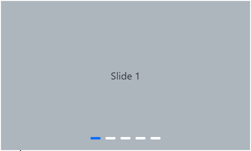
Indicators
Show or hide indicators
In indicators, the total slides and current slide state have been depicted. You can show/hide the indicators using the ShowIndicators property. The following example depicts the code to hide the indicators in the carousel.
@using Syncfusion.EJ2.Navigations;

<div class="container">
    <div class="control-container">
        @(Html.EJS().Carousel("defaultCarousel").ShowIndicators(false).Items(new List<CarouselItem> {
                    new CarouselItem { Template = "<div class='slide-content'>Slide 1</div>"  },
                    new CarouselItem { Template = "<div class='slide-content'>Slide 2</div>" },
                    new CarouselItem { Template = "<div class='slide-content'>Slide 3</div>" },
                    new CarouselItem { Template = "<div class='slide-content'>Slide 4</div>"  },
                    new CarouselItem { Template = "<div class='slide-content'>Slide 5</div>"  }
                })
                .Render()
            )
    </div>
</div>

<style>
    .control-container {
        background-color: #adb5bd;
        height: 300px;
        margin: 0 auto;
        width: 500px;
    }

    .e-carousel .slide-content {
        align-items: center;
        display: flex;
        font-size: 1.25rem;
        height: 100%;
        justify-content: center;
    }
</style>
public ActionResult Index()
{
return View();
}
Indicators template
Template option is provided to customize the indicators by using the IndicatorsTemplate property. The following example depicts the code for applying a template to indicators in the carousel.
@using Syncfusion.EJ2.Navigations;

<div class="container">
    <div class="control-container">
        @(Html.EJS().Carousel("defaultCarousel")
            .IndicatorsTemplate("<div class='indicator' indicator-index='${index}'></div>")
            .Items(new List<CarouselItem> {
                    new CarouselItem { Template = "<div class='slide-content'>Slide 1</div>"  },
                    new CarouselItem { Template = "<div class='slide-content'>Slide 2</div>" },
                    new CarouselItem { Template = "<div class='slide-content'>Slide 3</div>" },
                    new CarouselItem { Template = "<div class='slide-content'>Slide 4</div>"  },
                    new CarouselItem { Template = "<div class='slide-content'>Slide 5</div>"  }
                })
                .Render()
            )
    </div>
</div>

<style>
    .control-container {
        background-color: #adb5bd;
        height: 300px;
        margin: 0 auto;
        width: 500px;
    }

    .e-carousel .slide-content {
        align-items: center;
        display: flex;
        font-size: 1.25rem;
        height: 100%;
        justify-content: center;
    }

    .e-carousel .e-carousel-indicators .e-indicator-bars .e-indicator-bar.e-template .indicator {
        background-color: #ececec;
        border-radius: 0.25rem;
        cursor: pointer;
        height: 0.5rem;
        margin: 0.5rem;
        width: 1.5rem;
    }

    .e-carousel .e-carousel-indicators .e-indicator-bars .e-indicator-bar.e-active .indicator {
        background-color: #3c78ef;
    }
</style>
public ActionResult Index()
{
return View();
}
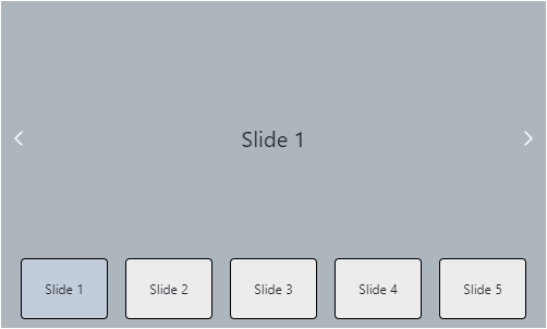
Showing preview of slide in indicator
You can customize the indicators by showing the preview image of each slide using the IndicatorsTemplate property. The following example depicts the code for showing the preview image using a template for indicators in the carousel.
@using Syncfusion.EJ2.Navigations;

<div class="container">
    <div class="control-container">
        @(Html.EJS().Carousel("defaultCarousel")
            .SlideChanged("onSlideChanged")
            .IndicatorsTemplate("#indicatorTemplate")
            .Items(new List<CarouselItem> {
                    new CarouselItem { Template = "<div class='slide-content'>Slide 1</div>"  },
                    new CarouselItem { Template = "<div class='slide-content'>Slide 2</div>" },
                    new CarouselItem { Template = "<div class='slide-content'>Slide 3</div>" },
                    new CarouselItem { Template = "<div class='slide-content'>Slide 4</div>"  },
                    new CarouselItem { Template = "<div class='slide-content'>Slide 5</div>"  }
                })
                .Render()
            )
    </div>
</div>

<script type="text/x-template" id="indicatorTemplate">
    <div class="indicator" indicator-index="${index}">
        <div class="preview-content">${getContent(data.index)}</div>
    </div>
</script>

<script type="text/javascript">
    window.getContent = function (index) {
        var birds = ['Slide 1', 'Slide 2', 'Slide 3', 'Slide 4', 'Slide 5'];
        return birds[index];
    };

    function onSlideChanged(args) {
        var carouselObj = document.querySelector(".e-carousel").ej2_instances[0];
        var indicators = carouselObj.element.querySelector('.e-carousel-indicators');
        ej.base.removeClass(indicators.querySelectorAll('.indicator'), 'active');
        ej.base.addClass([(indicators.querySelector('[data-index="' + args.currentIndex + '"]').children[0])], 'active');
    }

</script>
<style>
    .control-container {
        background-color: #adb5bd;
        height: 300px;
        margin: 0 auto;
        width: 500px;
    }

    .e-carousel .slide-content {
        align-items: center;
        display: flex;
        font-size: 1.25rem;
        height: 100%;
        justify-content: center;
    }

    .e-carousel .e-carousel-items,
    .e-carousel .e-carousel-navigators {
        height: calc(100% - 3rem);
    }

        .e-carousel .e-carousel-navigators .e-previous,
        .e-carousel .e-carousel-navigators .e-next,
        .e-carousel .e-carousel-navigators .nav-btn {
            padding: 0;
        }

            .e-carousel .e-carousel-navigators .nav-btn:active,
            .e-carousel .e-carousel-navigators .nav-btn:focus,
            .e-carousel .e-carousel-navigators .nav-btn:hover {
                background-color: transparent !important;
                color: inherit;
            }

        .e-carousel .e-carousel-navigators svg {
            fill: none;
            stroke: currentColor;
            stroke-linecap: square;
            stroke-width: 8px;
            height: 2rem;
            vertical-align: middle;
            width: 2rem;
        }

        .e-carousel .e-carousel-navigators .e-previous svg {
            transform: rotate(180deg);
        }

    .e-carousel .e-carousel-indicators .e-indicator-bars .e-indicator-bar .indicator {
        background-color: #ececec;
        border: 1px solid black;
        border-radius: 0.25rem;
        cursor: pointer;
        height: 3.5rem;
        margin: 0.5rem;
        width: 5rem;
    }

    .e-carousel .e-carousel-indicators .e-indicator-bars .e-indicator-bar.e-active .indicator {
        background-color: #c1cdda;
    }

    .preview-content {
        align-items: center;
        display: flex;
        height: 100%;
        justify-content: center;
    }
</style>
public ActionResult Index()
{
return View();
}
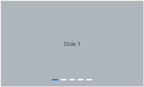
Indicators Types
Choose different types of indicators available using the IndicatorsType property. The indicator types are categorized as follows:
Default Indicator
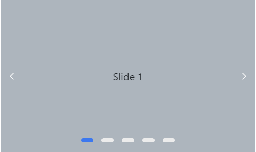
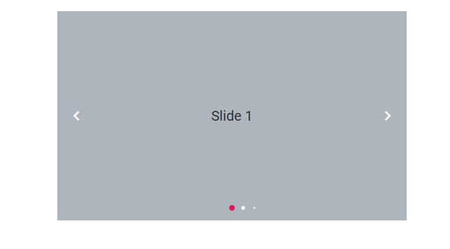
A default indicator in a carousel is a set of dots that indicate the current position of the slide in the carousel. The Default indicator can be achieved by setting the IndicatorsType to Default.
@using Syncfusion.EJ2.Navigations;

<div class="container">
    <div class="control-container">
        @(Html.EJS().Carousel("defaultCarousel").AutoPlay(false).IndicatorsType(CarouselIndicatorsType.Default).Items(new List<CarouselItem> {
            new CarouselItem { Template = "<div class='slide-content'>Slide 1</div>" },
            new CarouselItem { Template = "<div class='slide-content'>Slide 2</div>" },
            new CarouselItem { Template = "<div class='slide-content'>Slide 3</div>" },
            new CarouselItem { Template = "<div class='slide-content'>Slide 4</div>" },
            new CarouselItem { Template = "<div class='slide-content'>Slide 5</div>" }
            })
            .Render()
            )
    </div>
</div>

<style>
    .control-container {
        background-color: #adb5bd;
        height: 300px;
        margin: 0 auto;
        width: 500px;
    }

    .e-carousel .slide-content {
        align-items: center;
        display: flex;
        font-size: 1.25rem;
        height: 100%;
        justify-content: center;
    }
</style>
public ActionResult Index()
{
return View();
}
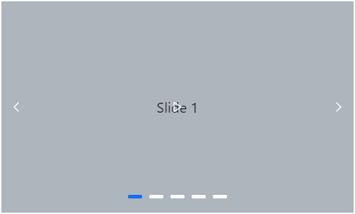
Dynamic Indicator
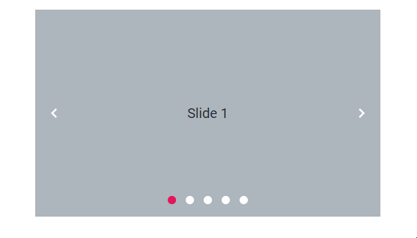
A dynamic indicator in a carousel provides visual cues or markers that dynamically change or update to indicate the current position. The Dynamic indicator can be achieved by setting the IndicatorsType to Dynamic.
@using Syncfusion.EJ2.Navigations;

<div class="container">
    <div class="control-container">
        @(Html.EJS().Carousel("defaultCarousel").AutoPlay(false).IndicatorsType(CarouselIndicatorsType.Dynamic).Items(new List<CarouselItem> {
            new CarouselItem { Template = "<div class='slide-content'>Slide 1</div>" },
            new CarouselItem { Template = "<div class='slide-content'>Slide 2</div>" },
            new CarouselItem { Template = "<div class='slide-content'>Slide 3</div>" },
            new CarouselItem { Template = "<div class='slide-content'>Slide 4</div>" },
            new CarouselItem { Template = "<div class='slide-content'>Slide 5</div>" }
            })
            .Render()
            )
    </div>
</div>

<style>
    .control-container {
        background-color: #adb5bd;
        height: 300px;
        margin: 0 auto;
        width: 500px;
    }

    .e-carousel .slide-content {
        align-items: center;
        display: flex;
        font-size: 1.25rem;
        height: 100%;
        justify-content: center;
    }
</style>
public ActionResult Index()
{
return View();
}
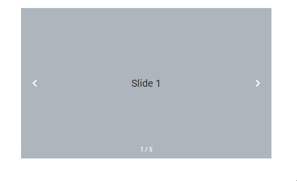
Fraction Indicator
The fraction indicator type displays the current slide index and total slide count as a fraction. The Fraction indicator can be achieved by setting the IndicatorsType to Fraction.
@using Syncfusion.EJ2.Navigations;

<div class="container">
    <div class="control-container">
        @(Html.EJS().Carousel("defaultCarousel").AutoPlay(false).IndicatorsType(CarouselIndicatorsType.Fraction).Items(new List<CarouselItem> {
            new CarouselItem { Template = "<div class='slide-content'>Slide 1</div>" },
            new CarouselItem { Template = "<div class='slide-content'>Slide 2</div>" },
            new CarouselItem { Template = "<div class='slide-content'>Slide 3</div>" },
            new CarouselItem { Template = "<div class='slide-content'>Slide 4</div>" },
            new CarouselItem { Template = "<div class='slide-content'>Slide 5</div>" }
            })
            .Render()
            )
    </div>
</div>

<style>
    .control-container {
        background-color: #adb5bd;
        height: 300px;
        margin: 0 auto;
        width: 500px;
    }

    .e-carousel .slide-content {
        align-items: center;
        display: flex;
        font-size: 1.25rem;
        height: 100%;
        justify-content: center;
    }
</style>
public ActionResult Index()
{
return View();
}
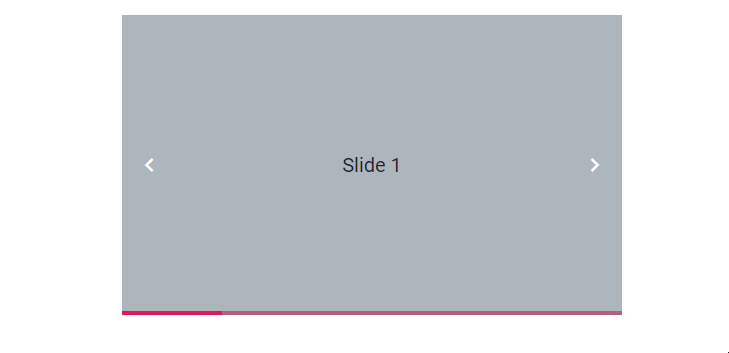
Progress Indicator
The Progress Indicator type displays the current slide as a progress bar. The Progress indicator can be achieved by setting the IndicatorsType to Progress.
@using Syncfusion.EJ2.Navigations;

<div class="container">
    <div class="control-container">
        @(Html.EJS().Carousel("defaultCarousel").AutoPlay(false).IndicatorsType(CarouselIndicatorsType.Progress).Items(new List<CarouselItem> {
            new CarouselItem { Template = "<div class='slide-content'>Slide 1</div>" },
            new CarouselItem { Template = "<div class='slide-content'>Slide 2</div>" },
            new CarouselItem { Template = "<div class='slide-content'>Slide 3</div>" },
            new CarouselItem { Template = "<div class='slide-content'>Slide 4</div>" },
            new CarouselItem { Template = "<div class='slide-content'>Slide 5</div>" }
            })
            .Render()
            )
    </div>
</div>

<style>
    .control-container {
        background-color: #adb5bd;
        height: 300px;
        margin: 0 auto;
        width: 500px;
    }

    .e-carousel .slide-content {
        align-items: center;
        display: flex;
        font-size: 1.25rem;
        height: 100%;
        justify-content: center;
    }
</style>
public ActionResult Index()
{
return View();
}
Play button
Show or hide the play button
In the carousel, AutoPlay actions have been controlled by using the ShowPlayButton property in the user interface. When you enable this property, the slide transitions are controlled using this play and pause button. This property depends on the ButtonsVisibility property. The following example depicts the code to show the play button in the carousel.
@using Syncfusion.EJ2.Navigations;

<div class="container">
    <div class="control-container">
        @(Html.EJS().Carousel("defaultCarousel").ShowPlayButton(true).Items(new List<CarouselItem> {
                    new CarouselItem { Template = "<div class='slide-content'>Slide 1</div>"  },
                    new CarouselItem { Template = "<div class='slide-content'>Slide 2</div>" },
                    new CarouselItem { Template = "<div class='slide-content'>Slide 3</div>" },
                    new CarouselItem { Template = "<div class='slide-content'>Slide 4</div>"  },
                    new CarouselItem { Template = "<div class='slide-content'>Slide 5</div>"  }
                })
                .Render()
            )
    </div>
</div>

<style>
    .control-container {
        background-color: #adb5bd;
        height: 300px;
        margin: 0 auto;
        width: 500px;
    }

    .e-carousel .slide-content {
        align-items: center;
        display: flex;
        font-size: 1.25rem;
        height: 100%;
        justify-content: center;
    }
</style>
public ActionResult Index()
{
return View();
}
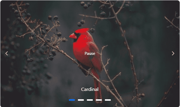
Play button template
Template option is provided to customize the play button by using the PlayButtonTemplate property. The following example depicts the code for applying a template to play Button in the carousel.
@using Syncfusion.EJ2.Navigations;

<div class="control-container">
    @(Html.EJS().Carousel("defaultCarousel")
            .ShowPlayButton(true)
            .PlayButtonTemplate("<div id='play'></div>")
            .Items(new List<CarouselItem> {
                    new CarouselItem { Template = "<figure class='img-container'><img src='https://ej2.syncfusion.com/products/images/carousel/cardinal.png' alt='cardinal' style='height:100%;width:100%;' /><figcaption class='img-caption'>Cardinal</figcaption></figure>"  },
                    new CarouselItem { Template = "<figure class='img-container'><img src='https://ej2.syncfusion.com/products/images/carousel/hunei.png' alt='kingfisher' style='height:100%;width:100%;' /><figcaption class='img-caption'>Kingfisher</figcaption></figure>" },
                    new CarouselItem { Template = "<figure class='img-container'><img src='https://ej2.syncfusion.com/products/images/carousel/costa-rica.png' alt='keel-billed-toucan' style='height:100%;width:100%;' /><figcaption class='img-caption'>Keel-billed-toucan</figcaption></figure>" },
                    new CarouselItem { Template = "<figure class='img-container'><img src='https://ej2.syncfusion.com/products/images/carousel/kaohsiung.png' alt='yellow-warbler' style='height:100%;width:100%;' /><figcaption class='img-caption'>Yellow-warbler</figcaption></figure>"  },
                    new CarouselItem { Template = "<figure class='img-container'><img src='https://ej2.syncfusion.com/products/images/carousel/bee-eater.png' alt='bee-eater' style='height:100%;width:100%;' /><figcaption class='img-caption'>Bee-eater</figcaption></figure>"  }
                })
                .Render()
            )
</div>

<script type="text/javascript">
    document.addEventListener('DOMContentLoaded', function () {
        var carouselObj = document.querySelector(".e-carousel").ej2_instances[0];
        var button = new ej.buttons.Button({ cssClass: 'e-play-pause-btn', content: "Pause" });
        button.appendTo('#play');
        button.element.onclick = () => {
            if (carouselObj.autoPlay) {
                button.content = "Play";
                carouselObj.autoPlay = false;
            } else {
                button.content = "Pause";
                carouselObj.autoPlay = true;
            }
        };
    });
</script>
<style>
    .control-container {
        height: 360px;
        margin: 0 auto;
        width: 600px;
    }

    .img-container {
        height: 100%;
        margin: 0;
    }

    .img-caption {
        color: #fff;
        font-size: 1rem;
        position: absolute;
        bottom: 3rem;
        width: 100%;
        text-align: center;
    }

    .e-play-pause-btn {
        border-radius: unset !important;
        color: white !important;
    }
</style>
public ActionResult Index()
{
return View();
}