Groups in ASP.NET CORE TextBox Component
18 Dec 20245 minutes to read
The following section explains you the steps required to create TextBox with icon and floating label.
Floating label:
To add the Floating label by using FloatLabelType property. Specifies the floating label behavior of the TextBox that the placeholder text floats above the TextBox based on the below values. Possible values are:
- Never - The placeholder text should not be float ever.
- Always - The placeholder text floats above the TextBox always.
- Auto - The placeholder text floats above the TextBox while focusing or enter a value in TextBox.
And refer to the following sections to add the icons to the TextBox.
With icon and floating label
Create an icon in the TextBox using the addIcon method and enable the float label using the FloatLabelType property. The user can place the icon on either side of the TextBox by specifying “append” or “prepend” in the addIcon method.
<div class="control-section">
<h4> TextBox with icons </h4>
<div style="margin:5px">
<ejs-textbox id="append-textbox" placeholder="Enter date" created="onAppendHanlder"></ejs-textbox>
</div>
<div style="margin:5px">
<ejs-textbox id="prepend-textbox" placeholder="Enter date" created="onPrependHanlder"></ejs-textbox>
</div>
<div style="margin:5px">
<ejs-textbox id="textbox" placeholder="Enter date" created="onCreateonHanlder"></ejs-textbox>
</div>
</div>
<script>
function onAppendHanlder()
{
var textboxObj = document.getElementById("append-textbox");
textboxObj.ej2_instances[0].addIcon("append", "e-date-icon");
}
function onPrependHanlder()
{
var textboxObj = document.getElementById("prepend-textbox");
textboxObj.ej2_instances[0].addIcon("prepend", "e-date-icon");
}
function onCreateonHanlder()
{
var textboxObj = document.getElementById("textbox");
textboxObj.ej2_instances[0].addIcon("append", "e-date-icon");
textboxObj.ej2_instances[0].addIcon("prepend", "e-dropdown-icon");
}
</script>
<style>
.e-input-group-icon:before {
font-family: e-icons;
}
.e-input-group .e-input-group-icon.e-input-popup-date { /* csslint allow: adjoining-classes */
font-size: 16px;
}
.e-input-group.e-small .e-input-group-icon.e-input-popup-date { /* csslint allow: adjoining-classes */
font-size: 14px;
}
.e-input-group-icon.e-input-popup-date:before { /* csslint allow: adjoining-classes */
content: "";
}
.e-input-group-icon.e-input-down:before { /* csslint allow: adjoining-classes */
content: "";
}
.e-input-group-icon.e-input-date:before { /* csslint allow: adjoining-classes */
content: "";
}
</style>public ActionResult Index()
{
return View();
}Output be like the below.
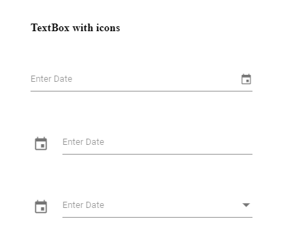
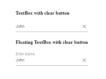
With clear button and floating label
The clear button is added to the input for clearing the value given in the TextBox.
It is shown only when the input field has a value, otherwise not shown.
You can add the clear button to the TextBox by enabling showClearButton API.
<div class="control-section">
    <div class="control_wrapper accordion-control-section">
        <h4> TextBox with clear button </h4>
        <ejs-textbox id="firstname" placeholder="First Name" showClearButton="true" floatLabelType="Never"></ejs-textbox>

        <h4> Floating TextBox with clear button </h4>
        <ejs-textbox id="lastname" placeholder="Last Name" showClearButton="true" floatLabelType="Auto"></ejs-textbox>
    </div>
</div>
public ActionResult Index()
{
return View();
}Output be like the below.
Multi-line input with floating label
To create a multiline input using the multiline API, it will act as a TextArea component. You can also resize the rows.
<div class="control-section">

    <ejs-textbox id="multiline-textbox" placeholder="Address" floatLabelType="Auto" multiline="true"></ejs-textbox>

</div>
public ActionResult Index()
{
return View();
}