Change the floating label color of the TextBox
23 Dec 20241 minute to read
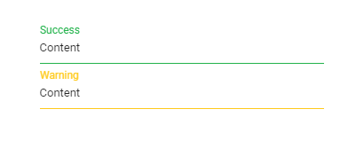
You can change the floating label color of the TextBox for both success and warning validation states by applying the following CSS styles.
     /* For Success state */
    .e-float-input.e-input-group.e-success label.e-float-text,
    .e-float-input.e-input-group.e-success input:focus ~ label.e-float-text,
    .e-float-input.e-input-group.e-success input:valid ~ label.e-float-text {
        color: #22b24b;
    }

    /* For Warning state */
    .e-float-input.e-input-group.e-warning label.e-float-text,
    .e-float-input.e-input-group.e-warning input:focus ~ label.e-float-text,
    .e-float-input.e-input-group.e-warning input:valid ~ label.e-float-text {
        color: #ffca1c;
}<div class="control-section">
<ejs-textbox id="success" placeholder="success" floatLabelType="Auto" cssClass="e-success"></ejs-textbox>
<ejs-textbox id="Warning" placeholder="Warning" floatLabelType="Auto" cssClass="e-warning"></ejs-textbox>
</div>
<style>
/* For Success state */
.e-float-input.e-success label.e-float-text,
.e-float-input.e-success input:focus ~ label.e-float-text,
.e-float-input.e-success input:valid ~ label.e-float-text {
color: #22b24b;
}
/* For Warning state */
.e-float-input.e-warning label.e-float-text,
.e-float-input.e-warning input:focus ~ label.e-float-text,
.e-float-input.e-warning input:valid ~ label.e-float-text {
color: #ffca1c;
}
</style>public ActionResult Index()
{
return View();
}Output be like the below.