Size and Color with ASP.NET CORE AppBar Control
4 Jun 20247 minutes to read
Size
The size of the AppBar can be set using the mode property. The available types of the AppBar are as follows:
- Regular AppBar
- Prominent AppBar
- Dense AppBar
Regular AppBar
This mode is the default one in which the AppBar is displayed with the default height.
<ejs-appbar id="defaultAppBar" colorMode="Primary">
    <e-content-template>
        <ejs-button id="defaultButtonMenu" cssClass="e-inherit" iconCss="e-icons e-menu"></ejs-button>
        <span class="regular">Regular AppBar</span>
        <div class="e-appbar-spacer"></div>
        <ejs-button id="defaultButtonLogin" cssClass="e-inherit" content="FREE TRIAL"></ejs-button>
    </e-content-template>
</ejs-appbar>

<style>
    #defaultAppBar .e-btn.e-inherit {
        margin:0 3px;
    }
</style>
Prominent AppBar
This height mode can be set to the AppBar by setting Prominent to the mode property. The prominent AppBar is displayed with a longer height and can be used for larger titles, images, or texts. It is also longer than the regular AppBar. In the following example, we have customized the prominent text using align-self and white-space CSS properties. You can change the prominent AppBar height if larger titles, images, or texts are used.
<ejs-appbar id="defaultAppBar" colorMode="Primary" mode="Prominent" cssClass="prominent-appbar">
    <e-content-template>
        <ejs-button id="defaultButtonMenu" cssClass="e-inherit" iconCss="e-icons e-menu"></ejs-button>
        <span class="prominent">AppBar Component with Prominent mode</span>
        <div class="e-appbar-spacer"></div>
        <ejs-button id="defaultButtonLogin" cssClass="e-inherit" content="FREE TRIAL"></ejs-button>
    </e-content-template>
</ejs-appbar>

<style>
    .prominent-appbar .prominent {
        align-self: center;
        white-space: break-spaces;
        text-align: inherit;
        font-size: 35px;
        line-height: 50px;
    }
    .prominent-appbar.e-appbar {
        background-image: url("https://ej2.syncfusion.com/demos/src/appbar/images/prominent.png");
        background-size: 100% 400px;
        color: #ffffff;
        background-repeat: no-repeat;
        height: 400px;
    }
    .prominent-appbar .e-inherit.e-btn {
        background: transparent;
    }
    .prominent-appbar .e-inherit.e-btn:hover,
    .prominent-appbar .e-inherit.e-btn:focus,
    .prominent-appbar .e-inherit.e-btn:active,
    .prominent-appbar .e-inherit.e-btn.e-active,
    .prominent-appbar .e-inherit.e-css.e-btn:hover,
    .prominent-appbar .e-inherit.e-css.e-btn:focus
    .prominent-appbar .e-inherit.e-css.e-btn:active
    .prominent-appbar .e-inherit.e-css.e-btn.e-active {
        background: rgba(255, 255, 255, .08);
    }
</style>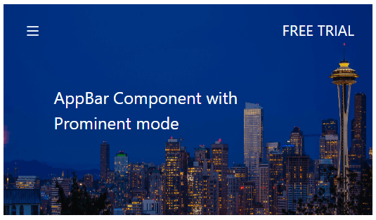
Dense AppBar
This height mode can be set to the AppBar by setting Dense to the mode property. Dense AppBar is displayed with shorter height which is denser to accommodate all the AppBar content.
<ejs-appbar id="defaultAppBar" colorMode="Primary" mode="Dense">
    <e-content-template>
        <ejs-button id="defaultButtonMenu" cssClass="e-inherit" iconCss="e-icons e-menu"></ejs-button>
        <span class="dense">Dense AppBar</span>
        <div class="e-appbar-spacer"></div>
        <ejs-button id="defaultButtonLogin" cssClass="e-inherit" content="FREE TRIAL"></ejs-button>
    </e-content-template>
</ejs-appbar>

<style>
    #defaultAppBar .e-btn.e-inherit {
        margin:0 3px;
    }
</style>
Color
The background and font colors can be set using the color mode property. The available types of background color for the AppBar are as follows:
- Light AppBar
- Dark AppBar
- Primary AppBar
- Inherit AppBar
Light AppBar
This color mode is the default one in which the AppBar can be displayed with a light background and its corresponding font color.
<ejs-appbar id="defaultAppBar">
    <e-content-template>
        <a href="https://www.syncfusion.com/aspnet-core-ui-controls" target="_blank" rel="noopener" role="link" aria-label="Syncfusion core controls">
           <div class="syncfusion-logo"></div>
        </a>
        <div class="e-appbar-spacer"></div>
        <ejs-button id="defaultButtonLogin" isPrimary=true content="FREE TRIAL"></ejs-button>
    </e-content-template>
</ejs-appbar>

<style>
    #defaultAppBar .syncfusion-logo {
        background: url(https://cdn.syncfusion.com/blazor/images/demos/syncfusion-logo.svg);
        background-size: contain;
        background-repeat: no-repeat;
        height: 30px;
        width: 150px;
    }
</style>
Dark AppBar
This color mode can be set to the AppBar by setting Dark to the property color mode. A dark AppBar can be displayed with a dark background and its corresponding font color.
<ejs-appbar id="defaultAppBar" colorMode="Dark">
    <e-content-template>
        <ejs-button id="defaultButtonMenu" cssClass="e-inherit" iconCss="e-icons e-menu"></ejs-button>
        <div class="e-appbar-spacer"></div>
        <ejs-button id="defaultButtonLogin" cssClass="e-inherit" content="FREE TRIAL"></ejs-button>
    </e-content-template>
</ejs-appbar>

<style>
    #defaultAppBar .e-btn.e-inherit {
        margin:0 3px;
    }
</style>
Primary AppBar
This color mode can be set to the AppBar by setting Primary to the property color mode. The primary AppBar can be displayed with primary colors.
<ejs-appbar id="defaultAppBar" colorMode="Primary">
    <e-content-template>
        <ejs-button id="defaultButtonMenu" cssClass="e-inherit" iconCss="e-icons e-menu"></ejs-button>
        <div class="e-appbar-spacer"></div>
        <ejs-button id="defaultButtonLogin" cssClass="e-inherit" content="FREE TRIAL"></ejs-button>
    </e-content-template>
</ejs-appbar>

<style>
    #defaultAppBar .e-btn.e-inherit {
        margin:0 3px;
    }
</style>
Inherit AppBar
This color mode can be set to the AppBar by setting Inherit to the property color mode. The AppBar inherits the background and font color from its parent element.
<ejs-appbar id="defaultAppBar" colorMode="Inherit">
    <e-content-template>
        <a href="https://www.syncfusion.com/aspnet-core-ui-controls" target="_blank" rel="noopener" role="link" aria-label="Syncfusion core controls">
           <div class="syncfusion-logo"></div>
        </a>
        <div class="e-appbar-spacer"></div>
        <ejs-button id="defaultButtonLogin" isPrimary=true content="FREE TRIAL"></ejs-button>
    </e-content-template>
</ejs-appbar>

<style>
    #defaultAppBar .syncfusion-logo {
        background: url(https://cdn.syncfusion.com/blazor/images/demos/syncfusion-logo.svg);
        background-size: contain;
        background-repeat: no-repeat;
        height: 30px;
        width: 150px;
    }
</style>