Design User Interface with ASP.NET CORE AppBar Control
7 Jun 202417 minutes to read
Spacer
Spacer is used to provide spacing between the AppBar contents which gives additional space to the content layout.
The following example depicts the code to provide spacing between the home and pan buttons in the AppBar:
<ejs-appbar id="defaultAppBar" colorMode="Primary">
    <e-content-template>
        <ejs-button id="defaultButtonHome" cssClass="e-inherit" iconCss="e-icons e-home"></ejs-button>
        <div class="e-appbar-spacer"></div>
        <ejs-button id="defaultButtonCut" cssClass="e-inherit" iconCss="e-icons e-cut"></ejs-button>
        <div class="e-appbar-spacer"></div>
        <ejs-button id="defaultButtonPan" cssClass="e-inherit" iconCss="e-icons e-pan"></ejs-button>
    </e-content-template>
</ejs-appbar>
Separator
Separator shows a vertical line to visually group or separate the AppBar contents.
The following example depicts the code to provide a vertical line between a group of buttons in the AppBar.
<ejs-appbar id="defaultAppBar" colorMode="Primary">
    <e-content-template>
        <ejs-button id="defaultButtonCut" cssClass="e-inherit" iconCss="e-icons e-cut"></ejs-button>
        <ejs-button id="defaultButtonCopy" cssClass="e-inherit" iconCss="e-icons e-copy"></ejs-button>
        <ejs-button id="defaultButtonPaste" cssClass="e-inherit" iconCss="e-icons e-paste"></ejs-button>
        <div class="e-appbar-separator"></div>
        <ejs-button id="defaultButtonBold" cssClass="e-inherit" iconCss="e-icons e-bold"></ejs-button>
        <ejs-button id="defaultButtonUnderline" cssClass="e-inherit" iconCss="e-icons e-underline"></ejs-button>
        <ejs-button id="defaultButtonItalic" cssClass="e-inherit" iconCss="e-icons e-italic"></ejs-button>
        <div class="e-appbar-separator"></div>
        <ejs-button id="defaultButtonAlignLeft" cssClass="e-inherit" iconCss="e-icons e-align-left"></ejs-button>
        <ejs-button id="defaultButtonAlignRight" cssClass="e-inherit" iconCss="e-icons e-align-right"></ejs-button>
        <ejs-button id="defaultButtonAlignCenter" cssClass="e-inherit" iconCss="e-icons e-align-center"></ejs-button>
        <ejs-button id="defaultButtonJustify" cssClass="e-inherit" iconCss="e-icons e-justify"></ejs-button>
    </e-content-template>
</ejs-appbar>

<style>
    #defaultAppBar .e-btn.e-inherit {
        margin: 0 3px;
    }
</style>
Media Query
Media Query is used to adjusting the AppBar for different screen sizes. Resize the screen to observe the responsive layout of the AppBar.
<div class="default-appbar-section">
    <ejs-appbar id="defaultAppBar" colorMode="Primary">
        <e-content-template>
            <ejs-button id="defaultButtonMenu" cssClass="e-inherit" iconCss="e-icons e-menu"></ejs-button>
            <ejs-button id="defaultButtonHome" cssClass="e-inherit" content="Home"></ejs-button>
            <ejs-button id="defaultButtonAbout" cssClass="e-inherit" content="About"></ejs-button>
            <ejs-button id="defaultButtonProducts" cssClass="e-inherit" content="Products"></ejs-button>
            <ejs-button id="defaultButtonContacts" cssClass="e-inherit" content="Contacts"></ejs-button>
            <div class="e-appbar-spacer"></div>
            <div class="e-appbar-separator"></div>
            <ejs-button id="defaultButtonLogin" cssClass="e-inherit" content="Login"></ejs-button>
        </e-content-template>
    </ejs-appbar>
</div>

<style>
    .default-appbar-section .e-btn.e-inherit {
        margin: 0 3px;
    }
    @@media screen and (max-width: 1024px) {
        .default-appbar-section .e-appbar {
           flex-flow: row wrap;
           height: auto;
           gap: 8px;
        }
        .default-appbar-section {
           width: 350px;
        }
    }
    @@media screen and (max-width: 480px) {
        .default-appbar-section {
           width: 200px;
           margin: 0 2px;
        }
    }
</style>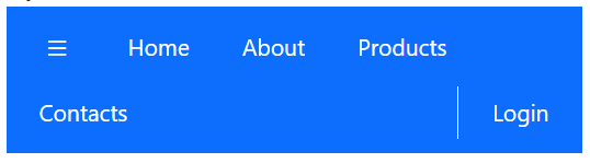
Designing AppBar with Menu
AppBar is rendered with a Menu component in its AppBar header area. Menu component’s styles are inherited from the AppBar component using the e-inherit CSS class.
@using Syncfusion.EJ2;
@using Syncfusion.EJ2.Navigations;

@{
    List<MenuItem> companyMenuItems = new List<MenuItem>()
    {
        new MenuItem
        {
            Text = "Company",
            Items = new List<MenuItem>()
            {
                new MenuItem { Text = "About Us" },
                new MenuItem { Text = "Customers" },
                new MenuItem { Text = "Blog" },
                new MenuItem { Text = "Careers" }
            }
        }
    };

    List<MenuItem> productMenuItems = new List<MenuItem>()
    {
        new MenuItem
        {
            Text = "Products",
            Items = new List<MenuItem>()
            {
                new MenuItem { Text = "Developer" },
                new MenuItem { Text = "Analytics" },
                new MenuItem { Text = "Reporting" },
                new MenuItem { Text = "Help Desk" }
            }
        }
    };

    List<MenuItem> aboutMenuItems = new List<MenuItem>(){
        new MenuItem
        {
            Text = "About Us"
        }
    };

    List<MenuItem> carrerMenuItems = new List<MenuItem>(){
        new MenuItem
        {
            Text = "Carrers"
        }
    };
}

<ejs-appbar id="defaultAppBar" colorMode="Primary">
    <e-content-template>
        <ejs-button id="defaultButtonMenu" cssClass="e-inherit" iconCss="e-icons e-menu"></ejs-button>
        <ejs-menu id="defaultMenuCompany" cssClass="e-inherit" items="@companyMenuItems"></ejs-menu>
        <ejs-menu id="defaultMenuProducts" cssClass="e-inherit" items="@productMenuItems"></ejs-menu>
        <ejs-menu id="defaultMenuAbout" cssClass="e-inherit" items="@aboutMenuItems"></ejs-menu>
        <ejs-menu id="defaultMenuCarrers" cssClass="e-inherit" items="@carrerMenuItems"></ejs-menu>
        <div class="e-appbar-spacer"></div>
        <ejs-button id="defaultButtonLogin" cssClass="e-inherit" content="Login"></ejs-button>
    </e-content-template>
</ejs-appbar>

<style>
    #defaultAppBar .e-btn.e-inherit {
        margin: 0 3px;
    }
</style>
Designing AppBar with Buttons
The AppBar is rendered with a Button and DropDownButton component in its AppBar header area. Button and DropDownButton components’ styles are inherited from the AppBar component using the e-inherit CSS class.
@using Syncfusion.EJ2;
@using Syncfusion.EJ2.Navigations;

@{
    List<object> productDropDownButtonItems = new List<object>();
    productDropDownButtonItems.Add(new
    {
        text = "Developer",
    });
    productDropDownButtonItems.Add(new
    {
        text = "Analytics",
    });
    productDropDownButtonItems.Add(new
    {
        text = "Reporting",
    });
    productDropDownButtonItems.Add(new
    {
        text = "E-Signature",
    });
    productDropDownButtonItems.Add(new
    {
        text = "Help-Desk",
    });
}

<ejs-appbar id="defaultAppBar" colorMode="Primary">
    <e-content-template>
        <ejs-button id="defaultButtonMenu" cssClass="e-inherit" iconCss="e-icons e-menu"></ejs-button>
        <ejs-dropdownbutton id="defaultDropDownButtonProduct" cssClass="e-inherit" content="Products" items="@productDropDownButtonItems"></ejs-dropdownbutton>
        <div class="e-appbar-spacer"></div>
        <ejs-button id="defaultButtonLogin" cssClass="e-inherit" content="Login"></ejs-button>
    </e-content-template>
</ejs-appbar>

<style>
    #defaultAppBar .e-btn.e-inherit {
        margin: 0 3px;
    }
</style>
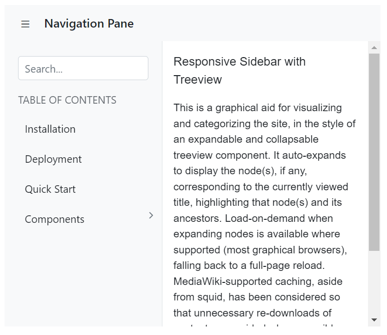
Designing AppBar with SideBar
The AppBar is rendered with the SideBar component below the AppBar. Click on the menu icon to expand/collapse the Sidebar. In the following sample, the toggle method has been used to show or hide the Sidebar on the AppBar button click.
@using Syncfusion.EJ2;
@using Syncfusion.EJ2.Navigations;

@{
    Dictionary<string, object> htmlAttribute = new Dictionary<string, object>()
        { { "class", "sidebar-treeview" } };

    List<TreeDatas> treedata = new List<TreeDatas>();
    treedata.Add(new TreeDatas { nodeId = "01", nodeText = "Installation" });
    treedata.Add(new TreeDatas { nodeId = "02", nodeText = "Deployment" });
    treedata.Add(new TreeDatas { nodeId = "03", nodeText = "Quick Start" });
    treedata.Add(new TreeDatas { nodeId = "04", nodeText = "Components", hasChild = true });
    treedata.Add(new TreeDatas { nodeId = "04-01", nodeText = "Calendar", pid = "04" });
    treedata.Add(new TreeDatas { nodeId = "04-02", nodeText = "DatePicker", pid = "04" });
    treedata.Add(new TreeDatas { nodeId = "04-03", nodeText = "DateTimePicker", pid = "04" });
    treedata.Add(new TreeDatas { nodeId = "04-04", nodeText = "DateRangePicker", pid = "04" });
    treedata.Add(new TreeDatas { nodeId = "04-05", nodeText = "TimePicker", pid = "04" });
    treedata.Add(new TreeDatas { nodeId = "04-06", nodeText = "SideBar", pid = "04" });
}

<div class="default-appbar-section">
    <div>
        <ejs-appbar id="defaultAppBar">
            <e-content-template>
                <ejs-button id="defaultButtonMenu" cssClass="e-inherit" iconCss="e-icons e-menu" onclick="toggle()"></ejs-button>
                <div class="e-folder">
                    <div class="e-folder-name">Navigation Pane</div>
                </div>
            </e-content-template>
        </ejs-appbar>
    </div>
    <ejs-sidebar id="sideTree" htmlAttributes="@htmlAttribute" width="290px" target=".main-content" mediaQuery="(min-width: 600px)" isOpen="true">
        <e-content-template>
           <div class='main-menu'>
               <div class="table-content">
                   <ejs-textbox id="resSearch" placeholder="Search..."></ejs-textbox>
                   <p class="main-menu-header">TABLE OF CONTENTS</p>
               </div>
               <div>
                   <ejs-treeview id="mainTree" cssClass="main-treeview" expandOn="Click">
                      <e-treeview-fields id="nodeId" text="nodeText" dataSource="@treedata" hasChildren="hasChild" parentID="pid"></e-treeview-fields>
                   </ejs-treeview>
               </div>
           </div>
        </e-content-template>
    </ejs-sidebar>
    <div class="main-content" id="main-text">
        <div class="sidebar-content">
            <div class="sidebar-heading"> Responsive Sidebar with Treeview</div>
            <p class="paragraph-content">
               This is a graphical aid for visualising and categorising the site, in the style of an expandable and collapsable treeview component.
               It auto-expands to display the node(s), if any, corresponding to the currently viewed title, highlighting that node(s)
               and its ancestors. Load-on-demand when expanding nodes is available where supported (most graphical browsers),
               falling back to a full-page reload. MediaWiki-supported caching, aside from squid, has been considered so that
               unnecessary re-downloads of content are avoided where possible. The complete expanded/collapsed state of
               the treeview persists across page views in most situations.
            </p>
        </div>
    </div>
</div>

<script>
document.addEventListener('DOMContentLoaded', function () {
  sidebarObj = document.getElementById("sideTree").ej2_instances[0];
});
function toggle() {
  sidebarObj.toggle();
}
</script>

<style>
    .default-appbar-section .e-appbar .e-folder {
        margin:0 5px;
    }
    .container-fluid {
        padding-left: 0;
        padding-right: 0;
    }
    .sidebar-treeview .e-treeview .e-icon-collapsible,
    .sidebar-treeview .e-treeview .e-icon-expandable {
        float: right;
    }
    .sidebar-treeview .e-treeview .e-icon-collapsible,
    .sidebar-treeview .e-treeview .e-icon-expandable {
        margin: 3px;
    }
    .sidebar-treeview .e-treeview,
    .sidebar-treeview .e-treeview .e-ul {
        padding: 0;
        margin: 0;
    }
    .default-appbar-section .sidebar-treeview {
        z-index: 20 !important;
    }
    .sidebar-treeview .main-menu .main-menu-header {
        color: #656a70;
        padding: 15px 15px 15px 0;
        font-size: 14px;
        width: 13em;
        margin: 0;
    }
    #main-text .sidebar-heading {
        font-size: 16px;
    }
    .sidebar-treeview .table-content {
        padding: 20px 18px;
        height: 8em;
    }
    #main-text .sidebar-content .line {
        width: 100%;
        height: 1px;
        border-bottom: 1px dashed #ddd;
        margin: 40px 0;
    }
    #main-text .sidebar-content {
        padding: 15px;
        font-size: 14px;
    }
    #main-text .paragraph-content {
        padding: 15px 0;
        font-weight: normal;
        font-size: 14px;
    }
    .sidebar-treeview .main-treeview .icon {
        font-family: 'fontello';
        font-size: 16px;
        margin: -4px 0;
    }
    .e-folder {
        text-align: center;
        font-weight: 500;
        font-size: 16px
    }
    .sidebar-treeview .e-treeview .e-text-content {
        padding-left: 18px;
    }
    #wrapper .e-toolbar {
        border-bottom: 1px solid #d2d6de;
    }
    .default-appbar-section .main-content {
        height: 380px;
    }
    .sidebar-treeview {
        border-right: 1px solid #dee2e6 !important;
    }
    .e-folder-name {
        margin-top: -2px;
    }
</style>