How can I help you?
Columns in Angular TreeGrid component
6 Feb 202624 minutes to read
In the Syncfusion® Angular TreeGrid component, columns are fundamental elements that play a pivotal role in organizing and displaying data within applications. They serve as the building blocks for data presentation, allowing specification of what data fields to show, how to format and style them, and how to enable various interactions within the TreeGrid.
The column definitions are used as the dataSource schema in the TreeGrid. The field property of the column is necessary to map the data source values in TreeGrid columns.
Column types
The Syncfusion® TreeGrid component allows specifying the type of data that a column binds using the column.type property. The type property is used to determine the appropriate format, such as number or date, for displaying the column data.
TreeGrid supports the following column types:
-
string: Represents a column that binds to string data. This is the default type if the
typeproperty is not defined. - number: Represents a column that binds to numeric data. It supports formatting options for displaying numbers.
- boolean: Represents a column that binds to boolean data. It displays checkboxes for boolean values.
- date: Represents a column that binds to date data. It supports formatting options for displaying dates.
- datetime: Represents a column that binds to date and time data. It supports formatting options for displaying date and time values.
- checkbox: Represents a column that displays checkboxes.
The following example demonstrates how to specify column types in a TreeGrid using the types mentioned above:
import { NgModule, ViewChild } from '@angular/core'
import { BrowserModule } from '@angular/platform-browser'
import { TreeGridModule } from '@syncfusion/ej2-angular-treegrid'
import { PageService, SortService, FilterService } from '@syncfusion/ej2-angular-treegrid'
import { Component, OnInit, } from '@angular/core';
import { sampleData } from './datasource';
@Component({
imports: [
TreeGridModule,
],
providers: [PageService, SortService, FilterService],
standalone: true,
selector: 'app-container',
template: `<ejs-treegrid #treegrid [dataSource]='data' height='250' [treeColumnIndex]='1' childMapping='subtasks' >
<e-columns>
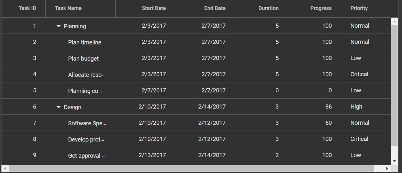
<e-column field='taskID' headerText='Task ID' textAlign='Right' type='number' width=90></e-column>
<e-column field='taskName' headerText='Task Name' textAlign='Left' type='string' width=180></e-column>
<e-column field='startDate' headerText='Start Date' textAlign='Right' format='yMd' type='date' width=120></e-column>
<e-column field='endDate' headerText='End Date' textAlign='Right' format='dd/MM/yyyy hh:mm' width=200 type='dateTime'></e-column>
<e-column field='approved' headerText='Approved' width='100' type='boolean' [displayAsCheckBox]='true'></e-column>
<e-column field='progress' headerText='Progress' textAlign='Right' type='number' width=120></e-column>
</e-columns>
</ejs-treegrid>`
})
export class AppComponent implements OnInit {
public data?: Object[];
ngOnInit(): void {
this.data = sampleData;
}
}import { bootstrapApplication } from '@angular/platform-browser';
import { AppComponent } from './app.component';
import 'zone.js';
bootstrapApplication(AppComponent).catch((err) => console.error(err));
- If the type is not defined, then it will be determined from the first record of the dataSource.
- If the first record of the dataSource is null/blank value for a column, then it is necessary to define the type for that column. This is because the TreeGrid uses the column type to determine which filter dialog to display for that column.
Difference between boolean type and checkbox type column
- Use the boolean column type when binding boolean values from your datasource and/or editing boolean property values from your type.
- Use the checkbox column type when enabling selection/deselection of the whole row.
- When the TreeGrid column
typeis a checkbox, the selection type of the TreeGrid selectionSettings will be multiple. This is the default behavior. - If there are multiple columns with the column type as checkbox, the TreeGrid will automatically enable the other column’s checkbox when selecting one column checkbox.
To learn more about how to render boolean values as checkboxes in a Syncfusion® TreeGrid Column, please refer to the Render Boolean Values as Checkbox section.
Column width
To adjust the column width in a TreeGrid, the width property within the column property of the TreeGrid configuration can be used. This property enables defining the column width in pixels or as a percentage. The width can be set to a specific value, like 100 for 100 pixels, or as a percentage value, such as 25% for 25% of the available width.
- TreeGrid column width is calculated based on the sum of column widths. For example, a TreeGrid container with 4 columns and a width of 800 pixels will have columns with a default width of 200 pixels each.
- If widths are specified for some columns but not others, the TreeGrid will distribute the available width equally among the columns without explicit widths. For example, if there are 3 columns with widths of 100px, 200px, and no width specified for the third column, the third column will occupy the remaining width after accounting for the first two columns.
- Columns with percentage widths are responsive and adjust their width based on the size of the container. For example, a column with a width of 50% will occupy 50% of the TreeGrid width and will adjust proportionally when the TreeGrid container is resized to a smaller size.
- When columns are manually resized in the Syncfusion® TreeGrid, a minimum width is set to ensure that the content within the cells remains readable. By default, the minimum width is set to 10 pixels if not explicitly specified for a column.
- If the total width of all columns exceeds the width of the TreeGrid container, a horizontal scrollbar will automatically appear to allow horizontal scrolling within the TreeGrid.
- When columns are hidden using the column chooser, the width of the hidden columns is removed from the total TreeGrid width, and the remaining columns will be resized to fill the available space.
- If the parent element has a fixed width, the TreeGrid component will inherit that width and occupy the available space. However, if the parent element does not have a fixed width, the TreeGrid component will adjust its width dynamically based on the available space.
To learn more about resizing, refer to the resizing section here
Supported types for column width:
The Syncfusion® TreeGrid supports the following three types of column width:
1. Auto
The column width is automatically calculated based on the content within the column cells. If the content exceeds the width of the column, it will be truncated with an ellipsis (…) at the end. The width can be set for columns as auto in the TreeGrid configuration as shown below:
<e-column field='taskID' headerText='Task ID' textAlign='Right' width='auto'></e-column>2. Percentage
The column width is specified as a percentage value relative to the width of the TreeGrid container. For example, a column width of 25% will occupy 25% of the total TreeGrid width. The width can be set for columns as percentage in the TreeGrid configuration as shown below:
<e-column field='taskID' headerText='Task ID' textAlign='Right' width='25%'></e-column>3. Pixel
The column width is specified as an absolute pixel value. For example, a column width of 100px will have a fixed width of 100 pixels regardless of the TreeGrid container size. The width can be set for columns as pixel in the TreeGrid configuration as shown below:
<e-column field='taskID' headerText='Task ID' textAlign='Right' width='100'></e-column>import { NgModule, ViewChild } from '@angular/core'
import { BrowserModule } from '@angular/platform-browser'
import { TreeGridModule } from '@syncfusion/ej2-angular-treegrid'
import { PageService, SortService, FilterService } from '@syncfusion/ej2-angular-treegrid'
import { Component, OnInit } from '@angular/core';
import { sampleData } from './datasource';
@Component({
imports: [TreeGridModule, ],
providers: [PageService,
SortService,
FilterService],
standalone: true,
selector: 'app-container',
template: `<ejs-treegrid #treegrid [dataSource]='data' height='250' [treeColumnIndex]='1' childMapping='subtasks' >
<e-columns>
<e-column field='taskID' headerText='Task ID' textAlign='Right' width='auto'></e-column>
<e-column field='taskName' headerText='Task Name' textAlign='Left' width='240'></e-column>
<e-column field='startDate' headerText='Start Date' textAlign='Right' format='yMd' width=120></e-column>
<e-column field='duration' headerText='Duration' textAlign='Right' width=90></e-column>
<e-column field='progress' headerText='Progress' textAlign='Right' width='15%'></e-column>
</e-columns>
</ejs-treegrid>`
})
export class AppComponent implements OnInit {
public data?: Object[];
ngOnInit(): void {
this.data = sampleData;
}
}import { bootstrapApplication } from '@angular/platform-browser';
import { AppComponent } from './app.component';
import 'zone.js';
bootstrapApplication(AppComponent).catch((err) => console.error(err));Column formatting
Column formatting is a powerful feature in the Syncfusion® TreeGrid that allows customizing the display of data in columns. Different formatting options can be applied to columns based on requirements, such as displaying numbers with specific formats, formatting dates according to a specific locale, and using templates to format column values.
The column.format property can be used to specify the format for column values.
import { NgModule, ViewChild } from '@angular/core'
import { BrowserModule } from '@angular/platform-browser'
import { TreeGridModule } from '@syncfusion/ej2-angular-treegrid'
import { Component, OnInit } from '@angular/core';
import { formatData } from './datasource';

@Component({
  imports: [
    TreeGridModule,
  ],
  standalone: true,
  selector: 'app-container',
  template: `<ejs-treegrid [dataSource]='data' height='250' [treeColumnIndex]='1' childMapping='subtasks' >
                    <e-columns>
                        <e-column field='orderID' headerText='Order ID' textAlign='Right' width=90></e-column>
                        <e-column field='orderName' headerText='Order Name' textAlign='Left' width=180></e-column>
                        <e-column field='price' headerText='Price' textAlign='Right' format='c2' type='number' width=80></e-column>
                    </e-columns>
              </ejs-treegrid>`
})
export class AppComponent implements OnInit {

  public data?: Object[];

  ngOnInit(): void {
    this.data = formatData;
  }
}
import { bootstrapApplication } from '@angular/platform-browser';
import { AppComponent } from './app.component';
import 'zone.js';
bootstrapApplication(AppComponent).catch((err) => console.error(err));
- The TreeGrid uses the Internalization library to format values based on the specified format and culture.
- By default, the number and date values are formatted in en-US locale. The currency and date can be localized in different locale as explained here.
- The available format codes may vary depending on the data type of the column.
- A custom function can be provided to the format property, instead of a format string, to customize the formatting further.
- Ensure that the format string is valid and compatible with the data type of the column, to avoid unexpected results.
Number formatting
Number formatting allows customizing the display of numeric values in TreeGrid columns. Standard numeric format strings or custom numeric format strings can be used to specify the desired format. The column.format property can be used to specify the number format for numeric columns. For example, the following format strings can be used to format numbers:
| Format | Description | Remarks |
|---|---|---|
| N | Denotes numeric type. | The numeric format is followed by integer value as N2, N3, etc., which denotes the number of precision to be allowed. |
| C | Denotes currency type. | The currency format is followed by integer value as C2, C3, etc., which denotes the number of precision to be allowed. |
| P | Denotes percentage type | The percentage format expects the input value to be in the range of 0 to 1. For example the cell value 0.2 is formatted as 20%. The percentage format is followed by integer value as P2, P3, etc., which denotes the number of precision to be allowed. |
The following example demonstrates the formatting of data for units column using the ‘N’ format, price column using the ‘P’ format, and unitPrice column using the ‘C’ format.
import { NgModule, ViewChild } from '@angular/core'
import { BrowserModule } from '@angular/platform-browser'
import { TreeGridModule } from '@syncfusion/ej2-angular-treegrid'
import { Component, OnInit } from '@angular/core';
import { formatData } from './datasource';

@Component({
    imports: [
        TreeGridModule
    ],
    standalone: true,
    selector: 'app-container',
    template: `<ejs-treegrid [dataSource]='data' height='250' [treeColumnIndex]='1' childMapping='subtasks' >
                    <e-columns>
                        <e-column field='orderID' headerText='Order ID' textAlign='Right' width=90></e-column>
                        <e-column field='orderName' headerText='Order Name' textAlign='Left' width=150></e-column>
                        <e-column field='unitPrice' headerText='Unit Price' textAlign='Right' format='C' width=100></e-column>
                        <e-column field='price' headerText='Price' textAlign='Right' format='P2'  width=100></e-column>
                        <e-column field='units' headerText='Units' textAlign='Right' format='N'  width=100></e-column>
                    </e-columns>
                </ejs-treegrid>`
})
export class AppComponent implements OnInit {

    public data?: Object[];

    ngOnInit(): void {
        this.data = formatData;
    }
}
import { bootstrapApplication } from '@angular/platform-browser';
import { AppComponent } from './app.component';
import 'zone.js';
bootstrapApplication(AppComponent).catch((err) => console.error(err));To learn more about number formatting, refer to the number section.
Date formatting
Date formatting in TreeGrid columns allows customizing how date values are displayed. Standard date format strings, such as “d,” “D,” “MMM dd, yyyy,” and more, can be used, or custom format strings can be created. To specify the desired date format, the format property of the TreeGrid columns can be used. For example, format can be set as a string like “yMd” for a built-in date format.
Additionally, custom format strings can be used to format date values, and examples of custom formats and formatted date values are provided in the table below:
| Format | Formatted value |
|---|---|
| { type:’date’, format:’dd/MM/yyyy’ } | 04/07/1996 |
| { type:’date’, format:’dd.MM.yyyy’ } | 04.07.1996 |
| { type:’date’, skeleton:’short’ } | 7/4/96 |
| { type: ‘dateTime’, format: ‘dd/MM/yyyy hh:mm a’ } | 04/07/1996 12:00 AM |
| { type: ‘dateTime’, format: ‘MM/dd/yyyy hh:mm:ss a’ } | 07/04/1996 12:00:00 AM |
import { NgModule, ViewChild } from '@angular/core'
import { BrowserModule } from '@angular/platform-browser'
import { TreeGridModule } from '@syncfusion/ej2-angular-treegrid'
import { Component, OnInit } from '@angular/core';
import { formatData } from './datasource';

@Component({
    imports: [ TreeGridModule
    ],
    standalone: true,
    selector: 'app-container',
    template: `<ejs-treegrid [dataSource]='data' height='250' [treeColumnIndex]='1' childMapping='subtasks' >
                    <e-columns>
                        <e-column field='orderID' headerText='Order ID' textAlign='Right' width=90></e-column>
                        <e-column field='orderName' headerText='Order Name' textAlign='Left' width=180></e-column>
                        <e-column field='orderDate' [format]='formatOptions' headerText='Order Date' textAlign='Left' width=120></e-column>
                        <e-column field='shippedDate' [format]='shipFormat' headerText='Ship Date' textAlign='Left' width=170></e-column>
                        <e-column field='units' headerText='Units' textAlign='Right' format='N' type='number' width=80></e-column>
                    </e-columns>
                </ejs-treegrid>`
})
export class AppComponent implements OnInit {

    public data?: Object[];
    public formatOptions?: object;
    public shipFormat?: object;

    ngOnInit(): void {
        this.data = formatData;
        this.formatOptions = { type: 'date', format: 'dd/MM/yyyy' };
        this.shipFormat = { type: 'dateTime', format: 'dd/MM/yyyy hh:mm a' };
    }
}
import { bootstrapApplication } from '@angular/platform-browser';
import { AppComponent } from './app.component';
import 'zone.js';
bootstrapApplication(AppComponent).catch((err) => console.error(err));To learn more about date formatting, refer to Date formatting.
Format the date column based on localization
The date column can also be formatted based on the localization settings of the browser. The format property of the TreeGrid columns along with the locale property can be used to specify the desired date format based on the locale.
In this example, the format property specifies the date format as “yyyy-MMM-dd”, and the locale property specifies the locale as “es-AR” for Spanish (Argentina).
import { NgModule, ViewChild } from '@angular/core'
import { BrowserModule } from '@angular/platform-browser'
import { TreeGridModule } from '@syncfusion/ej2-angular-treegrid'
import { PageService, SortService, FilterService } from '@syncfusion/ej2-angular-treegrid'

import {
    L10n,
    loadCldr,
    setCulture,
    setCurrencyCode,
} from '@syncfusion/ej2-base';
import { Component, OnInit } from '@angular/core';
import { formatData } from './datasource';
import * as cagregorian from './ca-gregorian.json';
import * as currencies from './currencies.json';
import * as numbers from './numbers.json';
import * as timeZoneNames from './timeZoneNames.json';

@Component({
    imports: [TreeGridModule,],

    providers: [PageService,
        SortService,
        FilterService],
    standalone: true,
    selector: 'app-container',
    template: `<ejs-treegrid [dataSource]='data' [locale]='locale' height='315px' [treeColumnIndex]='1' childMapping='subtasks' >
                  <e-columns>
                      <e-column field='orderID' headerText='Order ID' textAlign='Right' width=90></e-column>
                      <e-column field='orderName' headerText='Order Name' textAlign='Left' width=180></e-column>
                      <e-column field='OrderDate' headerText='OrderDate' [format]='formatOptions' textAlign='Right' width=150></e-column>
                      <e-column field='price' headerText='Price' textAlign='Right' format='c2' type='number' width=80></e-column>
                  </e-columns>
                </ejs-treegrid>`,
})
export class AppComponent implements OnInit {
    public data?: object[];
    public formatOptions?: object;
    public locale: string = 'es-AR';

    ngOnInit(): void {
        setCulture('es-AR');
        setCurrencyCode('ARS');
        loadCldr(cagregorian, currencies, numbers, timeZoneNames);
        this.formatOptions = { type: 'date', format: 'yyyy-MMM-dd' };
        this.data = formatData;
    }
}
import { bootstrapApplication } from '@angular/platform-browser';
import { AppComponent } from './app.component';
import 'zone.js';
bootstrapApplication(AppComponent).catch((err) => console.error(err));Format template column value
Template columns in TreeGrid provide a way to customize the appearance of column values using HTML templates. In addition to HTML markup, number formatting can also be used to format the value displayed in a template column. To format values in a column template, Angular pipes and the format property can be used. In this example, the date pipe is used to format the OrderDate value as a date in the format ‘dd/MMM/yyyy’.
 <e-column field='orderDate'  headerText='Order Date' textAlign='Right' width=120>
        <ng-template #template let-data>

          {{ data.orderDate | date:'dd/MMM/yyyy' }}

        </ng-template>
</e-column>import { Component, OnInit,ViewChild } from '@angular/core';
import { formatData } from './datasource';
@Component({
selector: 'app-container',
template: `<ejs-treegrid [dataSource]='data' height='315' [treeColumnIndex]='1' childMapping='subtasks' >
<e-columns>
<e-column field='orderID' headerText='Order ID' textAlign='Right' width=90></e-column>
<e-column field='orderName' headerText='Order Name' textAlign='Left' width=180></e-column>
<e-column field='orderDate' headerText='Order Date' textAlign='Right' width=120>
<ng-template #template let-data>
{{ data.orderDate | date:'dd/MMM/yyyy' }}
</ng-template>
</e-column>
<e-column field='shippedDate' headerText='Ship Date' textAlign='Right' width=150></e-column>
<e-column field='units' headerText='Units' textAlign='Right' format='N' type='number' width=80></e-column>
</e-columns>
</ejs-treegrid>`
})
export class AppComponent implements OnInit {
public data?: Object[];
ngOnInit(): void {
this.data = formatData;
}
}import { bootstrapApplication } from '@angular/platform-browser';
import { AppComponent } from './app.component';
import 'zone.js';
bootstrapApplication(AppComponent).catch((err) => console.error(err));Other Angular pipes, such as currency, decimal, percent, etc., can be used to format other types of values in the column template based on requirements.
Custom formatting
The Syncfusion® TreeGrid allows customizing the formatting of data in TreeGrid columns. Custom formats can be applied to numeric or date columns to display data in a specific way according to requirements. To apply custom formatting to TreeGrid columns in the Syncfusion® TreeGrid, the format property can be used. The following example demonstrates how custom formatting can be used for numeric and date columns:
In the following example, the numberFormatOptions object is used as the format property for the ‘units’ column to apply a custom numeric format with four decimal places. Similarly, the dateFormatOptions object is used as the format property for the ‘OrderDate’ column to apply a custom date format displaying the date in the format of day-of-the-week, month abbreviation, day, and 2-digit year (e.g. Sun, May 8, ‘23).
import { NgModule, ViewChild } from '@angular/core'
import { BrowserModule } from '@angular/platform-browser'
import { TreeGridModule } from '@syncfusion/ej2-angular-treegrid'
import { Component, OnInit } from '@angular/core';
import { formatData } from './datasource';

@Component({
    imports: [ TreeGridModule  ],
    standalone: true,
    selector: 'app-container',
    template: `<ejs-treegrid [dataSource]='data' height='250' [treeColumnIndex]='1' childMapping='subtasks' >
                    <e-columns>
                        <e-column field='orderID' headerText='Order ID' textAlign='Right' width=90></e-column>
                        <e-column field='orderName' headerText='Order Name' textAlign='Left' width=180></e-column>
                        <e-column field='orderDate' headerText='Order Date' textAlign='Right' [format]='dateFormatOptions' width=120></e-column>
                        <e-column field='units' headerText='Units' textAlign='Right' [format]='numberFormatOptions' width=80></e-column>
                    </e-columns>
                </ejs-treegrid>`
})
export class AppComponent implements OnInit {

    public data?: Object[];
    public numberFormatOptions?: object;
    public dateFormatOptions?: object;

    ngOnInit(): void {
        this.data = formatData;
        this.numberFormatOptions = {
            // Custom format for numeric columns
            format: '##.0000',
        };
        this.dateFormatOptions = {
            // Custom format for date columns
            type: 'Date',
            format: "EEE, MMM d, ''yy",
        };
    }
}
import { bootstrapApplication } from '@angular/platform-browser';
import { AppComponent } from './app.component';
import 'zone.js';
bootstrapApplication(AppComponent).catch((err) => console.error(err));To learn more about custom formatting, refer to Custom Date formatting and Custom Number formatting.
Align the text of content
The text in the content of a TreeGrid column can be aligned using the textAlign property. This property allows specifying the alignment of the text within the cells of a particular column in the TreeGrid. By default, the text is aligned to the left, but the alignment can be changed by setting the value of the textAlign property to one of the following options:
- Left: Aligns the text to the left (default).
- Center: Aligns the text to the center.
- Right: Aligns the text to the right.
- Justify: Align the text to the justify.
The following example demonstrates using the textAlign property to align the text of a TreeGrid column:
import { NgModule,ViewChild } from '@angular/core'
import { BrowserModule } from '@angular/platform-browser'
import { ColumnMenu, TreeGridModule } from '@syncfusion/ej2-angular-treegrid'
import { DropDownList, DropDownListModule } from '@syncfusion/ej2-angular-dropdowns'
import { Component, OnInit } from '@angular/core';
import { sampleData } from './datasource';
import { TreeGridComponent, Column } from '@syncfusion/ej2-angular-treegrid';
import { ChangeEventArgs } from '@syncfusion/ej2-angular-dropdowns';

@Component({
imports: [
        TreeGridModule,
        DropDownListModule
    ],
    standalone: true,
    selector: 'app-container',
    template: `<div style="display: flex">
                <label style="padding: 30px 17px 0 0;">Select column name :</label>
                <ejs-dropdownlist  style="padding: 26px 0 0 0" index="0" width="100" [dataSource]="columnData" [fields]='fields' (change) ="changeColumn($event)"></ejs-dropdownlist>
                </div>

            <div style="display: flex">
                <label style="padding: 30px 17px 0 0;">Align the text for columns :</label>
                <ejs-dropdownlist  style="padding: 26px 0 0 0" index="0" width="100" [dataSource]="alignmentData" (change) ="changeAlignment($event)"></ejs-dropdownlist>
              </div>

                <ejs-treegrid #treegrid [dataSource]='data' height='250' [treeColumnIndex]='1' childMapping='subtasks'>
                    <e-columns>
                        <e-column field='taskID' headerText='Task ID' width=90></e-column>
                        <e-column field='taskName' headerText='Task Name' width=180></e-column>
                        <e-column field='startDate' headerText='Start Date' format='yMd' width=90></e-column>
                        <e-column field='duration' headerText='Duration' width=80></e-column>
                        <e-column field='progress' headerText='Progress' width=80></e-column>
                    </e-columns>
                </ejs-treegrid>`
})
export class AppComponent implements OnInit {
    public data?: object[];
    @ViewChild('treegrid') public treegrid?: TreeGridComponent;
    public column_name:any;
    public fields: Object = { text: 'text', value: 'value' };
    public alignmentData: Object[] = [
        { text: 'Left', value: 'Left' },
        { text: 'Right', value: 'Right' },
        { text: 'Center', value: 'Center' },
        { text: 'Justify', value: 'Justify' },
    ];

    public columnData: Object[] = [
        { text: 'Task Id', value: 'taskID' },
        { text: 'Start Date', value: 'startDate' },
        { text: 'Duration', value: 'duration' },
        { text: 'Progress', value: 'progress' },
    ];
    public changeAlignment(args: ChangeEventArgs): void {
        (this.treegrid as TreeGridComponent).columns.forEach((col: any) => {
            if(col.field == this.column_name){
            col.textAlign = args.value as string;
            }
        });
        (this.treegrid as TreeGridComponent).refreshColumns();
    }
    public changeColumn(args: ChangeEventArgs): void {
            this.column_name=args.value;
    }
    ngOnInit(): void {
        this.data = sampleData;
        const defaultColumn : any = this.columnData[0];
        this.column_name = defaultColumn.value;
    }
}
import { bootstrapApplication } from '@angular/platform-browser';
import { AppComponent } from './app.component';
import 'zone.js';
bootstrapApplication(AppComponent).catch((err) => console.error(err));
- The
textAlignproperty changes the alignment for both the column content and header. If the header needs to be aligned differently, the headerTextAlign property can be used.
Render boolean values as checkbox
The TreeGrid component allows rendering boolean values as checkboxes in columns. This can be achieved by using the displayAsCheckBox property, which is available in the column. This property is useful when there is a boolean column in the TreeGrid and the values need to be displayed as checkboxes instead of the default text representation of true or false.
To enable the rendering of boolean values as checkboxes, set the displayAsCheckBox property of the columns to true.
import { NgModule, ViewChild } from '@angular/core'
import { BrowserModule } from '@angular/platform-browser'
import { TreeGridModule } from '@syncfusion/ej2-angular-treegrid'
import { PageService, SortService, FilterService } from '@syncfusion/ej2-angular-treegrid'
import { Component, OnInit } from '@angular/core';
import { sampleData } from './datasource';

@Component({
    imports: [
        TreeGridModule],
    providers: [PageService,
        SortService,
        FilterService],
    standalone: true,
    selector: 'app-container',
    template: `<ejs-treegrid [dataSource]='data' height='250' [treeColumnIndex]='1' childMapping='subtasks'>
                    <e-columns>
                        <e-column field='taskID' headerText='Task ID' textAlign='Right' width=90></e-column>
                        <e-column field='taskName' headerText='Task Name' textAlign='Left' width=180></e-column>
                        <e-column field='startDate' headerText='Start Date' textAlign='Right' format='yMd' width=90></e-column>
                        <e-column field='approved' headerText='Approved' width='150' [displayAsCheckBox]="true" textAlign='Center'> </e-column>
                        <e-column field='duration' headerText='Duration' textAlign='Right' width=80></e-column>
                    </e-columns>
                </ejs-treegrid>`
})
export class AppComponent implements OnInit {

    public data?: Object[];

    ngOnInit(): void {
        this.data = sampleData;
    }
}
import { bootstrapApplication } from '@angular/platform-browser';
import { AppComponent } from './app.component';
import 'zone.js';
bootstrapApplication(AppComponent).catch((err) => console.error(err));
- The
displayAsCheckBoxproperty is only applicable to boolean values in TreeGrid columns.- When
displayAsCheckBoxis set to true, the boolean values will be rendered as checkboxes in the TreeGrid column, with checked state indicating true and unchecked state indicating false.
How to prevent checkbox in the blank row
To prevent the checkbox in the blank row of the TreeGrid, even if the displayAsCheckBox property is set to true for that column, the rowDataBound event can be used to check for empty or null values in the row data. If all the values in the row are empty or null, the inner HTML of the corresponding cell can be set to an empty string to hide the checkbox.
The following example demonstrates how to prevent a checkbox from being displayed in a blank row in a TreeGrid:
import { NgModule, ViewChild } from '@angular/core'
import { BrowserModule } from '@angular/platform-browser'
import { TreeGridModule } from '@syncfusion/ej2-angular-treegrid'
import { PageService, SortService, FilterService } from '@syncfusion/ej2-angular-treegrid'
import { Component, OnInit } from '@angular/core';
import { projectData } from './datasource';
import { TreeGridComponent } from '@syncfusion/ej2-angular-treegrid';
import { RowDataBoundEventArgs, Column } from '@syncfusion/ej2-angular-grids';

@Component({
    imports: [ TreeGridModule, ],
   providers: [PageService,
        SortService,
        FilterService],
    standalone: true,
    selector: 'app-container',
    template: `<ejs-treegrid #treegrid [dataSource]='data' height='315px' [treeColumnIndex]='1' idMapping='TaskID' parentIdMapping="parentID" (rowDataBound)='rowDataBound($event)'>
                <e-columns>
                    <e-column field='TaskID' headerText='Task ID' textAlign='Right' width=90></e-column>
                    <e-column field='TaskName' headerText='Task Name' textAlign='Left' width=180></e-column>
                    <e-column field='StartDate' headerText='Start Date' textAlign='Right'  width=160 format='yMd'></e-column>
                    <e-column field='Duration' headerText='Duration' textAlign='Right' format='c2' type='number' width=80></e-column>
                    <e-column field='Approved' headerText='Approved' width=130 displayAsCheckBox="true"></e-column>
                 </e-columns>
              </ejs-treegrid>`,
})
export class AppComponent implements OnInit {
    public data?: object[];

    @ViewChild('treegrid')
    public treegrid?: TreeGridComponent;

    ngOnInit(): void {
        this.data = projectData;
    }
    rowDataBound(args: RowDataBoundEventArgs) {
        let count = 0;
        let data: any = projectData[(args.data as any).index];
        let keys = Object.keys(data);
        for (let i = 0; i < keys.length; i++) {
            if (
                data[keys[i]] == null ||
                data[keys[i]] == '' ||
                data[keys[i]] == undefined
            ) {
                count++;
            }
        }
        if (count == keys.length || count == keys.length - 1) {
            var col: any = (this.treegrid as TreeGridComponent).columns;
            for (let i = 0; i < col.length; i++) {
                if ((col[i] as Column).displayAsCheckBox) {
                    (args.row as Element).children[0].innerHTML='';
                    (args.row as Element).children[i].innerHTML = '';
                }
            }
        }
    }
}
import { bootstrapApplication } from '@angular/platform-browser';
import { AppComponent } from './app.component';
import 'zone.js';
bootstrapApplication(AppComponent).catch((err) => console.error(err));AutoFit columns
The TreeGrid has a feature that allows automatically adjusting column widths based on the maximum content width of each column when double-clicking on the resizer symbol located in a specific column header. This feature ensures that all data in the TreeGrid rows is displayed without wrapping. To use this feature, inject the ResizeService in the provider section of AppModule and enable the resizer symbol in the column header by setting the allowResizing property to true in the TreeGrid.
The following screenshot represents the resizing the column using resizer symbol:
Resizing a column to fit its content using method support
The autoFitColumns method resizes the column to fit the widest cell’s content without wrapping. Specific columns can be autofitted at initial rendering by invoking the autoFitColumns method in dataBound event.
To use autoFitColumns method, inject ResizeService in the provider section of AppModule.
import { NgModule, } from '@angular/core'
import { BrowserModule } from '@angular/platform-browser'
import { TreeGridModule } from '@syncfusion/ej2-angular-treegrid'
import { PageService, SortService, FilterService } from '@syncfusion/ej2-angular-treegrid'
import { Component, OnInit, ViewChild } from '@angular/core';
import { sampleData } from './datasource';
import { TreeGridComponent, ResizeService } from '@syncfusion/ej2-angular-treegrid';

@Component({
    imports: [TreeGridModule,],
    providers: [ResizeService],
    standalone: true,
    selector: 'app-container',
    template: `<ejs-treegrid #treegrid [dataSource]='data' height='250' [allowResizing]='true' (dataBound)='onDataBound()' [treeColumnIndex]='1' childMapping='subtasks' >
                    <e-columns>
                        <e-column field='taskID' headerText='Task ID' textAlign='Right' width=90></e-column>
                        <e-column field='taskName' headerText='Task Name' textAlign='Left' width=180></e-column>
                        <e-column field='startDate' headerText='Start Date' textAlign='Right' format='yMd' width=120></e-column>
                        <e-column field='duration' headerText='Duration' textAlign='Right' width=130></e-column>
                        <e-column field='progress' headerText='Progress' textAlign='Right' width=120></e-column>
                    </e-columns>
                </ejs-treegrid>`,

})
export class AppComponent implements OnInit {

    public data?: Object[];
    @ViewChild('treegrid')
    public treeGridObj?: TreeGridComponent;

    ngOnInit(): void {
        this.data = sampleData;
    }
    onDataBound() {
        (this.treeGridObj as TreeGridComponent).autoFitColumns(['taskName']);
    }
}
import { bootstrapApplication } from '@angular/platform-browser';
import { AppComponent } from './app.component';
import 'zone.js';
bootstrapApplication(AppComponent).catch((err) => console.error(err));All the columns can be autofitted by invoking the
autoFitColumnsmethod without specifying column names.
AutoFit columns with empty space
The Autofit feature is utilized to display columns in a TreeGrid based on the defined width specified in the columns declaration. If the total width of the columns is less than the width of the TreeGrid, this means that white space will be displayed in the TreeGrid instead of the columns auto-adjusting to fill the entire TreeGrid width.
This feature can be enabled by enabling the autoFit property of grid object in TreeGrid instance using the load event of the TreeGrid. This feature ensures that the column width is rendered only as defined in the TreeGrid column definition.
import { NgModule, ViewChild } from '@angular/core'
import { BrowserModule } from '@angular/platform-browser'
import { TreeGridModule } from '@syncfusion/ej2-angular-treegrid'
import { PageService, SortService, FilterService } from '@syncfusion/ej2-angular-treegrid'
import { Component, OnInit } from '@angular/core';
import { TreeGridComponent } from '@syncfusion/ej2-angular-treegrid';
import { formatData } from './datasource';

@Component({
    imports: [TreeGridModule,],
    providers: [PageService, SortService, FilterService],
    standalone: true,
    selector: 'app-container',
    template: `<ejs-treegrid #treegrid [dataSource]='data' height='250' [treeColumnIndex]='1' childMapping='subtasks' allowResizing= 'true' width= '850' (load) ="load()">
                <e-columns>
                    <e-column field='orderID' headerText='Order ID' textAlign='Right' minWidth='100' width='150' maxWidth='200'></e-column>
                    <e-column field='orderName' headerText='Order Name' textAlign='Left' minWidth='100' width='150' maxWidth='200'></e-column>
                    <e-column field='orderDate' headerText='Order Date' textAlign='Right'  minWidth='100' width='150' maxWidth='200' format='yMd'></e-column>
                    <e-column field='price' headerText='Price' textAlign='Right' format='c2' type='number' minWidth='100' width='150' maxWidth='200'></e-column>
                </e-columns>
              </ejs-treegrid>`,
})
export class AppComponent implements OnInit {
    public data?: Object[];

    @ViewChild('treegrid')
    public treeGridObj?: TreeGridComponent;
    ngOnInit(): void {
        this.data = formatData;
    }
    load(): void {
        (this.treeGridObj as TreeGridComponent).grid.autoFit = true;
    }
}
import { bootstrapApplication } from '@angular/platform-browser';
import { AppComponent } from './app.component';
import 'zone.js';
bootstrapApplication(AppComponent).catch((err) => console.error(err));If any one of the column width is undefined, then the particular column will automatically adjust to fill the entire width of the TreeGrid table, even if the
autoFitproperty of TreeGrid is enabled.
AutoFit columns when changing column visibility using column chooser
In the Syncfusion® TreeGrid, columns can be auto-fitted when the column visibility is changed using the column chooser. This can be achieved by calling the autoFitColumns method in the actionComplete event. By using the requestType property in the event arguments, different actions can be differentiated, and then the autoFitColumns method can be called when the request type is columnState.
The following example demonstrates how to auto fit columns when changing column visibility using column chooser:
import { NgModule, ViewChild } from '@angular/core'
import { BrowserModule } from '@angular/platform-browser'
import { TreeGridModule } from '@syncfusion/ej2-angular-treegrid'
import { PageService, SortService, FilterService, ColumnChooserService, ToolbarService } from '@syncfusion/ej2-angular-treegrid'
import { Component, OnInit } from '@angular/core';
import { sampleData } from './datasource';
import { TreeGridComponent, TreeActionEventArgs, } from '@syncfusion/ej2-angular-treegrid';

@Component({
    imports: [TreeGridModule,],
    providers: [PageService, ColumnChooserService, ToolbarService, SortService, FilterService],
    standalone: true,
    selector: 'app-container',
    template: `<ejs-treegrid #treegrid [dataSource]='data' height='250' [treeColumnIndex]='1' childMapping='subtasks' [allowPaging]="true"
                 [toolbar]="toolbarItems" (actionComplete)="onActionComplete($event)" [showColumnChooser]= 'true' >
                    <e-columns>
                      <e-column field='taskID' headerText='Task ID' textAlign='Right' width=90></e-column>
                      <e-column field='taskName' headerText='Task Name' textAlign='Left' width=180></e-column>
                      <e-column field='startDate' headerText='Start Date' textAlign='Right'  width=160 format='yMd'></e-column>
                      <e-column field='duration' headerText='Duration' textAlign='Right' format='c2' type='number' width=80></e-column>
                    </e-columns>
                </ejs-treegrid>`
})
export class AppComponent implements OnInit {

    public data?: object[];
    @ViewChild('treegrid')
    public treegrid?: TreeGridComponent;
    public toolbarItems?: string[];

    ngOnInit(): void {
        this.data = sampleData;
        this.toolbarItems = ['ColumnChooser'];
    }

    public onActionComplete({ requestType }: TreeActionEventArgs): void {
        if (requestType === 'columnstate') {
            (this.treegrid as TreeGridComponent).autoFitColumns();
        }
    }
}
import { bootstrapApplication } from '@angular/platform-browser';
import { AppComponent } from './app.component';
import 'zone.js';
bootstrapApplication(AppComponent).catch((err) => console.error(err));Locked columns
The Syncfusion® TreeGrid allows locking columns, which prevents them from being reordered and moves them to the first position. This functionality can be achieved by setting the column.lockColumn property to true, which locks the column and moves it to the first position in the TreeGrid.
The following example demonstrates how to use the lockColumn property to lock a column in the Syncfusion® TreeGrid. Additionally, in the code snippet below, the locked column is differentiated using CSS with a custom attributes property.
import { NgModule } from '@angular/core'
import { BrowserModule } from '@angular/platform-browser'
import { TreeGridModule, ReorderService } from '@syncfusion/ej2-angular-treegrid'
import { Component, OnInit, ViewEncapsulation } from '@angular/core';
import { sampleData } from './datasource';

@Component({
    imports: [TreeGridModule ],
    providers: [ReorderService],
    standalone: true,
    selector: 'app-container',
    template: `<ejs-treegrid #treegrid [dataSource]='data' height='285' [allowReordering]='true' [allowSelection]='false' [treeColumnIndex]='2' childMapping='subtasks' >
                  <e-columns>
                      <e-column field='taskID' headerText='Task ID' textAlign='Right' width=90></e-column>
                      <e-column field='taskName' headerText='Task Name' textAlign='Left' width=180></e-column>
                      <e-column field='startDate' headerText='Start Date' textAlign='Right' format='yMd' width=120></e-column>
                      <e-column field='duration' headerText='Duration' textAlign='Right' width=120 [lockColumn]= 'true' [customAttributes]='customAttributes'></e-column>
                      <e-column field='progress' headerText='Progress' textAlign='Right' width=120></e-column>
                  </e-columns>
                </ejs-treegrid>`,

    encapsulation: ViewEncapsulation.None,
    styleUrls: ['./custom-column.style.css']
})
export class AppComponent implements OnInit {

    public data?: Object[];
    public customAttributes?: Object;

    ngOnInit(): void {
        this.data = sampleData;
        this.customAttributes = { class: 'customcss' };
    }
}
import { bootstrapApplication } from '@angular/platform-browser';
import { AppComponent } from './app.component';
import 'zone.js';
bootstrapApplication(AppComponent).catch((err) => console.error(err));<!DOCTYPE html>
<html lang="en">
<head>
<title>Syncfusion Angular Grid</title>
<meta charset="utf-8" />
<meta name="viewport" content="width=device-width, initial-scale=1.0" />
<meta name="description" content="Typescript UI Controls" />
<meta name="author" content="Syncfusion" />
<style>
#loader {
color: #008cff;
font-family: 'Helvetica Neue', 'calibiri';
font-size: 16px;
height: 40px;
left: 45%;
position: absolute;
top: 45%;
width: 30%;
}
</style>
</head>
<body style="margin-top: 125px">
<app-container>
<div id='loader'>Loading....</div>
</app-container>
</body>
</html>Show or hide columns
The Syncfusion® TreeGrid component allows showing or hiding columns dynamically by using property or methods available in the TreeGrid. This feature can be useful when customizing the visibility of columns in the TreeGrid based on requirements.
Using property
Columns can be shown or hidden in the TreeGrid using the visible property of each column. By setting the visible property to true or false, whether the column should be visible or hidden in the TreeGrid can be controlled. The following example demonstrates how to show or hide a column in the TreeGrid using the visible property:
In the following example, the duration column is defined with visible property set to false, which will hide the column in the rendered TreeGrid.
import { NgModule, ViewChild } from '@angular/core'
import { BrowserModule } from '@angular/platform-browser'
import { TreeGridModule, ReorderService } from '@syncfusion/ej2-angular-treegrid'
import { Component, OnInit } from '@angular/core';
import { sampleData } from './datasource';

@Component({
    imports: [TreeGridModule],
    providers: [ReorderService],
    standalone: true,
    selector: 'app-container',
    template: `<ejs-treegrid [dataSource]='data' height='250' [treeColumnIndex]='1' childMapping='subtasks' autoCheckHierarchy='true'>
                    <e-columns>
                        <e-column field='taskID' headerText='Task ID' textAlign='Right' width=90></e-column>
                        <e-column field='taskName' headerText='Task Name' textAlign='Left' width=180></e-column>
                        <e-column field='startDate' headerText='Start Date' textAlign='Right' format='yMd' width=90></e-column>
                        <e-column field='duration' headerText='Duration' [visible]='false' textAlign='Right' width=80></e-column>
                    </e-columns>
                </ejs-treegrid>`
})
export class AppComponent implements OnInit {
    public data?: object[];

    ngOnInit(): void {
        this.data = sampleData;
    }
}
import { bootstrapApplication } from '@angular/platform-browser';
import { AppComponent } from './app.component';
import 'zone.js';
bootstrapApplication(AppComponent).catch((err) => console.error(err));
- Hiding a column using the
visibleproperty only affects the UI representation of the TreeGrid. The data for the hidden column will still be available in the underlying data source, and can be accessed or modified programmatically.- When a column is hidden, its width is not included in the calculation of the total TreeGrid width.
- To hide a column permanently, its visible property can be set to false in the column definition, or the column definition can be removed altogether.
Using methods
Columns can also be shown or hidden in TreeGrid using the showColumns and hideColumns methods of the TreeGrid component. These methods allow showing or hiding columns based on either the headerText or the field of the column.
Based on header text
Columns can be dynamically shown or hidden in the TreeGrid based on the header text by invoking the showColumns or hideColumns methods. These methods take either an array of column header texts or a simple string value for a column header text as the first parameter, and the value headerText as the second parameter to specify that columns are being shown or hidden based on the header text.
The following example demonstrates how to show or hide a column based on the HeaderText in the TreeGrid:
import { NgModule } from '@angular/core'
import { BrowserModule } from '@angular/platform-browser'
import { TreeGridModule, ReorderService } from '@syncfusion/ej2-angular-treegrid'
import { ButtonModule } from '@syncfusion/ej2-angular-buttons';
import { Component, OnInit, ViewChild } from '@angular/core';
import { sampleData } from './datasource';
import { TreeGridComponent } from '@syncfusion/ej2-angular-treegrid';
import { ButtonComponent } from '@syncfusion/ej2-angular-buttons';

@Component({
    imports: [TreeGridModule, ButtonModule],
    providers: [ReorderService],
    standalone: true,
    selector: 'app-container',
    template: `<button id='show' ejs-button class='e-flat' (click)='show()'> Show </button>
             <button id='hide' ejs-button class='e-flat' (click)='hide()'> Hide </button>

              <ejs-treegrid #treegrid [dataSource]='data' height='285' [treeColumnIndex]='1' childMapping='subtasks' >
                  <e-columns>
                    <e-column field='taskID' headerText='Task ID' textAlign='Right' width=90></e-column>
                    <e-column field='taskName' headerText='Task Name' textAlign='Left' width=180></e-column>
                    <e-column field='startDate' headerText='Start Date' textAlign='Right' format='yMd' width=90></e-column>
                    <e-column field='duration' headerText='Duration' textAlign='Right' width=80></e-column>
                  </e-columns>
                </ejs-treegrid>`,
})
export class AppComponent implements OnInit {

    public data?: Object[];
    @ViewChild('treegrid')
    public treeGridObj?: TreeGridComponent;

    ngOnInit(): void {
        this.data = sampleData;
    }
    show() {
        (this.treeGridObj as TreeGridComponent).showColumns(
            'Task Name',
            'headerText'
        ); //show by HeaderText
    }

    hide() {
        (this.treeGridObj as TreeGridComponent).hideColumns(
            'Task Name',
            'headerText'
        ); //hide by HeaderText
    }
}
import { bootstrapApplication } from '@angular/platform-browser';
import { AppComponent } from './app.component';
import 'zone.js';
bootstrapApplication(AppComponent).catch((err) => console.error(err));Based on field
Columns can be dynamically shown or hidden in the TreeGrid using external buttons based on the field by invoking the showColumns or hideColumns methods. These methods take either an array of column header texts or a simple string value for a column header text as the first parameter, and the value field as the second parameter to specify that columns are being shown or hidden based on the field.
The following example demonstrates how to show or hide a column based on the field in the TreeGrid:
import { NgModule } from '@angular/core'
import { BrowserModule } from '@angular/platform-browser'
import { TreeGridModule, ReorderService } from '@syncfusion/ej2-angular-treegrid'
import { ButtonModule } from '@syncfusion/ej2-angular-buttons';
import { Component, OnInit, ViewChild } from '@angular/core';
import { sampleData } from './datasource';
import { TreeGridComponent } from '@syncfusion/ej2-angular-treegrid';
import { ButtonComponent } from '@syncfusion/ej2-angular-buttons';

@Component({
    imports: [ButtonModule, TreeGridModule],
    providers: [ReorderService],
    standalone: true,
    selector: 'app-container',
    template: `<button id='show' ejs-button class='e-flat' (click)='show()'> Show </button>
             <button id='hide' ejs-button class='e-flat' (click)='hide()'> Hide </button>

             <ejs-treegrid #treegrid [dataSource]='data' height='285' [treeColumnIndex]='1' childMapping='subtasks' >
                  <e-columns>
                      <e-column field='taskID' headerText='Task ID' textAlign='Right' width=90></e-column>
                      <e-column field='taskName' headerText='Task Name' textAlign='Left' width=180></e-column>
                      <e-column field='startDate' headerText='Start Date' textAlign='Right' format='yMd' width=90></e-column>
                      <e-column field='duration' headerText='Duration' textAlign='Right' width=80></e-column>
                  </e-columns>
              </ejs-treegrid>`,
})
export class AppComponent implements OnInit {
    public data?: Object[];

    @ViewChild('treegrid')
    public treeGridObj?: TreeGridComponent;

    ngOnInit(): void {
        this.data = sampleData;
    }
    show() {
        (this.treeGridObj as TreeGridComponent).showColumns(['taskName', 'startDate'], 'field'); //show by Field
    }

    hide() {
        (this.treeGridObj as TreeGridComponent).hideColumns(['taskName', 'startDate'], 'field'); //hide by Field
    }
}
import { bootstrapApplication } from '@angular/platform-browser';
import { AppComponent } from './app.component';
import 'zone.js';
bootstrapApplication(AppComponent).catch((err) => console.error(err));Controlling TreeGrid actions
Various actions such as filtering, sorting, resizing, reordering, editing, and searching can be controlled for specific columns in the Syncfusion® Angular TreeGrid using the following properties:
- allowEditing: Enables or disables editing for a column.
- allowFiltering: Enables or disables filtering for a column.
- allowSorting: Enables or disables sorting for a column.
- allowReordering: Enables or disables reordering for a column.
- allowResizing: Enables or disables resizing for a column
- allowSearching: Enables or disables searching for a column
The following example demonstrates how to control TreeGrid actions for specific columns:
import { NgModule, ViewChild } from '@angular/core'
import { BrowserModule } from '@angular/platform-browser'
import { TreeGridModule } from '@syncfusion/ej2-angular-treegrid'
import { PageService, SortService, FilterService } from '@syncfusion/ej2-angular-treegrid'
import { Component, OnInit, } from '@angular/core';
import { sampleData } from './datasource';

@Component({
    imports: [TreeGridModule,],
    providers: [PageService, SortService, FilterService],
    standalone: true,
    selector: 'app-container',
    template: `<ejs-treegrid #treegrid [dataSource]='data' height='250' [treeColumnIndex]='1' childMapping='subtasks'  [allowFiltering]="true" [allowSorting]="true">
                    <e-columns>
                      <e-column field='taskID' headerText='Task ID' [allowSorting]="false" textAlign='Right' width=120></e-column>
                      <e-column field='taskName' headerText='Task Name' textAlign='Left' width=180></e-column>
                      <e-column field='startDate' headerText='Start Date' [allowFiltering]="false" textAlign='Right' format='yMd' width=120></e-column>
                      <e-column field='duration' headerText='Duration' textAlign='Right' width=120></e-column>
                      <e-column field='progress' headerText='Progress' textAlign='Right' width=120></e-column>
                    </e-columns>
                </ejs-treegrid>`,
})
export class AppComponent implements OnInit {

    public data?: Object[];

    ngOnInit(): void {
        this.data = sampleData;
    }
}
import { bootstrapApplication } from '@angular/platform-browser';
import { AppComponent } from './app.component';
import 'zone.js';
bootstrapApplication(AppComponent).catch((err) => console.error(err));Customize column styles
Customizing the TreeGrid column styles allows modifying the appearance of columns in the TreeGrid component to meet design requirements. The font, background color, and other styles of the columns can be customized. To customize the columns styles in the TreeGrid, TreeGrid event, CSS, property or method support can be used.
For more information check on this documentation.
Manipulating columns
The Syncfusion® TreeGrid for Angular provides powerful features for manipulating columns. This section explains how to access columns, update column definitions, and add/remove columns using Syncfusion® TreeGrid properties, methods, and events.
Accessing columns
To access columns in the Syncfusion® TreeGrid component, the following methods can be used:
This method returns the array of columns defined in the TreeGrid.
let columns = this.treegrid.getColumns();This method returns the column object that matches the specified field name.
let column = this.treegrid.getColumnByField('taskName');This method returns the column object that matches the specified UID.
let column = this.treegrid.getColumnByUid("grid-column128");This method returns the array of visible columns.
let visibleColumns = this.treegrid.getVisibleColumns();This method returns an array of field names of all the columns in the TreeGrid.
let fieldNames = this.treegrid.getColumnFieldNames()For a complete list of column properties, refer to this section.
Updating column definitions
The column definitions in the TreeGrid can be updated using the column property. The properties of the column objects in the columns array can be modified to update the columns dynamically. For example, the headerText, width, visible, and other properties of a column can be changed to update its appearance and behavior in the TreeGrid and then the refreshColumns method can be called to apply the changes to the TreeGrid.
import { NgModule, ViewChild } from '@angular/core'
import { BrowserModule } from '@angular/platform-browser'
import { TreeGridModule } from '@syncfusion/ej2-angular-treegrid'
import { PageService, SortService, FilterService } from '@syncfusion/ej2-angular-treegrid'
import { ButtonModule } from '@syncfusion/ej2-angular-buttons'
import { Component, OnInit } from '@angular/core';
import { sampleData } from './datasource';
import { TreeGridComponent } from '@syncfusion/ej2-angular-treegrid';

@Component({
    imports: [TreeGridModule, ButtonModule],
    providers: [PageService, SortService, FilterService],
    standalone: true,
    selector: 'app-container',
    template: `<button ejs-button id="btnId" cssClass="e-info" (click)='updateColumns()'> Update Columns </button>
               <ejs-treegrid #treegrid [dataSource]='data' height='250' [treeColumnIndex]='1' childMapping='subtasks' >
                    <e-columns>
                        <e-column field='taskID' headerText='Task ID' textAlign='Right' width=90></e-column>
                        <e-column field='taskName' headerText='Task Name' textAlign='Left' width=180></e-column>
                        <e-column field='startDate' headerText='Start Date' textAlign='Right' format='yMd' width=120></e-column>
                        <e-column field='duration' headerText='Duration' textAlign='Right' width=130></e-column>
                        <e-column field='progress' headerText='Progress' textAlign='Right' width=120></e-column>
                    </e-columns>
                </ejs-treegrid>`,
})
export class AppComponent implements OnInit {

    public data?: Object[];
    @ViewChild('treegrid') treegrid?: TreeGridComponent;
    ngOnInit(): void {
        this.data = sampleData;
    }

    updateColumns(): void {
        // Modifying column properties
        var column: any = (this.treegrid as TreeGridComponent).columns;

        column[0].textAlign = 'Center';
        column[0].width = '100';
        column[2].visible = false;
        column[1].customAttributes = {
            class: 'customcss',
        };
        // Applying changes to the treegrid
        (this.treegrid as TreeGridComponent).refreshColumns();
    }

}
import { bootstrapApplication } from '@angular/platform-browser';
import { AppComponent } from './app.component';
import 'zone.js';
bootstrapApplication(AppComponent).catch((err) => console.error(err));Adding/removing columns
The TreeGrid component allows dynamically adding or removing columns to and from the TreeGrid using the columns property, which can be accessed through the instance of the TreeGrid.
To add a new column to the TreeGrid, the new column object can be directly pushed to the columns property. To remove a column from the TreeGrid, the pop method can be used, which removes the last element from the columns array of the TreeGrid. Alternatively, the splice method can be used to remove a specific column from the columns array.
The following example demonstrates how to add and remove a column from the TreeGrid:
import { NgModule, ViewChild } from '@angular/core'
import { BrowserModule } from '@angular/platform-browser'
import { TreeGridModule } from '@syncfusion/ej2-angular-treegrid'
import { PageService, SortService, FilterService } from '@syncfusion/ej2-angular-treegrid'
import { ButtonModule } from '@syncfusion/ej2-angular-buttons'
import { Component, OnInit } from '@angular/core';
import { sampleData } from './datasource';
import { TreeGridComponent, Column } from '@syncfusion/ej2-angular-treegrid';

@Component({
    imports: [TreeGridModule, ButtonModule],
    providers: [PageService, SortService, FilterService],
    standalone: true,
    selector: 'app-container',
    template: `<button ejs-button id='add' cssClass="e-info" (click)='addColumns()'> Add Column</button>
             <button ejs-button id='delete' cssClass="e-info" (click)='deleteColumns()'> Delete Column</button>

             <ejs-treegrid #treegrid [dataSource]='data' height='250' [treeColumnIndex]='1' childMapping='subtasks'>
                  <e-columns>
                      <e-column field='taskID' headerText='Task ID' textAlign='Right' width=90></e-column>
                      <e-column field='taskName' headerText='Task Name' textAlign='Left' width=180></e-column>
                      <e-column field='startDate' headerText='Start Date' textAlign='Right' format='yMd' width=90></e-column>
                      <e-column field='duration' headerText='Duration'  textAlign='Right' width=80></e-column>
                  </e-columns>
              </ejs-treegrid>`,
})
export class AppComponent implements OnInit {
    public data?: object[];
    @ViewChild('treegrid')
    public treegrid?: TreeGridComponent;

    ngOnInit(): void {
        this.data = sampleData;
    }
    addColumns(): void {
        var col: any = (this.treegrid as TreeGridComponent).columns;
        var newColumns = [
            { field: 'progress', headerText: 'Progress', width: 120 },
            { field: 'priority', headerText: 'Priority', width: 120, format: 'yMd' },
        ];
        newColumns.forEach((cols: any) => {
            col.push(cols);
        });
        (this.treegrid as TreeGridComponent).refreshColumns();
    }
    deleteColumns(): void {
        var col: any = (this.treegrid as TreeGridComponent).columns;
        col.pop();
        (this.treegrid as TreeGridComponent).refreshColumns();
    }
}
import { bootstrapApplication } from '@angular/platform-browser';
import { AppComponent } from './app.component';
import 'zone.js';
bootstrapApplication(AppComponent).catch((err) => console.error(err));How to refresh columns
The refreshColumns method of the Syncfusion® TreeGrid can be used to refresh the columns in the TreeGrid. This method can be used when the TreeGrid columns need to be updated dynamically based on actions or data changes.
this.treegrid.refreshColumns();Responsive columns
The Syncfusion® Angular TreeGrid component provides a built-in feature to toggle the visibility of columns based on media queries using the hideAtMedia property of the column object. The hideAtMedia accepts valid Media Queries.
In this example, there is a TreeGrid that displays data with two columns: Task ID and Start Date. The hideAtMedia property of the Task ID column has been set to (min-width: 700px) which means that this column will be hidden when the browser screen width is less than or equal to 700px.
import { NgModule, ViewChild } from '@angular/core'
import { BrowserModule } from '@angular/platform-browser'
import { TreeGridModule } from '@syncfusion/ej2-angular-treegrid'
import { PageService, SortService, FilterService } from '@syncfusion/ej2-angular-treegrid'
import { Component, OnInit } from '@angular/core';
import { sampleData } from './datasource';

@Component({
    imports: [TreeGridModule],
    providers: [PageService, SortService, FilterService],
    standalone: true,
    selector: 'app-container',
    template: `<ejs-treegrid [dataSource]='data' height='250' [treeColumnIndex]='1' childMapping='subtasks' >
                    <e-columns>
                        <e-column field='taskID' headerText='Task ID' hideAtMedia='(min-width: 700px)' textAlign='Right' width=90></e-column>// column hides when browser screen width lessthan 700px;
                        <e-column field='taskName' headerText='Task Name' textAlign='Left' width=180></e-column>
                        <e-column field='startDate' headerText='Start Date' hideAtMedia='(max-width: 500px)' textAlign='Right' format='yMd' width=90></e-column>// column shows when browser screen width lessthan or equalto 500px;
                        <e-column field='duration' headerText='Duration' textAlign='Right' width=80></e-column>
                    </e-columns>
                </ejs-treegrid>`
})
export class AppComponent implements OnInit {

    public data?: Object[];

    ngOnInit(): void {
        this.data = sampleData;
    }
}
import { bootstrapApplication } from '@angular/platform-browser';
import { AppComponent } from './app.component';
import 'zone.js';
bootstrapApplication(AppComponent).catch((err) => console.error(err));