How can I help you?
Getting started with the Angular Dialog component
26 Feb 202621 minutes to read
This section explains the steps to create a simple Dialog component and configure its available functionalities in Angular.
Note: This guide supports Angular 21 and other recent Angular versions. For detailed compatibility with other Angular versions, please refer to the Angular version support matrix. Starting from Angular 19, standalone components are the default, and this guide reflects that architecture.
Ready to streamline your Syncfusion® Angular development? Discover the full potential of Syncfusion® Angular components with Syncfusion® AI Coding Assistant. Effortlessly integrate, configure, and enhance your projects with intelligent, context-aware code suggestions, streamlined setups, and real-time insights—all seamlessly integrated into your preferred AI-powered IDEs like VS Code, Cursor, Syncfusion® CodeStudio and more. Explore Syncfusion® AI Coding Assistant
Prerequisites
Ensure your development environment meets the System Requirements for Syncfusion Angular UI Components.
SetUp the Angular application
A straightforward approach to beginning with Angular is to create a new application using the Angular CLI. Install Angular CLI globally with the following command:
npm install -g @angular/cliAngular 21 Standalone Architecture: Standalone components are the default in Angular 21. This guide uses the modern standalone architecture. If you need more information about the standalone architecture, refer to the Standalone Guide.
Installing a specific version
To install a particular version of Angular CLI, use:
npm install -g @angular/[email protected]Create a new application
With Angular CLI installed, execute this command to generate a new application:
ng new syncfusion-angular-app- This command will prompt you to configure settings like enabling Angular routing and choosing a stylesheet format.
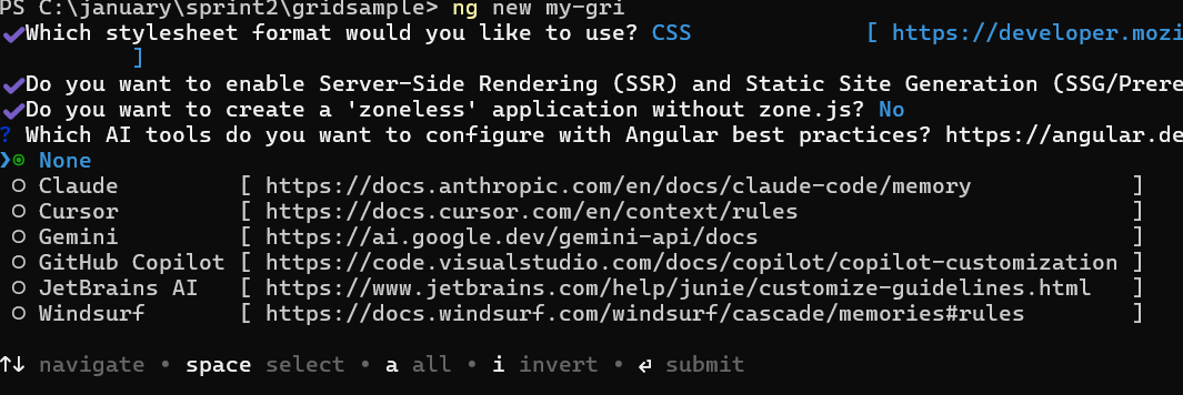
? Which stylesheet format would you like to use? (Use arrow keys)
> CSS             [ https://developer.mozilla.org/docs/Web/CSS                     ]
  Sass (SCSS)     [ https://sass-lang.com/documentation/syntax#scss                ]
  Sass (Indented) [ https://sass-lang.com/documentation/syntax#the-indented-syntax ]
Less [ http://lesscss.org ]- By default, a CSS-based application is created. Use SCSS if required:
ng new syncfusion-angular-app --style=scss- During project setup, when prompted for the Server-side rendering (SSR) option, choose the appropriate configuration.

- Select the required AI tool or ‘none’ if you do not need any AI tool.
- Navigate to your newly created application directory:
cd syncfusion-angular-appNote: In Angular 19 and below, it uses
app.component.ts,app.component.html,app.component.cssetc. In Angular 20+, the CLI generates a simpler structure withsrc/app/app.ts,app.html, andapp.css(no.component.suffixes).
Installing Syncfusion® Popups package
Syncfusion®’s Angular component packages are available on npmjs.com. To use Syncfusion® Angular components, install the necessary package.
This guide uses the Angular Dialog component for demonstration. Add the Angular Dialog component component with:
ng add @syncfusion/ej2-angular-popupsThis command will perform the following configurations:
- Add the
@syncfusion/ej2-angular-popupspackage and peer dependencies to yourpackage.json. - Import the Dialog component component in your application.
- Register the default Syncfusion® material theme in
angular.json.
For more details on version compatibility, refer to the Version Compatibility section.
Syncfusion® offers two package structures for Angular components:
- Ivy library distribution package format
- Angular compatibility compiler (ngcc), which is Angular’s legacy compilation pipeline.
Syncfusion®’s latest Angular packages are provided as Ivy-compatible and suited for Angular 12 and above. To install the package, execute:ng add @syncfusion/ej2-angular-popupsFor applications not compiled with Ivy, use the
ngcctagged packages:The ngcc packages are still compatible with Angular CLI versions 15 and below. However, they may generate warnings suggesting the use of IVY compiled packages. Starting from Angular 16, support for the ngcc package has been completely removed. If you have further questions regarding ngcc compatibility, please refer to the following FAQ.
npm add @syncfusion/[email protected]
Adding CSS reference
Syncfusion® Angular component themes can be added in various ways: via CSS or SCSS styles from npm packages, CDN, CRG, or Theme Studio.
The Material theme is added to your styles.css when you run ng add (this happens automatically by default).
To stylize only specific Syncfusion® components, import the necessary styles. For example, to style only the Dialog component:
@import '../node_modules/@syncfusion/ej2-base/styles/material3.css';
@import '../node_modules/@syncfusion/ej2-icons/styles/material3.css';
@import '../node_modules/@syncfusion/ej2-buttons/styles/material3.css';
@import '../node_modules/@syncfusion/ej2-angular-popups/styles/material3.css';
Ensure that the import order aligns with the component’s dependency sequence.
For using SCSS styles, refer to this guide.
Adding Dialog component
Use the following snippet in the src/app/app.ts file to import the Dialog component.
import { Component, ViewChild } from '@angular/core';
import { DialogModule, DialogComponent } from '@syncfusion/ej2-angular-popups';

@Component({
  selector: 'app-root',
  imports: [DialogModule],
  template: `
    <div id="dialog-container">
      <button class="e-control e-btn" id="targetButton" (click)="onOpenDialog()">Open Dialog</button>
      <ejs-dialog id="dialog" #ejDialog target="#dialog-container" [showCloseIcon]="true" content="This is a Dialog content"
        width="350px">
      </ejs-dialog>
    </div>
  `
})
export class App {
  // Element reference for the Dialog instance
  @ViewChild('ejDialog') public ejDialog!: DialogComponent;

  public onOpenDialog(): void {
    // Call the show method to open the Dialog
    this.ejDialog.show();
  }
}
Add the following styles in the corresponding CSS file (for example, styles.css):
#dialog-container {
    height: 500px;
}
Note: Ensure that the element with the id
dialog-containerexists and wraps the dialog. For example, set the id on the root element inindex.htmlif needed:<app-root id='dialog-container'></app-root>.
Running the application
Run the ng serve command in a terminal to serve your application, then open it in a browser.
ng serveThe following example shows a basic Dialog component.
import { DialogModule } from '@syncfusion/ej2-angular-popups';
import { Component, ViewChild, OnInit, ElementRef } from '@angular/core';
import { DialogComponent } from '@syncfusion/ej2-angular-popups';

@Component({
  imports: [DialogModule],
  standalone: true,
  selector: 'app-root',
  template: `
      <div id="dialog-container">
        <button class="e-control e-btn" id="targetButton" (click)="onOpenDialog($event)">Open Dialog</button>
        <ejs-dialog id='dialog' #ejDialog target="#dialog-container" [showCloseIcon]='true' content='This is a Dialog content'
          width='350px'>
      </ejs-dialog>
      </div>`
})

export class AppComponent implements OnInit {
  ngOnInit(): void { }
  // Reference the Dialog element
  @ViewChild('ejDialog') ejDialog: DialogComponent | any;

  // Show the Dialog when click the button
  public onOpenDialog = (event: any): void => {
    this.ejDialog.show();
  };
}
import { bootstrapApplication } from '@angular/platform-browser';
import { AppComponent } from './app.component';
import 'zone.js';
bootstrapApplication(AppComponent).catch((err) => console.error(err));The dialog’s max-height is calculated based on the dialog target element’s height. If the
targetproperty is not configured,document.bodyis considered the target. To display the dialog at a proper height, add amin-heightto the target element.
If the dialog is rendered againstbodyand its height exceeds the body’s height, the dialog’s height will not be set automatically. In this scenario, set CSS on thehtmlandbodyelements to provide full height.
html, body {
   height: 100%;
}
Modal Dialog
A modal shows an overlay behind the Dialog, so the user must interact with the dialog before interacting with the rest of the application.
When the user clicks the overlay, handle the action through the overlayClick event. In the sample below, clicking the overlay closes the dialog.
When a modal dialog is opened, scrolling on the dialog’s target is disabled and re-enabled after the dialog is closed.
import { DialogModule } from '@syncfusion/ej2-angular-popups';
import { Component, ViewChild, OnInit, ElementRef } from '@angular/core';
import { DialogComponent } from '@syncfusion/ej2-angular-popups';

@Component({
  imports: [DialogModule],
  standalone: true,
  selector: 'app-root',
  template: `
      <div id="dialog-container">
        <button class="e-control e-btn" id="targetButton" (click)="onOpenDialog($event)">Open Modal Dialog</button>
        <ejs-dialog id='dialog' #ejDialog target="#dialog-container" isModal='true' header='Dialog' [showCloseIcon]='true' content='This is a Dialog content'
          width='350px' (overlayClick)="onOverlayClick()">
        </ejs-dialog>
      </div>`
})

export class AppComponent implements OnInit {
  ngOnInit(): void { }
  // Reference the Dialog element
  @ViewChild('ejDialog') ejDialog: DialogComponent | any;

  // Show the Dialog when click the button
  public onOpenDialog = (event: any): void => {
    this.ejDialog.show();
  };

  // Hide the Dialog when click the Dialog overlay
  public onOverlayClick() {
    this.ejDialog.hide();
  }
}
import { bootstrapApplication } from '@angular/platform-browser';
import { AppComponent } from './app.component';
import 'zone.js';
bootstrapApplication(AppComponent).catch((err) => console.error(err));Enable header
Enable the Dialog header by providing text or HTML content through the header property.
import { DialogModule } from '@syncfusion/ej2-angular-popups';
import { Component, ViewChild, OnInit } from '@angular/core';
import { DialogComponent } from '@syncfusion/ej2-angular-popups';

@Component({
  imports: [DialogModule],
  standalone: true,
  selector: 'app-root',
  template: `
      <div id="dialog-container">
        <button class="e-control e-btn" id="targetButton" (click)="onOpenDialog($event)">Open Dialog</button>
          <ejs-dialog id='dialog' #ejDialog target="#dialog-container" header='Dialog' [showCloseIcon]='true' content='This is a Dialog content' width='350px'>
        </ejs-dialog>
      </div>`
})

export class AppComponent implements OnInit {
  ngOnInit(): void { }
  // Reference the Dialog element
  @ViewChild('ejDialog') ejDialog: DialogComponent | any;

  // Show the Dialog when click the button
  public onOpenDialog = (event: any): void => {
    this.ejDialog.show();
  };
}
import { bootstrapApplication } from '@angular/platform-browser';
import { AppComponent } from './app.component';
import 'zone.js';
bootstrapApplication(AppComponent).catch((err) => console.error(err));Enable default footer buttons
The Dialog provides built-in support to render buttons in the footer (for example, “OK” or “Cancel”). Each Dialog button can trigger actions when clicked.
The primary button is automatically focused when the Dialog opens. Use the click event to handle actions.
When the Dialog initializes with more than one primary button, the first primary button receives focus when the Dialog opens.
The sample below renders footer buttons and handles their click events.
import { DialogModule } from '@syncfusion/ej2-angular-popups';
import { Component, ViewChild, OnInit } from '@angular/core';
import { DialogComponent } from '@syncfusion/ej2-angular-popups';

@Component({
  imports: [DialogModule],
  standalone: true,
  selector: 'app-root',
  template: `
      <div id="dialog-container">
        <button class="e-control e-btn" id="targetButton" (click)="onOpenDialog($event)">Open Dialog</button>
        <ejs-dialog id='dialog' #ejDialog target="#dialog-container" header='Dialog' [showCloseIcon]='true' content='This is a Dialog with button and primary button'
          width='350px' [buttons]='buttons'>
      </ejs-dialog>
      </div>`
})

export class AppComponent implements OnInit {
  ngOnInit(): void { }
  // Reference the Dialog element
  @ViewChild('ejDialog') ejDialog: DialogComponent | any;

  // Show the Dialog when click the button
  public onOpenDialog = (event: any): void => {
    this.ejDialog.show();
  };

  // Enables the footer buttons
  public buttons: Object = [
    {
      'click': this.hideDialog.bind(this),
      // Accessing button component properties by buttonModel property
      buttonModel: {
        content: 'OK',
        // Enables the primary button
        isPrimary: true
      }
    },
    {
      'click': this.hideDialog.bind(this),
      buttonModel: {
        content: 'Cancel'
      }
    }
  ];

  // Hide the Dialog when click the footer button.
  public hideDialog() {
    this.ejDialog.hide();
  }
}
import { bootstrapApplication } from '@angular/platform-browser';
import { AppComponent } from './app.component';
import 'zone.js';
bootstrapApplication(AppComponent).catch((err) => console.error(err));Draggable
The Angular Dialog supports dragging within its target container by grabbing the Dialog header, allowing the user to reposition the Dialog dynamically.
The Dialog can be draggable only when the Dialog header is enabled.
Starting from v16.2.x, draggable is also supported for modal dialogs.
import { DialogModule } from '@syncfusion/ej2-angular-popups';
import { Component, ViewChild, OnInit } from '@angular/core';
import { DialogComponent } from '@syncfusion/ej2-angular-popups';

@Component({
  imports: [DialogModule],
  standalone: true,
  selector: 'app-root',
  template: `
    <div id="dialog-container">
      <button class="e-control e-btn" id="targetButton" (click)="onOpenDialog($event)">Open Dialog</button>
      <ejs-dialog id='dialog' #ejDialog target="#dialog-container" allowDragging='true' header='Dialog' [showCloseIcon]='true'
        content='This is a Dialog with drag enabled' width='350px'>
      </ejs-dialog>
    </div>`
})

export class AppComponent implements OnInit {
  ngOnInit(): void { }
  // Reference the Dialog element
  @ViewChild('ejDialog') ejDialog: DialogComponent | any;

  // Show the Dialog when click the button
  public onOpenDialog = (event: any): void => {
    this.ejDialog.show();
  };
}
import { bootstrapApplication } from '@angular/platform-browser';
import { AppComponent } from './app.component';
import 'zone.js';
bootstrapApplication(AppComponent).catch((err) => console.error(err));Positioning
The Angular Dialog can be positioned using the position property by providing the X and Y coordinates. It can be positioned inside the target container or the <body> element based on the given X and Y values.
- For X: left, center, right, or any offset value
- For Y: top, center, bottom, or any offset value
The below example demonstrates the different Dialog positions.
import { DialogModule } from '@syncfusion/ej2-angular-popups';
import { Component, ViewChild, OnInit } from '@angular/core';
import { DialogComponent } from '@syncfusion/ej2-angular-popups';

@Component({
  imports: [DialogModule],
  standalone: true,
  selector: 'app-root',
  template: `
      <div id="dialog-container">
        <button class="e-control e-btn" id="targetButton" (click)="onOpenDialog($event)">Open Dialog</button>
        <ejs-dialog id='dialog' #ejDialog target="#dialog-container" [position]='position' header='Dialog' [showCloseIcon]='true'
          content='This is a Dialog with drag enabled' width='350px'>
        <ng-template #header>
            <span>Choose a Dialog Position</span>
        </ng-template>
        <ng-template #content>
          <table style="width:320px;padding:18px; padding-top:0px;">
            <tr>
              <td><input type="radio" name="xy" (click)="changePosition($event)" value="left top" checked="true">left top</td>
              <td><input type="radio" name="xy" (click)="changePosition($event)" value="center top">center top</td>
              <td><input type="radio" name="xy" (click)="changePosition($event)" value="right top">right top</td>
            </tr>
            <tr>
              <td><input type="radio" name="xy" (click)="changePosition($event)" value="left center">left center</td>
              <td><input type="radio" name="xy" (click)="changePosition($event)" value="center center">center center</td>
              <td><input type="radio" name="xy" (click)="changePosition($event)" value="right center">right center</td>
            </tr>
            <tr>
              <td><input type="radio" name="xy" (click)="changePosition($event)" value="left bottom">left bottom</td>
              <td><input type="radio" name="xy" (click)="changePosition($event)" value="center bottom">center bottom</td>
              <td><input type="radio" name="xy" (click)="changePosition($event)" value="right bottom">right bottom</td>
            </tr>
          </table>
        </ng-template>
        <ng-template #footerTemplate>
            <span id="posvalue" style="float:left; padding-left:10px;">Position: "Left", "Top"</span>
        </ng-template>
      </ejs-dialog>
      </div>
      `
})

export class AppComponent implements OnInit {
  ngOnInit(): void { }
  // Reference the Dialog element
  @ViewChild('ejDialog') ejDialog: DialogComponent | any;

  // Set Dialog position
  public position: object = { X: 'left', Y: 'top' };

  // Show the Dialog when click the button
  public onOpenDialog = (event: any): void => {
    this.ejDialog.show();
  };

  public changePosition = (event: any): void => {
    this.ejDialog.position = { X: event.currentTarget.value.split(" ")[0], Y: event.currentTarget.value.split(" ")[1] };
    document.getElementById("posvalue")!.innerHTML = 'Position: {X: "' + event.currentTarget.value.split(" ")[0] + '", Y: "' + event.currentTarget.value.split(" ")[1] + '"}';
  }
}
import { bootstrapApplication } from '@angular/platform-browser';
import { AppComponent } from './app.component';
import 'zone.js';
bootstrapApplication(AppComponent).catch((err) => console.error(err));Refer to the Angular Dialog feature tour page for a summary of features. You can also explore the Angular Dialog example that shows how to render the dialog.