How can I help you?
Getting Started with the Vue Uploader Component in Vue 3
10 Feb 202621 minutes to read
This article provides a step-by-step guide for setting up a Vite project with a JavaScript environment and integrating the Syncfusion® Vue Uploader component using the Composition API / Options API.
The Composition API is a new feature introduced in Vue.js 3 that provides an alternative way to organize and reuse component logic. It allows developers to write components as functions that use smaller, reusable functions called composition functions to manage their properties and behavior.
The Options API is the traditional way of writing Vue.js components, where the component logic is organized into a series of options that define the component’s properties and behavior. These options include data, methods, computed properties, watchers, life-cycle hooks, and more.
To get start quickly with Vue Uploader component, you can check on this video:
Prerequisites
System requirements for Syncfusion® Vue UI components
Set up the Vite project
A recommended approach for beginning with Vue is to scaffold a project using Vite. To create a new Vite project, use one of the commands that are specific to either NPM or Yarn.
npm create vite@latestor
yarn create viteUsing one of the above commands will lead you to set up additional configurations for the project as below:
1.Define the project name: We can specify the name of the project directly. Let’s specify the name of the project as my-project for this article.
? Project name: » my-project2.Select Vue as the framework. It will create a Vue 3 project.
? Select a framework: » - Use arrow-keys. Return to submit.
Vanilla
> Vue
  React
  Preact
  Lit
  Svelte
  Others
3.Choose JavaScript as the framework variant to build this Vite project using JavaScript and Vue.
? Select a variant: » - Use arrow-keys. Return to submit.
> JavaScript
  TypeScript
  Customize with create-vue ↗
  Nuxt ↗
4.Roll-down is Vite’s new experimental faster bundler (rust-based, replacing roll-up). Choose No uses the stable, proven roll-up-based Vite (recommended for most users)
Use rolldown-vite (Experimental)? No5.Install dependencies and start the dev server.
Install with npm and start now?: YesSince you selected Yes, the development server should start automatically. If you selected No, please follow these steps to set up and start the project manually:
cd my-project
npm install
or
cd my-project
yarn install
Now that my-project is ready to run with default settings, let’s add Syncfusion® components to the project.
Add Syncfusion® Vue packages
Syncfusion® Vue component packages are available at npmjs.com. To use Syncfusion® Vue components in the project, install the corresponding npm package.
This article uses the Vue Uploader component as an example. To use the Vue Uploader component in the project, the @syncfusion/ej2-vue-inputs package needs to be installed using the following command:
npm install @syncfusion/ej2-vue-inputs --saveor
yarn add @syncfusion/ej2-vue-inputsImport Syncfusion® CSS styles
Syncfusion® components require CSS stylesheets to display correctly. You can import themes in various ways, such as using CSS or SASS styles from npm packages, CDN, CRG, and Theme Studio. Refer to themes topic to learn more about built-in themes and different ways to reference themes in a Vue project.
In this article, Material3 theme is applied using CSS styles, which are available in installed packages. The necessary Material3 CSS styles for the Uploader component and its dependents were imported into the <style> section of src/App.vue file.
<style>
  @import "../node_modules/@syncfusion/ej2-base/styles/material.css";
  @import "../node_modules/@syncfusion/ej2-buttons/styles/material.css";
  @import "../node_modules/@syncfusion/ej2-vue-inputs/styles/material.css";
</style>
The order of CSS imports matters. Import base styles first, then component-specific styles. Missing CSS imports can result in misaligned layouts, buttons without styling, or missing visual elements in popups and dialogs.
Add Syncfusion® Vue component
Follow the below steps to add the Vue Uploader component using Composition API or Options API:
1.First, import and register the Uploader component in the script section of the src/App.vue file. If you are using the Composition API, you should add the setup attribute to the script tag to indicate that Vue will be using the Composition API.
<script setup>
  import { UploaderComponent as EjsUploader } from "@syncfusion/ej2-vue-inputs";
</script><script>
import { UploaderComponent } from "@syncfusion/ej2-vue-inputs";
//Component registeration
export default {
name: "App",
components: {
"ejs-uploader'":UploaderComponent
}
}
</script>2.In the template section, define the Uploader component with the dataSource property and column definitions.
<template>
  <div>
    <div id="modalTarget" class="control-section; position:relative" style="height:350px;">
        <ejs-uploader ref="uploadObj" id='defaultfileupload' name="UploadFiles"></ejs-uploader>
    </div>
  </div>
</template>
Here is the summarized code for the above steps in the src/App.vue file:
<template>
  <div>
    <div id="modalTarget" class="control-section; position:relative" style="height:350px;">
        <ejs-uploader ref="uploadObj" id='defaultfileupload' name="UploadFiles"></ejs-uploader>
    </div>
  </div>
</template>

<script setup>
import { UploaderComponent as EjsUploader } from "@syncfusion/ej2-vue-inputs";
  const data = [];
</script>

<style>
    @import "../node_modules/@syncfusion/ej2-base/styles/material.css";
    @import "../node_modules/@syncfusion/ej2-buttons/styles/material.css";
    @import "../node_modules/@syncfusion/ej2-vue-inputs/styles/material.css";
    #app {
        color: #008cff;
        height: 40px;
        width: 20%;
        text-align: left;
    }
    .control-section {
        height: 100%;
        min-height: 200px;
    }
</style><template>
<div>
<div id="modalTarget" class="control-section; position:relative" style="height:350px;">
<ejs-uploader ref="uploadObj" id='defaultfileupload' name="UploadFiles"></ejs-uploader>
</div>
</div>
</template>
<script>
import { UploaderComponent } from "@syncfusion/ej2-vue-inputs";
//Component registeration
export default {
name: "App",
components: {
"ejs-uploader":UploaderComponent
},
data: function() {
return { }
}
}
</script>
<style>
@import "../node_modules/@syncfusion/ej2-base/styles/material.css";
@import "../node_modules/@syncfusion/ej2-buttons/styles/material.css";
@import "../node_modules/@syncfusion/ej2-vue-inputs/styles/material.css";
#app {
color: #008cff;
height: 40px;
width: 20%;
text-align: left;
}
.control-section {
height: 100%;
min-height: 200px;
}
</style>Run the project
To run the project, use the following command:
npm run devor
yarn run devThe output will appear as follows:

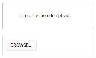
Adding drop area
By default, the uploader component allows to upload files by drag the files from file explorer, and drop into the drop area. You can configure any other external element as drop target using dropArea property.
In the following sample, drop target is configured.
<template>
  <div>
    <div id='droparea'>Drop files here to upload</div>
    <ejs-uploader ref="uploadObj" id='defaultfileupload' name="UploadFiles" :dropArea="dropElement"></ejs-uploader>
  </div>
</template>
<script setup>
import { UploaderComponent  as EjsUploader } from "@syncfusion/ej2-vue-inputs";
const dropElement = "#droparea";
</script>
<style>
    @import "../node_modules/@syncfusion/ej2-base/styles/material.css";
    @import "../node_modules/@syncfusion/ej2-buttons/styles/material.css";
    @import "../node_modules/@syncfusion/ej2-vue-inputs/styles/material.css";
    #container {
        visibility: hidden;
        padding-left: 5%;
        width: 100%;
    }
    #loader {
        color: #008cff;
        font-family: 'Helvetica Neue','calibiri';
        font-size: 14px;
        height: 40px;
        left: 45%;
        position: absolute;
        top: 45%;
        width: 30%;
    }
    .fileupload {
        margin: 20px auto;
        width: 400px;
    }
    #droparea {
        padding: 50px 25px;
        border: 1px solid #c3c3c3;
        text-align: center;
    }
    .e-file-select,
    .e-file-drop {
        display: none;
    }
    body .e-upload-drag-hover {
         outline: 2px dashed brown;
    }
    #uploadfile {
        width: 60%;
        display: inline-flex;
        margin-left: 5%;
    }
    #app {
        color: #008cff;
        height: 40px;
        width: 40%;
        text-align: left;
    }
</style><template>
<div>
<div id='droparea'>Drop files here to upload</div>
<ejs-uploader ref="uploadObj" id='defaultfileupload' name="UploadFiles" :dropArea = "dropElement"></ejs-uploader>
</div>
</template>
<script>
import { UploaderComponent } from "@syncfusion/ej2-vue-inputs";
//Component registeration
export default {
name: "App",
components: {
"ejs-uploader":UploaderComponent
},
data: function() {
return {
dropElement: '#droparea'
}
}
}
</script>
<style>
@import "../node_modules/@syncfusion/ej2-base/styles/material.css";
@import "../node_modules/@syncfusion/ej2-buttons/styles/material.css";
@import "../node_modules/@syncfusion/ej2-vue-inputs/styles/material.css";
#container {
visibility: hidden;
padding-left: 5%;
width: 100%;
}
#loader {
color: #008cff;
font-family: 'Helvetica Neue','calibiri';
font-size: 14px;
height: 40px;
left: 45%;
position: absolute;
top: 45%;
width: 30%;
}
.fileupload {
margin: 20px auto;
width: 400px;
}
#droparea {
padding: 50px 25px;
border: 1px solid #c3c3c3;
text-align: center;
}
.e-file-select,
.e-file-drop {
display: none;
}
body .e-upload-drag-hover {
outline: 2px dashed brown;
}
#uploadfile {
width: 60%;
display: inline-flex;
margin-left: 5%;
}
#app {
color: #008cff;
height: 40px;
width: 40%;
text-align: left;
}
</style>The output will appear as follows:
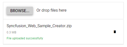
Configure asynchronous settings
The uploader component process the files to upload in Asynchronous mode by default. Define the properties saveUrl and removeUrl to handle the save and remove action as follows.
<template>
  <div>
    <ejs-uploader ref="uploadObj" id='defaultfileupload' name="UploadFiles" :asyncSettings= "path" ></ejs-uploader>
  </div>
</template>
<script setup>
import { UploaderComponent as EjsUploader } from "@syncfusion/ej2-vue-inputs";
const path = { saveUrl: 'https://ej2.syncfusion.com/services/api/uploadbox/Save',
                  removeUrl: 'https://ej2.syncfusion.com/services/api/uploadbox/Remove'}
</script>
<style>
    @import "../node_modules/@syncfusion/ej2-base/styles/material.css";
    @import "../node_modules/@syncfusion/ej2-buttons/styles/material.css";
    @import "../node_modules/@syncfusion/ej2-vue-inputs/styles/material.css";

    #app {
        color: #008cff;
        height: 40px;
        width: 40%;
        text-align: left;
    }
</style><template>
<div>
<ejs-uploader ref="uploadObj" id='defaultfileupload' name="UploadFiles" :asyncSettings= "path" ></ejs-uploader>
</div>
</template>
<script>
import { UploaderComponent } from "@syncfusion/ej2-vue-inputs";
//Component registeration
export default {
name: "App",
components: {
"ejs-uploader":UploaderComponent
},
data: function() {
return {
path: {
saveUrl: 'https://ej2.syncfusion.com/services/api/uploadbox/Save',
removeUrl: 'https://ej2.syncfusion.com/services/api/uploadbox/Remove'
}
}
}
}
</script>
<style>
@import "../node_modules/@syncfusion/ej2-base/styles/material.css";
@import "../node_modules/@syncfusion/ej2-buttons/styles/material.css";
@import "../node_modules/@syncfusion/ej2-vue-inputs/styles/material.css";
#app {
color: #008cff;
height: 40px;
width: 40%;
text-align: left;
}
</style>The output will appear as follows:
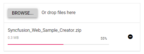
Handle success and failed upload
You can handle the success and failure actions using the success and failure events. To handle these event, define the function and assign it to corresponding event as follows.
<template>
  <div>
    <ejs-uploader ref="uploadObj" id='defaultfileupload' name="UploadFiles" :asyncSettings= "path" :success= "onUploadSuccess" :failure= "onUploadFailed" ></ejs-uploader>
  </div>
</template>
<script setup>
import { UploaderComponent as EjsUploader} from "@syncfusion/ej2-vue-inputs";
    const path = { saveUrl: 'https://services.syncfusion.com/vue/production/api/FileUploader/Save',
            removeUrl: 'https://services.syncfusion.com/vue/production/api/FileUploader/Remove'}
    const onUploadSuccess = () => {
      console.log('Uploaded successfully');
    };
    const onUploadFailed = () => {
      console.log('Upload fails');
    };
</script>
<style>
    @import "../node_modules/@syncfusion/ej2-base/styles/material.css";
    @import "../node_modules/@syncfusion/ej2-buttons/styles/material.css";
    @import "../node_modules/@syncfusion/ej2-vue-inputs/styles/material.css";

    #app {
        color: #008cff;
        height: 40px;
        width: 40%;
        text-align: left;
    }
</style><template>
<div>
<ejs-uploader ref="uploadObj" id='defaultfileupload' name="UploadFiles" :asyncSettings= "path" :success= "onUploadSuccess" :failure= "onUploadFailed" ></ejs-uploader>
</div>
</template>
<script>
import { UploaderComponent } from "@syncfusion/ej2-vue-inputs";
//Component registeration
export default {
name: "App",
components: {
"ejs-uploader":UploaderComponent
},
data: function() {
return {
path: {
saveUrl: 'https://services.syncfusion.com/vue/production/api/FileUploader/Save',
removeUrl: 'https://services.syncfusion.com/vue/production/api/FileUploader/Remove'
}
}
},
methods: {
onUploadSuccess: function () {
console.log('Uploaded successfully');
},
onUploadFailed: function () {
console.log('Upload fails');
}
}
}
</script>
<style>
@import "../node_modules/@syncfusion/ej2-base/styles/material.css";
@import "../node_modules/@syncfusion/ej2-buttons/styles/material.css";
@import "../node_modules/@syncfusion/ej2-vue-inputs/styles/material.css";
#app {
color: #008cff;
height: 40px;
width: 40%;
text-align: left;
}
</style>The output will appear as follows: