How can I help you?
Getting Started with the Vue Uploader Component in Vue 2
10 Feb 202615 minutes to read
This article provides a step-by-step guide for setting up a Vue 2 project using Vue-CLI and integrating the Syncfusion® Vue Uploader component.
Prerequisites
System requirements for Syncfusion® Vue UI components
Setup the Vue 2 project
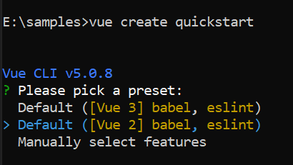
To generate a Vue 2 project using Vue-CLI, use the vue create command. Follow these steps to install Vue CLI and create a new project:
npm install -g @vue/cli
vue create quickstart
cd quickstart
npm run serve
or
yarn global add @vue/cli
vue create quickstart
cd quickstart
yarn run serve
When creating a new project, choose the option Default ([Vue 2] babel, eslint) from the menu.
Once the quickstart project is set up with default settings, proceed to add Syncfusion® components to the project.
Add Syncfusion® Vue packages
Syncfusion® packages are available at npmjs.com. To use Vue components, install the required npm package.
This article uses the Vue Uploader component as an example. Install the @syncfusion/ej2-vue-inputs package by running the following command:
npm install @syncfusion/ej2-vue-inputs --saveor
yarn add @syncfusion/ej2-vue-inputsImport Syncfusion® CSS styles
Syncfusion® components require CSS stylesheets to display correctly. You can import themes in various ways, such as using CSS or SASS styles from npm packages, CDN, CRG, and Theme Studio. Refer to themes topic to learn more about built-in themes and different ways to reference themes in a Vue project.
In this article, the Material3 theme is applied using CSS styles, which are available in installed packages. The necessary Material3 CSS styles for the Uploader component and its dependents were imported into the <style> section of the src/App.vue file.
<style>
@import "../node_modules/@syncfusion/ej2-base/styles/material.css";
@import "../node_modules/@syncfusion/ej2-buttons/styles/material.css";
@import "../node_modules/@syncfusion/ej2-vue-inputs/styles/material.css";
</style>
The order of CSS imports matters. Import base styles first, then component-specific styles. Missing CSS imports can result in misaligned layouts, buttons without styling, or missing visual elements in popups and dialogs.
Add Syncfusion® Vue component
Follow the below steps to add the Vue Uploader component:
1. First, import and register the Uploader component in the script section of the src/App.vue file.
<script setup>
import { UploaderComponent as EjsUploader } from '@syncfusion/ej2-vue-inputs';
</script><script>
import { UploaderComponent } from '@syncfusion/ej2-vue-inputs';
export default {
name: "App",
components: {
"ejs-uploader':":UploaderComponent
}
}
</script>2. In the template section define the Uploader component.
<template>
    <div id="app">
    <ejs-uploader ref="uploadObj" id='defaultfileupload' name="UploadFiles"></ejs-uploader>
  </div>
</template>
Here is the summarized code for the above steps in the src/App.vue file:
<template>
    <div>
        <div id="modalTarget" class="control-section; position:relative" style="height:350px;">
            <ejs-uploader ref="uploadObj" id='defaultfileupload' name="UploadFiles"></ejs-uploader>
        </div>
    </div>
</template>
<script setup>
import { UploaderComponent as EjsUploader } from '@syncfusion/ej2-vue-inputs';

</script>
<style>
@import "../node_modules/@syncfusion/ej2-base/styles/material.css";
@import "../node_modules/@syncfusion/ej2-buttons/styles/material.css";
@import "../node_modules/@syncfusion/ej2-vue-inputs/styles/material.css";
</style><template>
<div>
<div id="modalTarget" class="control-section; position:relative" style="height:350px;">
<ejs-uploader ref="uploadObj" id='defaultfileupload' name="UploadFiles"></ejs-uploader>
</div>
</div>
</template>
<script>
import { UploaderComponent } from '@syncfusion/ej2-vue-inputs';
export default {
name: "App",
components: {
"ejs-uploader": UploaderComponent,
},
data: function () {
return {}
}
}
</script>
<style>
@import "../node_modules/@syncfusion/ej2-base/styles/material.css";
@import "../node_modules/@syncfusion/ej2-buttons/styles/material.css";
@import "../node_modules/@syncfusion/ej2-vue-inputs/styles/material.css";
</style>Run the project
To run the project, use the following command:
npm run serveor
yarn run serveThe Essential® JS2 AJAX library has been integrated for uploader server requests. Hence, use the third party
promiselibrary like blue-bird to use the uploader in Internet Explorer.
Adding drop area
By default, the uploader component allows to upload files by drag the files from file explorer, and drop into the drop area. You can configure any other external element as drop target using dropArea property.
In the following sample, drop target is configured.
<template>
    <div>
        <div id='droparea'>
            Drop files here to upload
        </div>
        <ejs-uploader ref="uploadObj" id='defaultfileupload' name="UploadFiles" :dropArea="dropElement"></ejs-uploader>
    </div>
</template>
<script setup>
import { UploaderComponent as EjsUploader } from '@syncfusion/ej2-vue-inputs';

const dropElement = '#droparea';

</script>
<style>
@import "../node_modules/@syncfusion/ej2-base/styles/material.css";
@import "../node_modules/@syncfusion/ej2-buttons/styles/material.css";
@import "../node_modules/@syncfusion/ej2-vue-inputs/styles/material.css";

#container {
    visibility: hidden;
    padding-left: 5%;
    width: 100%;
}

#loader {
    color: #008cff;
    font-family: 'Helvetica Neue', 'calibiri';
    font-size: 14px;
    height: 40px;
    left: 45%;
    position: absolute;
    top: 45%;
    width: 30%;
}

.fileupload {
    margin: 20px auto;
    width: 400px;
}

#droparea {
    padding: 50px 25px;
    margin: 30px auto;
    border: 1px solid #c3c3c3;
    text-align: center;
    width: 20%;
    display: inline-flex;
}

.e-file-select,
.e-file-drop {
    display: none;
}

body .e-upload-drag-hover {
    outline: 2px dashed brown;
}

#uploadfile {
    width: 60%;
    display: inline-flex;
    margin-left: 5%;
}
</style><template>
<div>
<div id='droparea'>
Drop files here to upload
</div>
<ejs-uploader ref="uploadObj" id='defaultfileupload' name="UploadFiles" :dropArea="dropElement"></ejs-uploader>
</div>
</template>
<script>
import { UploaderComponent } from '@syncfusion/ej2-vue-inputs';
export default {
name: "App",
components: {
"ejs-uploader": UploaderComponent
},
data: function () {
return {
dropElement: '#droparea'
}
}
}
</script>
<style>
@import "../node_modules/@syncfusion/ej2-base/styles/material.css";
@import "../node_modules/@syncfusion/ej2-buttons/styles/material.css";
@import "../node_modules/@syncfusion/ej2-vue-inputs/styles/material.css";
#container {
visibility: hidden;
padding-left: 5%;
width: 100%;
}
#loader {
color: #008cff;
font-family: 'Helvetica Neue', 'calibiri';
font-size: 14px;
height: 40px;
left: 45%;
position: absolute;
top: 45%;
width: 30%;
}
.fileupload {
margin: 20px auto;
width: 400px;
}
#droparea {
padding: 50px 25px;
margin: 30px auto;
border: 1px solid #c3c3c3;
text-align: center;
width: 20%;
display: inline-flex;
}
.e-file-select,
.e-file-drop {
display: none;
}
body .e-upload-drag-hover {
outline: 2px dashed brown;
}
#uploadfile {
width: 60%;
display: inline-flex;
margin-left: 5%;
}
</style>Configure asynchronous settings
The uploader component process the files to upload in Asynchronous mode by default. Define the properties saveUrl and removeUrl to handle the save and remove action as follows.
<template>
  <div>
    <ejs-uploader ref="uploadObj" id='defaultfileupload' name="UploadFiles" :asyncSettings="path"></ejs-uploader>
  </div>
</template>
<script setup>
import { UploaderComponent as EjsUploader } from '@syncfusion/ej2-vue-inputs';

const path = {
  saveUrl: 'https://services.syncfusion.com/vue/production/api/FileUploader/Save',
  removeUrl: 'https://services.syncfusion.com/vue/production/api/FileUploader/Remove'
};

</script>
<style>
@import "../node_modules/@syncfusion/ej2-base/styles/material.css";
@import "../node_modules/@syncfusion/ej2-buttons/styles/material.css";
@import "../node_modules/@syncfusion/ej2-vue-inputs/styles/material.css";
</style><template>
<div>
<ejs-uploader ref="uploadObj" id='defaultfileupload' name="UploadFiles" :asyncSettings="path"></ejs-uploader>
</div>
</template>
<script>
import { UploaderComponent } from '@syncfusion/ej2-vue-inputs';
export default {
name: "App",
components: {
"ejs-uploader": UploaderComponent
},
data: function () {
return {
path: {
saveUrl: 'https://services.syncfusion.com/vue/production/api/FileUploader/Save',
removeUrl: 'https://services.syncfusion.com/vue/production/api/FileUploader/Remove'
}
}
}
}
</script>
<style>
@import "../node_modules/@syncfusion/ej2-base/styles/material.css";
@import "../node_modules/@syncfusion/ej2-buttons/styles/material.css";
@import "../node_modules/@syncfusion/ej2-vue-inputs/styles/material.css";
</style>Handle success and failed upload
You can handle the success and failure actions using the success and failure events. To handle these event, define the function and assign it to corresponding event as follows.
<template>
  <div>
    <ejs-uploader ref="uploadObj" id='defaultfileupload' name="UploadFiles" :asyncSettings="path"
      :success="onUploadSuccess" :failure="onUploadFailed"></ejs-uploader>
  </div>
</template>
<script setup>
import { UploaderComponent as EjsUploader } from '@syncfusion/ej2-vue-inputs';

const path = {
  saveUrl: 'https://services.syncfusion.com/vue/production/api/FileUploader/Save',
  removeUrl: 'https://services.syncfusion.com/vue/production/api/FileUploader/Remove'
};

const onUploadSuccess = () => {
  console.log('Uploaded successfully');
};
const onUploadFailed = () => {
  console.log('Upload fails');
};

</script>
<style>
@import "../node_modules/@syncfusion/ej2-base/styles/material.css";
@import "../node_modules/@syncfusion/ej2-buttons/styles/material.css";
@import "../node_modules/@syncfusion/ej2-vue-inputs/styles/material.css";
</style><template>
<div>
<ejs-uploader ref="uploadObj" id='defaultfileupload' name="UploadFiles" :asyncSettings="path"
:success="onUploadSuccess" :failure="onUploadFailed"></ejs-uploader>
</div>
</template>
<script>
import { UploaderComponent } from '@syncfusion/ej2-vue-inputs';
export default {
name: "App",
components: {
"ejs-uploader": UploaderComponent
},
data: function () {
return {
path: {
saveUrl: 'https://services.syncfusion.com/vue/production/api/FileUploader/Save',
removeUrl: 'https://services.syncfusion.com/vue/production/api/FileUploader/Remove'
}
}
},
methods: {
onUploadSuccess: function () {
console.log('Uploaded successfully');
},
onUploadFailed: function () {
console.log('Upload fails');
}
}
}
</script>
<style>
@import "../node_modules/@syncfusion/ej2-base/styles/material.css";
@import "../node_modules/@syncfusion/ej2-buttons/styles/material.css";
@import "../node_modules/@syncfusion/ej2-vue-inputs/styles/material.css";
</style>You can also explore Vue File Upload feature tour page for its groundbreaking features. You can also explore our Vue File Upload example that shows how to render the file upload and browse the files which you want to upload to the server.