How can I help you?
Getting Started with the Vue Radio button Component in Vue 2
13 Mar 20266 minutes to read
This article provides a step-by-step guide for setting up a Vue 2 project using Vue-CLI and integrating the Syncfusion® Vue Radio button component.
Prerequisites
System requirements for Syncfusion® Vue UI components
Setting up the Vue 2 project
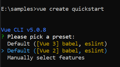
To generate a Vue 2 project using Vue-CLI, use the vue create command. Follow these steps to install Vue CLI and create a new project:
npm install -g @vue/cli
vue create quickstart
cd quickstart
npm run serve
or
yarn global add @vue/cli
vue create quickstart
cd quickstart
yarn run serve
When creating a new project, choose the option Default ([Vue 2] babel, eslint) from the menu.
Once the quickstart project is set up with default settings, proceed to add Syncfusion® components to the project.
Add Syncfusion® Vue packages
Syncfusion® packages are available at npmjs.com. To use Vue components, install the required npm package.
This article uses the Vue Radio button component as an example. Install the @syncfusion/ej2-vue-buttons package by running the following command:
npm install @syncfusion/ej2-vue-buttons --saveor
yarn add @syncfusion/ej2-vue-buttonsImport Syncfusion® CSS styles
Syncfusion® components require CSS stylesheets to display correctly. You can import themes in various ways, such as using CSS or SASS styles from npm packages, CDN, CRG, and Theme Studio. Refer to themes topic to learn more about built-in themes and different ways to reference themes in a Vue project.
In this article, the Material3 theme is applied using CSS styles, which are available in installed packages. The necessary Material3 CSS styles for the Radio button component and its dependents were imported into the <style> section of the src/App.vue file.
<style>
@import "../node_modules/@syncfusion/ej2-base/styles/material3.css";
@import "../node_modules/@syncfusion/ej2-buttons/styles/material3.css";
</style>
The order of CSS imports matters. Import base styles first, then component-specific styles. Missing CSS imports can result in misaligned layouts, buttons without styling, or missing visual elements in popups and dialogs.
Add Syncfusion® Vue component
Follow the below steps to add the Vue Radio button component:
1. First, import and register the Radio button component in the script section of the src/App.vue file.
<script setup>
import { RadioButtonComponent as EjsRadiobutton } from "@syncfusion/ej2-vue-buttons";
</script><script>
import { RadioButtonComponent } from "@syncfusion/ej2-vue-buttons";
export default {
components: {
'ejs-radiobutton': RadioButtonComponent
}
}
</script>2. In the template section, define the Radio button component with the label property.
<template>
<ejs-radiobutton label='Default'></ejs-radiobutton>
</template>
Here is the summarized code for the above steps in the src/App.vue file:
<template>
  <ul>
    <li><ejs-radiobutton label='Option 1' name='default'></ejs-radiobutton></li>
    <li><ejs-radiobutton label='Option 2' name='default' checked=true></ejs-radiobutton></li>
  </ul>
</template>

<script setup>
import { RadioButtonComponent as EjsRadiobutton } from "@syncfusion/ej2-vue-buttons";
import { enableRipple } from '@syncfusion/ej2-base';

enableRipple(true);
</script>

<style>
@import "../node_modules/@syncfusion/ej2-base/styles/material3.css";
@import "../node_modules/@syncfusion/ej2-buttons/styles/material3.css";

.e-radio-wrapper {
  margin-top: 18px;
}

li {
  list-style: none;
}
</style><template>
<ul>
<li><ejs-radiobutton label='Option 1' name='default'></ejs-radiobutton></li>
<li><ejs-radiobutton label='Option 2' name='default' checked=true></ejs-radiobutton></li>
</ul>
</template>
<script>
import { RadioButtonComponent } from "@syncfusion/ej2-vue-buttons";
import { enableRipple } from '@syncfusion/ej2-base';
enableRipple(true);
export default {
name: "App",
components: {
'ejs-radiobutton': RadioButtonComponent
}
}
</script>
<style>
@import "../node_modules/@syncfusion/ej2-base/styles/material3.css";
@import "../node_modules/@syncfusion/ej2-buttons/styles/material3.css";
.e-radio-wrapper {
margin-top: 18px;
}
li {
list-style: none;
}
</style>Run the project
To run the project, use the following command:
npm run serveor
yarn run serveChange the RadioButton state
The Essential® JS 2 RadioButton contains 2 states visually, they are as follows:
- Checked
- Unchecked
The RadioButton checked property is used to handle the checked and unchecked state. In the checked state an inner circle will be added to the visualization of RadioButton.
<template>
  <ul>
    <li><ejs-radiobutton label='Option 1' name='default' checked=true></ejs-radiobutton></li>
    <li><ejs-radiobutton label='Option 2' name='default'></ejs-radiobutton></li>
  </ul>
</template>

<script setup>
import { RadioButtonComponent as EjsRadiobutton } from "@syncfusion/ej2-vue-buttons";
import { enableRipple } from '@syncfusion/ej2-base';

enableRipple(true);
</script>

<style>
@import "../node_modules/@syncfusion/ej2-base/styles/material3.css";
@import "../node_modules/@syncfusion/ej2-buttons/styles/material3.css";

.e-radio-wrapper {
  margin-top: 18px;
}

li {
  list-style: none;
}
</style><template>
<ul>
<li><ejs-radiobutton label='Option 1' name='default' checked=true></ejs-radiobutton></li>
<li><ejs-radiobutton label='Option 2' name='default'></ejs-radiobutton></li>
</ul>
</template>
<script>
import { RadioButtonComponent } from "@syncfusion/ej2-vue-buttons";
import { enableRipple } from '@syncfusion/ej2-base';
enableRipple(true);
export default {
name: "App",
components: {
'ejs-radiobutton': RadioButtonComponent
}
}
</script>
<style>
@import "../node_modules/@syncfusion/ej2-base/styles/material3.css";
@import "../node_modules/@syncfusion/ej2-buttons/styles/material3.css";
.e-radio-wrapper {
margin-top: 18px;
}
li {
list-style: none;
}
</style>