How can I help you?
Getting Started with the Vue Mention Component in Vue 2
10 Feb 202620 minutes to read
This article provides a step-by-step guide for setting up a Vue 2 project using Vue-CLI and integrating the Syncfusion® Vue Mention component.
To get started quickly with Vue Mention, check this video:
Prerequisites
System requirements for Syncfusion® Vue UI components
Setup the Vue 2 project
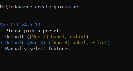
To generate a Vue 2 project using Vue-CLI, use the vue create command. Follow these steps to install Vue CLI and create a new project:
npm install -g @vue/cli
vue create quickstart
cd quickstart
npm run serve
or
yarn global add @vue/cli
vue create quickstart
cd quickstart
yarn run serve
When creating a new project, choose the option Default ([Vue 2] babel, eslint) from the menu.
Once the quickstart project is set up with default settings, proceed to add Syncfusion® components to the project.
Add Syncfusion® Vue packages
Syncfusion® packages are available at npmjs.com. To use Vue components, install the required npm package.
This article uses the Vue Mention component as an example. Install the @syncfusion/ej2-vue-dropdowns package by running the following command:
npm install @syncfusion/ej2-vue-dropdowns --saveor
yarn add @syncfusion/ej2-vue-dropdownsImport Syncfusion® CSS styles
Syncfusion® components require CSS stylesheets to display correctly. You can import themes in various ways, such as using CSS or SASS styles from npm packages, CDN, CRG, and Theme Studio. Refer to themes topic to learn more about built-in themes and different ways to reference themes in a Vue project.
In this article, the Material3 theme is applied using CSS styles, which are available in installed packages. The necessary Material3 CSS styles for the Mention component and its dependents were imported into the <style> section of the src/App.vue file.
<style>
@import "../node_modules/@syncfusion/ej2-base/styles/bootstrap5.css";
@import "../node_modules/@syncfusion/ej2-buttons/styles/bootstrap5.css";
@import "../node_modules/@syncfusion/ej2-popups/styles/bootstrap5.css";
@import "../node_modules/@syncfusion/ej2-lists/styles/bootstrap5.css";
@import "../node_modules/@syncfusion/ej2-vue-dropdowns/styles/bootstrap5.css";
</style>
The order of CSS imports matters. Import base styles first, then component-specific styles. Missing CSS imports can result in misaligned layouts, buttons without styling, or missing visual elements in popups and dialogs.
Add Syncfusion® Vue component
Follow the below steps to add the Vue Mention component:
1. First, import and register the Mention component in the script section of the src/App.vue file.
<script setup>
import { MentionComponent as EjsMention } from "@syncfusion/ej2-vue-dropdowns";
</script><script>
import { MentionComponent } from "@syncfusion/ej2-vue-dropdowns";
export default {
components: {
'ejs-mention': MentionComponent
}
}
</script>Adding Mention component
Add the EJ2 Vue Mention using <ejs-mention> to the <template> section of the App.vue file in src directory. To use the Mention component properly, the target property should be configured so that it renders the Mention component in the configured element.
<template>
  <div id="app">
    <label id="comment" >Comments</label>
    <div id="mentionElement" placeholder = "Type @ and tag user"></div>
    <ejs-mention id='defaultMention' :target='mentionTarget'></ejs-mention>
  </div>
</template>

<script setup>
import { MentionComponent as EjsMention } from "@syncfusion/ej2-vue-dropdowns";
const mentionTarget = "#mentionElement";
</script>

<style>
  @import "../node_modules/@syncfusion/ej2-base/styles/bootstrap5.css";
  @import "../node_modules/@syncfusion/ej2-buttons/styles/bootstrap5.css";
  @import "../node_modules/@syncfusion/ej2-popups/styles/bootstrap5.css";
  @import "../node_modules/@syncfusion/ej2-lists/styles/bootstrap5.css";
  @import "../node_modules/@syncfusion/ej2-vue-dropdowns/styles/bootstrap5.css";

    #app {
        color: #008cff;
        height: 40px;
        left: 15%;
        position: absolute;
        top: 10%;
        width: 30%;
    }

    #comment {
        font-size: 15px;
        font-weight: 600;
    }

    #mentionElement {
        min-height: 100px;
        border: 1px solid #D7D7D7;
        border-radius: 4px;
        padding: 8px;
        font-size: 14px;
        width: 600px;
    }

    div#mentionElement[placeholder]:empty:before {
        content: attr(placeholder);
        color: #555;
    }
</style><template>
<div id="app">
<label id="comment" >Comments</label>
<div id="mentionElement" placeholder = "Type @ and tag user"></div>
<ejs-mention id='defaultMention' :target='mentionTarget'></ejs-mention>
</div>
</template>
<script>
import { MentionComponent } from "@syncfusion/ej2-vue-dropdowns";
export default {
components: {
'ejs-mention': MentionComponent
},
name: 'app',
data: function() {
return {
mentionTarget: "#mentionElement",
};
}
}
</script>
<style>
@import "../node_modules/@syncfusion/ej2-base/styles/bootstrap5.css";
@import "../node_modules/@syncfusion/ej2-buttons/styles/bootstrap5.css";
@import "../node_modules/@syncfusion/ej2-popups/styles/bootstrap5.css";
@import "../node_modules/@syncfusion/ej2-lists/styles/bootstrap5.css";
@import "../node_modules/@syncfusion/ej2-vue-dropdowns/styles/bootstrap5.css";
#app {
color: #008cff;
height: 40px;
left: 15%;
position: absolute;
top: 10%;
width: 30%;
}
#comment {
font-size: 15px;
font-weight: 600;
}
#mentionElement {
min-height: 100px;
border: 1px solid #D7D7D7;
border-radius: 4px;
padding: 8px;
font-size: 14px;
width: 600px;
}
div#mentionElement[placeholder]:empty:before {
content: attr(placeholder);
color: #555;
}
</style>Binding data source
After initialization, populate the Mention with data using the dataSource property. Here, an array of string values is passed to the Mention component.
<template>
  <div id="app">
    <label id="comment" >Comments</label>
    <div id="mentionElement" placeholder = "Type @ and tag user"></div>
    <ejs-mention id='defaultMention' :target='mentionTarget' :dataSource='userData'></ejs-mention>
  </div>
</template>
<script setup>
import { MentionComponent as EjsMention } from "@syncfusion/ej2-vue-dropdowns";
const mentionTarget = "#mentionElement";
const userData = ['Selma Rose', 'Garth', 'Robert', 'William', 'Joseph'];
</script>
<style>
  @import "../node_modules/@syncfusion/ej2-base/styles/bootstrap5.css";
  @import "../node_modules/@syncfusion/ej2-buttons/styles/bootstrap5.css";
  @import "../node_modules/@syncfusion/ej2-popups/styles/bootstrap5.css";
  @import "../node_modules/@syncfusion/ej2-lists/styles/bootstrap5.css";
  @import "../node_modules/@syncfusion/ej2-vue-dropdowns/styles/bootstrap5.css";
  #app {
    color: #008cff;
    height: 40px;
    left: 15%;
    position: absolute;
    top: 10%;
    width: 30%;
  }
  #comment {
      font-size: 15px;
      font-weight: 600;
  }
  #mentionElement {
      min-height: 100px;
      border: 1px solid #D7D7D7;
      border-radius: 4px;
      padding: 8px;
      font-size: 14px;
      width: 600px;
  }
  div#mentionElement[placeholder]:empty:before {
      content: attr(placeholder);
      color: #555;
  }
</style><template>
<div id="app">
<label id="comment" >Comments</label>
<div id="mentionElement" placeholder = "Type @ and tag user"></div>
<ejs-mention id='defaultMention' :target='mentionTarget' :dataSource='userData'></ejs-mention>
</div>
</template>
<script>
import { MentionComponent } from "@syncfusion/ej2-vue-dropdowns";
export default {
components: {
'ejs-mention': MentionComponent
},
name: 'app',
data: function() {
return {
mentionTarget: "#mentionElement",
userData: ['Selma Rose', 'Garth', 'Robert', 'William', 'Joseph']
};
}
}
</script>
<style>
@import "../node_modules/@syncfusion/ej2-base/styles/bootstrap5.css";
@import "../node_modules/@syncfusion/ej2-buttons/styles/bootstrap5.css";
@import "../node_modules/@syncfusion/ej2-popups/styles/bootstrap5.css";
@import "../node_modules/@syncfusion/ej2-lists/styles/bootstrap5.css";
@import "../node_modules/@syncfusion/ej2-vue-dropdowns/styles/bootstrap5.css";
#app {
color: #008cff;
height: 40px;
left: 15%;
position: absolute;
top: 10%;
width: 30%;
}
#comment {
font-size: 15px;
font-weight: 600;
}
#mentionElement {
min-height: 100px;
border: 1px solid #D7D7D7;
border-radius: 4px;
padding: 8px;
font-size: 14px;
width: 600px;
}
div#mentionElement[placeholder]:empty:before {
content: attr(placeholder);
color: #555;
}
</style>Here is the summarized code for the above steps in the src/App.vue file:
<template>
  <div id="app">
    <label id="comment">Comments</label>
    <div id="mentionElement" placeholder="Type @ and tag user"></div>
    <ejs-mention id='defaultMention' :target='mentionTarget' :dataSource='userData'></ejs-mention>
  </div>
</template>
<script setup>
import { MentionComponent as EjsMention } from "@syncfusion/ej2-vue-dropdowns";

const mentionTarget = "#mentionElement";
const userData = ['Selma Rose', 'Garth', 'Robert', 'William', 'Joseph'];

</script>
<style>
@import "../node_modules/@syncfusion/ej2-base/styles/bootstrap5.css";
@import "../node_modules/@syncfusion/ej2-buttons/styles/bootstrap5.css";
@import "../node_modules/@syncfusion/ej2-popups/styles/bootstrap5.css";
@import "../node_modules/@syncfusion/ej2-lists/styles/bootstrap5.css";
@import "../node_modules/@syncfusion/ej2-vue-dropdowns/styles/bootstrap5.css";

#app {
  color: #008cff;
  height: 40px;
  left: 15%;
  position: absolute;
  top: 10%;
  width: 30%;
}

#comment {
  font-size: 15px;
  font-weight: 600;
}

#mentionElement {
  min-height: 100px;
  border: 1px solid #D7D7D7;
  border-radius: 4px;
  padding: 8px;
  font-size: 14px;
  width: 600px;
}

div#mentionElement[placeholder]:empty:before {
  content: attr(placeholder);
  color: #555;
}
</style><template>
<div id="app">
<label id="comment">Comments</label>
<div id="mentionElement" placeholder="Type @ and tag user"></div>
<ejs-mention id='defaultMention' :target='mentionTarget' :dataSource='userData'></ejs-mention>
</div>
</template>
<script>
import { MentionComponent } from "@syncfusion/ej2-vue-dropdowns";
export default {
name: "App",
components: {
'ejs-mention': MentionComponent
},
data: function () {
return {
mentionTarget: "#mentionElement",
userData: ['Selma Rose', 'Garth', 'Robert', 'William', 'Joseph']
};
}
}
</script>
<style>
@import "../node_modules/@syncfusion/ej2-base/styles/bootstrap5.css";
@import "../node_modules/@syncfusion/ej2-buttons/styles/bootstrap5.css";
@import "../node_modules/@syncfusion/ej2-popups/styles/bootstrap5.css";
@import "../node_modules/@syncfusion/ej2-lists/styles/bootstrap5.css";
@import "../node_modules/@syncfusion/ej2-vue-dropdowns/styles/bootstrap5.css";
#app {
color: #008cff;
height: 40px;
left: 15%;
position: absolute;
top: 10%;
width: 30%;
}
#comment {
font-size: 15px;
font-weight: 600;
}
#mentionElement {
min-height: 100px;
border: 1px solid #D7D7D7;
border-radius: 4px;
padding: 8px;
font-size: 14px;
width: 600px;
}
div#mentionElement[placeholder]:empty:before {
content: attr(placeholder);
color: #555;
}
</style>Run the project
To run the project, use the following command:
npm run serveor
yarn run serveDisplay Mention character
By using the showMentionChar property, the text content can be displayed along with the mention character. You can customize the mention character by using the mentionChar property in the Mention component.
By default, the mentionChar is
@and the showMentionChar property is disabled.
The following example displays the text content along with the mention character configured as #.
<template>
  <div id="app">
    <label id="comment">Comments</label>
    <div id="mentionElement" placeholder="Type # and tag user"></div>
    <ejs-mention id='defaultMention' showMentionChar='true' mentionChar='#' :target='mentionTarget'
      :dataSource='userData'></ejs-mention>
  </div>
</template>
<script setup>
import { MentionComponent as EjsMention } from "@syncfusion/ej2-vue-dropdowns";

const mentionTarget = "#mentionElement";
const userData = ['Selma Rose', 'Garth', 'Robert', 'William', 'Joseph'];

</script>
<style>
@import "../node_modules/@syncfusion/ej2-base/styles/bootstrap5.css";
@import "../node_modules/@syncfusion/ej2-buttons/styles/bootstrap5.css";
@import "../node_modules/@syncfusion/ej2-popups/styles/bootstrap5.css";
@import "../node_modules/@syncfusion/ej2-lists/styles/bootstrap5.css";
@import "../node_modules/@syncfusion/ej2-vue-dropdowns/styles/bootstrap5.css";

#app {
  color: #008cff;
  height: 40px;
  left: 15%;
  position: absolute;
  top: 10%;
  width: 30%;
}

#comment {
  font-size: 15px;
  font-weight: 600;
}

#mentionElement {
  min-height: 100px;
  border: 1px solid #D7D7D7;
  border-radius: 4px;
  padding: 8px;
  font-size: 14px;
  width: 600px;
}

div#mentionElement[placeholder]:empty:before {
  content: attr(placeholder);
}
</style><template>
<div id="app">
<label id="comment">Comments</label>
<div id="mentionElement" placeholder="Type # and tag user"></div>
<ejs-mention id='defaultMention' showMentionChar='true' mentionChar='#' :target='mentionTarget'
:dataSource='userData'></ejs-mention>
</div>
</template>
<script>
import { MentionComponent } from "@syncfusion/ej2-vue-dropdowns";
export default {
name: "App",
components: {
'ejs-mention': MentionComponent
},
data: function () {
return {
mentionTarget: "#mentionElement",
userData: ['Selma Rose', 'Garth', 'Robert', 'William', 'Joseph']
};
}
}
</script>
<style>
@import "../node_modules/@syncfusion/ej2-base/styles/bootstrap5.css";
@import "../node_modules/@syncfusion/ej2-buttons/styles/bootstrap5.css";
@import "../node_modules/@syncfusion/ej2-popups/styles/bootstrap5.css";
@import "../node_modules/@syncfusion/ej2-lists/styles/bootstrap5.css";
@import "../node_modules/@syncfusion/ej2-vue-dropdowns/styles/bootstrap5.css";
#app {
color: #008cff;
height: 40px;
left: 15%;
position: absolute;
top: 10%;
width: 30%;
}
#comment {
font-size: 15px;
font-weight: 600;
}
#mentionElement {
min-height: 100px;
border: 1px solid #D7D7D7;
border-radius: 4px;
padding: 8px;
font-size: 14px;
width: 600px;
}
div#mentionElement[placeholder]:empty:before {
content: attr(placeholder);
}
</style>