Getting Started with the Vue Dialog Component
13 Mar 202624 minutes to read
This article provides a step-by-step guide for setting up a Vue 2 project using Vue-CLI and integrating the Syncfusion® Vue Dialog component.
Prerequisites
System requirements for Syncfusion® Vue UI components
Setup the Vue 2 project
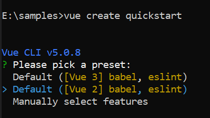
To generate a Vue 2 project using Vue-CLI, use the vue create command. Follow these steps to install Vue CLI and create a new project:
npm install -g @vue/cli
vue create quickstart
cd quickstart
npm run serve
or
yarn global add @vue/cli
vue create quickstart
cd quickstart
yarn run serve
When creating a new project, choose the option Default ([Vue 2] babel, eslint) from the menu.
Once the quickstart project is set up with default settings, proceed to add Syncfusion® components to the project.
Add Syncfusion® Vue packages
Syncfusion® packages are available at npmjs.com. To use Vue components, install the required npm package.
This article uses the Vue Dialog component as an example. Install the @syncfusion/ej2-vue-popups package by running the following command:
npm install @syncfusion/ej2-vue-popups --saveor
yarn add @syncfusion/ej2-vue-popupsImport Syncfusion® CSS styles
Syncfusion® components require CSS stylesheets to display correctly. You can import themes in various ways, such as using CSS or SASS styles from npm packages, CDN, CRG, and Theme Studio. Refer to themes topic to learn more about built-in themes and different ways to reference themes in a Vue project.
In this article, the Material3 theme is applied using CSS styles, which are available in installed packages. The necessary Material3 CSS styles for the Dialog component and its dependents were imported into the <style> section of the src/App.vue file.
<style>
@import "../node_modules/@syncfusion/ej2-base/styles/material3.css";
@import "../node_modules/@syncfusion/ej2-vue-buttons/styles/material3.css";
@import "../node_modules/@syncfusion/ej2-vue-popups/styles/material3.css";
</style>
The order of CSS imports matters. Import base styles first, then component-specific styles. Missing CSS imports can result in misaligned layouts, buttons without styling, or missing visual elements in popups and dialogs.
Add Syncfusion® Vue component
Follow the below steps to add the Vue Dialog component:
1. First, import and register the Dialog component in the script section of the src/App.vue file.
<script>
import { DialogComponent } from '@syncfusion/ej2-vue-popups';

export default {
    components: {
      'ejs-dialog': DialogComponent,
    }
}
</script>
2. In the template section, define the Dialog component.
<template>
  <div>
    <div class="col-lg-12 control-section">
        <ejs-dialog :buttons='dlgButtons' ref="dialogObj" :content='content' showCloseIcon=true >
        </ejs-dialog>
    </div>
  </div>
</template>

<script>
import { DialogComponent } from '@syncfusion/ej2-vue-popups';

export default {
    components: {
      'ejs-dialog': DialogComponent,
    },
    data: function() {
        return {
            content: '<p>In the Succinctly series, Syncfusion created a robust, free library of more than 130 technical e-books formatted for PDF, Kindle, and EPUB.</p>',
        }
    },
}
</script>
Running the application
Now run the npm run dev command in the console, it will build your application and open in the browser.
<template>
    <div>
        <div id="target" class="control-section">
            <ejs-dialog :target='target' :width='width' :content='content'>
            </ejs-dialog>
        </div>
    </div>
</template>
<script>

import { DialogComponent } from '@syncfusion/ej2-vue-popups';

export default {
    name: "App",
    components: {
        "ejs-dialog": DialogComponent
    },
    data: function () {
        return {
            target: "#target",
            width: '335px',
            content: 'This is a Dialog with content.'
        }
    }
}
</script>
<style>
@import "../node_modules/@syncfusion/ej2-vue-popups/styles/material3.css";

.control-section {
    height: 100%;
    min-height: 200px;
}
</style>In the dialog control, max-height is calculated based on the dialog target element height. If the target property is not configured, the document.body is considered as a target. Therefore, to show a dialog in proper height, you need to add min-height to the target element.
If the dialog is rendered based on the body, then the dialog will get the height based on its body element height. If the height of the dialog is larger than the body height, then the dialog’s height will not be set. For this scenario, we can set the CSS style for the html and body to get the dialog height.
html, body {
   height: 100%;
}
Modal dialog
A modal shows an overlay behind the Dialog. The user must interact with the Dialog before interacting with the remaining content in an application.
While the user clicks the overlay, the action can be handled through the overlayClick event. In the below sample, the Dialog close action is performed while clicking on the overlay.
When the modal dialog is opened, the Dialog’s target scrolling will be disabled. The scrolling will be enabled again once close the Dialog.
<template>
    <div>
        <div id="modalTarget" class="control-section; position:relative" style="height:350px;">
            <!-- Render Button to open the modal Dialog -->
            <ejs-button id='modalbtn' v-on:click="modalBtnClick">Open</ejs-button>
            <!-- Render modal Dialog -->
            <ejs-dialog ref="modalDialog" :isModal='isModal' :header='header' :target='target' :width='width'
                :animationSettings='animationSettings' :content='content' :open="modalDlgOpen" :close="modalDlgClose"
                :overlayClick="overlayClick">
            </ejs-dialog>
        </div>
    </div>
</template>
<script>
import { DialogComponent } from '@syncfusion/ej2-vue-popups';
import { ButtonComponent } from '@syncfusion/ej2-vue-buttons';

export default {
    name: "App",
    components: {
        "ejs-button": ButtonComponent,
        "ejs-dialog": DialogComponent
    },
    data: function () {
        return {
            target: "#modalTarget",
            width: '335px',
            header: 'Software Update',
            content: 'Your current software version is up to date.',
            isModal: true,
            animationSettings: { effect: 'None' }
        }
    },
    mounted: function () {
        document.getElementById('modalbtn').focus();
    },
    methods: {
        modalBtnClick: function () {
            this.$refs.modalDialog.show();
        },
        modalDlgClose: function () {
            document.getElementById('modalbtn').style.display = '';
        },
        modalDlgOpen: function () {
            document.getElementById('modalbtn').style.display = 'none';
        },
        overlayClick: function () {
            this.$refs.modalDialog.hide();
        }
    }
}
</script>
<style>
@import "../node_modules/@syncfusion/ej2-vue-popups/styles/material3.css";

#app {
    color: #008cff;
    height: 40px;
    left: 45%;
    position: absolute;
    top: 45%;
    width: 30%;
}

.control-section {
    height: 100%;
    min-height: 200px;
}
</style>Enable header
The Dialog header can be enabled by adding the header content as text or HTML content through the header property.
<template>
    <div>
        <div id="target" class="control-section; position:relative" style="height:350px;">
            <!-- Render Dialog -->
            <ejs-dialog ref="headerDialog" :header='header' :target='target' :width='width' :content='content'>
            </ejs-dialog>
        </div>
    </div>
</template>
<script>

import { DialogComponent } from '@syncfusion/ej2-vue-popups';

export default {
    name: "App",
    components: {
        "ejs-dialog": DialogComponent
    },
    data: function () {
        return {
            target: "#target",
            width: '335px',
            header: 'Dialog header',
            content: 'This is a Dialog with header.'
        }
    }
}
</script>
<style>
@import "../node_modules/@syncfusion/ej2-vue-popups/styles/material3.css";

#app {
    color: #008cff;
    height: 40px;
    left: 45%;
    position: absolute;
    top: 45%;
    width: 30%;
}

.control-section {
    height: 100%;
    min-height: 200px;
}
</style>Enable footer
The Dialog provides built-in support to render the buttons on the footer (for ex: ‘OK’ or ‘Cancel’ buttons). Each Dialog button allows the user to perform any action while clicking on it.
The primary button will be focused automatically on open the Dialog, and add the click event to handle the actions
When the Dialog initialize with more than one primary buttons, the first primary button gets focus on open the Dialog.
The below sample is rendered with button and its click event.
<template>
    <div>
        <div id="target" class="control-section; position:relative" style="height:350px;">
            <!-- Render Button to open the Dialog -->
            <ejs-button id='dlgbtn' v-on:click="btnClick">Open</ejs-button>
            <!-- Render Dialog -->
            <ejs-dialog ref="footerDialog" :header='header' :target='target' :width='width' :buttons='buttons'
                :content='content' :open="dlgOpen" :close="dlgClose">
            </ejs-dialog>
        </div>
    </div>
</template>
<script>
import { DialogComponent } from '@syncfusion/ej2-vue-popups';
import { ButtonComponent } from '@syncfusion/ej2-vue-buttons';

export default {
    name: "App",
    components: {
        "ejs-button": ButtonComponent,
        "ejs-dialog": DialogComponent
    },
    data: function () {
        return {
            target: "#target",
            width: '335px',
            header: 'Dialog',
            content: 'This is a Dialog with button and primary button.',
            buttons: [{ click: this.dlgButtonClick, buttonModel: { content: 'OK', isPrimary: true } },
            { click: this.dlgButtonClick, buttonModel: { content: 'Cancel' } }]
        }
    },
    mounted: function () {
        document.getElementById('dlgbtn').focus();
    },
    methods: {
        btnClick: function () {
            this.$refs.footerDialog.show();
        },
        dlgClose: function () {
            document.getElementById('dlgbtn').style.display = '';
        },
        dlgOpen: function () {
            document.getElementById('dlgbtn').style.display = 'none';
        },
        dlgButtonClick: function () {
            this.$refs.footerDialog.hide();
        }
    }
}
</script>
<style>
@import "../node_modules/@syncfusion/ej2-vue-popups/styles/material3.css";

#app {
    color: #008cff;
    height: 40px;
    left: 45%;
    position: absolute;
    top: 45%;
    width: 30%;
}

.control-section {
    height: 100%;
    min-height: 200px;
}
</style>Draggable
The Dialog supports to drag within its target container by grabbing the Dialog header, which allows the user to reposition the Dialog dynamically.
The Dialog can be draggable only when the Dialog header is enabled. From
16.2.xversion, enabled draggable support for modal dialog also.
<template>
    <div id="target" class="control-section">
        <ejs-dialog :header="header" :content="content" :allowDragging="draggable" :target='target' :width='width'>
        </ejs-dialog>
    </div>
</template>
<script>
import { DialogComponent } from '@syncfusion/ej2-vue-popups';

export default {
    name: "App",
    components: {
        "ejs-dialog": DialogComponent
    },
    data: function () {
        return {
            target: '#target',
            width: '300px',
            header: 'Dialog',
            draggable: true,
            content: 'This is a Dialog with drag enabled.'
        }
    }
}
</script>
<style>
@import "../node_modules/@syncfusion/ej2-vue-popups/styles/material3.css";

#app {
    color: #008cff;
    height: 40px;
    left: 45%;
    position: absolute;
    top: 45%;
    width: 30%;
}

.control-section {
    min-height: 355px;
    margin: 10px;
}</style>Positioning
The Dialog can be positioned using the position property by providing the X and Y co-ordinates. It can be positioned inside the target of the container or <body> of the element based on the given X and Y values.
for X is: left, center, right (or) any offset value
for Y is: top, center, bottom (or) any offset value
The below example demonstrates the different Dialog positions.
<template>
  <div>
     <div id="target" class="control-section">
         <ejs-button id="dialogBtn" v-on:click="buttonClick">Open Dialog</ejs-button>

        <ejs-dialog id='defaultDialog' header='Choose a Dialog Position' showCloseIcon='true' :position='position' :footerTemplate='footerTemplate' width='406px' ref='dialogObj'
            target='#target' :open='dialogOpen' :close='dialogClose' closeOnEscape='false'>
            <table style='width:371px' id ='poschange'>
                <tr>
                    <td><ejs-radiobutton id='radio1' label='Left Top' value='left top' name='xy' :change='changePosition' ></ejs-radiobutton></td>
                    <td><ejs-radiobutton id='radio2' label='Center Top' value='center top' name='xy' :change='changePosition'></ejs-radiobutton></td>
                    <td><ejs-radiobutton id='radio3' label='Right Top' value='right top' name='xy' :change='changePosition'></ejs-radiobutton></td>
                </tr>
                <tr>
                    <td><ejs-radiobutton id='radio4' label='Left Center' value='left center' name='xy' :change='changePosition' ></ejs-radiobutton></td>
                    <td><ejs-radiobutton id='radio5' checked='true' label='Center Center' value='center center' name='xy' :change='changePosition' ></ejs-radiobutton></td>
                    <td><ejs-radiobutton id='radio6' label='Right Center' value='right center' name='xy' :change='changePosition' ></ejs-radiobutton></td>
                </tr>
                <tr>
                    <td><ejs-radiobutton id='radio7' label='Left Bottom' value='left bottom' name='xy' :change='changePosition' ></ejs-radiobutton></td>
                    <td><ejs-radiobutton id='radio8' label='Center Bottom' value='center bottom' name='xy' :change='changePosition' ></ejs-radiobutton></td>
                    <td><ejs-radiobutton id='radio9' label='Right Bottom' value='right bottom' name='xy' :change='changePosition' ></ejs-radiobutton></td>
                </tr>
            </table>
        </ejs-dialog>
    </div>
  </div>
</template>

<script>

import { DialogComponent } from '@syncfusion/ej2-vue-popups';
import { ButtonComponent } from '@syncfusion/ej2-vue-buttons';
import { RadioButtonComponent } from '@syncfusion/ej2-vue-buttons';

export default {
name: "App",
components: {
"ejs-button":ButtonComponent,
"ejs-dialog":DialogComponent,
"ejs-radiobutton":RadioButtonComponent,
},
    data: function() {
        return {
            footerTemplate: '<span id="posvalue" style="float:left;margin-left:8px;padding:10px;">Position: { X: "Center", Y: "Center" }</span>',
            position: { X: 'center', Y: 'center' }
        }
    },
    methods: {
        buttonClick: function(){
            this.$refs.dialogObj.show();
        },
        changePosition: function(event) {
            this.$refs.dialogObj.position = { X: event.value.split(" ")[0], Y: event.value.split(" ")[1] };
            document.getElementById('posvalue').innerHTML = 'Position: {X: "' + event.value.split(" ")[0] + '", Y: "' + event.value.split(" ")[1] + '"}'
            const txt = event.event.target.parentElement.querySelector('.e-label').innerText.split(" ");
            document.getElementById('posvalue').innerHTML = 'Position: { X: "' + txt[0] + '", Y: "' + txt[1] + '" }';
        },
        dialogClose() {
            document.querySelector('#dialogBtn').style.display='inline-block';
        },
        dialogOpen() {
            document.querySelector('#dialogBtn').style.display='none';
        }
    }
}
</script>

<style>
    html,
    body,
    #container {
        height: 100%;
        overflow: hidden;
        width: 100%;
    }
    .control-section {
        min-height: 350px;
        max-width: 840px;
        margin: 10px;
    }
    #defaultDialog table,
    #defaultDialog th,
    #defaultDialog td {
        border: 1px solid #D8D8D8;
        border-collapse: collapse;
    }

    #container {
        height: 365px;
    }

    #defaultDialog.e-dialog .e-footer-content {
        padding: 0px 1px 4px ! important;
    }

    .tableStyle {
        margin: 17px;
        width: 304px;
    }

    .e-dialog .e-dlgcontent{
        padding: 10px 16px 10px;
    }

    .e-radio +label .e-label {
        line-height:18px;
    }

    td {
        padding: 6px;
    }
</style>