Container in Vue Diagram component
27 Jun 202517 minutes to read
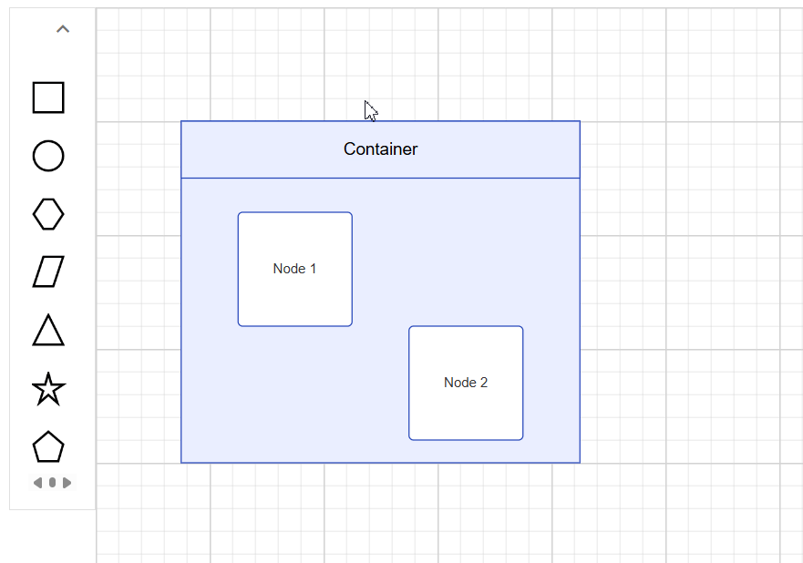
A Container is a group of logically related shapes surrounded by a visible boundary. Shapes can be added or removed from the container at runtime. Changes made to the container do not affect its child elements, which can be individually selected, moved, or edited.
Create Container
Add a Container
The following code illustrates how to create a container node:
<template>
  <div id="app">
    <ejs-diagram ref="diagramRef" id="diagram" width="100%" height="500px" :nodes="nodes" />
  </div>
</template>

<script setup>
import { ref, onMounted } from 'vue';
import { DiagramComponent as EjsDiagram } from '@syncfusion/ej2-vue-diagrams';

// Define a collection of nodes used in the diagram
const nodes = [
  // First rectangle node
  {
    id: 'node1',
    // Margin from the left and top
    margin: { left: 50, top: 30 },
    width: 100, height: 100,
    style: { fill: 'white', strokeColor: '#2546BB', strokeWidth: 1 },
    shape: { type: 'Basic', shape: 'Rectangle', cornerRadius: 4 },
    annotations: [{ content: 'Node 1' }]
  },
  // Second rectangle node
  {
    id: 'node2',
    // Margin from the left and top
    margin: { left: 200, top: 130 },
    width: 100, height: 100,
    style: { fill: 'white', strokeColor: '#2546BB', strokeWidth: 1 },
    shape: { type: 'Basic', shape: 'Rectangle', cornerRadius: 4 },
    annotations: [{ content: 'Node 2' }]
  },
  // Container node configuration to contain node1 and node2
  {
    id: 'container',
    width: 350, height: 280, // Width and height of the container
    offsetX: 250, offsetY: 250, // Position of the container
    shape: {
      // Define the type as a container
      type: 'Container',
      // Includes node1 and node2 as children
      children: ['node1', 'node2'],
    },
    // Style properties for the container
    style: { fill: '#E9EEFF', strokeColor: '#2546BB', strokeWidth: 1 }
  },
];


const diagramRef = ref(null);

onMounted(() => {
  // Retrieve the diagram instance
  const diagramInstance = diagramRef.value.ej2Instances;
  diagramInstance.select([diagramInstance.getObject("container")]);
});
</script>

<style>
@import "../node_modules/@syncfusion/ej2-vue-diagrams/styles/tailwind3.css";
@import "../node_modules/@syncfusion/ej2-base/styles/tailwind3.css";
@import "../node_modules/@syncfusion/ej2-popups/styles/tailwind3.css";
@import "../node_modules/@syncfusion/ej2-splitbuttons/styles/tailwind3.css";
@import "../node_modules/@syncfusion/ej2-navigations/styles/tailwind3.css";
</style><template>
<div id="app">
<ejs-diagram ref="diagramRef" id="diagram" width="100%" height="500px" :nodes="nodes" />
</div>
</template>
<script>
import { DiagramComponent } from "@syncfusion/ej2-vue-diagrams";
export default {
name: "App",
components: { "ejs-diagram": DiagramComponent },
data() {
return {
nodes: [
// First rectangle node
{
id: 'node1',
// Margin from the left and top
margin: { left: 50, top: 30 },
width: 100, height: 100,
style: { fill: 'white', strokeColor: '#2546BB', strokeWidth: 1 },
shape: { type: 'Basic', shape: 'Rectangle', cornerRadius: 4 },
annotations: [{ content: 'Node 1' }]
},
// Second rectangle node
{
id: 'node2',
// Margin from the left and top
margin: { left: 200, top: 130 },
width: 100, height: 100,
style: { fill: 'white', strokeColor: '#2546BB', strokeWidth: 1 },
shape: { type: 'Basic', shape: 'Rectangle', cornerRadius: 4 },
annotations: [{ content: 'Node 2' }]
},
// Container node configuration to contain node1 and node2
{
id: 'container',
width: 350, height: 280, // Width and height of the container
offsetX: 250, offsetY: 250, // Position of the container
shape: {
// Define the type as a container
type: 'Container',
// Includes node1 and node2 as children
children: ['node1', 'node2'],
},
// Style properties for the container
style: { fill: '#E9EEFF', strokeColor: '#2546BB', strokeWidth: 1 }
},
]
};
},
mounted() {
// Retrieve the diagram instance
const diagramInstance = this.$refs.diagramRef.ej2Instances;
diagramInstance.select([diagramInstance.getObject("container")]);
},
};
</script>
<style>
@import "../node_modules/@syncfusion/ej2-vue-diagrams/styles/tailwind3.css";
@import "../node_modules/@syncfusion/ej2-base/styles/tailwind3.css";
@import "../node_modules/@syncfusion/ej2-popups/styles/tailwind3.css";
@import "../node_modules/@syncfusion/ej2-splitbuttons/styles/tailwind3.css";
@import "../node_modules/@syncfusion/ej2-navigations/styles/tailwind3.css";
</style>Setting a Header
You can provide a textual description for a container using its header property. Also, users can customize the header’s appearance using the header’s style property.
The following code example explains how to define a container header and its customization:
<template>
  <div id="app">
    <ejs-diagram id="diagram" width="100%" height="500px" :nodes="nodes" />
  </div>
</template>

<script setup>
import { DiagramComponent as EjsDiagram } from '@syncfusion/ej2-vue-diagrams';

// Define a collection of nodes used in the diagram
const nodes = [
  {
    id: 'node1',
    margin: { left: 50, top: 30 },
    width: 100, height: 100,
    style: { fill: '#357BD2', strokeColor: 'white' },
    annotations: [{ content: 'Node 1', style: { color: 'white', fontFamily: 'Arial' } }],
  },
  {
    id: 'node2',
    margin: { left: 200, top: 130 },
    width: 100, height: 100,
    style: { fill: '#357BD2', strokeColor: 'white' },
    annotations: [{ content: 'Node 2', style: { color: 'white', fontFamily: 'Arial' } }],
  },
  // Container Node
  {
    id: 'container',
    // Container Size
    width: 350, height: 300,
    // Container Position
    offsetX: 250, offsetY: 250,
    // Define Shape
    shape: {
      // Set type as Container
      type: 'Container',
      // Define header for container
      header: {
        annotation: {
          content: 'Container Title',
          // Style of container title text
          style: { fontSize: 18, bold: true, color: 'white' },
        },
        // Height of container header
        height: 40,
        // Style of container header
        style: { fill: '#3c63ac', strokeColor: '#30518f' },
      },
      // children of container
      children: ['node1', 'node2'],
    },
    // style of container
    style: { fill: 'white', strokeColor: '#30518f', strokeDashArray: '4 4' },
  },
];
</script>

<style>
@import "../node_modules/@syncfusion/ej2-vue-diagrams/styles/tailwind3.css";
@import "../node_modules/@syncfusion/ej2-base/styles/tailwind3.css";
@import "../node_modules/@syncfusion/ej2-popups/styles/tailwind3.css";
@import "../node_modules/@syncfusion/ej2-splitbuttons/styles/tailwind3.css";
@import "../node_modules/@syncfusion/ej2-navigations/styles/tailwind3.css";
</style><template>
<div id="app">
<ejs-diagram id="diagram" width="100%" height="500px" :nodes="nodes" />
</div>
</template>
<script>
import { DiagramComponent } from "@syncfusion/ej2-vue-diagrams";
export default {
name: "App",
components: { "ejs-diagram": DiagramComponent },
data() {
return {
nodes: [
{
id: 'node1',
margin: { left: 50, top: 30 },
width: 100, height: 100,
style: { fill: '#357BD2', strokeColor: 'white' },
annotations: [{ content: 'Node 1', style: { color: 'white', fontFamily: 'Arial' } }],
},
{
id: 'node2',
margin: { left: 200, top: 130 },
width: 100, height: 100,
style: { fill: '#357BD2', strokeColor: 'white' },
annotations: [{ content: 'Node 2', style: { color: 'white', fontFamily: 'Arial' } }],
},
// Container Node
{
id: 'container',
// Container Size
width: 350, height: 300,
// Container Position
offsetX: 250, offsetY: 250,
// Define Shape
shape: {
// Set type as Container
type: 'Container',
// Define header for container
header: {
annotation: {
content: 'Container Title',
// Style of container title text
style: { fontSize: 18, bold: true, color: 'white' },
},
// Height of container header
height: 40,
// Style of container header
style: { fill: '#3c63ac', strokeColor: '#30518f' },
},
// children of container
children: ['node1', 'node2'],
},
// style of container
style: { fill: 'white', strokeColor: '#30518f', strokeDashArray: '4 4' },
},
]
};
},
};
</script>
<style>
@import "../node_modules/@syncfusion/ej2-vue-diagrams/styles/tailwind3.css";
@import "../node_modules/@syncfusion/ej2-base/styles/tailwind3.css";
@import "../node_modules/@syncfusion/ej2-popups/styles/tailwind3.css";
@import "../node_modules/@syncfusion/ej2-splitbuttons/styles/tailwind3.css";
@import "../node_modules/@syncfusion/ej2-navigations/styles/tailwind3.css";
</style>NOTE
You can edit the header by double-clicking the region of the container’s header.
Container from symbol palette
Container nodes can be preconfigured and added to the symbol palette. Users can drag and drop these container nodes into the diagram as needed.
To learn more, refer to the Symbol Palette documentation.
Interactively add or remove diagram elements into Container
You can interactively add or remove diagram elements from the Container in the runtime. When a diagram element is dropped near the container’s edge, the container automatically resizes to accommodate it.
Interaction
Containers support the same interactions as regular nodes—such as selection, dragging, resizing, and rotating. For more information refer to the nodes interactions
Events
The events triggered when interacting with container nodes are similar to those for individual nodes. For more information, refer to the nodes events