How can I help you?
Getting Started with the Vue DateTimePicker Component in Vue 2
13 Mar 20265 minutes to read
This article provides a step-by-step guide for setting up a Vue 2 project using Vue-CLI and integrating the Syncfusion® Vue DateTimePicker component.
Prerequisites
System requirements for Syncfusion® Vue UI components
Setup the Vue 2 project
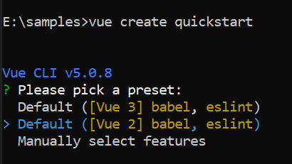
To generate a Vue 2 project using Vue-CLI, use the vue create command. Follow these steps to install Vue CLI and create a new project:
npm install -g @vue/cli
vue create quickstart
cd quickstart
npm run serve
or
yarn global add @vue/cli
vue create quickstart
cd quickstart
yarn run serve
When creating a new project, choose the option Default ([Vue 2] babel, eslint) from the menu.
Once the quickstart project is set up with default settings, proceed to add Syncfusion® components to the project.
Adding Syncfusion® packages
Syncfusion® packages are available at npmjs.com. To use Vue components, install the required npm package.
This article uses the Vue DateTimePicker component as an example. Install the @syncfusion/ej2-vue-calendars package by running the following command:
npm install @syncfusion/ej2-vue-calendars --saveor
yarn add @syncfusion/ej2-vue-calendarsImport Syncfusion® CSS styles
Syncfusion® components require CSS stylesheets to display correctly. You can import themes in various ways, such as using CSS or SASS styles from npm packages, CDN, CRG, and Theme Studio. Refer to themes topic to learn more about built-in themes and different ways to reference themes in a Vue project.
In this article, the Material3 theme is applied using CSS styles, which are available in installed packages. The necessary Material3 CSS styles for the DateTimePicker component and its dependents were imported into the <style> section of the src/App.vue file.
<style>
@import '../node_modules/@syncfusion/ej2-base/styles/material3.css';
@import '../node_modules/@syncfusion/ej2-buttons/styles/material3.css';
@import '../node_modules/@syncfusion/ej2-inputs/styles/material3.css';
@import '../node_modules/@syncfusion/ej2-popups/styles/material3.css';
@import '../node_modules/@syncfusion/ej2-lists/styles/material3.css';
@import "../node_modules/@syncfusion/ej2-vue-calendars/styles/material3.css";
</style>
The order of CSS imports matters. Import base styles first, then component-specific styles. Missing CSS imports can result in misaligned layouts, buttons without styling, or missing visual elements in popups and dialogs.
Add Syncfusion® Vue component
Follow the below steps to add the Vue DateTimePicker component:
First, import and register the DateTimePicker component in the script section of the src/App.vue file.
<template>
    <div id="app">
      <div class='wrapper'>
         <ejs-datetimepicker :placeholder="waterMark" ></ejs-datetimepicker>
      </div>
    </div>
</template>
<script>

import { DateTimePickerComponent } from '@syncfusion/ej2-vue-calendars';

export default {
    name: "App",
    components: {
    "ejs-datetimepicker":DateTimePickerComponent
    },
    data () {
    return {
      waterMark : 'Select a datetime'
    }
  }
}
Running the Application
Now run the npm run dev command in the console, it will build your application and open in the browser.
<template>
    <div id="app">
      <div class='wrapper'>
         <ejs-datetimepicker :placeholder="waterMark" ></ejs-datetimepicker>
      </div>
    </div>
</template>
<script>

import { DateTimePickerComponent } from '@syncfusion/ej2-vue-calendars';

export default {
name: "App",
components: {
"ejs-datetimepicker":DateTimePickerComponent
},
    data () {
    return {
      waterMark : 'Select a datetime'
    }
  }
}
</script>
<style>
@import '../node_modules/@syncfusion/ej2-base/styles/material3.css';
@import '../node_modules/@syncfusion/ej2-buttons/styles/material3.css';
@import '../node_modules/@syncfusion/ej2-inputs/styles/material3.css';
@import '../node_modules/@syncfusion/ej2-popups/styles/material3.css';
@import '../node_modules/@syncfusion/ej2-lists/styles/material3.css';
@import "../node_modules/@syncfusion/ej2-vue-calendars/styles/material3.css";
   .wrapper {
    max-width: 250px;
    margin: 0 auto;
  }
</style>Setting the value,min and max
The minimum and maximum date and time can be defined using the min and max properties. The following example demonstrates how to set the min and max when initializing the DateTimePicker. For more information about range restriction in DateTimePicker, refer to the date-time-range page.
<template>
    <div id="app">
      <div class='wrapper'>
         <ejs-datetimepicker :placeholder="waterMark" :min="minDate" :max="maxDate"  :value="val"></ejs-datetimepicker>
      </div>
    </div>
</template>
<script>

import { DateTimePickerComponent } from '@syncfusion/ej2-vue-calendars';

export default {
name: "App",
components: {
"ejs-datetimepicker":DateTimePickerComponent
},
    data () {
    return {
      waterMark : 'Select a datetime',
       minDate : new Date('5/5/2019 2:00 AM'),
       maxDate : new Date('5/25/2019 2:00 AM'),
       val : new Date('5/10/2019 12:00 AM')
    }
  }
}
</script>
<style>
@import '../node_modules/@syncfusion/ej2-base/styles/material3.css';
@import '../node_modules/@syncfusion/ej2-buttons/styles/material3.css';
@import '../node_modules/@syncfusion/ej2-inputs/styles/material3.css';
@import '../node_modules/@syncfusion/ej2-popups/styles/material3.css';
@import '../node_modules/@syncfusion/ej2-lists/styles/material3.css';
@import "../node_modules/@syncfusion/ej2-vue-calendars/styles/material3.css";
   .wrapper {
    max-width: 250px;
    margin: 0 auto;
  }
</style>If the value of
minormaxproperties changed through code behind, then you have to update thevalueproperty to set within the range.