Getting Started with the Vue Block Editor component in Vue 2
30 Jun 20265 minutes to read
This section explains how to create a simple Block Editor and configure its available functionalities in the Vue environment.
Prerequisites
System requirements for Syncfusion® Vue UI components
Dependencies
The list of dependencies required to use the Block Editor component in your application is given as follows:
|-- @syncfusion/ej2-vue-blockeditor
    |-- @syncfusion/ej2-vue-base
    |-- @syncfusion/ej2-base
    |-- @syncfusion/ej2-popups
    |-- @syncfusion/ej2-buttons
    |-- @syncfusion/ej2-splitbuttons
    |-- @syncfusion/ej2-navigations
    |-- @syncfusion/ej2-dropdowns
    |-- @syncfusion/ej2-inputs
Setting up the Vue 2 project
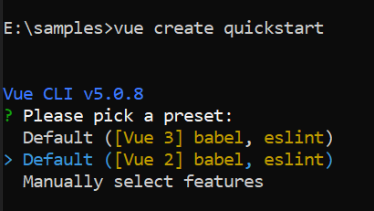
To generate a Vue 2 project using Vue-CLI, use the vue create command. Follow these steps to install Vue CLI and create a new project:
npm install -g @vue/cli
vue create quickstart
cd quickstart
npm run serve
or
yarn global add @vue/cli
vue create quickstart
cd quickstart
yarn run serve
When creating a new project, choose the option Default ([Vue 2] babel, eslint) from the menu.
Once the quickstart project is set up with default settings, proceed to add Syncfusion® components to the project.
Add Syncfusion® Vue packages
Syncfusion® packages are available at npmjs.com. To use Vue components, install the required npm package.
This article uses the Vue Block Editor component as an example. Install the block editor package by running the following command:
npm install @syncfusion/ej2-vue-blockeditor --saveor
yarn add @syncfusion/ej2-vue-blockeditorImport Syncfusion® CSS styles
You can import themes for the Syncfusion® Vue component in various ways, such as using CSS or SASS styles from npm packages, CDN, CRG and Theme Studio. Refer to themes topic to know more about built-in themes and different ways to refer to themes in a Vue project.
To install the tailwind3 theme package, use the following command:
npm install @syncfusion/ej2-tailwind3-theme --saveTo render the Block Editor component, import the required Tailwind3 CSS styles for the component and its dependencies into the <style> section of the src/App.vue file. This approach ensures that all necessary dependency styles are loaded, as shown below.
<style>
@import "../node_modules/@syncfusion/ej2-tailwind3-theme/styles/blockeditor/index.css";
</style>
Add Syncfusion® Vue component
Follow the below steps to add the Vue Block Editor component using Composition API or Options API:
1. First, import and register the Block Editor component in the script section of the src/App.vue file. If you are using the Composition API, you should add the setup attribute to the script tag to indicate that Vue will be using the Composition API.
<script setup>
import { BlockEditorComponent as EjsBlockeditor  } from "@syncfusion/ej2-vue-blockeditor";
</script><script>
import { BlockEditorComponent } from "@syncfusion/ej2-vue-blockeditor";
export default {
components: {
'ejs-blockeditor': BlockEditorComponent
}
}
</script>2. In the template section define the Block Editor component.
<template>
    <div id='container' style="margin: 50px auto;">
        <ejs-blockeditor></ejs-blockeditor>
    </div>
</template>
Here is the summarized code for the above steps in the src/App.vue file:
<template>
  <div id='container'>
     <ejs-blockeditor></ejs-blockeditor>
  </div>
</template>

<script setup>
import { BlockEditorComponent as EjsBlockeditor } from '@syncfusion/ej2-vue-blockeditor';
</script>

<style>
  @import "../node_modules/@syncfusion/ej2-tailwind3-theme/styles/blockeditor/index.css";
  #container {
    margin: 50px auto;
  }
</style><template>
<div id='container'>
<ejs-blockeditor></ejs-blockeditor>
</div>
</template>
<script>
import { BlockEditorComponent } from '@syncfusion/ej2-vue-blockeditor';
import { enableRipple } from '@syncfusion/ej2-base';
enableRipple(true);
export default {
components: {
"ejs-blockeditor": BlockEditorComponent
}
}
</script>
<style>
@import "../node_modules/@syncfusion/ej2-tailwind3-theme/styles/blockeditor/index.css";
#container {
margin: 50px auto;
}
</style>Run the project
To run the project, use the following command:
npm run serveor
yarn run serve