Getting Started with the Vue Auto complete Component in Vue 2
10 Feb 202613 minutes to read
This article provides a step-by-step guide for setting up a Vue 2 project using Vue-CLI and integrating the Syncfusion® Vue AutoComplete component.
Prerequisites
System requirements for Syncfusion® Vue UI components
Setting up the Vue 2 project
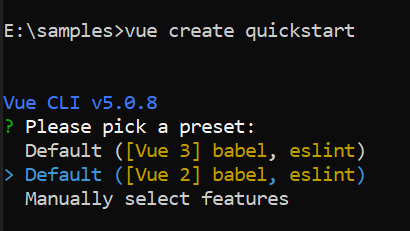
To generate a Vue 2 project using Vue-CLI, use the vue create command. Follow these steps to install Vue CLI and create a new project:
npm install -g @vue/cli
vue create quickstart
cd quickstart
npm run serve
or
yarn global add @vue/cli
vue create quickstart
cd quickstart
yarn run serve
When creating a new project, choose the option Default ([Vue 2] babel, eslint) from the menu.
Once the quickstart project is set up with default settings, proceed to add Syncfusion® components to the project.
Add Syncfusion® Vue packages
Syncfusion® packages are available at npmjs.com. To use Vue components, install the required npm package.
This article uses the Vue Auto complete component as an example. Install the @syncfusion/ej2-vue-dropdowns package by running the following command:
npm install @syncfusion/ej2-vue-dropdowns --saveor
yarn add @syncfusion/ej2-vue-dropdownsImport Syncfusion® CSS styles
Syncfusion® components require CSS stylesheets to display correctly. You can import themes in various ways, such as using CSS or SASS styles from npm packages, CDN, CRG, and Theme Studio. Refer to themes topic to learn more about built-in themes and different ways to reference themes in a Vue project.
In this article, the Material3 theme is applied using CSS styles, which are available in installed packages. The necessary Material3 CSS styles for the AutoComplete component and its dependents were imported into the <style> section of the src/App.vue file.
<style>
@import "../node_modules/@syncfusion/ej2-base/styles/material.css";
@import "../node_modules/@syncfusion/ej2-inputs/styles/material.css";
@import "../node_modules/@syncfusion/ej2-vue-dropdowns/styles/material.css";
</style>
The order of CSS imports matters. Import base styles first, then component-specific styles. Missing CSS imports can result in misaligned layouts, buttons without styling, or missing visual elements in popups and dialogs.
Add Syncfusion® Vue component
Follow the below steps to add the Vue AutoComplete component:
1. First, import and register the AutoComplete component in the script section of the src/App.vue file.
<script setup>
import { AutoCompleteComponent as EjsAutocomplete } from '@syncfusion/ej2-vue-dropdowns';
</script><script>
import { AutoCompleteComponent } from '@syncfusion/ej2-vue-dropdowns';
export default {
components: {
'ejs-autocomplete': AutoCompleteComponent
}
}
</script>Binding data source
After initialization, populate the AutoComplete with data using the dataSource property. Here, an array of string values is passed to the AutoComplete component.
<template>
    <div id="app">
    <ejs-autocomplete :dataSource='sportsData' :placeholder="waterMark"></ejs-autocomplete>
  </div>
</template>
<script setup>
import { AutoCompleteComponent as EjsAutocomplete } from '@syncfusion/ej2-vue-dropdowns';
const waterMark = 'e.g. Basketball';
const sportsData = ['American Football', 'Badminton', 'Basketball', 'Cricket',
                'Football', 'Golf', 'Gymnastics',
                'Hockey', 'Rugby', 'Snooker', 'Tennis'
            ];
</script></template>
<script>
import { AutoCompleteComponent } from '@syncfusion/ej2-vue-dropdowns';
export default {
components: {
'ejs-autocomplete': AutoCompleteComponent
},
name: 'app',
data () {
return {
waterMark : 'e.g. Basketball',
sportsData: ['American Football', 'Badminton', 'Basketball', 'Cricket',
'Football', 'Golf', 'Gymnastics',
'Hockey', 'Rugby', 'Snooker', 'Tennis'
]
}
}
}
</script>Here is the summarized code for the above steps in the src/App.vue file:
<template>
  <div id="app">
    <ejs-autocomplete :dataSource='sportsData' :placeholder="waterMark"></ejs-autocomplete>
  </div>
</template>
<script setup>
import { AutoCompleteComponent as EjsAutocomplete } from '@syncfusion/ej2-vue-dropdowns';

const waterMark = 'e.g. Basketball';
const sportsData = ['American Football', 'Badminton', 'Basketball', 'Cricket',
  'Football', 'Golf', 'Gymnastics',
  'Hockey', 'Rugby', 'Snooker', 'Tennis'
]
</script>
<style>
@import "../node_modules/@syncfusion/ej2-base/styles/material.css";
@import "../node_modules/@syncfusion/ej2-inputs/styles/material.css";
@import "../node_modules/@syncfusion/ej2-vue-dropdowns/styles/material.css";

#app {
  color: #008cff;
  height: 40px;
  left: 35%;
  position: absolute;
  top: 35%;
  width: 30%;
}
</style><template>
<div id="app">
<ejs-autocomplete :dataSource='sportsData' :placeholder="waterMark"></ejs-autocomplete>
</div>
</template>
<script>
import { AutoCompleteComponent } from '@syncfusion/ej2-vue-dropdowns';
export default {
name: "App",
components: {
'ejs-autocomplete': AutoCompleteComponent
},
data() {
return {
waterMark: 'e.g. Basketball',
sportsData: ['American Football', 'Badminton', 'Basketball', 'Cricket',
'Football', 'Golf', 'Gymnastics',
'Hockey', 'Rugby', 'Snooker', 'Tennis'
]
}
}
}
</script>
<style>
@import "../node_modules/@syncfusion/ej2-base/styles/material.css";
@import "../node_modules/@syncfusion/ej2-inputs/styles/material.css";
@import "../node_modules/@syncfusion/ej2-vue-dropdowns/styles/material.css";
#app {
color: #008cff;
height: 40px;
left: 35%;
position: absolute;
top: 35%;
width: 30%;
}
</style>Run the project
To run the project, use the following command:
npm run serveor
yarn run serveCustom values
The AutoComplete allows the user to give input as custom value which is not required to present in predefined set of values. By default, this support is enabled by allowCustom property. The custom value will be sent to post back handler when a form is about to be submitted.
<template>
  <div id="app">
    <ejs-autocomplete :dataSource='sportsData' :placeholder="waterMark"></ejs-autocomplete>
  </div>
</template>
<script setup>
import { AutoCompleteComponent as EjsAutocomplete } from '@syncfusion/ej2-vue-dropdowns';

const waterMark = 'Find a game';
const allowCustom = true;
const sportsData = ['Badminton', 'Basketball', 'Cricket',
  'Football', 'Golf', 'Gymnastics',
  'Hockey', 'Rugby', 'Snooker', 'Tennis'
];
</script>
<style>
@import "../node_modules/@syncfusion/ej2-base/styles/material.css";
@import "../node_modules/@syncfusion/ej2-inputs/styles/material.css";
@import "../node_modules/@syncfusion/ej2-vue-dropdowns/styles/material.css";

#app {
  color: #008cff;
  height: 40px;
  left: 35%;
  position: absolute;
  top: 35%;
  width: 30%;
}
</style><template>
<div id="app">
<ejs-autocomplete :dataSource='sportsData' :placeholder="waterMark"></ejs-autocomplete>
</div>
</template>
<script>
import { AutoCompleteComponent } from '@syncfusion/ej2-vue-dropdowns';
export default {
name: "App",
components: {
'ejs-autocomplete': AutoCompleteComponent
},
data() {
return {
waterMark: 'Find a game',
allowCustom: true,
sportsData: ['Badminton', 'Basketball', 'Cricket',
'Football', 'Golf', 'Gymnastics',
'Hockey', 'Rugby', 'Snooker', 'Tennis'
]
}
}
}
</script>
<style>
@import "../node_modules/@syncfusion/ej2-base/styles/material.css";
@import "../node_modules/@syncfusion/ej2-inputs/styles/material.css";
@import "../node_modules/@syncfusion/ej2-vue-dropdowns/styles/material.css";
#app {
color: #008cff;
height: 40px;
left: 35%;
position: absolute;
top: 35%;
width: 30%;
}
</style>Configure the suggestion list
By default, suggestion list width automatically adjusts according to the AutoComplete input element’s width, and the height of the suggestion list has ‘300px’. The height and width of the popup list can also be customized using the popupHeight and popupWidth property respectively. In the following sample, suggestion list’s width and height are configured.
<template>
  <div id="app">
    <ejs-autocomplete :dataSource='sportsData' :popupHeight='height' :popupWidth='width'
      :placeholder="waterMark"></ejs-autocomplete>
  </div>
</template>
<script setup>
import { AutoCompleteComponent as EjsAutocomplete } from '@syncfusion/ej2-vue-dropdowns';

const waterMark = 'Find a game';
const allowCustom = true;
const height = '250px';
const width = '250px';
const sportsData = ['Badminton', 'Basketball', 'Cricket',
  'Football', 'Golf', 'Gymnastics',
  'Hockey', 'Rugby', 'Snooker', 'Tennis'
];
</script>
<style>
@import "../node_modules/@syncfusion/ej2-base/styles/material.css";
@import "../node_modules/@syncfusion/ej2-inputs/styles/material.css";
@import "../node_modules/@syncfusion/ej2-vue-dropdowns/styles/material.css";

#app {
  color: #008cff;
  height: 40px;
  left: 35%;
  position: absolute;
  top: 35%;
  width: 30%;
}
</style><template>
<div id="app">
<ejs-autocomplete :dataSource='sportsData' :popupHeight='height' :popupWidth='width'
:placeholder="waterMark"></ejs-autocomplete>
</div>
</template>
<script>
import { AutoCompleteComponent } from '@syncfusion/ej2-vue-dropdowns';
export default {
name: "App",
components: {
'ejs-autocomplete': AutoCompleteComponent
},
data() {
return {
waterMark: 'Find a game',
allowCustom: true,
height: '250px',
width: '250px',
sportsData: ['Badminton', 'Basketball', 'Cricket',
'Football', 'Golf', 'Gymnastics',
'Hockey', 'Rugby', 'Snooker', 'Tennis'
]
}
}
}
</script>
<style>
@import "../node_modules/@syncfusion/ej2-base/styles/material.css";
@import "../node_modules/@syncfusion/ej2-inputs/styles/material.css";
@import "../node_modules/@syncfusion/ej2-vue-dropdowns/styles/material.css";
#app {
color: #008cff;
height: 40px;
left: 35%;
position: absolute;
top: 35%;
width: 30%;
}
</style>NOTE
You can refer to our Vue AutoComplete feature tour page for its groundbreaking feature representations. You can also explore our Vue AutoComplete example to know how to render and configure the autocomplete.