Getting started with the 3D Chart component (Vue 2)
19 Mar 202623 minutes to read
This article provides a step-by-step guide for setting up a Vue 2 project using Vue-CLI and integrating the Syncfusion® 3D Chart component.
Prerequisites
System requirements for Syncfusion® Vue UI components
Dependencies
Below is the list of minimum dependencies required to use the 3D Chart component.
|-- @syncfusion/ej2-vue-charts
    |-- @syncfusion/ej2-base
    |-- @syncfusion/ej2-data
    |-- @syncfusion/ej2-pdf-export
    |-- @syncfusion/ej2-file-utils
    |-- @syncfusion/ej2-compression
    |-- @syncfusion/ej2-charts
    |-- @syncfusion/ej2-vue-base
    |-- @syncfusion/ej2-svg-base
Setting up the Vue 2 project
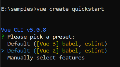
To generate a Vue 2 project using Vue-CLI, use the vue create command. Follow these steps to install Vue CLI and create a new project:
npm install -g @vue/cli
vue create quickstart
cd quickstart
npm run serve
or
yarn global add @vue/cli
vue create quickstart
cd quickstart
yarn run serve
When creating a new project, choose the option Default ([Vue 2] babel, eslint) from the menu.
Once the quickstart project is set up with default settings, proceed to add Syncfusion® components to the project.
Add Syncfusion® Vue packages
Syncfusion® packages are available at npmjs.com. To use Vue components, install the required npm package.
This article uses the Vue 3D Chart component as an example. Install the @syncfusion/ej2-vue-charts package by running:
npm install @syncfusion/ej2-vue-chartsor
yarn add @syncfusion/ej2-vue-chartsNote: npm v5+ saves packages to
dependenciesby default;--saveis not required.
Add Syncfusion® Vue component
Follow the steps below to add the 3D Chart component:
- First, import and register the 3D Chart component in the
scriptsection of the src/App.vue file.
<template>
  <div id="app">
    <ejs-chart3d id="container">
      <e-chart3d-series-collection>
        <e-chart3d-series type="Column"></e-chart3d-series>
      </e-chart3d-series-collection>
    </ejs-chart3d>
  </div>
</template>

<script>
import {
  Chart3DComponent,
  Chart3DSeriesCollectionDirective,
  Chart3DSeriesDirective
} from '@syncfusion/ej2-vue-charts';

export default {
  components: {
    'ejs-chart3d': Chart3DComponent,
    'e-chart3d-series-collection': Chart3DSeriesCollectionDirective,
    'e-chart3d-series': Chart3DSeriesDirective
  }
}
</script>
2. In the template section, define the 3D Chart component.
<template>
  <div id="app">
      <ejs-chart3d id="container"> </ejs-chart3d>
  </div>
</template>
Here is the summarized code for the above steps in the src/App.vue file:
<template>
  <div id="app">
    <ejs-chart3d id="container"> </ejs-chart3d>
  </div>
</template>
<script>
import { Chart3DComponent } from '@syncfusion/ej2-vue-charts';

export default {
  name: "App",
  components: {
    'ejs-chart3d': Chart3DComponent
  },
  data() {
    return {
    }
  }
}
</script>
<style>
#container {
  height: 350px;
}
</style>
Run the project
To run the project, use the following command:
npm run serveor
yarn run serveModule registration
The 3D Chart component is organized into feature-specific modules. In Vue, enable a feature by registering its module(s) in the component’s provide option. The following features are demonstrated in the examples:
-
ColumnSeries3D— Module for column series. -
Legend3D— Module for legend support. -
Tooltip3D— Module for tooltip support. -
DataLabel3D— Module for data labels. -
Category3D— Module for category axis support.
The sample code below shows how to register the required modules in the component provide option:
import {
  Chart3DComponent, Chart3DSeriesCollectionDirective, Chart3DSeriesDirective,
  Chart3D, ColumnSeries3D, Category3D, Legend3D, Tooltip3D, DataLabel3D
} from "@syncfusion/ej2-vue-charts";

export default {
  components: {
    'ejs-chart3d': Chart3DComponent,
    'e-chart3d-series-collection': Chart3DSeriesCollectionDirective,
    'e-chart3d-series': Chart3DSeriesDirective
  },
  provide: {
    chart3d: [Chart3D, ColumnSeries3D, Category3D, Legend3D, Tooltip3D, DataLabel3D]
  }
};
Populate 3D chart with data
This section explains how to plot below JSON data to the 3D Chart.
export default {
  data() {
    return {
        seriesData: [
            { month: 'Jan', sales: 35 }, { month: 'Feb', sales: 28 },
            { month: 'Mar', sales: 34 }, { month: 'Apr', sales: 32 },
            { month: 'May', sales: 40 }, { month: 'Jun', sales: 32 },
            { month: 'Jul', sales: 35 }, { month: 'Aug', sales: 55 },
            { month: 'Sep', sales: 38 }, { month: 'Oct', sales: 30 },
            { month: 'Nov', sales: 25 }, { month: 'Dec', sales: 32 }
        ]
    };
  }
};- Add a series object to the 3D Chart by using
seriesproperty. Now map the field namesmonthandsalesin the JSON data to thexNameandyNameproperties of the series, then set the JSON data todataSourceproperty.
Since the JSON contains category data, set the valueType for horizontal axis to Category. By default, the axis valueType is Numeric.
<template>
  <div id="app">
    <ejs-chart3d id="container" :primaryXAxis='primaryXAxis'>
      <e-chart3d-series-collection>
        <e-chart3d-series :dataSource='seriesData' type='Column' xName='month' yName='sales' name='Sales'>
        </e-chart3d-series>
      </e-chart3d-series-collection>
    </ejs-chart3d>
  </div>
</template>
<script>
import { Chart3DComponent, Chart3DSeriesCollectionDirective, Chart3DSeriesDirective, ColumnSeries3D, Category3D } from "@syncfusion/ej2-vue-charts";

export default {
  name: "App",
  components: {
    'ejs-chart3d': Chart3DComponent,
    'e-chart3d-series-collection': Chart3DSeriesCollectionDirective,
    'e-chart3d-series': Chart3DSeriesDirective
  },
  data() {
    return {
      seriesData: [
        { month: 'Jan', sales: 35 }, { month: 'Feb', sales: 28 },
        { month: 'Mar', sales: 34 }, { month: 'Apr', sales: 32 },
        { month: 'May', sales: 40 }, { month: 'Jun', sales: 32 },
        { month: 'Jul', sales: 35 }, { month: 'Aug', sales: 55 },
        { month: 'Sep', sales: 38 }, { month: 'Oct', sales: 30 },
        { month: 'Nov', sales: 25 }, { month: 'Dec', sales: 32 }
      ],
      primaryXAxis: {
        valueType: 'Category'
      }
    };
  },
  provide: {
    chart3d: [ColumnSeries3D, Category3D]
  }
};
</script>
<style>
#container {
  height: 350px;
}
</style>- The sales data are in thousands. Format the vertical axis labels by adding $ as a prefix and K as a suffix by setting the axis
labelFormatto ‘${value}K’ using thelabelFormatproperty. Here,{value}is a placeholder for each axis label.
Verify the chart
After starting the dev server, confirm the 3D chart renders correctly:
- Start the dev server with
npm run serveoryarn run serve. - Open the project URL shown in the terminal and verify the chart displays.
- If the chart does not render, check the browser console for errors related to missing modules, incorrect imports, or incompatible Vue versions.
Troubleshooting (common issues)
- Chart not rendering: ensure required 3D modules are registered in
provideand thatseriesDatacontains valid data. - Incorrect module key: some sample code uses the
chart3dkey inprovide; keep the key consistent with the examples used in the project. - Version mismatch: confirm
@syncfusion/ej2-vue-chartsis compatible with the project’s Vue version.
Add 3D chart title
You can add a title using title property to the 3D Chart to provide quick information to the user about the data plotted in the 3D Chart.
<template>
  <div id="app">
    <ejs-chart3d id="container" :title='title' :primaryXAxis='primaryXAxis' :primaryYAxis='primaryYAxis'>
      <e-chart3d-series-collection>
        <e-chart3d-series :dataSource='seriesData' type='Column' xName='month' yName='sales' name='Sales'>
        </e-chart3d-series>
      </e-chart3d-series-collection>
    </ejs-chart3d>
  </div>
</template>
<script>
import { Chart3DComponent, Chart3DSeriesCollectionDirective, Chart3DSeriesDirective, ColumnSeries3D, Category3D } from "@syncfusion/ej2-vue-charts";

export default {
  name: "App",
  components: {
    'ejs-chart3d': Chart3DComponent,
    'e-chart3d-series-collection': Chart3DSeriesCollectionDirective,
    'e-chart3d-series': Chart3DSeriesDirective
  },
  data() {
    return {
      seriesData: [
        { month: 'Jan', sales: 35 }, { month: 'Feb', sales: 28 },
        { month: 'Mar', sales: 34 }, { month: 'Apr', sales: 32 },
        { month: 'May', sales: 40 }, { month: 'Jun', sales: 32 },
        { month: 'Jul', sales: 35 }, { month: 'Aug', sales: 55 },
        { month: 'Sep', sales: 38 }, { month: 'Oct', sales: 30 },
        { month: 'Nov', sales: 25 }, { month: 'Dec', sales: 32 }
      ],
      primaryXAxis: {
        valueType: 'Category'
      },
      primaryYAxis: {
        labelFormat: '${value}K'
      },
      title: "Sales Analysis"
    };
  },
  provide: {
    chart3d: [ColumnSeries3D, Category3D]
  }
};
</script>
<style>
#container {
  height: 350px;
}
</style>Enable legend
You can use legend for the 3D Chart by setting the visible property to true in legendSettings object and by injecting the Legend3D into the provide.
<template>
  <div id="app">
    <ejs-chart3d id="container" :title='title' :primaryXAxis='primaryXAxis' :primaryYAxis='primaryYAxis'
      :legendSettings='legendSettings'>
      <e-chart3d-series-collection>
        <e-chart3d-series :dataSource='seriesData' type='Column' xName='month' yName='sales' name='Sales'>
        </e-chart3d-series>
      </e-chart3d-series-collection>
    </ejs-chart3d>
  </div>
</template>
<script>
import { Chart3DComponent, Chart3DSeriesCollectionDirective, Chart3DSeriesDirective, ColumnSeries3D, Category3D, Legend3D } from "@syncfusion/ej2-vue-charts";

export default {
  name: "App",
  components: {
    'ejs-chart3d': Chart3DComponent,
    'e-chart3d-series-collection': Chart3DSeriesCollectionDirective,
    'e-chart3d-series': Chart3DSeriesDirective
  },
  data() {
    return {
      seriesData: [
        { month: 'Jan', sales: 35 }, { month: 'Feb', sales: 28 },
        { month: 'Mar', sales: 34 }, { month: 'Apr', sales: 32 },
        { month: 'May', sales: 40 }, { month: 'Jun', sales: 32 },
        { month: 'Jul', sales: 35 }, { month: 'Aug', sales: 55 },
        { month: 'Sep', sales: 38 }, { month: 'Oct', sales: 30 },
        { month: 'Nov', sales: 25 }, { month: 'Dec', sales: 32 }
      ],
      primaryXAxis: {
        valueType: 'Category'
      },
      primaryYAxis: {
        labelFormat: '${value}K'
      },
      legendSettings: {
        visible: true
      },
      title: "Sales Analysis"
    };
  },
  provide: {
    chart3d: [ColumnSeries3D, Category3D, Legend3D]
  }
};
</script>
<style>
#container {
  height: 350px;
}
</style>Add data label
You can add data labels to improve the readability of the 3D Chart. This can be achieved by setting the visible property to true in the dataLabel object and by injecting DataLabel3D into the provide.
<template>
  <div id="app">
    <ejs-chart3d id="container" :title='title' :primaryXAxis='primaryXAxis' :primaryYAxis='primaryYAxis'
      :legendSettings='legendSettings'>
      <e-chart3d-series-collection>
        <e-chart3d-series :dataSource='seriesData' type='Column' xName='month' yName='sales' name='Sales'
          :dataLabel='dataLabel'> </e-chart3d-series>
      </e-chart3d-series-collection>
    </ejs-chart3d>
  </div>
</template>
<script>
import { Chart3DComponent, Chart3DSeriesCollectionDirective, Chart3DSeriesDirective, ColumnSeries3D, Category3D, Legend3D, DataLabel3D } from "@syncfusion/ej2-vue-charts";

export default {
  name: "App",
  components: {
    'ejs-chart3d': Chart3DComponent,
    'e-chart3d-series-collection': Chart3DSeriesCollectionDirective,
    'e-chart3d-series': Chart3DSeriesDirective
  },
  data() {
    return {
      seriesData: [
        { month: 'Jan', sales: 35 }, { month: 'Feb', sales: 28 },
        { month: 'Mar', sales: 34 }, { month: 'Apr', sales: 32 },
        { month: 'May', sales: 40 }, { month: 'Jun', sales: 32 },
        { month: 'Jul', sales: 35 }, { month: 'Aug', sales: 55 },
        { month: 'Sep', sales: 38 }, { month: 'Oct', sales: 30 },
        { month: 'Nov', sales: 25 }, { month: 'Dec', sales: 32 }
      ],
      primaryXAxis: {
        valueType: 'Category'
      },
      primaryYAxis: {
        labelFormat: '${value}K'
      },
      legendSettings: {
        visible: true
      },
      dataLabel: {
        visible: true
      },
      title: "Sales Analysis"
    };
  },
  provide: {
    chart3d: [ColumnSeries3D, Category3D, Legend3D, DataLabel3D]
  }
};
</script>
<style>
#container {
  height: 350px;
}
</style>Enable tooltip
The tooltip is useful when you cannot display information by using the data labels due to space constraints. You can enable tooltip by setting the enable property as true in tooltip object and by injecting Tooltip3D into the provide.
<template>
  <div id="app">
    <ejs-chart3d id="container" :title='title' :primaryXAxis='primaryXAxis' :primaryYAxis='primaryYAxis'
      :tooltip='tooltip'>
      <e-chart3d-series-collection>
        <e-chart3d-series :dataSource='seriesData' type='Column' xName='month' yName='sales' name='Sales'
          :dataLabel='dataLabel'> </e-chart3d-series>
      </e-chart3d-series-collection>
    </ejs-chart3d>
  </div>
</template>
<script>
import { Chart3DComponent, Chart3DSeriesCollectionDirective, Chart3DSeriesDirective, ColumnSeries3D, Category3D, DataLabel3D, Tooltip3D } from "@syncfusion/ej2-vue-charts";

export default {
  name: "App",
  components: {
    'ejs-chart3d': Chart3DComponent,
    'e-chart3d-series-collection': Chart3DSeriesCollectionDirective,
    'e-chart3d-series': Chart3DSeriesDirective
  },
  data() {
    return {
      seriesData: [
        { month: 'Jan', sales: 35 }, { month: 'Feb', sales: 28 },
        { month: 'Mar', sales: 34 }, { month: 'Apr', sales: 32 },
        { month: 'May', sales: 40 }, { month: 'Jun', sales: 32 },
        { month: 'Jul', sales: 35 }, { month: 'Aug', sales: 55 },
        { month: 'Sep', sales: 38 }, { month: 'Oct', sales: 30 },
        { month: 'Nov', sales: 25 }, { month: 'Dec', sales: 32 }
      ],
      primaryXAxis: {
        valueType: 'Category'
      },
      primaryYAxis: {
        labelFormat: '${value}K'
      },
      dataLabel: {
        visible: true
      },
      tooltip: {
        enable: true
      },
      title: "Sales Analysis"
    };
  },
  provide: {
    chart3d: [ColumnSeries3D, Category3D, DataLabel3D, Tooltip3D]
  }
};
</script>
<style>
#container {
  height: 350px;
}
</style>You can refer to our
Vue 3D Chartsfeature tour page for its groundbreaking feature representations. You can also explore our Vue 3D Charts example that shows various 3D Chart types and how to represent time-dependent data, showing trends in data at equal intervals.