LayoutsRight ChevronPagination
Pagination - Image
Pagination
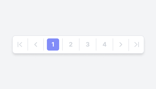
Pagination is a design technique used in web applications to break large volumes of content into smaller, more navigable sections. It typically includes navigation features such as page numbers, "Next" and "Previous" buttons, the ability to directly enter a page number via a numeric textbox, and sometimes a page selector or options for adjusting the number of items displayed per page. By presenting content in smaller chunks, pagination enhances the user experience, making it easier to browse and find relevant information without overwhelming users with excessive content at once.
Simple PaginationFigma LogoGet FigmaGo to Figma
In this demo, the pagination includes "Previous" and "Next" buttons, along with numbered page links for easy navigation. The current page is highlighted for clarity, and an ellipsis feature provides quick access to distant pages, simplifying the process of browsing through multiple pages.
Figma LogoGet FigmaGo to Figma
Desktop View
Tablet View
Mobile View
Toggle between Light and Dark Mode
Loading Indicator
Advanced PaginationFigma LogoGet FigmaGo to Figma
In this demo, the pagination includes "Previous" and "Next" buttons, numbered page links, and a dropdown to select items per page. The current page is highlighted for clarity, and it also displays the current page number out of the total pages, along with the total item count, giving users full control over navigation and view settings.
Figma LogoGet FigmaGo to Figma
Desktop View
Tablet View
Mobile View
Toggle between Light and Dark Mode
Loading Indicator
Advanced Pagination with Rounded SelectionFigma LogoGet FigmaGo to Figma
In this demo, the pagination includes "Previous" and "Next" buttons, numbered page links with a round selection style, and a dropdown to select items per page. The current page is highlighted for clarity, and it also displays the current page number out of the total pages, along with the total item count, giving users full control over navigation and view settings.
Figma LogoGet FigmaGo to Figma
Desktop View
Tablet View
Mobile View
Toggle between Light and Dark Mode
Loading Indicator
Advanced Pagination Using Page SelectorFigma LogoGet FigmaGo to Figma
In this demo, the pagination includes "Previous" and "Next" buttons, a page input field displaying the current page out of the total pages, and a dropdown to set items per page. This input field allows users to jump to specific pages, making it easy to navigate through large sets of data.
Figma LogoGet FigmaGo to Figma
Desktop View
Tablet View
Mobile View
Toggle between Light and Dark Mode
Loading Indicator
Shortened PaginationFigma LogoGet FigmaGo to Figma
In this demo, the pagination includes "First", "Last", "Previous", and "Next" buttons, with the current page and total pages displayed in the center. This compact design offers shortened pagination, displaying only the essential navigation controls for a streamlined user experience.
Figma LogoGet FigmaGo to Figma
Desktop View
Tablet View
Mobile View
Toggle between Light and Dark Mode
Loading Indicator
Pagination in Header SectionFigma LogoGet FigmaGo to Figma
In this demo, the pagination includes "Previous" and "Next" buttons, items-per-page dropdown, and icons for display options and filtering. Positioned within the header, this compact design enables users to easily navigate, adjust views, and apply filters, providing an efficient and user-friendly interface for managing content.
Figma LogoGet FigmaGo to Figma
Desktop View
Tablet View
Mobile View
Toggle between Light and Dark Mode
Loading Indicator