LayoutsRight ChevronNavigation Bar
Navigation Bar - Image
Navigation Bar
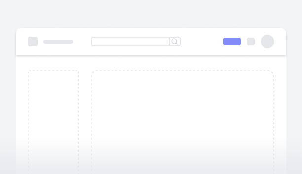
The navigation bar is a user interface element that provides links or buttons to different sections or pages. Typically located at the top of the application, it allows users to easily navigate between sections or pages. The navigation bar may also include menus, icons, or dropdowns, further enhancing the usability and accessibility of the application.
Simple NavbarFigma LogoGet FigmaGo to Figma
In the demo, the navigation bar is showcased, featuring the company logo and name on the left. It includes a search feature for quick content access, an option to add new widgets, menu icons for easy navigation, and a user profile section. On tablet and mobile devices, the layout adjusts to fit the screen, ensuring an optimized viewing experience.
Figma LogoGet FigmaGo to Figma
Desktop View
Tablet View
Mobile View
Toggle between Light and Dark Mode
Loading Indicator
Navbar with Menu and other optionsFigma LogoGet FigmaGo to Figma
In this demo, a double navigation bar is exhibited. The top bar prominently displays the company logo and name, along with primary navigation links, an upgrade button, menu icons for easy navigation, and a user profile section. The bottom bar provides secondary navigation links and a search bar for easy access to content. On tablet and mobile devices, the layout adjusts to fit the screen, ensuring an optimized viewing experience.
Figma LogoGet FigmaGo to Figma
Desktop View
Tablet View
Mobile View
Toggle between Light and Dark Mode
Loading Indicator
Navbar with Menu and DropdownFigma LogoGet FigmaGo to Figma
In this demo, a double navigation bar is exhibited. The top bar prominently displays the company logo and name, along with menu icons for easy navigation and dropdowns for selecting a location and contact. The bottom bar provides additional navigation options. On tablet and mobile devices, the layout adjusts to fit the screen, ensuring an optimized viewing experience.
Figma LogoGet FigmaGo to Figma
Desktop View
Tablet View
Mobile View
Toggle between Light and Dark Mode
Loading Indicator
Navbar with Menu and SearchFigma LogoGet FigmaGo to Figma
In this demo, a double navigation bar is exhibited. The top bar prominently displays the company logo and name, along with primary navigation links, menu icons for easy navigation, a dropdown, and a user profile section. The bottom bar provides a search bar for easy access to content. On tablet and mobile devices, the layout adjusts to fit the screen, ensuring an optimized viewing experience.
Figma LogoGet FigmaGo to Figma
Desktop View
Tablet View
Mobile View
Toggle between Light and Dark Mode
Loading Indicator
Navbar with Menu and BreadcrumbFigma LogoGet FigmaGo to Figma
In this demo, a three-tier navigation bar is exhibited. The top bar prominently displays the company logo and name, along with a search option, menu icons for easy navigation, and a user profile section. The middle bar includes breadcrumbs for quick navigation, along with dropdown options for additional selections. The bottom bar provides other navigation links. On tablet and mobile devices, the layout adjusts to fit the screen, ensuring an optimized viewing experience.
Figma LogoGet FigmaGo to Figma
Desktop View
Tablet View
Mobile View
Toggle between Light and Dark Mode
Loading Indicator
Navbar with Multiple OptionsFigma LogoGet FigmaGo to Figma
In this demo, a three-tier navigation bar is exhibited. The top bar prominently displays the company logo and name, along with a user profile section and primary menu navigation links. The middle bar includes secondary menu navigation links. The bottom bar provides a search option and call-to-action (CTA) buttons. On tablet and mobile devices, the layout adjusts to fit the screen, ensuring an optimized viewing experience.
Figma LogoGet FigmaGo to Figma
Desktop View
Tablet View
Mobile View
Toggle between Light and Dark Mode
Loading Indicator