LayoutsRight ChevronModals
Modals - Image

Modals

The modal dialog is a user interface element designed to perform specific tasks or actions through a focused layout. It includes input fields, dropdown menus, toggles, date pickers, and call-to-action buttons. It presents a clean and intuitive user experience. The design emphasizes clarity, usability, and consistency.
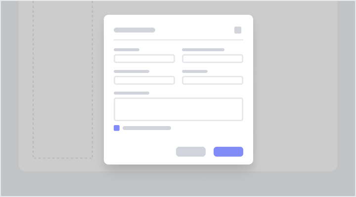
Two-Column Layout Modal for FormsFigma LogoGet FigmaGo to Figma
In this demo, the modal dialog features a two-column layout with a section for profile image upload, input fields for contact details, dropdowns for selections, and checkboxes for preferences. Action buttons are at the bottom.
Figma LogoGet FigmaGo to Figma
Desktop View
Tablet View
Mobile View
Toggle between Light and Dark Mode
Loading Indicator
Single-Column Form ModalFigma LogoGet FigmaGo to Figma
In this demo, the modal collects essential details with a single-column layout. It includes required fields, optional inputs, and a dropdown for streamlined data entry.
Figma LogoGet FigmaGo to Figma
Desktop View
Tablet View
Mobile View
Toggle between Light and Dark Mode
Loading Indicator
Accordion Layout ModalFigma LogoGet FigmaGo to Figma
In this demo, the modal features an accordion layout, organizing information into expandable sections for efficiency. Each section includes input fields, toggles, and dropdowns, enabling smooth data configuration. Action buttons at the bottom simplify task completion.
Figma LogoGet FigmaGo to Figma
Desktop View
Tablet View
Mobile View
Toggle between Light and Dark Mode
Loading Indicator
Searchable Checklist ModalFigma LogoGet FigmaGo to Figma
In this demo, the modal features a searchable input at the top for filtering items, a checklist for selecting multiple entries, and dropdown menus aligned to the right of each list item for assigning specific options. An informational label is placed at the footer alongside action buttons, ensuring clarity and efficient interactions.
Figma LogoGet FigmaGo to Figma
Desktop View
Tablet View
Mobile View
Toggle between Light and Dark Mode
Loading Indicator
Two-Column Input ModalFigma LogoGet FigmaGo to Figma
In this demo, the modal features a two-column layout with labeled input fields, dropdown menus for selections, and a multiline text area for detailed descriptions. Date pickers and checkboxes are included for capturing timeline details. Action buttons at the footer ensure a seamless user experience.
Figma LogoGet FigmaGo to Figma
Desktop View
Tablet View
Mobile View
Toggle between Light and Dark Mode
Loading Indicator
Data Grid Modal with Export FeaturesFigma LogoGet FigmaGo to Figma
In this demo, the modal uses headers to group related sections and improve readability. Labels are positioned to the left of input fields for clarity, ensuring a structured approach that supports efficient data entry and interaction.
Figma LogoGet FigmaGo to Figma
Desktop View
Tablet View
Mobile View
Toggle between Light and Dark Mode
Loading Indicator
Grouping Headers ModalFigma LogoGet FigmaGo to Figma
In this demo, the modal utilizes grouping headers to organize related sections, ensuring clear separation with left-aligned labels. This structured approach enhances usability, enabling efficient interaction with grouped content.
Figma LogoGet FigmaGo to Figma
Desktop View
Tablet View
Mobile View
Toggle between Light and Dark Mode
Loading Indicator
Tabbed Navigation ModalFigma LogoGet FigmaGo to Figma
In this demo, the modal layout features a structured form with tabs for easy navigation. It includes a section for image upload, input fields for entering details, dropdown menus for selecting options, and toggle switches for settings. Action buttons are at the bottom for user interactions.
Figma LogoGet FigmaGo to Figma
Desktop View
Tablet View
Mobile View
Toggle between Light and Dark Mode
Loading Indicator
Single-Column Layout Modal with RTEFigma LogoGet FigmaGo to Figma
In this demo, the modal features a single-column layout with structured inputs, including a priority selector and a due-date picker, alongside a rich text editor (RTE) for descriptions. A prominent call-to-action button ensures efficient ticket submission.
Figma LogoGet FigmaGo to Figma
Desktop View
Tablet View
Mobile View
Toggle between Light and Dark Mode
Loading Indicator
Modal with Sidebar NavigationFigma LogoGet FigmaGo to Figma
In this demo, the modal layout features a sidebar menu for navigation. It allows users to update account information, manage security settings, and toggle advanced options. Clear buttons and concise labels ensure an intuitive experience.
Figma LogoGet FigmaGo to Figma
Desktop View
Tablet View
Mobile View
Toggle between Light and Dark Mode
Loading Indicator
Feedback Modal with RTEFigma LogoGet FigmaGo to Figma
In this demo, the modal allows users to provide detailed feedback on a document using an intuitive rich text editor. It includes a character counter and clearly labeled buttons for efficient review and submission.
Figma LogoGet FigmaGo to Figma
Desktop View
Tablet View
Mobile View
Toggle between Light and Dark Mode
Loading Indicator