LayoutsRight ChevronCards
Cards - Image
Cards
The card is a flexible and compact UI element used to present content in a clear and organized way. Typically consisting of a container that holds a combination of text, images, icons, links, and other elements, cards are commonly used to display discrete pieces of content, such as articles, products, or user profiles. They are often interactive, allowing for actions like expanding, clicking, or navigating to other content. Widely used in dashboards, content galleries, and e-commerce sites, cards provide an intuitive and modular way to organize and present information.
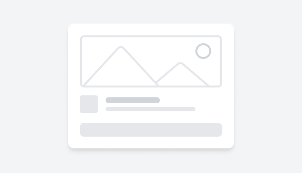
Simple Card LayoutFigma LogoGet FigmaGo to Figma
In this demo, you will explore a collection of cards designed to capture attention and provide detailed information. Each card features a visually appealing image, complemented by a concise description, a title, and a call-to-action button for further exploration.
Figma LogoGet FigmaGo to Figma
Desktop View
Tablet View
Mobile View
Toggle between Light and Dark Mode
Loading Indicator
Rounded Corner Card with Spacious DesignFigma LogoGet FigmaGo to Figma
In this demo, you will explore a series of informative cards, each focusing on a distinct theme, such as fashion, fitness, and technology. Each card includes an eye-catching image with rounded corners and custom spacing, as well as a concise headline and detailed description.
Figma LogoGet FigmaGo to Figma
Desktop View
Tablet View
Mobile View
Toggle between Light and Dark Mode
Loading Indicator
Rounded Corner Card with Spacious Design and a ButtonFigma LogoGet FigmaGo to Figma
In this demo, we present a set of visually engaging cards that seamlessly adjust to different visual styles. Each card features an image with rounded corners and distinct spacing around it, a title, a concise description, and a Get Started call-to-action button to encourage user interaction.
Figma LogoGet FigmaGo to Figma
Desktop View
Tablet View
Mobile View
Toggle between Light and Dark Mode
Loading Indicator
Card Layout with AvatarFigma LogoGet FigmaGo to Figma
In this demo, we feature a series of personalized cards that spotlight individuals and their areas of expertise. Each card includes a profile picture, the individual’s name and area of expertise, an article title, and content.
Figma LogoGet FigmaGo to Figma
Desktop View
Tablet View
Mobile View
Toggle between Light and Dark Mode
Loading Indicator
Card Layout with Avatar and Edit ButtonFigma LogoGet FigmaGo to Figma
In this demo, we show a series of interactive profile cards that spotlight individuals and their areas of expertise. Each card features a profile picture, name, area of expertise, and an Edit button for customization. Accompanying these is an engaging headline and a brief article description, offering insights into different topics.
Figma LogoGet FigmaGo to Figma
Desktop View
Tablet View
Mobile View
Toggle between Light and Dark Mode
Loading Indicator
Benefits Highlight Card with CTAFigma LogoGet FigmaGo to Figma
In this demo, we present a collection of cards designed to highlight the benefits of different subjects. Each card features a title and description, with the benefits listed to help readers easily grasp the key points. A Get Started Now call-to-action button is also available to encourage further action.
Figma LogoGet FigmaGo to Figma
Desktop View
Tablet View
Mobile View
Toggle between Light and Dark Mode
Loading Indicator
Card Layout with BadgesFigma LogoGet FigmaGo to Figma
In this demo, a collection of cards brings to light different extraordinary places and experiences from around the world. Each card features a stunning image paired with a title, description, and a categorizing badge label at the bottom.
Figma LogoGet FigmaGo to Figma
Desktop View
Tablet View
Mobile View
Toggle between Light and Dark Mode
Loading Indicator
Card Layout with Split ImagesFigma LogoGet FigmaGo to Figma
In this demo, the split-image cards showcase captivating visuals on the left, with descriptive content on the right. Each card includes an image, title, and description. A View Details call-to-action button invites further exploration.
Figma LogoGet FigmaGo to Figma
Desktop View
Tablet View
Mobile View
Toggle between Light and Dark Mode
Loading Indicator
Text-Focused Card LayoutFigma LogoGet FigmaGo to Figma
In this demo, each card displays a clear title, a description, and an author section with an avatar. The design is easy to read and helps users connect with the author and their content.
Figma LogoGet FigmaGo to Figma
Desktop View
Tablet View
Mobile View
Toggle between Light and Dark Mode
Loading Indicator
Card Layout with Left-Aligned ImageFigma LogoGet FigmaGo to Figma
In this demo, we showcase a collection of informative cards that highlight technological advancements. Each card layout pairs a striking image on the left with an author section on the right featuring an avatar, title, and description.
Figma LogoGet FigmaGo to Figma
Desktop View
Tablet View
Mobile View
Toggle between Light and Dark Mode
Loading Indicator
User Profile Card LayoutFigma LogoGet FigmaGo to Figma
In this demo, we feature cards that showcase eye-catching images at the top, each with a title and a short summary to provide context. The card ends with an author section, featuring an avatar, name, role, and date.
Figma LogoGet FigmaGo to Figma
Desktop View
Tablet View
Mobile View
Toggle between Light and Dark Mode
Loading Indicator
Cards with User Avatars and RatingsFigma LogoGet FigmaGo to Figma
In this demo, each card features an icon, title, and brief description. Below this, user avatars and a star rating provide community feedback. This layout offers a quick overview of experiences or services and adds credibility through user input and ratings.
Figma LogoGet FigmaGo to Figma
Desktop View
Tablet View
Mobile View
Toggle between Light and Dark Mode
Loading Indicator
Card Layout with Right-Aligned ImagesFigma LogoGet FigmaGo to Figma
In this demo, the card layout features text on the left and an image on the right. It includes a category label, title, and description, with a professional look. This setup is ideal for showcasing corporate or business content.
Figma LogoGet FigmaGo to Figma
Desktop View
Tablet View
Mobile View
Toggle between Light and Dark Mode
Loading Indicator
Card Layout with Link ButtonsFigma LogoGet FigmaGo to Figma
In this demo, each card layout includes a title, description, and a View More button. The simple yet attractive design invites users to explore more content.
Figma LogoGet FigmaGo to Figma
Desktop View
Tablet View
Mobile View
Toggle between Light and Dark Mode
Loading Indicator
Card Layout with CTA ButtonFigma LogoGet FigmaGo to Figma
In this demo, the card layout features a title, description, and a call-to-action (CTA) button. The clean and straightforward design emphasizes key information while encouraging further engagement.
Figma LogoGet FigmaGo to Figma
Desktop View
Tablet View
Mobile View
Toggle between Light and Dark Mode
Loading Indicator