How can I help you?
Getting Started with React UI Components in the SharePoint Framework
18 May 20266 minutes to read
This article provides a step-by-step guide for setting up a SharePoint project and integrating the Syncfusion® React components.
SharePoint Framework (SPFx) is a development model and framework provided by Microsoft for building custom solutions and extensions for SharePoint and Microsoft Teams. It is a modern, client-side framework that allows developers to create web parts, extensions, and customizations that can be deployed and used within SharePoint sites and Teams applications.
Prerequisites
Set up the SharePoint project
Create a new SPFx project using the following command:
Step 1: To initiate the creation of a new SharePoint project, use the following command:
yo @microsoft/sharepointStep 2: Specify the name of the project as my-project and the name of the WebPart as App for this article. You will be prompted with a series of configuration questions as shown below:
Let's create a new Microsoft 365 solution.
? What is your solution name? my-project
? Which type of client-side component to create? WebPart
Add new Web part to solution my-project.
? What is your Web part name? App
? Which template would you like to use? React
Step 3: To establish trust for the certificate in the development environment, execute the following command:
heft trust-dev-certWith these steps complete, your my-project SharePoint Framework solution is ready for Syncfusion® component integration.
Add Syncfusion® React packages
Syncfusion® React component packages are available at npmjs.com. To use Syncfusion® React components in the project, install the corresponding npm package.
This guide uses the React Grid component as an example. To install the React Grid component package, use the following command:
npm install @syncfusion/ej2-react-grids --saveImport Syncfusion® CSS styles
Themes for Syncfusion® React components can be applied using CSS files from npm packages, CDN, CRG, or Theme Studio. Refer to the themes documentation for more detail.
This example demonstrates importing the tailwind3 theme CSS within the App.tsx file located at ~/src/webparts/app/components/App.tsx:
require('@syncfusion/ej2-grids/styles/tailwind3.css');Add Syncfusion® React component
Follow the below steps to add the React Grid component:
Step 1: In the App.tsx file inside the ~/src/webparts/app/components folder, declare the values for the dataSource property.
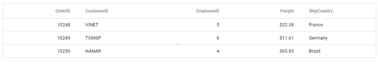
const data = [
  {
    OrderID: 10248, CustomerID: 'VINET', EmployeeID: 5, ShipCountry: 'France', Freight: 32.38
  },
  {
    OrderID: 10249, CustomerID: 'TOMSP', EmployeeID: 6, ShipCountry: 'Germany', Freight: 11.61
  },
  {
    OrderID: 10250, CustomerID: 'HANAR', EmployeeID: 4, ShipCountry: 'Brazil', Freight: 65.83
  }
];
Step 2: Define the Grid component with the dataSource property and column definitions.
import * as React from 'react';
import { ColumnDirective, ColumnsDirective, GridComponent } from '@syncfusion/ej2-react-grids';

export default class App extends React.Component<IAppProps, {}> {

  public render(): React.ReactElement<IAppProps> {
    return (
      <GridComponent dataSource={data}>
        <ColumnsDirective>
          <ColumnDirective field='OrderID' width='100' textAlign="Right" />
          <ColumnDirective field='CustomerID' width='100' />
          <ColumnDirective field='EmployeeID' width='100' textAlign="Right" />
          <ColumnDirective field='Freight' width='100' format="C2" textAlign="Right" />
          <ColumnDirective field='ShipCountry' width='100' />
        </ColumnsDirective>
      </GridComponent>
    );
  }
}
Here is the summarized code for the above steps:
import * as React from 'react';
import { IAppProps } from './IAppProps';
import { ColumnDirective, ColumnsDirective, GridComponent } from '@syncfusion/ej2-react-grids';

require('@syncfusion/ej2-react-grids/styles/tailwind3.css');

export default class App extends React.Component<IAppProps, {}> {

  public render(): React.ReactElement<IAppProps> {
    const data = [
      {
        OrderID: 10248, CustomerID: 'VINET', EmployeeID: 5, ShipCountry: 'France', Freight: 32.38
      },
      {
        OrderID: 10249, CustomerID: 'TOMSP', EmployeeID: 6, ShipCountry: 'Germany', Freight: 11.61
      },
      {
        OrderID: 10250, CustomerID: 'HANAR', EmployeeID: 4, ShipCountry: 'Brazil', Freight: 65.83
      }
    ];

    return (
      <GridComponent dataSource={data}>
        <ColumnsDirective>
          <ColumnDirective field='OrderID' width='100' textAlign="Right" />
          <ColumnDirective field='CustomerID' width='100' />
          <ColumnDirective field='EmployeeID' width='100' textAlign="Right" />
          <ColumnDirective field='Freight' width='100' format="C2" textAlign="Right" />
          <ColumnDirective field='ShipCountry' width='100' />
        </ColumnsDirective>
      </GridComponent>
    );
  }
}
Run the project
To run the project, use the following command:
npm startThe output will appear as follows: