How can I help you?
Disabled Items in React DropDownList component
21 Feb 20269 minutes to read
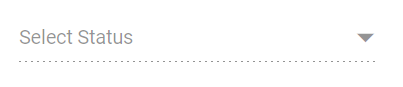
The DropDownList supports enabling or disabling individual items as needed. Map the disabled field from your data source to control item availability. Disabled items cannot be selected. Configure the disabled state mapping using the fields.disabled property.
The following example demonstrates disabling specific states using the disabled field.
[Class-component]
import { DropDownListComponent } from '@syncfusion/ej2-react-dropdowns';
import * as React from 'react';
import * as ReactDOM from 'react-dom';
export default class App extends React.Component {
    // define the data with category
    statusData = [
        { "Status": "Open", "State": false },
        { "Status": "Waiting for Customer", "State": false },
        { "Status": "On Hold", "State": true },
        { "Status": "Follow-up", "State": false },
        { "Status": "Closed", "State": true },
        { "Status": "Solved", "State": false },
        { "Status": "Feature Request", "State": false }
    ];
    // map the groupBy field with Category column
    fields = { value: 'Status', disabled: 'State' };
    render() {
        return (
        // specifies the tag for render the DropDownList component
        <DropDownListComponent id="atcelement" fields={this.fields} dataSource={this.statusData} placeholder="Select Status"/>);
    }
}
ReactDOM.render(<App />, document.getElementById('sample'));
import { DropDownListComponent } from '@syncfusion/ej2-react-dropdowns';
import * as React from 'react';
import * as ReactDOM from 'react-dom';
export default class App extends React.Component<{}, {}> {
// define the data with category
private statusData: { [key: string]: Object }[] = [
{ "Status": "Open", "State": false },
{ "Status": "Waiting for Customer", "State": false },
{ "Status": "On Hold", "State": true },
{ "Status": "Follow-up", "State": false },
{ "Status": "Closed", "State": true },
{ "Status": "Solved", "State": false },
{ "Status": "Feature Request", "State": false }
];
// map the groupBy field with Category column
private fields: object = { value: 'Status', disabled: 'State' };
public render() {
return (
// specifies the tag for render the DropDownList component
<DropDownListComponent id="atcelement" fields={this.fields} dataSource={this.statusData} placeholder="Select Status" />
);
}
}
ReactDOM.render(<App />, document.getElementById('sample'));[Functional-component]
import { DropDownListComponent } from '@syncfusion/ej2-react-dropdowns';
import * as React from 'react';
import * as ReactDOM from 'react-dom';
function App() {
    // define the data with category
    let statusData = [
        { "Status": "Open", "State": false },
        { "Status": "Waiting for Customer", "State": false },
        { "Status": "On Hold", "State": true },
        { "Status": "Follow-up", "State": false },
        { "Status": "Closed", "State": true },
        { "Status": "Solved", "State": false },
        { "Status": "Feature Request", "State": false }
    ];
    // map the groupBy field with Category column
    const fields = { value: 'Status', disabled: 'State' };
    return (
    // specifies the tag for render the DropDownList component
    <DropDownListComponent id="atcelement" fields={fields} dataSource={statusData} placeholder="Select Status"/>);
}
ReactDOM.render(<App />, document.getElementById('sample'));
import { DropDownListComponent } from '@syncfusion/ej2-react-dropdowns';
import * as React from 'react';
import * as ReactDOM from 'react-dom';
function App() {
// define the data with category
let statusData: { [key: string]: Object }[] = [
{ "Status": "Open", "State": false },
{ "Status": "Waiting for Customer", "State": false },
{ "Status": "On Hold", "State": true },
{ "Status": "Follow-up", "State": false },
{ "Status": "Closed", "State": true },
{ "Status": "Solved", "State": false },
{ "Status": "Feature Request", "State": false }
];
// map the groupBy field with Category column
const fields: object = { value: 'Status', disabled: 'State' };
return (
// specifies the tag for render the DropDownList component
<DropDownListComponent id="atcelement" fields={fields} dataSource={statusData} placeholder="Select Status" />
);
}
ReactDOM.render(<App />, document.getElementById('sample'));Disable Item Method
Use the disableItem method to dynamically disable individual items. To disable multiple items, iterate this method through your items list or array. The disabled state updates in the dataSource when items are disabled. If a selected item is disabled, its selection is automatically cleared.
| Parameter | Type | Description |
|---|---|---|
| itemHTMLLIElement | HTMLLIElement |
It accepts the HTML Li element of the item to be removed. |
| itemValue |
string | number | boolean | object
|
It accepts the string, number, boolean and object type value of the item to be removed. |
| itemIndex | number |
It accepts the index of the item to be removed. |
Disable the Component
To disable the entire component, set the enabled property to false.