How can I help you?
Responsive mode in EJ2 TypeScript Kanban control
23 Jun 20231 minute to read
The Kanban component has support for responsive behavior based on the client browser’s width and height.
Layouts
Possible layouts are:
- Default Layout
- Swimlane Layout
Default Layout
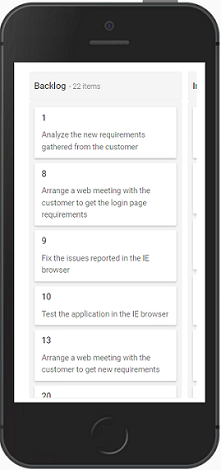
Kanban user interface is customized and redesigned for the best view on small screens. In responsive mode, the first column occupies 80% and the second column occupies 20% of the screen layout. Tap and hold the Kanban card to drag and drop it. Swipe left or right to view the columns.
Swimlane Layout
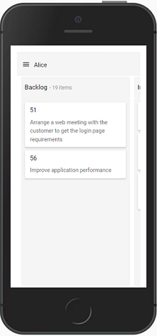
Kanban swimlane header is rendered with menu icon on top of the kanban board. It will show all the available swimlane groups of the header text with a popup when clicking the menu icon. Swimlane selected grouped header text resultant data is rendered on the Kanban board. By default, the first swimlane grouped header text is selected and the resultant data is shown on the Kanban board. The Kanban board data will be changed when changing the swimlane group header text.
Scrolling
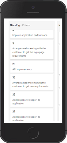
Column scrolling will be shown when exceeding the screen size in the columns.
Selection
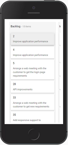
Select particular cards in the Kanban board by tapping the card.
Single Selection
Single card will be selected when you tap the card once and selection will be removed when you select another card.
Multiple Selection
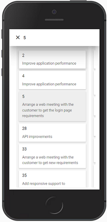
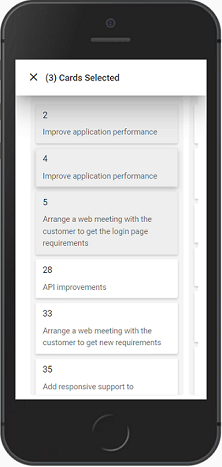
Enable selectionType as Multiple to select multiple cards. It will open the popup on the screen top. Selected card header text will be shown when selecting single card with a tap and hold action. If single card is selected, only tap action is required to select multiple cards. Multiple Selected card count will be shown on the popup when selecting multiple cards.
