Getting Started with EJ2 TypeScript Diagram
02 Sep 20268 minutes to read
This section explains the steps required to create a simple diagram and demonstrates the basic usage of the diagram control using a seed application.
Ready to streamline your Syncfusion® TypeScript development? Discover the full potential of Syncfusion® TypeScript control with Syncfusion® AI Coding Assistant. Effortlessly integrate, configure, and enhance your projects with intelligent, context-aware code suggestions, streamlined setups, and real-time insights—all seamlessly integrated into your preferred AI-powered IDEs like VS Code, Cursor, Syncfusion® CodeStudio and more. Explore Syncfusion® AI Coding Assistant.
Prerequisites
Ensure the following tools are installed on your machine:
- Git
- Node.js (latest LTS version recommended)
- Visual Studio Code
Set up the development environment
Open the command prompt from the required directory, and run the following command to clone the Syncfusion® TypeScript (Essential® JS 2) quickstart project from GitHub.
git clone https://github.com/SyncfusionExamples/ej2-quickstart-webpack ej2-quickstart
After cloning the application in the ej2-quickstart folder, run the following command to navigate to the folder.
cd ej2-quickstart
Install Syncfusion TypeScript packages
Syncfusion® TypeScript (Essential® JS 2) packages are available on the npmjs.com public registry. The quickstart application is preconfigured with the dependent @syncfusion/ej2 package in the package.json file. To render the Diagram control, you also need the @syncfusion/ej2-diagrams package.
Use the following command to install the dependent npm packages from the command prompt.
npm install
Import Syncfusion® CSS styles
The Diagram control needs Syncfusion® theme styles to display correctly. Syncfusion® theme packages include ready-to-use styles for supported controls.
To add the styles, install the Tailwind theme package using the following command:
npm install @syncfusion/ej2-tailwind-theme
Then add the following CSS reference to the src/styles/styles.css file:
@import "../../node_modules/@syncfusion/ej2-tailwind-theme/styles/diagram/index.css";
The theme package includes the required base component styles for the Diagram control, so no separate base style import is needed.
For the list of available themes, refer to the Themes documentation.
Syncfusion® provides multiple built-in themes. If the application uses a different theme, replace @syncfusion/ej2-tailwind-theme/styles/diagram/index.css with the corresponding stylesheet from the desired theme package. For example, to use the Material 3 theme, import @syncfusion/ej2-material3-theme/styles/diagram/index.css.
Add the HTML element
Open the src/index.html file and replace its contents with the following HTML for the Diagram component.
<!DOCTYPE html>
<html lang="en">
<head>
    <title>Essential JS 2</title>
    <meta charset="utf-8" />
    <meta name="viewport" content="width=device-width, initial-scale=1.0, user-scalable=no" />
</head>
<body>
    <div>
        <!--HTML diagram element, which is going to render as Essential JS 2 Diagram-->
        <div id="diagram"></div>
    </div>
</body>
</html>
Create your first Diagram with nodes and connectors
This section explains how to create a simple flowchart by adding nodes, customizing their appearance, and connecting them using connectors.
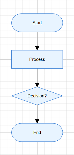
The following example creates a flowchart with four nodes: Start, Process, Decision, and End. It also applies common node and connector settings through the getNodeDefaults and getConnectorDefaults callback bindings.
Open the src/app/app.ts file and add the following code to render the Diagram control.
import { Diagram, NodeModel, ConnectorModel } from '@syncfusion/ej2-diagrams';

// Node defaults function
function nodeDefaults(node: NodeModel): NodeModel {
    node.width = 140;
    node.height = 50;
    node.style = {
        fill: '#E8F4FF',
        strokeColor: '#357BD2'
    };
    return node;
}

// Connector defaults function
function connectorDefaults(connector: ConnectorModel): ConnectorModel {
    connector.type = 'Orthogonal';
    connector.targetDecorator = {
        shape: 'Arrow',
        width: 10,
        height: 10
    };
    return connector;
}

// Initialize the Diagram control
let diagram: Diagram = new Diagram({
    width: '100%',
    height: '580px',
    getNodeDefaults: nodeDefaults,
    getConnectorDefaults: connectorDefaults,
    nodes: [
        {
            id: 'node1',
            offsetX: 300,
            offsetY: 100,
            shape: {
                type: 'Flow',
                shape: 'Terminator'
            },
            annotations: [{
                content: 'Start'
            }]
        },
        {
            id: 'node2',
            offsetX: 300,
            offsetY: 200,
            shape: {
                type: 'Flow',
                shape: 'Process'
            },
            annotations: [{
                content: 'Process'
            }]
        },
        {
            id: 'node3',
            offsetX: 300,
            offsetY: 300,
            shape: {
                type: 'Flow',
                shape: 'Decision'
            },
            annotations: [{
                content: 'Decision?'
            }]
        },
        {
            id: 'node4',
            offsetX: 300,
            offsetY: 400,
            shape: {
                type: 'Flow',
                shape: 'Terminator'
            },
            annotations: [{
                content: 'End'
            }]
        }
    ],
    connectors: [
        {
            id: 'connector1',
            sourceID: 'node1',
            targetID: 'node2'
        },
        {
            id: 'connector2',
            sourceID: 'node2',
            targetID: 'node3'
        },
        {
            id: 'connector3',
            sourceID: 'node3',
            targetID: 'node4'
        }
    ]
});

// Render initialized Diagram
diagram.appendTo('#diagram');
In this example:
-
offsetXandoffsetYdefine the position of each node. -
shapedefines the node shape configuration, and thetype: 'Flow'withshape: 'Terminator','Process', or'Decision'specifies flowchart shapes. -
annotationsadds text inside each node using thecontentproperty. -
sourceIDandtargetIDconnect one node to another. -
getNodeDefaultsapplies common width, height, fill color, and stroke color to all nodes. -
getConnectorDefaultsapplies common connector settings to all connectors, such as setting the routingtypetoOrthogonaland adding a target arrow decorator.
Ensure the
src/app/app.tsfile is imported by the application entry point (e.g.,src/index.ts) so that the Diagram control is initialized when the app loads.
Run the application
Run the application in the browser using the following command:
npm start
Then open the local URL shown in the terminal, such as http://localhost:4000. The application displays a flowchart diagram with four nodes connected by orthogonal connectors.
The output will appear as follows:
If
npm startfails, ensure all dependencies are installed by runningnpm installagain. If the default port (e.g.,4000) is already in use, stop the other process or change the port in the webpack configuration.