How can I help you?
Styles in ASP.NET MVC Floating Action Button Control
12 Jul 20244 minutes to read
This section explains the different styles of Floating Action Button.
FAB styles
The ASP.NET MVC Floating Action Button supports the following predefined styles that can be defined using the CssClass property. You can customize by replacing the CssClass property with the below defined class.
| Class | Description |
|---|---|
| e-success | Used to represent a positive action. |
| e-outline | Used to represent an appearance of button with outline. |
| e-info | Used to represent an informative action. |
| e-warning | Used to represent an action with caution. |
| e-danger | Used to represent a negative action. |
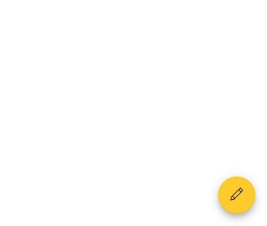
@using Syncfusion.EJ2.Buttons

@Html.EJS().Fab("fab").IconCss("e-icons e-edit").CssClass("e-warning").Render()
public ActionResult FabStyles()
{
return View();
}
NOTE
Predefined Floating Action Button styles provide only the visual indication. So, Floating Action Button Content property should define the Floating Action Button style for the users of assistive technologies such as screen readers.
Styles customization
To modify the Floating Action Button appearance, you need to override the default CSS of Floating Action Button component. Find the list of CSS classes and its corresponding section in Floating Action Button component. Also, you have an option to create your own custom theme for the controls using our Theme Studio.
| CSS Class | Purpose of Class |
|---|---|
| .e-fab.e-btn | To customize the FAB. |
| .e-fab.e-btn:hover | To customize the FAB on hover. |
| .e-fab.e-btn:focus | To customize the FAB on focus. |
| .e-fab.e-btn:active | To customize the FAB on active. |
| .e-fab.e-btn-icon | To customize the style of FAB icon. |
Show text on hover
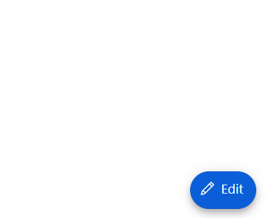
By using CssClass, you can customize the Floating Action Button to show text on hover with applied transition effect.
@using Syncfusion.EJ2.Buttons

@Html.EJS().Fab("fab").IconCss("e-icons e-edit").CssClass("fab-hover").Content("<span class='text-container'><span class='textEle'>Edit</span></span>").Render()

<style>

    .e-fab.e-btn.fab-hover {
        padding: 6px 2px 8px 10px;
    }

    .fab-hover .text-container {
        overflow: hidden;
        width: 0;
        margin: 0;
        transition: width .5s linear 0s, margin .2s linear .5s;
    }

    .fab-hover:hover .text-container {
        width: 25px;
        margin-right:10px;
        transition: width .5s linear .2s, margin .2s linear 0s;
    }

</style>
public ActionResult FabHover()
{
return View();
}
Outline customization
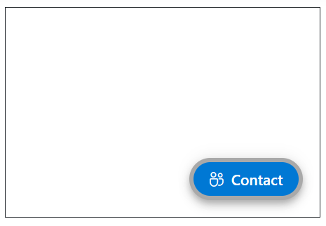
By using the CssClass property, you can customize the outline color of the Floating Action Button.
@using Syncfusion.EJ2.Buttons

<div id="target" style="min-height:200px; position:relative; width:300px; border:1px solid;">
    @Html.EJS().Fab("fab").Target("#target").IconCss("e-icons e-people").Content("Contact").CssClass("custom-css").Render()
</div>
<style>
    .custom-css.e-fab.e-btn {
        border-color: darkgrey;
        border-width: 4px;
    }
</style>
public ActionResult FabStyles()
{
return View();
}