How can I help you?
Action Buttons in Card Control
19 Dec 20222 minutes to read
You can include Action buttons within the Card and customize them. Action button is a div element with e-card-actions class followed by button tag or anchor tag within the card root element.
- For adding action buttons you can create button or anchor tag with
e-card-btnclass within the card action element.
    <div class = "e-card">
        <div class="e-card-actions">
            <button class="e-card-btn"></button>
            <a href="#"></a>
        </div>
    </div>
Vertical
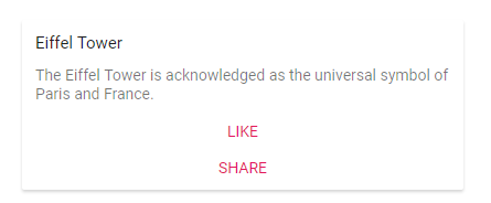
By default, action buttons positioned in horizontal alignment, and also it can be aligned to show in vertical alignment by adding e-card-vertical class.
    <div class = "e-card">
        <div class="e-card-actions e-card-vertical">
            <button class="e-card-btn">More</button>
            <a href="#">Share</a>
        </div>
</div><!--element which is going to render the Card-->
<div class="e-card" style="max-width:400px">
<div class="e-card-header-title">Eiffel Tower</div>
<div class="e-card-content">
The Eiffel Tower is acknowledged as the universal symbol of Paris and France.
</div>
<div class="e-card-actions e-card-vertical">
<button class="e-card-btn">LIKE</button>
<button class="e-card-btn">SHARE</button>
</div>
</div>public ActionResult Index()
{
return View();
}NOTE
