How can I help you?
Item Configuration in ASP.NET MVC Toolbar control
10 Aug 20237 minutes to read
The Toolbar can be rendered by defining an array of items. Items can be constructed with the following built-in command types or item template.
Button
Button is the default command type, and it can be rendered by using the text property. Properties of the button command type:
| Property | Description |
|---|---|
| text | The text to be displayed for button. |
| id | The ID of the button to be rendered. If the ID is not given, auto ID is generated. |
| prefixIcon | Defines the class used to specify an icon for the button. The icon is positioned before the text if text is available or the icon alone button is rendered. |
| suffixIcon | Defines the class used to specify an icon for the button. The icon is positioned after the text if text is available. If both prefixIcon and suffixIcon are specified, only prefixIcon is considered. |
| width | Used to set the width of the button. |
Separator
The Separator type adds a vertical separation between the Toolbar’s single/multiple commands.
@using Syncfusion.EJ2.Navigations;

<ejs-toolbar id="defaultToolbar">
    <e-toolbar-items>
        <e-toolbar-item text="Cut"></e-toolbar-item>
        <e-toolbar-item text="Copy"></e-toolbar-item>
        <e-toolbar-item type="Separator"></e-toolbar-item>
        <e-toolbar-item text="Paste"></e-toolbar-item>
        <e-toolbar-item type="Separator"></e-toolbar-item>
        <e-toolbar-item text="Undo"></e-toolbar-item>
        <e-toolbar-item text="Redo"></e-toolbar-item>
    </e-toolbar-items>
</ejs-toolbar>
public ActionResult Index()
{
return View();
}NOTE
If
Separatoris added as the first or the last item, it will not be visible.
Input
The Input type is only applicable for adding template elements when the template property is defined as an object. Input type creates an input element internally that acts as the container for Syncfusion input based components.
Note: Set toolbar item type property value as
Inputonly for Input components.
NumericTextBox
-
The
NumericTextBoxcomponent can be included by importing theNumericTextBoxmodule fromej2-inputs. -
Initialize the
NumericTextBoxin template property, where the Toolbar item type is set asInput. -
Related
NumericTextBoxcomponent properties can also be configured as given below.
<ejs-numerictextbox format="n2"></ejs-numerictextbox>DropDownList
-
The
DropDownListcomponent can be included by importing theDropDownListmodule fromej2-dropdowns. -
Initialize the
DropDownListin template property, where the Toolbar item type is set asInput. -
Related
DropDownListcomponent properties can also be configured as given below.
<ejs-dropdownlist width="100"></ejs-dropdownlist>RadioButton
-
The
RadioButtoncomponent can be included by importing theRadioButtonmodule fromej2-buttons. -
Initialize the
RadioButtonin template property, where the Toolbar item type is set asInput. -
Related
RadioButtoncomponent properties can also be configured as given below.
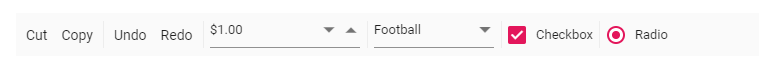
<ejs-radiobutton label="Option 1" name="default"></ejs-radiobutton>Output be like the below.
Enabling tab key navigation in Toolbar
The tabIndex property of a Toolbar item is used to enable tab key navigation for the item. By default, the user can switch between items using the arrow keys, but the tabIndex property allows you to switch between items using the Tab and Shift+Tab keys as well.
To use the tabIndex property, you need to set it for each Toolbar item that you want to enable tab key navigation. The tabIndex property should be set to a positive integer value. A value of 0 or a negative value will disable tab key navigation for the item.
For example, to enable tab key navigation for two Toolbar items, you can use the following code:
@using Syncfusion.EJ2.Navigations;

<ejs-toolbar id="defaultToolbar">
    <e-toolbar-items>
        <e-toolbar-item text="Item 1" tabIndex = "1"></e-toolbar-item>
        <e-toolbar-item text="Item 2" tabIndex = "2"></e-toolbar-item>
    </e-toolbar-items>
</ejs-toolbar>
With the above code, the user can switch between the two Toolbar items using the Tab and Shift+Tab keys, in addition to using the arrow keys. The items will be navigated in the order specified by the tabIndex values.
If you set the tabIndex value to 0 for all Toolbar items, tab key navigation will be based on the element order rather than the tabIndex values. For example:
@using Syncfusion.EJ2.Navigations;

<ejs-toolbar id="defaultToolbar">
    <e-toolbar-items>
        <e-toolbar-item text="Item 1" tabIndex = "0"></e-toolbar-item>
        <e-toolbar-item text="Item 2" tabIndex = "0"></e-toolbar-item>
    </e-toolbar-items>
</ejs-toolbar>
In this case, the user can switch between the two Toolbar items using the Tab and Shift+Tab keys, and the items will be navigated in the order in which they appear in the DOM.
Example:
Here is an example of how you can use the tabIndex property to enable tab key navigation for a Toolbar component:
@using Syncfusion.EJ2.Navigations;

<ejs-toolbar id="defaultToolbar">
    <e-toolbar-items>
        <e-toolbar-item text="Cut" tabIndex = 0></e-toolbar-item>
        <e-toolbar-item text="Copy" tabIndex = 0></e-toolbar-item>
        <e-toolbar-item type="Separator" tabIndex = 0></e-toolbar-item>
        <e-toolbar-item text="Paste" tabIndex = 0></e-toolbar-item>
        <e-toolbar-item type="Separator" tabIndex = 0></e-toolbar-item>
        <e-toolbar-item text="Undo" tabIndex = 0></e-toolbar-item>
        <e-toolbar-item text="Redo" tabIndex = 0></e-toolbar-item>
    </e-toolbar-items>
</ejs-toolbar>
public ActionResult Index()
{
return View();
}With the above code, the user can switch between the Toolbar items using the Tab and Shift+Tab keys, and the items will be navigated based on the element order.