How can I help you?
Label and Size in Radio Button Component
20 Oct 20222 minutes to read
This section explains the different sizes and labels.
Label
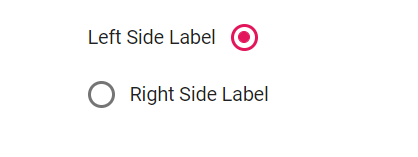
RadioButton caption can be defined by using the label property.
This reduces the manual addition of label for RadioButton. You can customize the label position before or after the RadioButton through the labelPosition property.
<ul>
    <li>
        <ejs-radiobutton id="radio1" label="Left Side Label" name="position" labelPosition="@Syncfusion.EJ2.Buttons.RadioLabelPosition.Before"></ejs-radiobutton>
    </li>
    <li>
        <ejs-radiobutton id="radio2" label="Right Side Label" name="position" labelPosition="@Syncfusion.EJ2.Buttons.RadioLabelPosition.After"></ejs-radiobutton>
    </li>
</ul>

<style>
    .e-radio-wrapper {
        margin-top: 18px;
    }

    li {
        list-style: none;
    }
</style>
public ActionResult Label()
{
return View();
}
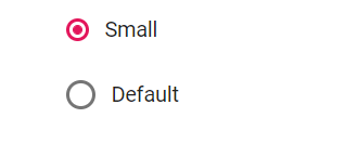
Size
The different RadioButton sizes available are default and small. To reduce the size of the default RadioButton to small, set the cssClass property to e-small.
<ul>
    <li>
        <ejs-radiobutton id="radio1" label="Small" name="size" checked="true" cssClass="e-small"></ejs-radiobutton>
    </li>
    <li>
        <ejs-radiobutton id="radio2" label="Default" name="size"></ejs-radiobutton>
    </li>
</ul>

<style>
    .e-radio-wrapper {
        margin-top: 18px;
    }

    li {
        list-style: none;
    }
</style>
public ActionResult Size()
{
return View();
}